
 Web Front-endH5 TutorialHow to use css3 attributes to enrich picture styles (rounded corners, shadows, gradients)_html5 tutorial skills
How to use css3 attributes to enrich picture styles (rounded corners, shadows, gradients)_html5 tutorial skills

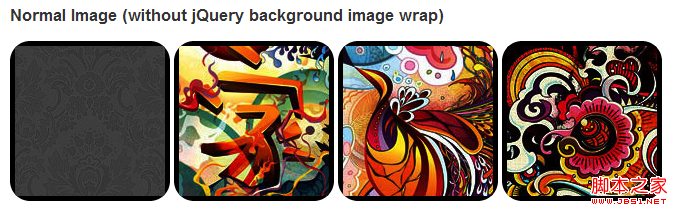
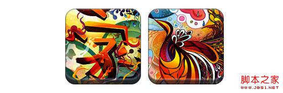
In CSS3, if box-shadow and border-radius are used directly on images, the browser cannot render them well. But if you use the image as a background-image, the added style browser can render it well. I will introduce how to use box-shadow, border-radius and transition to create different image style effects.
Problem
By looking at the demo, we can notice that we set border-radius and inline box-shadow for the first row of images. Firefox renders the border-radius of the image, but does not render the inline box-shadow. Both effects are not rendering in chrome and Safari.
.normal img {
border: solid 5px #000;
-webkit-border-radius: 20px;
-moz-border-radius: 20px;
border-radius: 20px;
-webkit-box-shadow: inset 0 1px 5px rgba(0,0,0,.5);
-moz-box-shadow: inset 0 1px 5px rgba(0,0,0,.5);
box-shadow: inset 0 1px 5px rgba(0,0,0,.5);
}
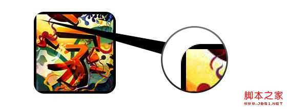
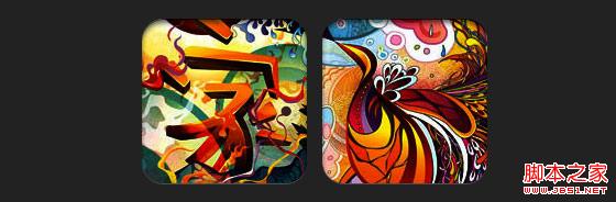
firefox effect:

chrome/safari
Workaround
In order for border-radius and inline box-shadow to work properly, we need to convert the image into background-image.

Dynamic method
In order to complete this work dynamically, we need to use jquery to add a background image wrapper to each image. The following js code adds a span package to each image. The background image path of span is the path of the image.
The code is relatively simple, I think there is no need to explain it. If you are not sure, you can directly check the jquery API.
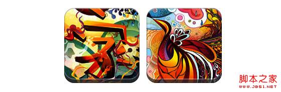
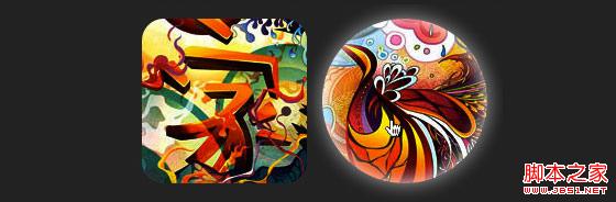
Output
The above code will output the following results:

Circle image
Add that we use border-radius to achieve the effect of circular images, the effect is as follows:
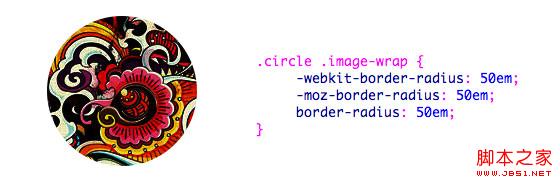
css:
.circle .image-wrap {
-webkit-border-radius: 50em;
-moz-border-radius: 50em;
border-radius: 50em;
}
Card style
The following is a card style picture, using multiple inline box-shadows.

css:
.card .image-wrap {
-webkit-box-shadow: inset 0 0 1px rgba(0,0,0,.8), inset 0 2px 0 rgba(255,255,255,.5) , inset 0 -1px 0 rgba(0,0,0,.4);
-moz-box-shadow: inset 0 0 1px rgba(0,0,0,.8), inset 0 2px 0 rgba( 255,255,255,.5), inset 0 -1px 0 rgba(0,0,0,.4);
box-shadow: inset 0 0 1px rgba(0,0,0,.8), inset 0 2px 0 rgba(255,255,255,.5), inset 0 -1px 0 rgba(0,0,0,.4);
-webkit-border-radius: 20px;
-moz-border-radius: 20px;
border-radius: 20px;
}
Relief style
The following is the relief effect.
css:
.embossed .image-wrap {
-webkit-box-shadow: inset 0 0 2px rgba(0,0,0,.8), inset 0 2px 0 rgba(255,255,255,.5), inset 0 - 7px 0 rgba(0,0,0,.6), inset 0 -9px 0 rgba(255,255,255,.3);
-moz-box-shadow: inset 0 0 2px rgba(0,0,0,. 8), inset 0 2px 0 rgba(255,255,255,.5), inset 0 -7px 0 rgba(0,0,0,.6), inset 0 -9px 0 rgba(255,255,255,.3);
box- shadow: inset 0 0 2px rgba(0,0,0,.8), inset 0 2px 0 rgba(255,255,255,.5), inset 0 -7px 0 rgba(0,0,0,.6), inset 0 - 9px 0 rgba(255,255,255,.3);
-webkit-border-radius: 20px;
-moz-border-radius: 20px;
border-radius: 20px;
}
Soft relief style
Compared to the relief style, the new style adds a 1px blur attribute.
css:
.soft-embossed .image-wrap {
-webkit-box-shadow: inset 0 0 4px rgba(0,0,0,1), inset 0 2px 1px rgba(255,255,255,.5), inset 0 -9px 2px rgba(0,0,0,.6), inset 0 -12px 2px rgba(255,255,255,.3);
-moz-box-shadow: inset 0 0 4px rgba(0,0,0, 1), inset 0 2px 1px rgba(255,255,255,.5), inset 0 -9px 2px rgba(0,0,0,.6), inset 0 -12px 2px rgba(255,255,255,.3);
box- shadow: inset 0 0 4px rgba(0,0,0,1), inset 0 2px 1px rgba(255,255,255,.5), inset 0 -9px 2px rgba(0,0,0,.6), inset 0 -12px 2px rgba(255,255,255,.3);
-webkit-border-radius: 20px;
-moz-border-radius: 20px;
border-radius: 20px;
}
Cutout style
Use embedded box-shadow to achieve the cutout effect.
css:
.cut-out .image-wrap {
-webkit-box-shadow: 0 1px 0 rgba(255,255,255,.2), inset 0 4px 5px rgba(0,0,0,.6), inset 0 1px 0 rgba(0,0,0,.6);
-moz-box-shadow: 0 1px 0 rgba(255,255,255,.2), inset 0 4px 5px rgba(0,0,0,.6) , inset 0 1px 0 rgba(0,0,0,.6);
box-shadow: 0 1px 0 rgba(255,255,255,.2), inset 0 4px 5px rgba(0,0,0,.6) , inset 0 1px 0 rgba(0,0,0,.6);
-webkit-border-radius: 20px;
-moz-border-radius: 20px;
border-radius: 20px;
}
Deformation and glowing
In this example, we add the transition attribute to the image package. When the mouse slides over, it will change from rounded corners to Round. Then we use multiple box-shadows to achieve the glow effect.
css:
.morphing-glowing .image-wrap {
-webkit-transition: 1s;
-moz-transition: 1s;
transition: 1s;
-webkit-border-radius: 20px;
-moz-border-radius: 20px;
border-radius: 20px;
}
.morphing-glowing .image-wrap:hover {
-webkit-box-shadow: 0 0 20px rgba(255,255,255,.6), inset 0 0 20px rgba(255,255,255,1);
-moz-box-shadow: 0 0 20px rgba(255,255,255,.6), inset 255, 1);
box-shadow: 0 0 20px rgba(255,255,255,.6), inset 0 0 20px rgba(255,255,255,1);
-webkit-border-radius: 60em;
-moz- border-radius: 60em;
border-radius: 60em;
}
Highlight effect
The highlight effect is achieved by adding the :after pseudo-class to the element.

css:
.glossy .image-wrap {
-webkit-box-shadow: inset 0 -1px 0 rgba(0,0,0,.5);
-moz-box-shadow: inset 0 -1px 0 rgba(0,0,0,.5);
box-shadow: inset 0 -1px 0 rgba(0,0,0,.5);
-webkit-border-radius: 20px;
-moz-border-radius: 20px;
border-radius: 20px;
}
.glossy .image-wrap:after {
position: absolute;
content: ' ' ;
width: 100%;
height: 50%;
top: 0;
left: 0;
-webkit-border-radius: 20px;
-moz-border -radius: 20px;
border-radius: 20px;
background: -moz-linear-gradient(top, rgba(255,255,255,0.7) 0%, rgba(255,255,255,.1) 100%);
background: -webkit-gradient(linear, left top, left bottom, color-stop(0%,rgba(255,255,255,0.7)), color-stop(100%,rgba(255,255,255,.1)));
background: linear-gradient(top, rgba(255,255,255,0.7) 0%,rgba(255,255,255,.1) 100%);
}
Reflection effect
In this example, we move the highlight effect to the bottom to achieve the reflection effect.

css:
.reflection .image-wrap:after {
position: absolute;
content: ' ';
width: 100%;
height: 30px;
bottom: -31px;
left: 0;
-webkit-border-top-left-radius: 20px;
-webkit-border-top-right-radius: 20px;
-moz-border-radius-topleft: 20px;
-moz-border-radius-topright: 20px;
border-top-left-radius: 20px;
border-top-right-radius: 20px;
background: -moz- linear-gradient(top, rgba(0,0,0,.3) 0%, rgba(255,255,255,0) 100%);
background: -webkit-gradient(linear, left top, left bottom, color- stop(0%,rgba(0,0,0,.3)), color-stop(100%,rgba(255,255,255,0)));
background: linear-gradient(top, rgba(0,0 ,0,.3) 0%,rgba(255,255,255,0) 100%);
}
.reflection .image-wrap:hover {
position: relative;
top: -8px;
}
Highlight and Reflection
In this example we use :before and :after to combine the highlight and reflection effects.

css:
.glossy-reflection .image-wrap {
-webkit-box-shadow: inset 0 -1px 0 rgba(0,0,0,.5), inset 0 1px 0 rgba(255,255,255,.6);
-moz-box-shadow: inset 0 -1px 0 rgba(0,0,0,.5), inset 0 1px 0 rgba(255,255,255,.6);
box-shadow: inset 0 -1px 0 rgba(0,0,0,.5), inset 0 1px 0 rgba(255,255,255,.6);
-webkit-transition: 1s;
-moz-transition: 1s;
transition: 1s;
-webkit-border-radius: 20px;
-moz-border-radius: 20px;
border-radius: 20px;
}
.glossy-reflection .image-wrap :before {
position: absolute;
content: ' ';
width: 100%;
height: 50%;
top: 0;
left: 0;
-webkit-border-radius: 20px;
-moz-border-radius: 20px;
border-radius: 20px; ) 0%, rgba(255,255,255,.1) 100%);
background: -webkit-gradient(linear, left top, left bottom, color-stop(0%,rgba(255,255,255,0.7)), color- stop(100%,rgba(255,255,255,.1)));
background: linear-gradient(top, rgba(255,255,255,0.7) 0%,rgba(255,255,255,.1) 100%);
}
.glossy-reflection .image-wrap:after {
position: absolute;
content: ' ';
width: 100%;
height: 30px;
bottom: - 31px;
left: 0;
-webkit-border-top-left-radius: 20px;
-webkit-border-top-right-radius: 20px;
-moz-border-radius -topleft: 20px;
-moz-border-radius-topright: 20px;
border-top-left-radius: 20px;
border-top-right-radius: 20px;
background: -moz-linear-gradient(top, rgba(230,230,230,.3) 0%, rgba(230,230,230,0) 100%);
background: -webkit-gradient(linear, left top, left bottom, color-stop (0%,rgba(230,230,230,.3)), color-stop(100%,rgba(230,230,230,0)));
background: linear-gradient(top, rgba(230,230,230,.3) 0%, rgba(230,230,230,0) 100%);
}
Tape style
In this example, we use :after to achieve the tape effect.

css:
.tape .image-wrap {
-webkit-box-shadow: inset 0 0 2px rgba(0,0,0,.7), inset 0 2px 0 rgba(255,255,255,.3), inset 0 - 1px 0 rgba(0,0,0,.5), 0 1px 3px rgba(0,0,0,.4);
-moz-box-shadow: inset 0 0 2px rgba(0,0,0 ,.7), inset 0 2px 0 rgba(255,255,255,.3), inset 0 -1px 0 rgba(0,0,0,.5), 0 1px 3px rgba(0,0,0,.4);
box-shadow: inset 0 0 2px rgba(0,0,0,.7), inset 0 2px 0 rgba(255,255,255,.3), inset 0 -1px 0 rgba(0,0,0,.5) , 0 1px 3px rgba(0,0,0,.4);
}
.tape .image-wrap:after {
position: absolute;
content: ' ';
width: 60px;
height: 25px;
top: -10px;
left: 50%;
margin-left: -30px;
border: solid 1px rgba(137,130,48, .2);
background: -moz-linear-gradient(top, rgba(254,243,127,.6) 0%, rgba(240,224,54,.6) 100%);
background: -webkit-gradient (linear, left top, left bottom, color-stop(0%,rgba(254,243,127,.6)), color-stop(100%,rgba(240,224,54,.6)));
background: linear -gradient(top, rgba(254,243,127,.6) 0%,rgba(240,224,54,.6) 100%);
-webkit-box-shadow: inset 0 1px 0 rgba(255,255,255,.3), 0 1px 0 rgba(0,0,0,.2);
}
Transform and Colorize
In this example we use :after, achieves a radial gradient effect when the mouse passes over.

css:
.morphing-tinting .image-wrap {
position: relative;
-webkit-transition: 1s;
-moz-transition: 1s;
transition: 1s;
-webkit -border-radius: 20px;
-moz-border-radius: 20px;
border-radius: 20px; webkit-border-radius: 30em;
-moz-border-radius: 30em;
border-radius: 30em;
}
.morphing-tinting .image-wrap:after {
position: absolute;
content: ' ';
width: 100%;
height: 100%;
top: 0;
left: 0;
-webkit-transition: 1s;
-moz-transition: 1s;
transition: 1s;
-webkit-border-radius: 30em;
-moz-border-radius: 30em; 30em;
}
.morphing-tinting .image-wrap:hover:after {
background: -webkit-gradient(radial, 50% 50%, 40, 50% 50%, 80, from( rgba(0,0,0,0)), to(rgba(0,0,0,1)));
background: -moz-radial-gradient(50% 50%, circle, rgba(0, 0,0,0) 40px, rgba(0,0,0,1) 80px);
}
Feather edge circle
css:

Copy code
border-radius: 30em;
}
.feather .image-wrap:after {
position: absolute;
content: ' ';
width: 100%;
height: 100%;
top : 0;
left: 0;
background: -webkit-gradient(radial, 50% 50%, 50, 50% 50%, 70, from(rgba(255,255,255,0)), to(rgba( 255,255,255,1)));
background: -moz-radial-gradient(50% 50%, circle, rgba(255,255,255,0) 50px, rgba(255,255,255,1) 70px);
}
Browser Compatibility
Create your own implementation Use the :before and :after pseudo-classes to create many styles for images, and you can try to create new effects yourself.

 H5 vs. Older HTML Versions: A ComparisonMay 06, 2025 am 12:09 AM
The main differences between HTML5 (H5) and older versions of HTML include: 1) H5 introduces semantic tags, 2) supports multimedia content, and 3) provides offline storage functions. H5 enhances the functionality and expressiveness of web pages through new tags and APIs, such as and tags, improving user experience and SEO effects, but need to pay attention to compatibility issues.
 H5 vs. HTML5: Clarifying the Terminology and RelationshipMay 05, 2025 am 12:02 AM
The difference between H5 and HTML5 is: 1) HTML5 is a web page standard that defines structure and content; 2) H5 is a mobile web application based on HTML5, suitable for rapid development and marketing.
 HTML5 Features: The Core of H5May 04, 2025 am 12:05 AM
The core features of HTML5 include semantic tags, multimedia support, form enhancement, offline storage and local storage. 1. Semantic tags such as, improve code readability and SEO effect. 2. Multimedia support simplifies the process of embedding media content through and tags. 3. Form Enhancement introduces new input types and verification properties, simplifying form development. 4. Offline storage and local storage improve web page performance and user experience through ApplicationCache and localStorage.
 H5: Exploring the Latest Version of HTMLMay 03, 2025 am 12:14 AM
HTML5isamajorrevisionoftheHTMLstandardthatrevolutionizeswebdevelopmentbyintroducingnewsemanticelementsandcapabilities.1)ItenhancescodereadabilityandSEOwithelementslike,,,and.2)HTML5enablesricher,interactiveexperienceswithoutplugins,allowingdirectembe
 Beyond Basics: Advanced Techniques in H5 CodeMay 02, 2025 am 12:03 AM
Advanced tips for H5 include: 1. Use complex graphics to draw, 2. Use WebWorkers to improve performance, 3. Enhance user experience through WebStorage, 4. Implement responsive design, 5. Use WebRTC to achieve real-time communication, 6. Perform performance optimization and best practices. These tips help developers build more dynamic, interactive and efficient web applications.
 H5: The Future of Web Content and DesignMay 01, 2025 am 12:12 AM
H5 (HTML5) will improve web content and design through new elements and APIs. 1) H5 enhances semantic tagging and multimedia support. 2) It introduces Canvas and SVG, enriching web design. 3) H5 works by extending HTML functionality through new tags and APIs. 4) Basic usage includes creating graphics using it, and advanced usage involves WebStorageAPI. 5) Developers need to pay attention to browser compatibility and performance optimization.
 H5: New Features and Capabilities for Web DevelopmentApr 29, 2025 am 12:07 AM
H5 brings a number of new functions and capabilities, greatly improving the interactivity and development efficiency of web pages. 1. Semantic tags such as enhance SEO. 2. Multimedia support simplifies audio and video playback through and tags. 3. Canvas drawing provides dynamic graphics drawing tools. 4. Local storage simplifies data storage through localStorage and sessionStorage. 5. The geolocation API facilitates the development of location-based services.
 H5: Key Improvements in HTML5Apr 28, 2025 am 12:26 AM
HTML5 brings five key improvements: 1. Semantic tags improve code clarity and SEO effects; 2. Multimedia support simplifies video and audio embedding; 3. Form enhancement simplifies verification; 4. Offline and local storage improves user experience; 5. Canvas and graphics functions enhance the visualization of web pages.


Hot AI Tools

Undresser.AI Undress
AI-powered app for creating realistic nude photos

AI Clothes Remover
Online AI tool for removing clothes from photos.

Undress AI Tool
Undress images for free

Clothoff.io
AI clothes remover

Video Face Swap
Swap faces in any video effortlessly with our completely free AI face swap tool!

Hot Article
Hot Tools

PhpStorm Mac version
The latest (2018.2.1) professional PHP integrated development tool

Dreamweaver CS6
Visual web development tools

Dreamweaver Mac version
Visual web development tools

VSCode Windows 64-bit Download
A free and powerful IDE editor launched by Microsoft

Atom editor mac version download
The most popular open source editor

