Home >Technology peripherals >It Industry >Youku announces updated logo: changing theme color from 'red and blue' to 'orange and blue'
Youku announces updated logo: changing theme color from 'red and blue' to 'orange and blue'
- WBOYWBOYWBOYWBOYWBOYWBOYWBOYWBOYWBOYWBOYWBOYWBOYWBforward
- 2024-01-17 11:54:17995browse
Today, Youku officially announced that it has updated its logo, changing it from the previous "red and blue" to "blue and orange", but the meaning of the new logo has not yet been explained. This update is to better adapt to market demand, better convey the brand concept, and better enhance the brand image. The color combination of the new logo is fresher and brighter, and more in line with the aesthetic needs of young people. Youku will continue to be committed to providing better video content and services to bring users a better viewing experience.


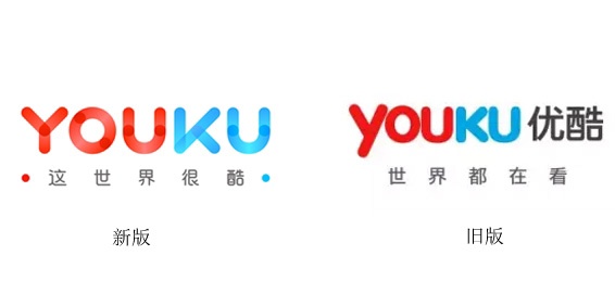
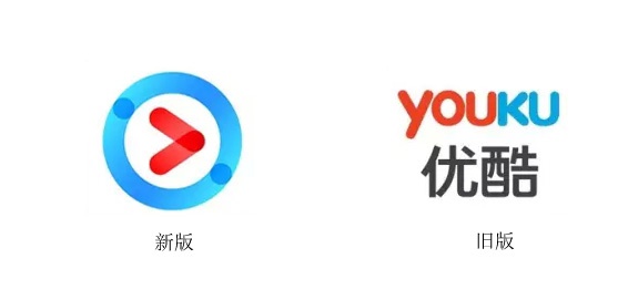
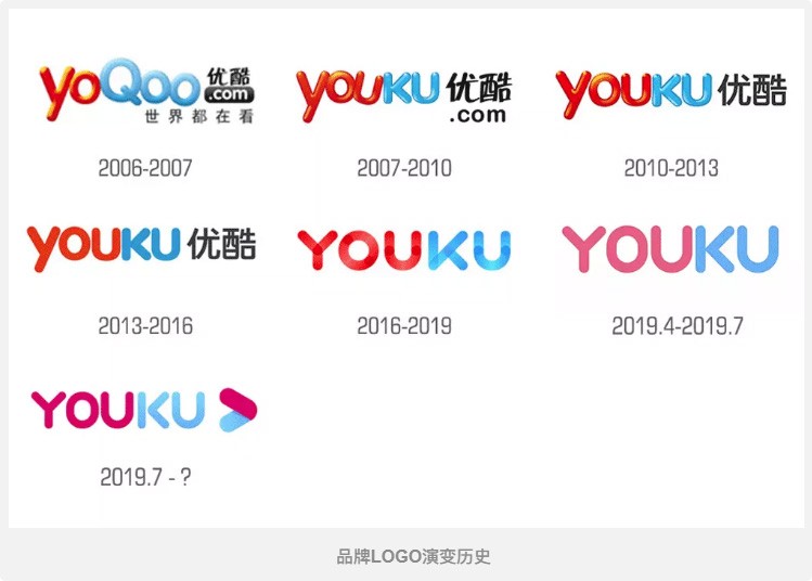
I believe many friends on this site have the impression that Youku has changed its logo many times since its establishment, for example:
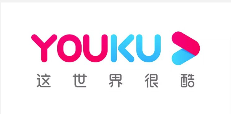
"Breakthrough, Forward, Victory". The new logo removes the "circle" design, symbolizing moving forward beyond the "circle", with a more concise and open image, facing the future, embracing the future, and creating the future.
Youku said that the play button represents the "V" shape of victory and also symbolizes the arrow moving forward. In addition, the pink and blue color scheme has higher saturation, which means that Youku gathers strength and continues to advance under the Alibaba entertainment ecosystem.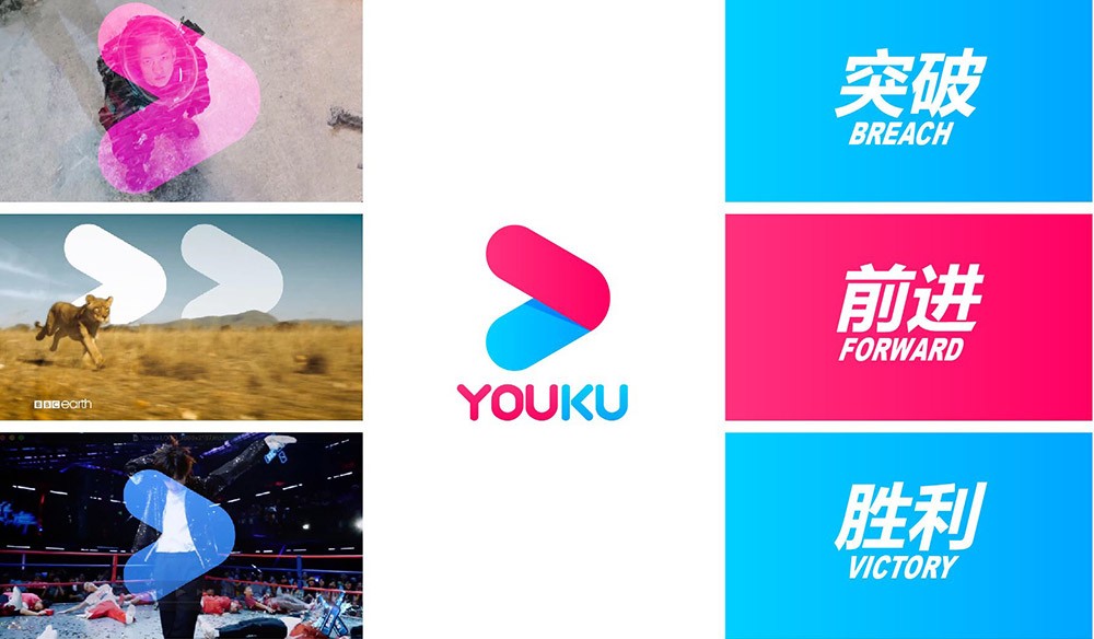
 ##
##The above is the detailed content of Youku announces updated logo: changing theme color from 'red and blue' to 'orange and blue'. For more information, please follow other related articles on the PHP Chinese website!

