


Matplotlib is a Python library often used for data visualization. Column charts are one of the most commonly used chart types in data visualization. Column charts can present data to the audience in a concise and clear way so that they can better understand the meaning of the data. However, if the colors in the chart cannot be set appropriately, it will be difficult to attract the audience's attention even if the data is meaningful. Therefore, how to use the Matplotlib library to set the color of the column chart has become a topic worth discussing.
Next, we will introduce how to use the Matplotlib library to set the color of the column chart. First, we need to install the Matplotlib library in our computer. If it is not installed yet, you can use the following Python command to install it:
pip install matplotlib
After the installation is complete, we can use the Matplotlib library for color settings. The specific code example is as follows:
import matplotlib.pyplot as plt

# 柱形图数据
x = ['A', 'B', 'C', 'D']
y = [50, 40, 30, 20]

# 设置柱形图颜色
colors = ['#A0CED9', '#F9CCCA', '#B2B2B2', '#C7CEEA']

# 绘制柱形图
plt.bar(x, y, color=colors)

# 显示图表
plt.show()
In the above code, we first define the data of the column chart, that is, the label of the x-axis and the value of the y-axis. Next, we set the color values of different columns by setting the colors list. Here, we use Hex color codes to represent different colors, which can be modified according to actual needs. Finally, we use the plt.bar() function of the Matplotlib library to draw the bar chart.
It is worth mentioning that in the column chart color setting, if we only set one color value, then all columns will be set to the same color. If you want to set different color values, you need to use a color list and pass it as the color parameter to the plt.bar() function.
In practical applications, we can also use some data analysis and visualization techniques to better set the color of the column chart. For example, we can gradient the color of the histogram according to the size of the data, so that the color of the column becomes darker as the data becomes larger, and the color of the column becomes lighter as the data becomes smaller, so as to more intuitively display the changing trend of the data.
In short, by using the Matplotlib library to set the color of the column chart, the effect of data visualization can be made more obvious and interesting. I hope the above sample code will be helpful to everyone. For more knowledge about the Matplotlib library and data visualization, please continue to pay attention to our learning and exploration.
The above is the detailed content of Matplotlib library: method to set column chart color. For more information, please follow other related articles on the PHP Chinese website!

 如何在 Windows 11 上更改标题栏颜色?Sep 14, 2023 pm 03:33 PM
默认情况下,Windows11上的标题栏颜色取决于您选择的深色/浅色主题。但是,您可以将其更改为所需的任何颜色。在本指南中,我们将讨论三种方法的分步说明,以更改它并个性化您的桌面体验,使其具有视觉吸引力。是否可以更改活动和非活动窗口的标题栏颜色?是的,您可以使用“设置”应用更改活动窗口的标题栏颜色,也可以使用注册表编辑器更改非活动窗口的标题栏颜色。若要了解这些步骤,请转到下一部分。如何在Windows11中更改标题栏的颜色?1.使用“设置”应用按+打开设置窗口。WindowsI前往“个性化”,然
![如何在 Windows 11 上反转颜色 [使用快捷方式]](https://img.php.cn/upload/article/000/887/227/168145458732944.png) 如何在 Windows 11 上反转颜色 [使用快捷方式]Apr 14, 2023 pm 02:43 PM
如何在 Windows 11 上反转颜色 [使用快捷方式]Apr 14, 2023 pm 02:43 PM使用 Windows 电脑时,可能需要反转电脑的颜色。这可能是由于个人偏好或显示驱动程序错误造成的。如果你想要反转 Windows 11 电脑的颜色,本文为你提供了在 Windows 电脑上反转颜色所需的所有必要步骤。在本文中反转图像上的颜色是什么意思?简单来说,反转图像的颜色意味着将图像的当前颜色翻转到色轮上的相反色调。你也可以说这意味着将图像的颜色更改为负片。例如,蓝色图像将反转为橙色,黑色变为白色,绿色变为洋红色等。如何在 Windows 11 上反转颜色?1. 使用微软画图按键 + ,输
 如何为所有文件夹在Windows 11中设置相同的文件夹视图?Apr 26, 2023 pm 10:31 PM
在Windows中,我们可以在文件资源管理器中查看文件夹、文件和其他文档。您可能已经观察到,很少有文件和文件夹具有较小的图标,而很少有较大的图标。因此可以理解,有一个定制选项可用。根据文件的性质,默认设置了不同的文件夹模板。例如,在包含照片的名为Picture的文件夹中,图像具有不同的视图。包含音乐文件的音乐文件夹将具有不同的模板。同样,对于文档、视频等文件夹,每个文件夹根据其类别包含不同的模板。您还可以选择文件夹的模板并将其设置为所有其他相同类型的文件夹。在本文中,我们将学习如何将文件夹视图应
 天然钛:揭秘iPhone 15 Pro的真实颜色Sep 18, 2023 pm 02:13 PM
随着一年一度的Wanderlust活动的结束,苹果终于平息了长达数月的关于其iPhone15阵容的谣言和猜测。正如预期的那样,其2023年的旗舰“Pro”型号在原始动力以及新的“钛”设计和美学方面与众不同。以下是新款iPhone15Pro型号的不同颜色,并确定“天然钛”变体的真实颜色和色调。苹果手机15专业版颜色苹果选择了5级钛合金作为最新iPhone15Pro型号的材料设计。iPhone15Pro上使用的钛合金以其强度重量比而闻名,不仅使其更加耐用和轻便,而且还赋予该设备优雅的“刷子”质地,这
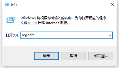 win10电脑护眼颜色怎么设置应用的详细教程Jul 08, 2023 am 10:46 AM
对于办公一族来说,面对电脑办公就是一整天,多数软件背景色都是纯白,看的时间长了,眼睛就会感到干涩,难受。其实,我们可以自定义调节一下窗口护眼色,网上介绍的方法操作起来比较麻烦,本文小编和大家分享一招win10调整窗口护眼色的方法。快来看看电脑护眼模式怎么设置的方法吧。1、首先在键盘上按下组合键【win】+【R】打开运行窗口输入【regedit】点击确定打开。2、然后依次展开注册表文件夹:【\HKEY_CURRENT_USER\ControlPanel\Colors】3、然后在Colors文件夹中
 如何在 iPhone 上使用多计时器与 iOS 17Jun 21, 2023 am 08:18 AM
什么是iOS17上的多计时器?在iOS17中,Apple现在为用户提供了在iPhone上一次设置多个计时器的能力。这是一个可喜的变化,许多人多年来一直期待的变化。时钟应用程序在iOS16之前只允许用户一次设置一个计时器,现在可用于激活任意数量的计时器,使其成为您一次完成多个任务的理想选择。您可以在计时器屏幕中设置任意数量的计时器。启动计时器后,所有活动计时器都将在锁屏界面和通知中心显示为“实时活动”通知。从这里,您可以查看计时器关闭、暂停或停止计时器的剩余时间,而无需打开时钟应用程序。当您在时钟
![如何为您的 Windows lComputer 设置首选频段 [2023]](https://img.php.cn/upload/article/000/465/014/168773917841923.png) 如何为您的 Windows lComputer 设置首选频段 [2023]Jun 26, 2023 am 08:26 AM
如何为您的 Windows lComputer 设置首选频段 [2023]Jun 26, 2023 am 08:26 AM几乎所有最新品牌的笔记本电脑都配备了双品牌WiFi。您可以将WiFi设置为5GHz或2.4GHz带宽。但是,事情并没有那么简单。笔记本电脑上的此功能很好地隐藏在设备管理器中,您无法从“设置”页面执行此操作。按照我们的指南为您的笔记本电脑、PC设置首选频段。注意–要切换到5GHz带宽WiFi,您需要WiFi路由器和设备都支持双频WiFi。如果它们中的任何一个都没有支持,则无法更改WiFi带宽。如何在设备上设置首选的WiFi频段设置首选频段以充分利用您的WiFi非常容易。方式1–设置首选频段步骤1–
 如何在 Windows 11 上快速设置动态壁纸Apr 25, 2023 pm 02:13 PM
桌面屏幕上的壁纸是系统启动后最令人兴奋和最引人注目的功能之一。它对人们产生有利的影响,并鼓励他们在感到快乐的同时提高工作效率。另一方面,更换壁纸并定期寻找它是一项耗时的任务。那么,如果你的桌面屏幕有一个动态的动态壁纸,可以让你看到各种轻松的壁纸,那不是很好吗?这也将允许用户下载任何GIF并将其设置为系统上的壁纸。在这篇文章中,我们将教您如何使用MicrosoftStore在您的PC上创建或获取动态壁纸。如何使用MicrosoftStore在Windows11上快速设置或获取动态壁


Hot AI Tools

Undresser.AI Undress
AI-powered app for creating realistic nude photos

AI Clothes Remover
Online AI tool for removing clothes from photos.

Undress AI Tool
Undress images for free

Clothoff.io
AI clothes remover

AI Hentai Generator
Generate AI Hentai for free.

Hot Article
Hot Tools

SublimeText3 Chinese version
Chinese version, very easy to use

SAP NetWeaver Server Adapter for Eclipse
Integrate Eclipse with SAP NetWeaver application server.

VSCode Windows 64-bit Download
A free and powerful IDE editor launched by Microsoft

Dreamweaver CS6
Visual web development tools

SublimeText3 Mac version
God-level code editing software (SublimeText3)

