 Web Front-end
 H5 Tutorial
 HTML5 SVG 2D Introduction 5 - Color Representation and Definition Methods_html5 Tutorial Skills
HTML5 SVG 2D Introduction 5 - Color Representation and Definition Methods_html5 Tutorial Skills
SVG and canvas are the same, both use standard HTML/CSS color representation methods, and these colors can be used for fill and stroke attributes.
There are basically the following ways to define colors :
1. Color name: directly use the color name red, blue, black...
2. rgba/rgb value: This is also It's easy to understand, for example #ff0000,rgba(255,100,100,0.5).
3. Hexadecimal value: Color defined in hexadecimal, such as #ffffff.
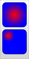
4. Gradient value: This is the same as canvas, supporting two gradient colors: linear gradient and circular gradient. As shown below:


5. Pattern fill: Use a custom pattern as the fill color.
The first ones are very simple, focus on the last two fill colors.
Linear Gradient
Use the linearGradient element to define a linear gradient, and each gradient color component is defined using the stop element. Look at the example below:
In this example, we need to pay attention to :
1. Gradient The color element must be placed in the defs element;
2. The id value needs to be set for the gradient color element, otherwise, other elements cannot use this gradient color.
3. The members of the gradient color are defined using stop, and its attributes can also be defined using CSS; it supports attributes such as class and id that are supported by standard HTML. Other commonly used attributes are as follows:
offset attribute: This defines the scope of the member color. The value of this attribute is from 0% to 100% (or 0 to 1) ; Usually the first color is set to 0%, and the last color is set to 100%.
stop-color attribute: This is very simple, it defines the color of the member color.
stop-opacity attribute: defines the transparency of the member color.
x1,y1,x2,y2Attribute: These two points define the direction of the gradient. If not written by default, it is a horizontal gradient. In the above example, a vertical gradient is also created.
4. To use gradient color, as shown in the example, just assign the value to fill or stroke directly in the form of url(#id).
5. Reuse of gradient members: You can also use xlink:href to reference defined gradient members, so the above example can also be rewritten as follows:
Circular Gradient
Use the radialGradient element to define the circular gradient, or use stop to define the member color. Look at the example:
From above As shown in the example, except for the element name and some special members, everything else is the same as a linear gradient, including the definition of stop, which must be placed in defs, an id must be set for it, and url(#id) must be used to assign values, etc. These special members are as follows:
offset attribute: This value is the same as the linear gradient, but the meaning is different. In a circular gradient, 0% represents the center of the circle, which is easy to understand.
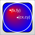
cx,cy,rAttributes: In fact, it is also easy to understand. Ring gradient. Of course, the center and radius of the ring must be defined. You can understand it by experiencing the size and position of the circle in the above example.
fx,fyAttributes: Define the position of the color center (focus), which is the coordinates of the thickest gradient. In the above example, the reddest point is the center of the circle, which is the default effect ; If you want to change it, you can set the fx, fy coordinate values.
But here you need to pay attention to the values of cx, cy, r, fx, fy above. You will find that they are all decimals, so what are the units?
This requires understanding another related attribute first: gradientUnits, which defines the coordinate units used to define gradient colors. This property has 2 available values: userSpaceOnUse and objectBoundingBox.
objectBoundingBox is the default value. The coordinates it uses are relative to the object bounding box (square bounding box, the situation that is not a square bounding box is more complicated, skip it), and the value range is 0 to 1. For example, the coordinate values of cx and cy in the above example are (0.25, 0.25). This means that the center of the circle is 1/4 of the upper left corner of the bounding box, and the radius of 0.25 means that the radius is 1/4 of the length of the object's square bounding box, as you can see in the picture.
userSpaceOnUse indicates that absolute coordinates are used. When using this setting, you must ensure that the gradient color and the filled object remain in the same position.
Look at the example below again. Note that the default value of the gradientUnits attribute is objectBoundingBox:

You will know the meaning of "focus" by looking at the renderings.
In addition, there are gradient elements and some transformation attributes, such as gradientTransform. This is not the focus here. Transformations will be summarized later.
Another attribute that may be used is the spreadMethod attribute, which defines the behavior that the gradient should take when it reaches its end point. This attribute has 3 optional values: pad (default value), reflect, repeat. Needless to say, pad is a natural transition. After the gradient color ends, the last member color is used to directly render the remaining part of the object. refect will continue the gradient color, but the gradient color will continue to be rendered in the reverse direction, starting from the last color to the first color; wait until it reaches the end of the gradient color again, and then reverse the order, so as to guide the object to be filled. . Repeat will also continue to render the gradient colors, but not in reverse order. It will still be rendered from the first color to the last color over and over again. The rendering is as follows:

Look at a piece of code that is repeatedly rendered:
Texture filling
Texture filling is also a popular filling method. In SVG, you can use pattern to create a texture, and then use this pattern to fill other objects . Look directly at the example:
> ;

The example looks very simple, create a pattern from the gradient color, and then use the pattern
Fill the rectangle. Things to note here:
1. Different browsers have different effects when filling this pattern.
For example, the example works the same in FireFix and Chrome. But if you put the gradient color
Ifand pattern are defined in the same defs combination, FireFox can still render normally,
But Chrome cannot recognize the gradient color and will only fill it with the default black.
2. Pattern also needs to define id.
3. Pattern must also be defined in defs.
4. The use of pattern also assigns url(#id) directly to fill or stroke.
The above are very simple. Let’s focus on the coordinate representation in the example. The coordinates in the pattern are more complicated.
pattern contains two related attributes: patternUnits and patternContentUnits attributes; these two attributes still have only two values: objectBoundingBox and userSpaceOnUse. The meanings of these two values are explained above. What is easy to confuse here is that the default values of these two properties are different, but when you understand the reason for doing this, you will find that it really makes sense.
1. patternUnitsAttribute
This attribute is the same as Gradient’s gradientUnits attribute. By default, objectBoundingBox is used. The attributes affected by this attribute are x, y, width, and height. These four attributes define the starting point, width and height of the pattern respectively. They all use relative values. In the example, you want to fill 4 times in both the horizontal and vertical directions, so the width and height are both set to 0.25.
2. patternContentUnitsAttribute
The default value of this attribute is just the opposite, using userSpaceOnUse. This attribute describes the coordinate system of the shapes drawn in the pattern (such as the rect and circle above). That is to say, by default, the shape you draw in the pattern uses a different coordinate system than the size/position of the pattern itself. Consider the situation in the example above, where we want to fill a 200*200 rectangle and repeat it 4 times in each direction. This means that each pattern is 50*50, so the two rectangles and a circle in the pattern are drawn in this 50*50 rectangle. In this way we can understand the coordinates of the rectangle and circle in the pattern above. In addition, in order to be centered, the pattern in this example needs to be offset by 10px before rendering, and this value is restricted by the patternUnits attribute, so by default, the x and y values are: 10/200=0.05.
So why does pattern set the default values of the two attributes in this way?
This is determined by the user's usage (discussed with the above example):
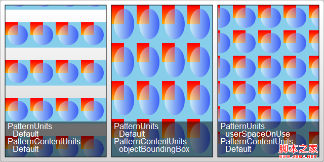
The first pattern style : I think this is most cases, so it is processed as the default value: pattern It will be stretched as the outer shape is scaled. No matter how big the outer square is, the pattern will always be filled 4 times in both directions. But the graphics contained in the pattern will not stretch as the filled square outside scales. Although it is far-fetched, let’s understand it this way.
The second pattern style : The shape in the pattern also stretches as the surrounding shape scales. We can also explicitly set the value of the patternContentUnits attribute to objectBoundingBox to achieve this effect. For example, modify the pattern part as follows:
< ;pattern id="Pattern" width=".25" height=".25" patternContentUnits="objectBoundingBox">
After modification, when the size of the filled rectangle is changed, the shape in the pattern will also be stretched. Moreover, after the modification, it was changed to the coordinates relative to the peripheral object, so the x and y coordinates of the pattern are no longer needed. The pattern will always be adjusted to fit the filled shape.
The third pattern style: The shape and size of the pattern are fixed. No matter how the peripheral objects are scaled, you can change the coordinate system to userSpaceOnUse to achieve this effect. The code is as follows:
Typical patterns among these 3 are as shown below:

Practical reference:
Official documentation: http://www.w3.org/TR/SVG11/
Script index: http://msdn.microsoft.com/zh-cn/library /ff971910(v=vs.85).aspx
Development Center: https://developer.mozilla.org/en/SVG
Popular Reference: http: //www.chinasvg.com/
 H5 vs. HTML5: Clarifying the Terminology and RelationshipMay 05, 2025 am 12:02 AM
The difference between H5 and HTML5 is: 1) HTML5 is a web page standard that defines structure and content; 2) H5 is a mobile web application based on HTML5, suitable for rapid development and marketing.
 HTML5 Features: The Core of H5May 04, 2025 am 12:05 AM
The core features of HTML5 include semantic tags, multimedia support, form enhancement, offline storage and local storage. 1. Semantic tags such as, improve code readability and SEO effect. 2. Multimedia support simplifies the process of embedding media content through and tags. 3. Form Enhancement introduces new input types and verification properties, simplifying form development. 4. Offline storage and local storage improve web page performance and user experience through ApplicationCache and localStorage.
 H5: Exploring the Latest Version of HTMLMay 03, 2025 am 12:14 AM
HTML5isamajorrevisionoftheHTMLstandardthatrevolutionizeswebdevelopmentbyintroducingnewsemanticelementsandcapabilities.1)ItenhancescodereadabilityandSEOwithelementslike,,,and.2)HTML5enablesricher,interactiveexperienceswithoutplugins,allowingdirectembe
 Beyond Basics: Advanced Techniques in H5 CodeMay 02, 2025 am 12:03 AM
Advanced tips for H5 include: 1. Use complex graphics to draw, 2. Use WebWorkers to improve performance, 3. Enhance user experience through WebStorage, 4. Implement responsive design, 5. Use WebRTC to achieve real-time communication, 6. Perform performance optimization and best practices. These tips help developers build more dynamic, interactive and efficient web applications.
 H5: The Future of Web Content and DesignMay 01, 2025 am 12:12 AM
H5 (HTML5) will improve web content and design through new elements and APIs. 1) H5 enhances semantic tagging and multimedia support. 2) It introduces Canvas and SVG, enriching web design. 3) H5 works by extending HTML functionality through new tags and APIs. 4) Basic usage includes creating graphics using it, and advanced usage involves WebStorageAPI. 5) Developers need to pay attention to browser compatibility and performance optimization.
 H5: New Features and Capabilities for Web DevelopmentApr 29, 2025 am 12:07 AM
H5 brings a number of new functions and capabilities, greatly improving the interactivity and development efficiency of web pages. 1. Semantic tags such as enhance SEO. 2. Multimedia support simplifies audio and video playback through and tags. 3. Canvas drawing provides dynamic graphics drawing tools. 4. Local storage simplifies data storage through localStorage and sessionStorage. 5. The geolocation API facilitates the development of location-based services.
 H5: Key Improvements in HTML5Apr 28, 2025 am 12:26 AM
HTML5 brings five key improvements: 1. Semantic tags improve code clarity and SEO effects; 2. Multimedia support simplifies video and audio embedding; 3. Form enhancement simplifies verification; 4. Offline and local storage improves user experience; 5. Canvas and graphics functions enhance the visualization of web pages.
 HTML5: The Standard and its Impact on Web DevelopmentApr 27, 2025 am 12:12 AM
The core features of HTML5 include semantic tags, multimedia support, offline storage and local storage, and form enhancement. 1. Semantic tags such as, etc. to improve code readability and SEO effect. 2. Simplify multimedia embedding with labels. 3. Offline storage and local storage such as ApplicationCache and LocalStorage support network-free operation and data storage. 4. Form enhancement introduces new input types and verification properties to simplify processing and verification.


Hot AI Tools

Undresser.AI Undress
AI-powered app for creating realistic nude photos

AI Clothes Remover
Online AI tool for removing clothes from photos.

Undress AI Tool
Undress images for free

Clothoff.io
AI clothes remover

Video Face Swap
Swap faces in any video effortlessly with our completely free AI face swap tool!

Hot Article

Hot Tools

MinGW - Minimalist GNU for Windows
This project is in the process of being migrated to osdn.net/projects/mingw, you can continue to follow us there. MinGW: A native Windows port of the GNU Compiler Collection (GCC), freely distributable import libraries and header files for building native Windows applications; includes extensions to the MSVC runtime to support C99 functionality. All MinGW software can run on 64-bit Windows platforms.

SecLists
SecLists is the ultimate security tester's companion. It is a collection of various types of lists that are frequently used during security assessments, all in one place. SecLists helps make security testing more efficient and productive by conveniently providing all the lists a security tester might need. List types include usernames, passwords, URLs, fuzzing payloads, sensitive data patterns, web shells, and more. The tester can simply pull this repository onto a new test machine and he will have access to every type of list he needs.

EditPlus Chinese cracked version
Small size, syntax highlighting, does not support code prompt function

Dreamweaver Mac version
Visual web development tools

ZendStudio 13.5.1 Mac
Powerful PHP integrated development environment


