


The following will show you the deformation and animation effects of CSS3 through pictures and texts
Several properties of CSS3 animation: transformation, transition and animation.
Introduced below: transition.
1. Example
First, let’s understand the animation effect of transition through an example.
Put the mouse on it and the div width will increase from 100px to 200px.
<style type="text/css">
div{
width: 100px;
height: 100px;
background-color: red;
}
div:hover{
width: 200px;
}</style><div></div>
This effect is actually an animation, but it changes very quickly and is not smooth.
If you want the div width to smoothly transition to 200px within 5 seconds after the mouse is placed on it. Just add one line of code;
div:hover{
width: 200px;
transition:width 5s ease-in;}
This effect is actually an animation, but it changes very quickly and is not smooth.
If you want the div width to smoothly transition to 200px within 5 seconds after the mouse is placed on it. Just add one line of code;
div:hover{
width: 200px;
transition:width 5s ease-in;}
What is used here is the transition attribute, which is used to achieve smooth transition of attribute values and produce visual animation effects.
The transition used above is an abbreviation and contains four attributes: transition-property, transition-duration, transition-timing-function, and transition-delay, which will be introduced one by one below.
2. transition
CSS3 adds a new transition attribute, which can make the effect more delicate and smooth when the style of an event-triggered element changes.
transition is used to describe how to make css attribute values smoothly transition from one value to another within a period of time. This transition effect can be triggered by mouse click, getting focus, being clicked or any change to the element.
Syntax:
transition :
[<'transition-property'> || <'transition-duration'> || <'transition-timing-function'> ||
<'transition-delay'> [, [<'transition-property'> || <'transition-duration'> ||
<'transition-timing-function'> || <'transition-delay'>]]*
Transition has four attribute values:
transition-property: The property to perform transition.
transition-duration: Specify the time required to complete the transition.
Transition-timing-function, during the duration period, the rate of transition transformation changes. A simple understanding is to specify the transition function.
transition-delay: transition delay time.
1. transition-property
Transition-property is used to specify which property uses the transition animation effect.
Syntax:
transition-property: none | all | [
none: No transition effect is applied to all attributes.
all: Default value. When the value is all, the transition effect will be executed when any attribute value of the element changes.
ident: element attribute name. Specify specific attributes through ident. If a transition effect cannot be applied to one of the multiple specified attributes, the other attributes will still take effect.
Transition attributes can only have transition effects if they have a midpoint value (attributes that need to be animated). All css attribute values and value types that can achieve transition effects are listed in w3c
Property Name
Typebackground-color
as colorbackground-position
as repeatable list of simple list of length, percentage, or calcborder-bottom-color
as colorborder-bottom-width
as lengthborder-left-color
as colorborder-left-width
as lengthborder-right-color
as colorborder-right-width
as lengthborder-spacing
as simple list of lengthborder-top-color
as colorborder-top-width
as lengthbottom
as length, percentage, or calcclip
as rectanglecolor
as colorfont-size
as lengthfont-weight
as font weightheight
as length, percentage, or calcleft
as length, percentage, or calcletter-spacing
as lengthline-height
as either number or lengthmargin-bottom
as lengthmargin-left
as lengthmargin-right
as lengthmargin-top
as lengthmax-height
as length, percentage, or calcmax-width
as length, percentage, or calcmin-height
as length, percentage, or calcmin-width
as length, percentage, or calcopacity
as numberoutline-color
as coloroutline-width
as lengthpadding-bottom
as lengthpadding-left
as lengthpadding-right
as lengthpadding-top
as lengthright
as length, percentage, or calctext-indent
as length, percentage, or calctext-shadow
as shadow listtop
as length, percentage, or calcvertical-align
as lengthvisibility
as visibilitywidth
as length, percentage, or calcword-spacing
as lengthz-index
as integer
Note: Not all attribute changes will trigger the transition animation effect, such as the adaptive width of the page. When the browser changes the width, the transition effect will not be triggered. However, changes in the attribute types shown in the above table will trigger a transition action effect.
For example: You can animate several attributes at the same time, such as setting animation effects for height and line-height at the same time, so that the div becomes taller and the text is still vertically centered.
<!DOCTYPE html><html><head>
<meta charset="utf-8">
<title>变形与动画</title>
<style type="text/css">div {
width: 300px;
height: 200px;
line-height: 200px;
text-align: center;
background-color: orange;
margin: 20px auto;
-webkit-transition-property: height line-height;
transition-property: height line-height;
-webkit-transition-duration: 1s;
transition-duration: 1s;
-webkit-transition-timing-function: ease-out;
transition-timing-function: ease-out;
-webkit-transition-delay: .2s;
transition-delay: .2s;}div:hover {
height: 100px;
line-height: 100px;}</style></head><body>
<div>文字垂直居中</div></body></html>

2. transition-duration
Transition-duration is used to set the time required to transition from the old attribute to the new attribute, that is, the duration.
3. transition-timing-function
Syntax:
transition-timing-function属性指的是过渡的“缓动函数”。通过这个函数会建立一条加速度曲线,因此在整个transition变化过程中,变化速度可以不断改变。主要包括以下几种函数。
ease:默认值,元素样式从初始状态过渡到终止状态速度由快到慢,逐渐变慢。linear:意思是线性过渡,即过渡过程恒速。ease-in:速度越来越快,呈现加速状态,通常称为“渐显效果”。ease-out:速度越来越慢,呈现减速状态,通常称为“渐隐效果”。ease-in-out速度先加速后减速,称为“渐显渐隐效果”。
举例:鼠标经过问号,帮助信息渐显渐隐。
<!doctype html><html><head>
<meta charset="utf-8">
<title>transition-demo by starof</title>
<style>#help{
width:20px;
height:20px;
border-radius:10px;
color:#fff;
background:#000;
text-align:center;
position:relative;
margin:50px 20px;
cursor:pointer;}#help .tips{
position:absolute;
width:300px;
height:100px;
background:#000;
top:-30px;
left:35px;
border-radius:10px;
opacity:0;
/*渐隐效果*/
transition: opacity .8s ease-in-out;
-moz-transition: opacity .8s ease-in-out;
-webkit-transition: opacity .8s ease-in-out;}.tips:before{
content:"";
border-width:10px;
border-style:solid;
border-color:transparent #000 transparent transparent;
position:absolute;
left:-20px;
top:30px;}#help:hover .tips{
opacity:0.5;
/*渐显效果*/
transition: opacity .8s ease-in-out;
-moz-transition: opacity .8s ease-in-out;
-webkit-transition: opacity .8s ease-in-out;}</style></head><body>
<div id="help">
?
<div >帮助信息</div>
</div></body></html>

4、transition-delay
transition-delay设置改变属性值后多长时间开始执行动画。
5、属性简写
在改变多个css属性的transition效果时,把几个transition声明用逗号隔开,然后每个属性就都有各自的过渡时间和效果。
Note:第一个时间是时长,第二个是延时。
a{
transition: background 0.8s ease-in 0.3,
color 0.6s ease-out 0.3;}
三、贝塞尔曲线和transition
transition的数学模型就是贝塞尔曲线,下面介绍。
曲线其实就是两点之间插值的效果,贝塞尔曲线是一种插值算法,比线性插值复杂一点。
贝塞尔曲线:起始点,终止点(也称锚点),控制点。通过调整控制点,贝塞尔曲线的形状发生变化。
k阶贝塞尔插值算法需要k+1个控制点。
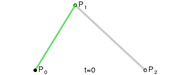
一阶贝塞尔曲线(线段):意思就是从P0到P1的连续点,用来描述一段线段。一次贝塞尔插值就是线性插值。


二阶贝塞尔曲线(抛物线):P0-P1是曲线在P0处的切线。

三阶贝塞尔曲线:

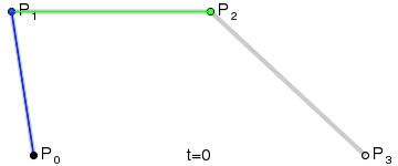
transition用到的就是三阶贝塞尔插值算法,如下图。
时间在0,1区间,待变换属性也认为是0,1区间。P0和P3的坐标一直是(0,0)和(1,1)。transition-timing-function属性用来确定P1和P2的坐标。
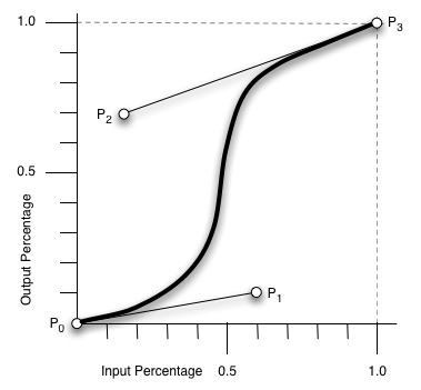
ease [0, 0] [0.25, 0.1] [0.25, 1.0] [1.0,1.0]
linear [0, 0] [0.0, 0.0] [1.0, 1.0] [1.0,1.0]
ease-in [0, 0] [0.42, 0] [1.0, 1.0] [1.0,1.0]
ease-out [0, 0] [0, 0] [0.58, 1.0] [1.0,1.0]
ease-in-out [0, 0] [0.42, 0] [0.58, 1.0] [1.0,1.0]
step-start steps(1,start)
step-end steps(1,end)
cubic-bezier(x1,y1,x2,y2) [0, 0] [x1, y1] [x2, y2] [1.0,1.0]
四、其他相关资料
canvas画贝塞尔曲线
<!DOCTYPE html PUBLIC "-//W3C//DTD XHTML 1.0 Transitional//EN" "http://www.w3.org/TR/xhtml1/DTD/xhtml1-transitional.dtd">
<html xmlns="http://www.w3.org/1999/xhtml">
<head>
<meta http-equiv="Content-Type" content="text/html; charset=utf-8">
<title>bezier demo</title>
</head>
<body>
<div style="width:800px;height:600px;background-color:#fac0c0;">
<canvas id="cvs" width="800" height="600">骚瑞,您的浏览器不支持canvas</canvas>
</div>
<script type="text/javascript">var cvs=document.getElementById("cvs"),
context=cvs.getContext("2d"),points=[];function getXY(node){var x=0,y=0;if (node.offsetParent)
{while (node.offsetParent)
{x += node.offsetLeft;y += node.offsetTop;node = node.offsetParent;}}
else {node.x && (x += node.x);node.y && (y += node.y);}return [x,y];}
function drawPoint(x,y,c,b) {!b && (b=2);context.fillStyle=c || "red";
context.fillRect(x,y,b,b);}function bezier(points,t){var i,n=points.length-1,x=0,y=0;function fn(p,n,i,t){return arrangement(n,i)*p*Math.pow(1-t,n-i)*Math.pow(t,i);}for(i=0;i<n+1;i++){x+=fn(points[i][0],n,i,t);
y+=fn(points[i][1],n,i,t);}return [x,y];}function factorial(n){if(isNaN(n) || n<=0 || Math.floor(n)!==n){return 1;}var s=1;
while(n){s*=n--;}return s;}function arrangement(n,r){return factorial(n)/(factorial(r)*factorial(n-r));}
cvs.addEventListener("click",function(event){var i,point=getXY(this),x=event.clientX-point[0]+(document.documentElement.scrollLeft || document.body.scrollLeft),y=event.clientY-point[1]+(document.documentElement.scrollTop || document.body.scrollTop);points.push([x,y]);context.clearRect(0,0,screen.width,screen.height);context.beginPath();
//pointsfor(i=0;i<points.length;i++){drawPoint(points[i][0],points[i][1],"blue",4);}//bezierfor (i = 0; i < 1; i += 0.001)
{drawPoint.apply(this, bezier(points,i));}//lineif(points.length==1){context.moveTo(points[0][0],points[0][1]);}else if (points.length>1){for(i=0;i<points.length;i++){context.lineTo(points[i][0],points[i][1]);}
context.lineWidth=0.2;context.stroke();context.closePath();}},true);</script>
</body>
</html>

希望这些内容可以帮助到大家,谢谢。

 Replace String Characters in JavaScriptMar 11, 2025 am 12:07 AM
Detailed explanation of JavaScript string replacement method and FAQ This article will explore two ways to replace string characters in JavaScript: internal JavaScript code and internal HTML for web pages. Replace string inside JavaScript code The most direct way is to use the replace() method: str = str.replace("find","replace"); This method replaces only the first match. To replace all matches, use a regular expression and add the global flag g: str = str.replace(/fi
 Build Your Own AJAX Web ApplicationsMar 09, 2025 am 12:11 AM
So here you are, ready to learn all about this thing called AJAX. But, what exactly is it? The term AJAX refers to a loose grouping of technologies that are used to create dynamic, interactive web content. The term AJAX, originally coined by Jesse J
 How do I create and publish my own JavaScript libraries?Mar 18, 2025 pm 03:12 PM
Article discusses creating, publishing, and maintaining JavaScript libraries, focusing on planning, development, testing, documentation, and promotion strategies.
 10 jQuery Fun and Games PluginsMar 08, 2025 am 12:42 AM
10 fun jQuery game plugins to make your website more attractive and enhance user stickiness! While Flash is still the best software for developing casual web games, jQuery can also create surprising effects, and while not comparable to pure action Flash games, in some cases you can also have unexpected fun in your browser. jQuery tic toe game The "Hello world" of game programming now has a jQuery version. Source code jQuery Crazy Word Composition Game This is a fill-in-the-blank game, and it can produce some weird results due to not knowing the context of the word. Source code jQuery mine sweeping game
 jQuery Parallax Tutorial - Animated Header BackgroundMar 08, 2025 am 12:39 AM
This tutorial demonstrates how to create a captivating parallax background effect using jQuery. We'll build a header banner with layered images that create a stunning visual depth. The updated plugin works with jQuery 1.6.4 and later. Download the
 Auto Refresh Div Content Using jQuery and AJAXMar 08, 2025 am 12:58 AM
This article demonstrates how to automatically refresh a div's content every 5 seconds using jQuery and AJAX. The example fetches and displays the latest blog posts from an RSS feed, along with the last refresh timestamp. A loading image is optiona
 Getting Started With Matter.js: IntroductionMar 08, 2025 am 12:53 AM
Matter.js is a 2D rigid body physics engine written in JavaScript. This library can help you easily simulate 2D physics in your browser. It provides many features, such as the ability to create rigid bodies and assign physical properties such as mass, area, or density. You can also simulate different types of collisions and forces, such as gravity friction. Matter.js supports all mainstream browsers. Additionally, it is suitable for mobile devices as it detects touches and is responsive. All of these features make it worth your time to learn how to use the engine, as this makes it easy to create a physics-based 2D game or simulation. In this tutorial, I will cover the basics of this library, including its installation and usage, and provide a
 How do I optimize JavaScript code for performance in the browser?Mar 18, 2025 pm 03:14 PM
The article discusses strategies for optimizing JavaScript performance in browsers, focusing on reducing execution time and minimizing impact on page load speed.


Hot AI Tools

Undresser.AI Undress
AI-powered app for creating realistic nude photos

AI Clothes Remover
Online AI tool for removing clothes from photos.

Undress AI Tool
Undress images for free

Clothoff.io
AI clothes remover

AI Hentai Generator
Generate AI Hentai for free.

Hot Article
Hot Tools

Zend Studio 13.0.1
Powerful PHP integrated development environment

Dreamweaver CS6
Visual web development tools

EditPlus Chinese cracked version
Small size, syntax highlighting, does not support code prompt function

ZendStudio 13.5.1 Mac
Powerful PHP integrated development environment

SublimeText3 Linux new version
SublimeText3 Linux latest version

