


How to use Vue to implement statistical charts for multi-dimensional data
In modern data analysis and visualization, statistical charts are an indispensable tool. In web development, Vue.js is one of the most popular front-end frameworks. This article will introduce how to use Vue.js to implement statistical charts of multi-dimensional data and provide some code examples.
- Preparation
Before we start, we need to make sure that Vue.js has been installed. You can use the following command to install:
npm install vue
At the same time, we also need to introduce some chart libraries. Here we choose to use the Vue-chartjs library, which is a Vue component encapsulated based on Chart.js. You can also use the following command to install:
npm install vue-chartjs chart.js
- Create Vue component
First, we need to create a Vue component to display statistical charts. In Vue.js, this can be achieved by creating a single-file component with the <template></template>, <script></script>, and <style></style> tags.
<template>
  <div>
    <canvas :id="chartId" :width="chartWidth" :height="chartHeight"></canvas>
  </div>
</template>

<script>
import { Bar } from 'vue-chartjs';

export default {
  extends: Bar,
  props: {
    chartId: {
      type: String,
      required: true
    },
    chartWidth: {
      type: Number,
      default: 600
    },
    chartHeight: {
      type: Number,
      default: 400
    },
    chartData: {
      type: Object,
      required: true
    }
  },
  mounted() {
    this.renderChart(this.chartData, { responsive: true });
  }
};
</script>
In this example, we create a BarChart component that inherits from the Bar class of the vue-chartjs library. We use a canvas tag to display the chart and receive chart-related parameters through props, including chart ID, width, height and data.
- Using the Statistical Chart Component
Once we create the Statistical Chart component, we can use it elsewhere. The following is an example that shows how to use the Statistical Chart component to display a histogram of multidimensional data.
<template>
  <div>
    <bar-chart
      chartId="myChart"
      :chartData="chartData"
    ></bar-chart>
  </div>
</template>

<script>
import BarChart from '@/components/BarChart.vue';

export default {
  components: {
    BarChart
  },
  data() {
    return {
      chartData: {
        labels: ['Red', 'Blue', 'Yellow', 'Green', 'Purple', 'Orange'],
        datasets: [
          {
            label: 'Dataset 1',
            backgroundColor: '#f87979',
            data: [12, 19, 3, 5, 2, 3]
          },
          {
            label: 'Dataset 2',
            backgroundColor: '#71b4e1',
            data: [7, 11, 5, 8, 3, 7]
          }
        ]
      }
    };
  }
};
</script>
In this example, we imported the previously created statistical chart component BarChart and used it in the template. At the same time, we defined a data object named chartData, which contains the label of the chart and two data sets. In actual applications, these data may come from back-end interfaces or other data sources.
- Running and debugging
In Vue.js, you can use the Vue CLI to run and debug the project. In the project root directory, run the following command to start the development server:
npm run serve
After that, you can open http://localhost:8080 in the browser to view the running application.
Summary
This article introduces how to use Vue.js to implement statistical charts of multi-dimensional data. By creating a statistical chart component and using the Vue-chartjs library to manipulate chart data, we can easily present many types of statistical charts. I hope this article will be helpful to you when developing data visualization applications using Vue.js.
The above is the content of this article. The code example can be directly copied to the Vue project for testing. I hope it will be helpful to you.
The above is the detailed content of How to use Vue to implement statistical charts of multi-dimensional data. For more information, please follow other related articles on the PHP Chinese website!

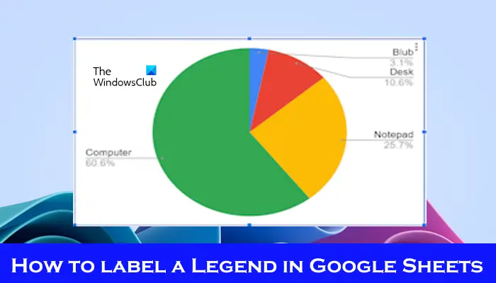 如何在Google Sheet中为图例添加标签Feb 19, 2024 am 11:03 AM
本文将演示如何在GoogleSheet中为图例添加标签,这些标签侧重于单个事物,提供名称或标识。图例解释了事物的系统或组,为您提供相关的上下文信息。如何在GoogleSheet中为图例添加标签有时候,在使用图表时,我们想要让图表更易于理解。通过添加恰当的标签和图例,可以实现这一目的。接下来,我们将介绍如何在Google表格中为图例添加标签,让您的数据更加清晰明了。创建图表编辑图例标签的文本我们开始吧。1]创建图表要标记图例,首先,我们必须创建一个图表:首先,在GoogleSheets的列或行中输
 如何使用PHP数组实现图表和统计图的生成和显示Jul 15, 2023 pm 12:24 PM
如何使用PHP数组实现图表和统计图的生成和显示PHP是一种广泛使用的服务器端脚本语言,具有强大的数据处理和图形生成能力。在Web开发中,经常需要展示数据的图表和统计图,通过PHP数组,我们可以轻松实现这些功能。本文将介绍如何使用PHP数组生成和显示图表和统计图,并提供相关的代码示例。引入必要的库文件和样式表在开始之前,我们需要在PHP文件中引入一些必要的库文
 Vue框架下,如何快速搭建统计图表系统Aug 21, 2023 pm 05:48 PM
Vue框架下,如何快速搭建统计图表系统在现代网页应用中,统计图表是必不可少的组成部分。Vue.js作为一款流行的前端框架,提供了很多便捷的工具和组件,能够帮助我们快速搭建统计图表系统。本文将介绍如何利用Vue框架以及一些插件来搭建一个简单的统计图表系统。首先,我们需要准备一个Vue.js的开发环境,包括安装Vue脚手架以及一些相关的插件。在命令行中执行以下命
 Vue统计图表的线性、饼状图功能实现Aug 19, 2023 pm 06:13 PM
Vue统计图表的线性、饼状图功能实现在数据分析和可视化领域,统计图表是一种非常常用的工具。Vue作为一种流行的JavaScript框架,提供了便捷的方法来实现各种功能,包括统计图表的展示和交互。本文将介绍如何使用Vue来实现线性和饼状图功能,并提供相应的代码示例。线性图功能实现线性图是一种用于展示数据趋势和变化的图表类型。在Vue中,我们可以使用一些优秀的第
 word图表怎么插入Mar 20, 2024 pm 03:41 PM
有时为了是数据展示的更加直观,我们需要借助图表来展示,但一说到图表很多人认为只能在excel上操作,其实不然,word也是可以直接插入图表。那如何操作呢?一起看看就知道了。1.首先我们打开一个word文档。 2.接下来我们在“插入”菜单中,找到“图表”工具按钮并点击。 3.单击“图表”按钮,在里面选择一个适合的图表,这里我们随意选择一种图表类型,单击“确定”就可以了 4.选择好图表之后,系统会自动打开excel图表,而且里面已经录入好数据,我们只要更改一下数据即可。这里大家如果已经做好表格
 Excel图表学习之如果让图表像网页一样动起来Aug 16, 2022 am 10:30 AM
在之前的文章《Excel图表学习之通过案例,聊聊怎么绘制量筒式柱形图》中,我们了解了绘制量筒式柱形图的方法。而今天我们再分享一个Excel图表教程,聊一个让Excel图表像网页一样动起来的方法,只要输入关键字,表格数据和图表就会自动改变,特别是公司的数据需要分部门统计时,简直太方便啦!
 react与vue的虚拟dom有什么区别Apr 22, 2022 am 11:11 AM
react与vue的虚拟dom没有区别;react和vue的虚拟dom都是用js对象来模拟真实DOM,用虚拟DOM的diff来最小化更新真实DOM,可以减小不必要的性能损耗,按颗粒度分为不同的类型比较同层级dom节点,进行增、删、移的操作。
 如何使用PHP和Vue.js实现图表上的数据筛选和排序功能Aug 27, 2023 am 11:51 AM
如何使用PHP和Vue.js实现图表上的数据筛选和排序功能在网页开发中,图表是一种非常常见的数据展示方式。使用PHP和Vue.js可以轻松实现图表上的数据筛选和排序功能,使用户能够自定义查看图表上的数据,提高数据的可视化效果和用户体验。首先,我们需要准备一组数据供图表使用。假设我们有一个数据表格,包含姓名、年龄和成绩三列,数据如下:姓名年龄成绩张三1890李


Hot AI Tools

Undresser.AI Undress
AI-powered app for creating realistic nude photos

AI Clothes Remover
Online AI tool for removing clothes from photos.

Undress AI Tool
Undress images for free

Clothoff.io
AI clothes remover

AI Hentai Generator
Generate AI Hentai for free.

Hot Article
Hot Tools

SublimeText3 Mac version
God-level code editing software (SublimeText3)

SAP NetWeaver Server Adapter for Eclipse
Integrate Eclipse with SAP NetWeaver application server.

MinGW - Minimalist GNU for Windows
This project is in the process of being migrated to osdn.net/projects/mingw, you can continue to follow us there. MinGW: A native Windows port of the GNU Compiler Collection (GCC), freely distributable import libraries and header files for building native Windows applications; includes extensions to the MSVC runtime to support C99 functionality. All MinGW software can run on 64-bit Windows platforms.

Dreamweaver CS6
Visual web development tools

WebStorm Mac version
Useful JavaScript development tools

