 Web Front-end
 H5 Tutorial
 In-depth analysis of the viewBox attribute usage when using SVG images in HTML5_html5 tutorial skills
Quickly understand the parameters of viewBox
The viewBox attribute is used to specify the origin and size of the coordinate system of the user's SVG image. All content drawn within SVG is done relative to this coordinate system. Because the SVG canvas is infinitely extended in all directions, you can even draw graphics outside the boundaries of this coordinate system; but the positioning of these graphics relative to the SVG viewport can also be controlled by the position of the user coordinate system.
The viewBox attribute uses four parameters to specify the position of the origin of the coordinate system and its dimensions: x y width height. Initially, this coordinate system is equivalent to the initialized viewport coordinate system (determined by the width and height of the SVG image), and its origin is at (0, 0) - the upper left corner of the SVG.
By changing the values of the two parameters x and y, the position of the origin can be adjusted. Changing the values of width and height can change the size of the coordinate system. Just using the viewBox attribute can help you expand or crop the SVG canvas. Read along with the examples.
Important note: In this article, I will not change the default behavior (scale and position) of the viewBox within the SVG viewport. Because, according to the default behavior of the property, the content of the viewBox will be completely contained within the viewport as much as possible, and then placed in the center. However, using the preserveAspectratio attribute allows you to freely change the size and position of the viewBox, but in this article, this is not a required technique, so we will not cover it in depth here.
Use viewBox to crop SVG, that is, use the viewBox attribute to make Art Direction SVG
A while ago, one of my clients requested that his website’s SVG avatar be set to different sizes for different screen sizes, so that only a small part of it would be visible on small screens, while it would be fine on medium screen sizes. See a larger portion and then see the full content on the big screen. The first thought that came to my mind at the time was that his request was actually to use the viewBox attribute to crop the SVG image, and then display a certain part of the image he wanted to see based on different screen sizes.
By changing the size and origin position of the SVG coordinate system, we can crop the SVG and display the part of the content we want to display in the viewport.
Let’s see how to do it.
Suppose we have the following complete SVG image, and then we want to crop it to the size of a small screen. This image is a free-to-use house vector image designed by Freepik. The image is licensed under a Creative Commons Attribution 3.0 Unported license. For the sake of simplicity, let's assume that the image is only going to be cropped to display on small and medium screens, and full content on large screens, as shown below. 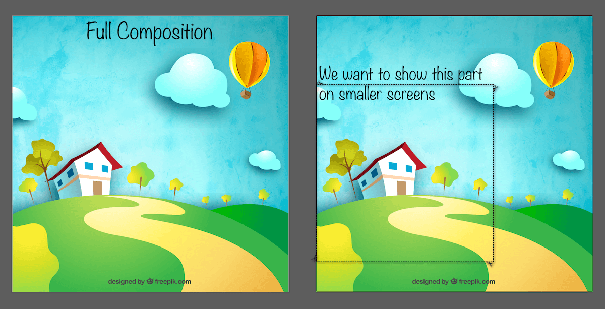
The picture on the left is the complete picture we will crop using the viewBox attribute, and the picture on the right is the area we want to display on the small screen.
Now, crop the SVG by changing the value of the viewBox attribute. There are some things to consider, which we’ll get to in a moment. But first, we need to change the coordinate system so that it matches the contents of the dashed rectangle in the image above. , by adjusting the origin of the system and the values of width and height, we can change its initial parameter value of 0 0 800 800.
But how do we know the new coordinates and dimensions? The point is not to go through a lot of repeated trial and error.
There are several ways. Since we are already in a graphics editor (my example is using AI), we can use the editor's panels to get the element's position and dimensions.
I draw this dotted rectangular box, not only to represent the content I want to display on the small screen, but also for another reason: we can get the position and size of this rectangle, and then use them as the value of the viewBox use. Using AI's Transform panel (pictured below), we obtain the values we need. By selecting the rectangle and clicking the Transform link in the upper right corner, we get the panel shown below, including the x, y, width and height values we need. 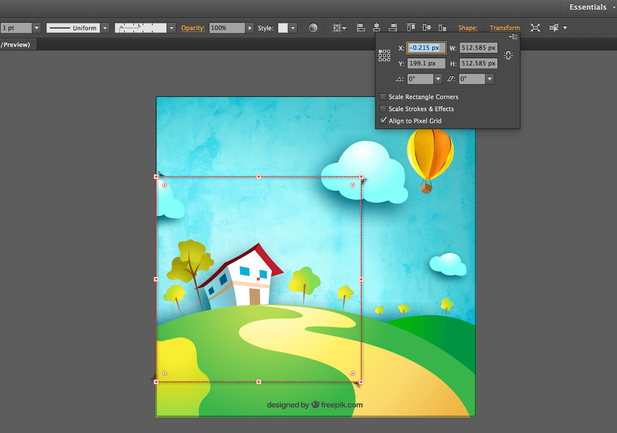
The transformation panel in this AI can be used to obtain the position and size of the selected rectangle
You may have noticed that the above value is not an integer, so we need to modify it manually. Based on the above information, we change the value of viewBox to 0 200 512 512.
Because the aspect ratio of the new viewBox is the same as that of the SVG view window (both are square), the content in the viewBox will be expanded, and only the selected area will be displayed in the view window. After changing the value of viewBox, the result is as shown below: 
New cropped SVG. Only the location we specify using the viewBox property is visible in the viewport. The blue border indicates the SVG's viewport.
At this point, there is a problem that needs to be solved:
What if the aspect ratio of the cropped area (i.e. viewBox) != the aspect ratio of the SVG view window?
In this case, there will be significant overflow. By obvious overflow, I don't mean the extension beyond the bounds of the SVG viewport, but the overflow defined by the viewBox relative to the new user coordinate system. The following figure illustrates this.
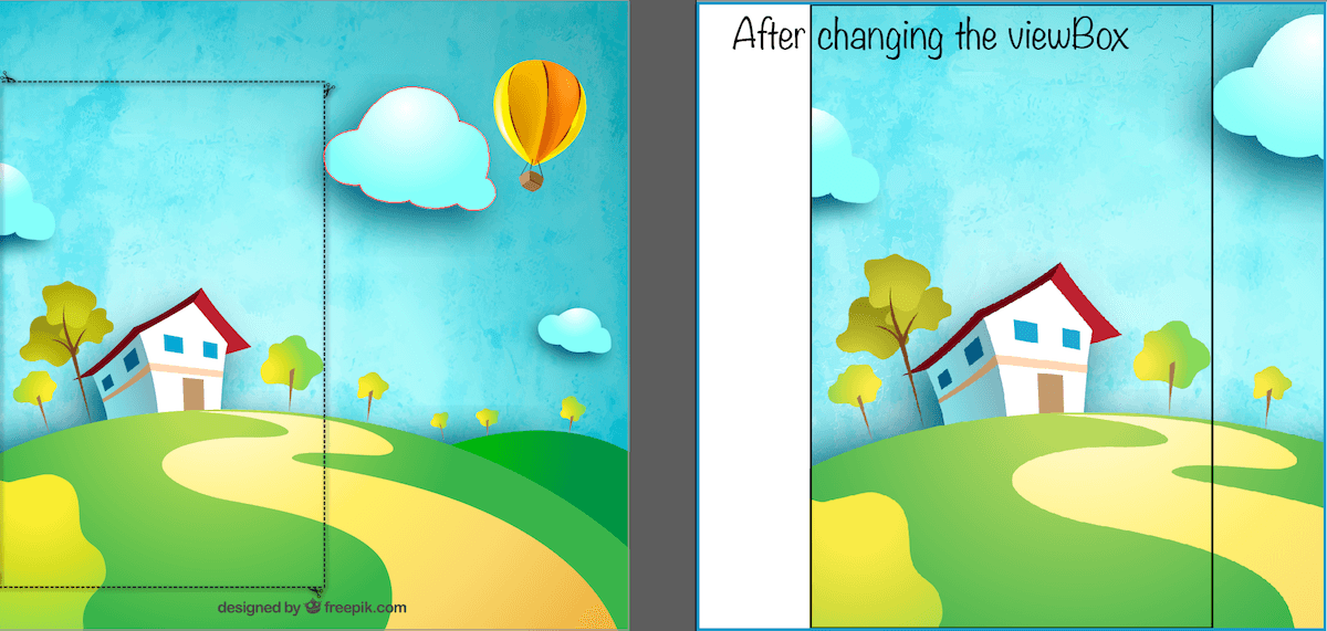
If the aspect ratio of the viewBox is different from the aspect ratio of the viewport, the content in the SVG will overflow the user coordinate system, and the result may be like this.
The black border represents the new user coordinate system, and the blue border is the SVG window.
The black border in the right picture above is the area defined by the viewBox. According to the default behavior of viewBox within the window, it will be centered and enlarged as much as possible to ensure that its content is contained in the window (blue border) as much as possible.
Because the SVG canvas is conceptually infinite in all directions, you can draw graphics outside the boundaries of the user coordinate system, and the content will directly overflow and move, as shown in the figure above.
If you change the aspect ratio of the SVG viewport (SVG's width and height) to fit them into the viewBox's aspect ratio, you won't see the overflow because the viewBox scales to fit the viewport, and Same as the previous example.
However, in some cases, you may not be able or simply not want to change the aspect ratio of your SVG. For example, if you are using SVG sprites as a set of images to display images on the page. In most cases, images have a fixed aspect ratio - and you don't want to change the size of the image just to fit the content of a small image inside it. Or maybe you embed an icon system and want all icons to be the same size at the same time.
In order to cut off redundant things (for example, some other icons on the sprite, displayed in the viewport), you can use
However, there is one more thing to remember: make sure that the x and y attributes of
-
"clipper"> - // Get the reference of root
- var svgRoot = ...; // Depends on how you embed and reference the SVG
- // Define the parameter value of viewBox
- var vbValue = '0 200 512 512';
- // Use Modernizr’s media query retrieval to change the value of the viewBox
- if (Modernizr.mq('(max-width: 700px)')) {
- svgRoot.setAttribute('viewBox', vbValue);
- }
- //Other sizes
- @media screen and (max-width: 700px) {
- svg {
- viewBox: 0 200 512 512;
- }
- }
- /* etc. */
Of course, cropping the excess means that you are still using a different aspect ratio and still need to deal with the extra white space on both sides of the content. If the SVG is a continuous scene, like our previous example, this is not necessary because you still need to adjust the aspect ratio of the viewport. If the SVG is a set of icons and you only use it once in a different viewport, this may not be a problem.
One important thing to remember here is that the aspect ratio of the viewBox is best kept consistent with the aspect ratio of the viewport; in addition, you need to set the fix to avoid any undefined extra white space in the SVG.
So, viewBox can be used to crop SVG and display only a certain part of the SVG as needed. But how does it apply to instances?
Art Directing SVG in responsive design
There is nothing to add in this part, except the code of the actual process. So, let's say you have the SVG shown above, and you want to use it as an avatar, for example, on small and medium sized screens you only want to display a cropped portion of it, and then display the full avatar on a large screen.
To change the width and height values of the SVG window, we can use CSS. But to change the value of the viewBox, currently we need to use JavaScript.
Not all SVG attributes and CSS attributes can be used equally; only a set of attributes with the same effect as CSS attributes can be set in CSS. You can see an overview of the set of SVG properties that can be used as CSS properties in this table. In SVG2, many attributes (such as x, y, cx, cy, r, etc.) can be added to this list; but these are the attributes we can use now.
In order to display different parts of SVG, you need to change the value of the viewBox based on different media queries. You can use Modernizr to find the media query conditions, and then change the value of the viewBox accordingly in JavaScript. An example is as follows:
This works, but wouldn’t it be nice if we could use CSS to achieve this effect?
Use CSS viewBox property to crop SVG
Disclaimer: At the time of writing this article, there is no CSSviewBox property. This is just an example to explain why this property is useful and how I imagine it could be used.
Ideally we would use it like this:
These styles will be put into (or taken out of) the SVG, and then the SVG will adjust its viewBox value according to the size of the viewport. Let it be the page viewport (in the case of inline
However, this is currently not possible because there is no viewBox attribute in CSS yet.
A while ago, I asked an editor of the SVG specification about this issue, and he said that I could make suggestions to SVGWG based on actual usage and examples. After some discussion on Twitter, I discovered that there was a similar SVGWG proposal thread a few years ago. The original proposal still exists today, so I hope that, with some examples of practical use, this proposal can be advanced and implemented in the near future. If you also want to see the viewBox property in CSS, please help make this happen by pushing forward this proposal and commenting.
Things to remember when using viewBox to complete SVG Art-Direction
When working on my client’s project, it took me less than a minute to art-direct the avatar according to the client’s requirements. However, this ends up branching out into three separate SVGs, rather than the same SVG different viewBoxes on different screen sizes.
The reason we chose three SVGs is that the size of the full SVG is too large, reaching over 100kb in size on mobile. The original SVG was around 200kb, I was able to compress the file to close to half the size by optimizing the SVG, but the image was still too big for mobile devices, so we ended up using three images of different sizes. When art-directing SVG, you need to remember this: performance issues. If your SVG is too large, don't use viewBox to art-direct.
Now, if you choose to use three different SVG images, there are a number of possible ways to do it - it depends on how you embed the SVG, and also on what you want to accomplish and what you don't want to accomplish.
Using the
But as mentioned before, if you want SVG with animation or interactive effects,  to embed SVG, SVG cannot be styled or animated unless the style and animation are defined in the
So, I always say: SVG provides us with many options that allow us to accomplish almost everything; you need to make a trade-off, prioritize, and sometimes even compromise, and make the best decision based on this. choose. But when it comes to performance, never compromising is good for development!
Before we end, because we mentioned the problem of using the viewBox attribute to change the size of the SVG canvas, let's look at another example where we can use this attribute to help us save some time and energy when dealing with SVG.
Use viewBox to extend SVG canvas
Just as the viewBox attribute can be used to scale an SVG, it can also be used to expand the SVG canvas.
A few weeks ago I created a tool that can generate SVG radial menus. I've created a few examples to demonstrate how to use JavaScript to animate the generated menus. The demo is embedded on the application page using the
It should be noted that "outside the boundary" refers to the content in SVG. It is still on the infinite SVG canvas, but exceeds the infinite rectangle defined by the viewport
Translator’s Note: For information on SVG canvas and windows, please read the relevant articles on w3cplus.
The size of the SVG created for the menu is just enough to contain the menu without making it any larger. Any extra white space around the menu is avoided.
I applied a bounce animation to a menu as an example of menu animation. This bouncing effect "stretches" the menu items, and also causes the menu items to be cut out individually (i.e., overflow) as they bounce. 
Initially, since the SVG viewport is defined by the
These cute bounce animations are applied to items that use the bounce time function to zoom from 0 to 100% (i.e. the item is initially invisible and zoomed out). This effect is if the item bounces past 100% size, then shrink it back to 100%. This effect causes the item to overflow when it bounces beyond the bounds of the SVG.
The picture below shows the effect of the zoom menu item when it is zoomed beyond the boundary of 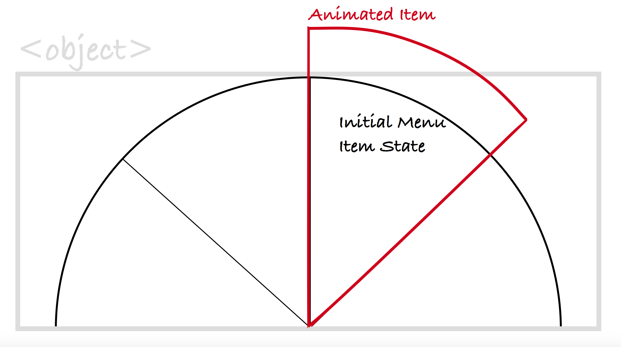
The diagram above shows the effect when the menu item is enlarged to exceed the bounds of the SVG window. The gray border represents the border of the SVG window (i.e., the
Setting overflow: visible to
To extend the SVG canvas, simply increase its dimensions. Therefore, we are using the dimensions of 700 x 500px instead of the original size of 500 x 250 for this SVG menu. This will also increase the height of the canvas displayed in the viewport by 100px, and the width of the canvas in the viewport will be increased by 200px. I determined these values based on how much space these menu items needed to expand for the bounce effect. Depending on your SVG and what exactly you're trying to accomplish, these values don't need to be consistent.
Now, in order to ensure that the menu is placed in the center of the window, we need to move the position of the coordinate system 100px in the negative direction (i.e. up and left). Applying this movement to the origin of the coordinate system is the same as applying a translation transformation to the menu in the system. The result is that the menu remains centered in the viewport. 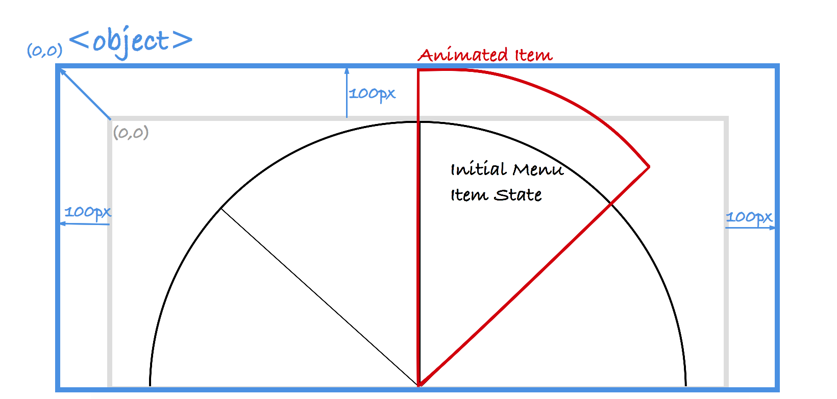
In this figure, the blue border represents the SVG window boundary (that is, the
By extending the size of the user coordinate system, you also increase the area of the canvas visible in the viewport. The result of this is that the contents of the canvas will appear slightly smaller - depending on how much you enlarge the canvas. But for the menu, this result is acceptable.
The screen recording below shows the results of expanding the SVG canvas, with the menu animation effect within the SVG bounds. 
Once the SVG canvas is expanded, the menu items have enough space to scale and will no longer be clipped due to overflow when applying the bounce effect.
Extend the SVG canvas by changing the four parameter values of the viewBox attribute, so that all problems and the problem of menu items being clipped can be solved. viewBox is really great~~
Conclusion
The viewBox attribute is great, it is an enhanced version of SVG. By using this attribute, you can save a lot of time when working with SVG, and you can quickly solve SVG problems without using a graphics editor. All in all, this is really convenient for editing SVG.
I highly recommend you learn all about this property and let it shine in your work. If you want to use it for art-direct SVG, don't forget that performance is the key.
 html5的div一行可以放两个吗Apr 25, 2022 pm 05:32 PM
html5的div元素默认一行不可以放两个。div是一个块级元素,一个元素会独占一行,两个div默认无法在同一行显示;但可以通过给div元素添加“display:inline;”样式,将其转为行内元素,就可以实现多个div在同一行显示了。
 html5中列表和表格的区别是什么Apr 28, 2022 pm 01:58 PM
html5中列表和表格的区别:1、表格主要是用于显示数据的,而列表主要是用于给数据进行布局;2、表格是使用table标签配合tr、td、th等标签进行定义的,列表是利用li标签配合ol、ul等标签进行定义的。
 html5怎么让头和尾固定不动Apr 25, 2022 pm 02:30 PM
固定方法:1、使用header标签定义文档头部内容,并添加“position:fixed;top:0;”样式让其固定不动;2、使用footer标签定义尾部内容,并添加“position: fixed;bottom: 0;”样式让其固定不动。
 HTML5中画布标签是什么May 18, 2022 pm 04:55 PM
HTML5中画布标签是“<canvas>”。canvas标签用于图形的绘制,它只是一个矩形的图形容器,绘制图形必须通过脚本(通常是JavaScript)来完成;开发者可利用多种js方法来在canvas中绘制路径、盒、圆、字符以及添加图像等。
 html5中不支持的标签有哪些Mar 17, 2022 pm 05:43 PM
html5中不支持的标签有:1、acronym,用于定义首字母缩写,可用abbr替代;2、basefont,可利用css样式替代;3、applet,可用object替代;4、dir,定义目录列表,可用ul替代;5、big,定义大号文本等等。
 html5废弃了哪个列表标签Jun 01, 2022 pm 06:32 PM
html5废弃了dir列表标签。dir标签被用来定义目录列表,一般和li标签配合使用,在dir标签对中通过li标签来设置列表项,语法“<dir><li>列表项值</li>...</dir>”。HTML5已经不支持dir,可使用ul标签取代。
 Html5怎么取消td边框May 18, 2022 pm 06:57 PM
3种取消方法:1、给td元素添加“border:none”无边框样式即可,语法“td{border:none}”。2、给td元素添加“border:0”样式,语法“td{border:0;}”,将td边框的宽度设置为0即可。3、给td元素添加“border:transparent”样式,语法“td{border:transparent;}”,将td边框的颜色设置为透明即可。
 html5是什么意思Apr 26, 2021 pm 03:02 PM
html5是指超文本标记语言(HTML)的第五次重大修改,即第5代HTML。HTML5是Web中核心语言HTML的规范,用户使用任何手段进行网页浏览时看到的内容原本都是HTML格式的,在浏览器中通过一些技术处理将其转换成为了可识别的信息。HTML5由不同的技术构成,其在互联网中得到了非常广泛的应用,提供更多增强网络应用的标准机。


Hot AI Tools

Undresser.AI Undress
AI-powered app for creating realistic nude photos

AI Clothes Remover
Online AI tool for removing clothes from photos.

Undress AI Tool
Undress images for free

Clothoff.io
AI clothes remover

AI Hentai Generator
Generate AI Hentai for free.

Hot Article

Hot Tools

SublimeText3 English version
Recommended: Win version, supports code prompts!

Safe Exam Browser
Safe Exam Browser is a secure browser environment for taking online exams securely. This software turns any computer into a secure workstation. It controls access to any utility and prevents students from using unauthorized resources.

Zend Studio 13.0.1
Powerful PHP integrated development environment

DVWA
Damn Vulnerable Web App (DVWA) is a PHP/MySQL web application that is very vulnerable. Its main goals are to be an aid for security professionals to test their skills and tools in a legal environment, to help web developers better understand the process of securing web applications, and to help teachers/students teach/learn in a classroom environment Web application security. The goal of DVWA is to practice some of the most common web vulnerabilities through a simple and straightforward interface, with varying degrees of difficulty. Please note that this software

mPDF
mPDF is a PHP library that can generate PDF files from UTF-8 encoded HTML. The original author, Ian Back, wrote mPDF to output PDF files "on the fly" from his website and handle different languages. It is slower than original scripts like HTML2FPDF and produces larger files when using Unicode fonts, but supports CSS styles etc. and has a lot of enhancements. Supports almost all languages, including RTL (Arabic and Hebrew) and CJK (Chinese, Japanese and Korean). Supports nested block-level elements (such as P, DIV),


