Attached to you is the rendering:
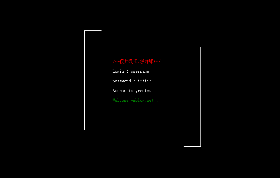
When I was working on a project recently, I needed to achieve a typing effect where characters appear one by one. I used the clip css animation of CSS to achieve it. Combined with the typewriter effect I wrote, the whole thing
When combined, the effect is great.
Let’s talk about this line first. We will see that it is a line. In fact, it is a border that is regularly displayed and hidden. Then the after and before attributes must come to mind here.
Let’s consider after for now.
Create a box first, and then a border
 <div class="box"></div>
 .box:before{
 content: '';
 position: absolute;
 width:px;height: px;border:px red solid;
 left:-px;top:-px;
 z-index: ;
 }
The next thing to do is to show and hide it regularly. The clip attribute is used here. I talked about it in this article: The implementation principle of the CSS circular percentage progress bar.
Let’s talk about how to implement this here. First of all, I want this to display the top border-left-bottom-right, so there is a loop. According to clip, rect (top, right, bottom,
Left), for example, if the top border is displayed, then it is:
clip:rect(px,px,px,px);
We just need to use animation to display it in sequence
@-webkit-keyframes clipMe{
%{ clip: rect(px, px, px, px); }
%{ clip: rect(px, px, px, px); }
%{ clip: rect(px, px, px, px); }
%{ clip: rect(px, px, px, px); }
%{ clip: rect(px, px, px, px); }
}
Then call the display in after:
.box:after{
-webkit-animation:clipMe s linear infinite;
}
Of course, it’s ok if we add an identical before. Their time interval is s. Note here that if you delay s, then what you will see in s is the entire
A border appears, change it to delay-s here, and this problem will be solved perfectly.
.box:before{
-webkit-animation:clipMe s -s linear infinite;
}
/***************************************************************/
Let’s talk about the typewriter. The typewriter is nothing more than constantly replacing the displayed characters and displaying them on the screen. First, get the content in the box,
<div class="box">
<span>/**仅共娱乐,然并卵**/</span>
<p>Login : Jmingzi</p>
<p>password : ******</p>
<p>Access is granted</p>
<span>Welcome ymblog.net !</span>
</div>
After obtaining, replace the display one by one,
var t = setInterval(function(){
str = con.substr(, strlen) + "_";
me.obj.html(str);
//内容打印完毕
if(strlen == con.length){
clearInterval(t);
}
strlen = strlen + ;
}, me.speed);
Here I just encapsulate it into a class to facilitate initialization of some parameters. The complete code:
//初始化工作,获取几段文字内容,将它们隐藏后逐个显示即可
$(function(){
function Type(obj, speed, welcome){
this.obj = obj;
this.speed = speed;
this.welcome = welcome;
}
Type.prototype = {
init : function(){
var str = this.obj.html();
this.obj.html(this.welcome);
this.add(str);
},
add : function(con){
var me = this;
var str;
var strlen = ;
var t = setInterval(function(){
str = con.substr(, strlen) + "_";
me.obj.html(str);
//内容打印完毕
if(strlen == con.length){
clearInterval(t);
}
strlen = strlen + ;
}, me.speed);
}
}
var a = new Type($('.box'), , '正在初始化...');
a.init();
});
The above is the entire content of this article, I hope it will be helpful to everyone
 Replace String Characters in JavaScriptMar 11, 2025 am 12:07 AM
Detailed explanation of JavaScript string replacement method and FAQ This article will explore two ways to replace string characters in JavaScript: internal JavaScript code and internal HTML for web pages. Replace string inside JavaScript code The most direct way is to use the replace() method: str = str.replace("find","replace"); This method replaces only the first match. To replace all matches, use a regular expression and add the global flag g: str = str.replace(/fi
 Build Your Own AJAX Web ApplicationsMar 09, 2025 am 12:11 AM
So here you are, ready to learn all about this thing called AJAX. But, what exactly is it? The term AJAX refers to a loose grouping of technologies that are used to create dynamic, interactive web content. The term AJAX, originally coined by Jesse J
 10 jQuery Fun and Games PluginsMar 08, 2025 am 12:42 AM
10 fun jQuery game plugins to make your website more attractive and enhance user stickiness! While Flash is still the best software for developing casual web games, jQuery can also create surprising effects, and while not comparable to pure action Flash games, in some cases you can also have unexpected fun in your browser. jQuery tic toe game The "Hello world" of game programming now has a jQuery version. Source code jQuery Crazy Word Composition Game This is a fill-in-the-blank game, and it can produce some weird results due to not knowing the context of the word. Source code jQuery mine sweeping game
 How do I create and publish my own JavaScript libraries?Mar 18, 2025 pm 03:12 PM
Article discusses creating, publishing, and maintaining JavaScript libraries, focusing on planning, development, testing, documentation, and promotion strategies.
 jQuery Parallax Tutorial - Animated Header BackgroundMar 08, 2025 am 12:39 AM
This tutorial demonstrates how to create a captivating parallax background effect using jQuery. We'll build a header banner with layered images that create a stunning visual depth. The updated plugin works with jQuery 1.6.4 and later. Download the
 Auto Refresh Div Content Using jQuery and AJAXMar 08, 2025 am 12:58 AM
This article demonstrates how to automatically refresh a div's content every 5 seconds using jQuery and AJAX. The example fetches and displays the latest blog posts from an RSS feed, along with the last refresh timestamp. A loading image is optiona
 Getting Started With Matter.js: IntroductionMar 08, 2025 am 12:53 AM
Matter.js is a 2D rigid body physics engine written in JavaScript. This library can help you easily simulate 2D physics in your browser. It provides many features, such as the ability to create rigid bodies and assign physical properties such as mass, area, or density. You can also simulate different types of collisions and forces, such as gravity friction. Matter.js supports all mainstream browsers. Additionally, it is suitable for mobile devices as it detects touches and is responsive. All of these features make it worth your time to learn how to use the engine, as this makes it easy to create a physics-based 2D game or simulation. In this tutorial, I will cover the basics of this library, including its installation and usage, and provide a
 How do I optimize JavaScript code for performance in the browser?Mar 18, 2025 pm 03:14 PM
The article discusses strategies for optimizing JavaScript performance in browsers, focusing on reducing execution time and minimizing impact on page load speed.


Hot AI Tools

Undresser.AI Undress
AI-powered app for creating realistic nude photos

AI Clothes Remover
Online AI tool for removing clothes from photos.

Undress AI Tool
Undress images for free

Clothoff.io
AI clothes remover

AI Hentai Generator
Generate AI Hentai for free.

Hot Article

Hot Tools

SublimeText3 English version
Recommended: Win version, supports code prompts!

mPDF
mPDF is a PHP library that can generate PDF files from UTF-8 encoded HTML. The original author, Ian Back, wrote mPDF to output PDF files "on the fly" from his website and handle different languages. It is slower than original scripts like HTML2FPDF and produces larger files when using Unicode fonts, but supports CSS styles etc. and has a lot of enhancements. Supports almost all languages, including RTL (Arabic and Hebrew) and CJK (Chinese, Japanese and Korean). Supports nested block-level elements (such as P, DIV),

Zend Studio 13.0.1
Powerful PHP integrated development environment

Atom editor mac version download
The most popular open source editor

MinGW - Minimalist GNU for Windows
This project is in the process of being migrated to osdn.net/projects/mingw, you can continue to follow us there. MinGW: A native Windows port of the GNU Compiler Collection (GCC), freely distributable import libraries and header files for building native Windows applications; includes extensions to the MSVC runtime to support C99 functionality. All MinGW software can run on 64-bit Windows platforms.


