Home >Java >javaTutorial >How to use springboot vue interface to test the front-end module tree and interface list
How to use springboot vue interface to test the front-end module tree and interface list
- WBOYWBOYWBOYWBOYWBOYWBOYWBOYWBOYWBOYWBOYWBOYWBOYWBforward
- 2023-05-22 17:28:471606browse
Test platform development based on springboot vue
1. Function introduction
Today’s goal is to draw a front-end page for the interface management list. I once planned to make a simple prototype, but after trying a web tool, I couldn't use it proficiently and finally gave up.
Finally decided to use elementUI components to piece it together. It took more than half a day to complete it, and it was obvious that this page was still a bit complicated for me.
Compared to a table page in project management, there is a lot more content here. Naturally, I encountered a lot of front-end knowledge that I didn't know much about before. By checking elementUI official documents, search engines, etc., and solving them one by one, I gained something.
First release the completed page of the first version and briefly describe the page functions.
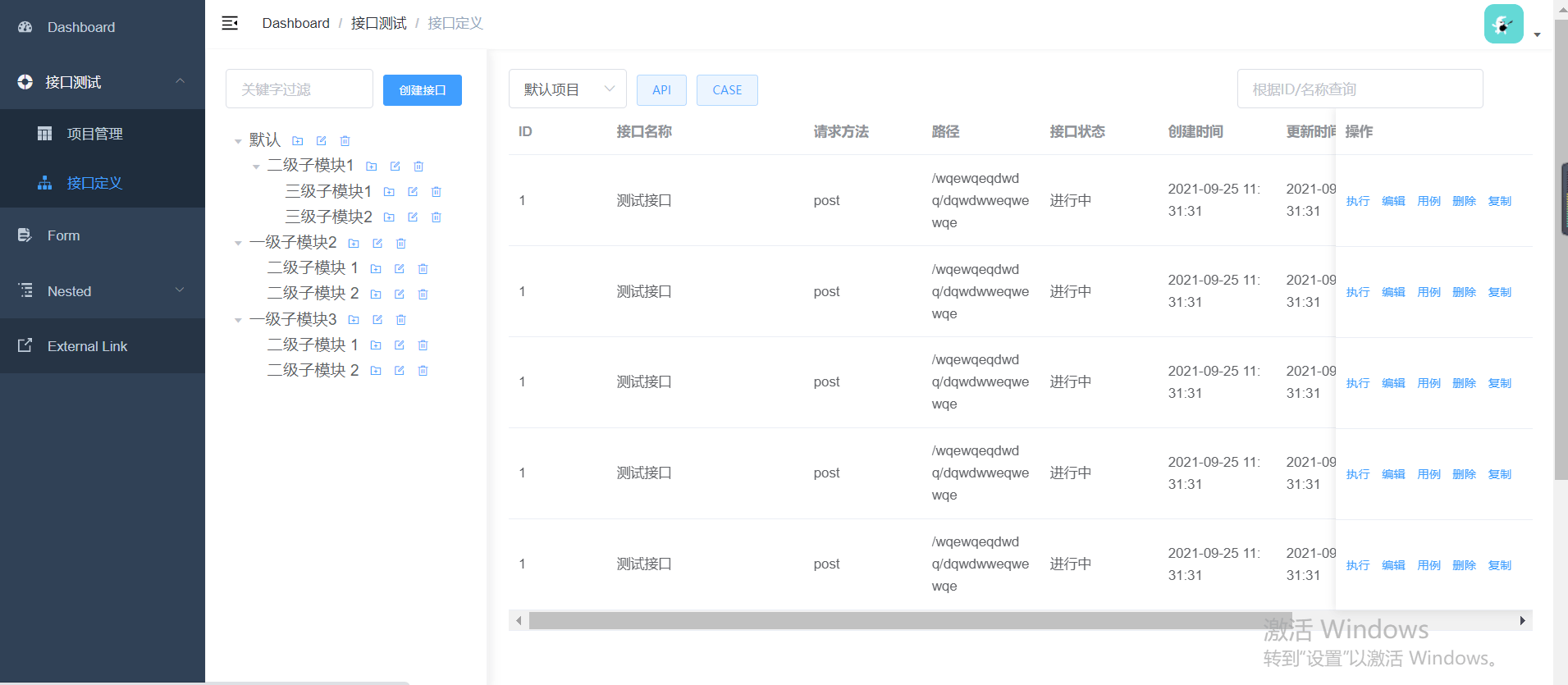
The entire page is divided into 2 areas:
The left area
is a module tree.
One project has multiple modules
One module can have multiple sub-modules
One module has multiple APIs and CASE
One API has multiple CASE
In addition, you can quickly search module nodes and search box There is also a button on the right side for creating an interface. I haven’t drawn the new page yet, but I’ll talk about it later.
Right area
This is mainly the display of the list.
You can directly click on a project in the [Project Management] list to jump there. If you enter the interface list page directly, a default project will be automatically selected. There is also a query box in the upper right corner, which supports queries with multiple conditions.
As for the two buttons: API and CASE, I want to switch to display the corresponding list after clicking them. Because the corresponding module trees are the same, I don’t think it is necessary to create a new page.
Finally, the operation bar is fixed at the far right of the list record. There are 5 buttons in it, each of which corresponds to a different function:
[Execute]: Can be used to debug interfaces, similar to using postman.
[Edit]: You can modify the interface content.
[Use Case]: Click to jump to the CASE list page of this interface.
[Delete]: Used to delete the interface, and also delete the CASE under this interface. It is estimated that the backend will perform logical deletion.
[Copy]: Copy the currently recorded interface content to facilitate quick creation.
Every function here is not simple, and the follow-up is full of challenges, and the corresponding rewards will definitely be full.
2. Page assembly ideas
The main idea is to find components in elementUI, and then modify the code. However, the points of attention encountered during this period are worth recording for reference only.
1. Layout container
The beginning is how to implement the layout of the left and right. The second one at the top of the component URL is the Container layout container.

Container component used for layout, which is convenient for quickly building the basic structure of the page. Scroll down and you can see several layout examples. To be honest, I didn’t understand much at first.
But continue to scroll down, there is only one page code example, which just meets my left and right layout needs, copy it first.
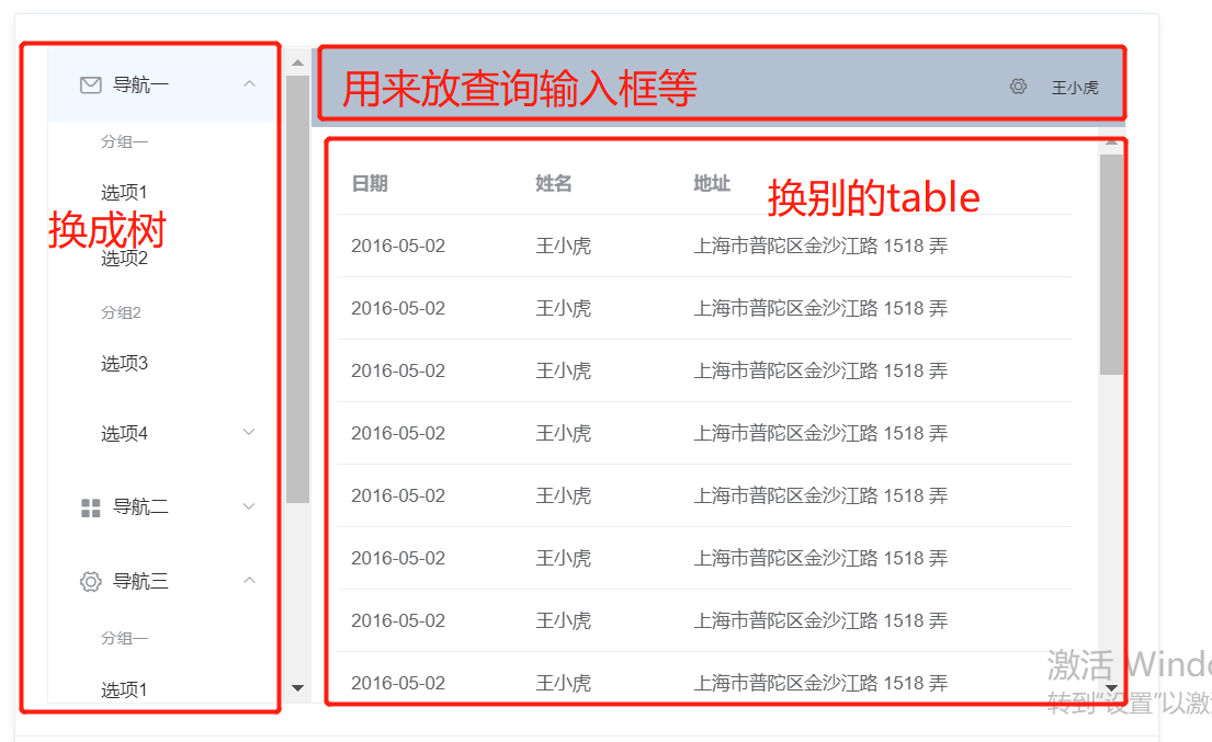
#You probably have an idea of what needs to be modified. The next step is to find the corresponding component, copy and paste the code.
I won’t keep track of it. If you have any questions and need to communicate, you can send me a private message. The following are the knowledge points to pay attention to when using each component.
2. Tree tree control
The control on the right is used, so be careful to copy the corresponding one.
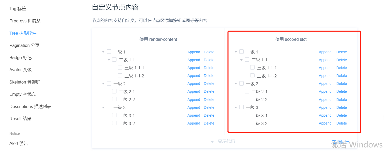
show-checkbox The attribute is the check box in front of the node. Remove it if it is not needed. default-expand-all, expand all by default:expand-on-click-node="false", the default is true, it will not automatically expand when a new node is added. I need to automatically expand it, so change it to false.
In addition, I replaced the button with an icon. The usage is super simple:
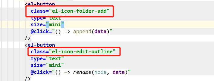
Just find the specific icon in the component in the class:

Horizontal scroll bar
When the node name is too long and exceeds the width of the side area, it needs to be able to scroll horizontally. I searched many methods online before, but none worked.
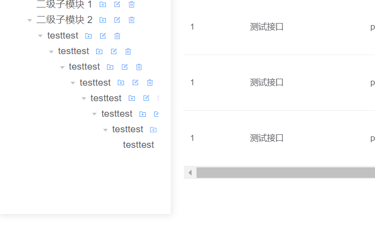
Finally I found that just adding display: flex to style is enough.

Flex is the abbreviation of Flexible Box, which means "elastic layout" and is used to provide maximum flexibility for box-shaped models.
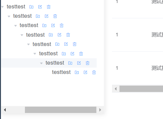
I also added some styles to the left side later, such as dividing lines and shadows:
<style>
  .el-aside {
    color: #333;
    border-right-style: solid;
    border-color: #f4f4f5;
    box-shadow: 0 2px 12px 0 rgba(0, 0, 0, 0.1)
  }
</style>
In fact, this kind of thing is not very beautiful, but it is not considered at the moment. These functions should be completed first, and then iteratively optimized later.
3. The right side of div and span
is also very simple, corresponding to 2 tags respectively: <el-header></el-header> and , just put the corresponding components in the corresponding tags.

But when I added a query input box to <el-header></el-header>, I found that the page could not be seen.

Do not display the input box.

Later I found that I shouldn’t include another div, just change it to span, or put it in the span of 2 buttons It can also be done in tags. The

<div> element is a block-level element, which is a container that can be used to combine other HTML elements. Wrapping multiple elements with tags is equivalent to them being in the same group. If you want to change the style or other things, just modify the tags directly and everything will be affected. The <p><code><span></span> element is an inline element that can be used as a container for text.
These two tags can usually be understood as having no difference, but it should be noted that div occupies one line, and span does not occupy one line. The span will be as wide as the content occupies .
The above is the detailed content of How to use springboot vue interface to test the front-end module tree and interface list. For more information, please follow other related articles on the PHP Chinese website!
Related articles
See more- How to Inject Dependencies into Self-Instantiated Objects in Spring?
- How to Dynamically Add Files to the Java Classpath at Runtime?
- How to Calculate the Difference Between Two Dates in Days Using Android/Java?
- Why i created a lightweight mini spring alternative and how I did it
- How to Ensure Task Termination During Java ExecutorService Shutdown

