 Web Front-end
 JS Tutorial
 Pure css to achieve realistic effect of raindrops on window glass_javascript skills
Pure css to achieve realistic effect of raindrops on window glass_javascript skills
Here is just using CSS technology to demonstrate such a scenario, which may not be very practical. However, this is a great opportunity to explore new features of CSS. Allows you to try out new features and tools. And gradually it will be practiced at work. When making the window raindrop effect, HAML and Sass will be used.
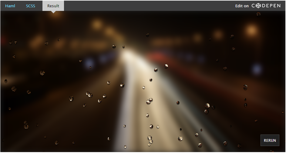
Case Effect

Looking at the above effect, is it a bit like standing indoors and looking at the night scene in the rain outside the window? The effect of raindrops on the window is so real, but the night scene outside the window is so blurry. We are no longer poetic. I think everyone is more concerned about what kind of technology is used to achieve such an effect.
Preprocessor
In this example, HAML and Sass are used instead of the familiar HTML and CSS. The main reason is that hundreds of
For the syntax of HAML and Sass, you can check their official websites. If your local computer does not have such a development environment, you can create a DEMO directly in Codepen and select the corresponding preprocessor. Select the corresponding preprocessor in the configuration of HTML and CSS. For example, select HAML in the HTML settings and select SCSS in the CSS settings.
For more Chinese tutorials about Sass, you can click here to read.
Structure
The structure of creating the effect of raindrops on the window is not too complicated. It is mainly divided into two levels, one is the window and the other is the raindrops. In the case, .window is used to represent the window, and the above raindrops are placed in the .raindrops container. The raindrops are made through .border and .drops. And place both window.window and raindrops.raindrops in the container.
In container:
.container
 .window
 .raindrops
 .borders
  - (1..120).each do
  .border
 .drops
  - (1..120).each do
  .raindrop
Compiled structure:
<div class="container">
 <div class="window"></div>
 <div class="raindrops">
 <div class="borders">
  <div class="border"></div>
  <!-- 此处省略 118个border -->
  <div class="border"></div>
 </div>
 <div class="drops">
  <div class="raindrop"></div>
  <!-- 此处省略 118个raindrop -->
  <div class="raindrop"></div>
 </div>
 </div>
</div>
Style
Styles are divided into three levels:
Blurred night scene outside the window (it can also be understood as the effect of a window)
Raindrop effect
Raindrop sliding animation effect
Next, briefly understand how these effects are achieved and what new CSS features are used.
Set variables
The entire effect is written using Sass. If you have never understood or been exposed to Sass, it is recommended that you have a brief understanding of it first. This will help you quickly understand the case effect production.
For the night scene outside the window, I found a picture of the lanterns coming on, and let the window occupy the full screen. Here we first declare three variables:
$image: "http://www.w3cplus.com/sites/default/files/blogs/2015/1506/huadenchushang.jpg";
$width:100vw;
$height:100vh;
In addition, you need to set the raindrop variable:
$raindrops:120;
It is important to note that the variable value of the raindrop should best match the raindrop structure in HTML.
Make the window occupy the full screen
The first thing to do is to make the window take up the full screen. In fact, it means to make .window display in full screen. As for how to achieve the full-screen effect, it is not difficult. I want students who know some CSS to be able to do it in minutes. However, the new method of CSS3 is used here, using the viewport unit to achieve the full-screen effect:
.container{
 position:relative;
 width:$width;
 height:$height;
 overflow:hidden;
}
.window{
 position:absolute;
 width:$width;
 height:$height;
 background:url($image);
 background-size:cover;
 background-position:50%;
}
uses two key knowledge points:
Use the viewport units vw and vh to make the container .container and .window as large as the viewport window. (For a detailed introduction to the Viewport unit, here is a detailed introduction)
Use the background-size property of CSS3 to make the background image fill the screen.
Blur effect (frosted glass)
The effect we want is not just as simple as a full-screen background image, but a blurry effect on the image. Some students may say that using production software to create a blurry back picture only takes a matter of minutes. If you still use this method to deal with it, it means you are already Out.
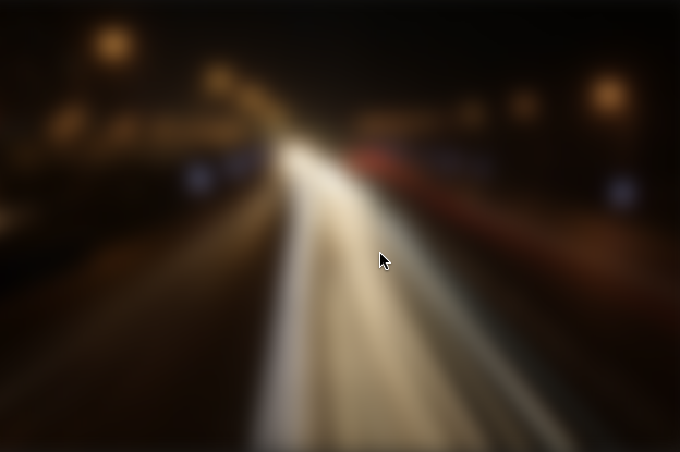
There is a filter attribute in CSS3, set it to blur(), and the effect will appear.
.window{
 ...
 filter:blur(10px);
}

现实生活中的雨露
在我们继续讨论之前,让我们看看现实生活中雨滴在窗户上的效果:

图片来自:Wikipedia
由于折射,雨滴翻转图像。另外,雨滴形状或多或少有些类似半球体,而且综们看起来有黑色边框。
雨滴
基于我们看到的雨滴效果,让我们来尝试制作一个单独的雨滴效果。
HAML
.container
 .window
 .raindrop
SCSS
$drop-width:15px;
$drop-stretch:1.1;
$drop-height:$drop-width*$drop-stretch;
.raindrop{
 position:absolute;
 top:$height/2;
 left:$width/2;
 width:$drop-width;
 height:$drop-height;
 border-radius:100%;
 background-image:url($image);
 background-size:$width*0.05 $height*0.05;
 transform:rotate(180deg);
}
这是很简单的,我做就是使用div.raindrop画了一个椭圆。并且用了当初的背景图进行了填补,并做了一个倒转的效果。

现在,我们要添加一个小边框,让雨滴看起来更像雨点(看起来有立体效果)。
HAML
.container
 .window
 .border
 .raindrop
SCSS
.border{
 position:absolute;
 top:$height/2;
 left:$width/2;
 margin-left:2px;
 margin-top:1px;
 width:$drop-width - 4;
 height:$drop-height;
 border-radius:100%;
 box-shadow:0 0 0 2px rgba(0,0,0,0.6);
}

请注意,我们不只是添加了一个边框,我们还对边框进行了挤压,所以看起来雨滴更自然一些。
雨滴看上去OK了,这个时候我们可以添加数以百计的雨滴:
HAML
.container
 .window
 .raindrops
 .borders
  - (1..120).each do
  .border
 .drops
  - (1..120).each do
  .raindrop
我们做了120个雨滴。
接下来使用Sass的循环给每个雨滴写样式:
@for $i from 1 through $raindrops{
 $x:random();
 $y:random();
 $drop-width:5px+random(11);
 $drop-stretch:0.7+(random()*0.5);
 $drop-height:$drop-width*$drop-stretch;
 .raindrop:nth-child(#{$i}){
  left:$x * $width;
  top:$y * $height;
  width:$drop-width;
  height:$drop-height;
  background-position:percentage($x) percentage($y);
 }
 .border:nth-child(#{$i}){
  left:$x * $width;
  top:$y * $height;
  width:$drop-width - 4;
  height:$drop-height;
 }
}
这里采用了Sass的@for循环对每个雨滴做样式处理,并且使用随机函数random()产生随机值,让每个雨滴的大小,挤压都不一致。同时还使用percentage()函数,让雨滴的背景图采用不同的位置。

上面看到的效果都是静态的,为了让它更具下雨的效果。雨滴滴下的效果,可以使用CSS3的animation来制作动画效果。
@keyframes falling {
 from {

 }
 to {
 transform: translateY(500px);
 }
}
定义好falling动画之后,只需要在雨滴上调用:
@for $i from 1 through $raindrops{
 $x:random();
 $y:random();
 $drop-width:5px+random(11);
 $drop-stretch:0.7+(random()*0.5);
 $drop-delay: (random()*2.5) + 1;
 $drop-height:$drop-width*$drop-stretch;
 .raindrop:nth-child(#{$i}){
  left:$x * $width;
  top:$y * $height;
  width:$drop-width;
  height:$drop-height;
 background-position:percentage($x) percentage($y);
 animation: #{$drop-delay}s falling 0.3s ease-in infinite;
 }
 .border:nth-child(#{$i}){
  left:$x * $width;
  top:$y * $height;
  width:$drop-width - 4;
  height:$drop-height;
 animation: #{$drop-delay}s falling 0.3s ease-in infinite;
 }
}
到了这一步,你也就能看到文章开头显示的雨滴窗户的效果了。是不是感觉很爽呀。
总结
文章一步一步演示了如何使用CSS新特性制作一个华灯初上,雨滴窗户的效果。整个实现过程采用了预处理器来编写代码。从整个过程中你可以很明显的感知,如果没有HAML和Sass这样的预处理器,你要为数以百计的雨滴写样式效果,那绝对是一件非常苦逼的事情。而使用之后,采用他们的功能特性,配合CSS3的一些新特性就能很轻松的完成。
浏览这个效果建议您使用Chrome浏览器浏览,因为这里使用了CSS3一些新特性,大家应该都懂的。千万别问我IE6浏览器怎么破,我也破不了。
纯css实现窗户玻璃雨滴逼真效果,内容到此为止,希望大家喜欢。
 Python vs. JavaScript: Community, Libraries, and ResourcesApr 15, 2025 am 12:16 AM
Python and JavaScript have their own advantages and disadvantages in terms of community, libraries and resources. 1) The Python community is friendly and suitable for beginners, but the front-end development resources are not as rich as JavaScript. 2) Python is powerful in data science and machine learning libraries, while JavaScript is better in front-end development libraries and frameworks. 3) Both have rich learning resources, but Python is suitable for starting with official documents, while JavaScript is better with MDNWebDocs. The choice should be based on project needs and personal interests.
 From C/C to JavaScript: How It All WorksApr 14, 2025 am 12:05 AM
The shift from C/C to JavaScript requires adapting to dynamic typing, garbage collection and asynchronous programming. 1) C/C is a statically typed language that requires manual memory management, while JavaScript is dynamically typed and garbage collection is automatically processed. 2) C/C needs to be compiled into machine code, while JavaScript is an interpreted language. 3) JavaScript introduces concepts such as closures, prototype chains and Promise, which enhances flexibility and asynchronous programming capabilities.
 JavaScript Engines: Comparing ImplementationsApr 13, 2025 am 12:05 AM
Different JavaScript engines have different effects when parsing and executing JavaScript code, because the implementation principles and optimization strategies of each engine differ. 1. Lexical analysis: convert source code into lexical unit. 2. Grammar analysis: Generate an abstract syntax tree. 3. Optimization and compilation: Generate machine code through the JIT compiler. 4. Execute: Run the machine code. V8 engine optimizes through instant compilation and hidden class, SpiderMonkey uses a type inference system, resulting in different performance performance on the same code.
 Beyond the Browser: JavaScript in the Real WorldApr 12, 2025 am 12:06 AM
JavaScript's applications in the real world include server-side programming, mobile application development and Internet of Things control: 1. Server-side programming is realized through Node.js, suitable for high concurrent request processing. 2. Mobile application development is carried out through ReactNative and supports cross-platform deployment. 3. Used for IoT device control through Johnny-Five library, suitable for hardware interaction.
 Building a Multi-Tenant SaaS Application with Next.js (Backend Integration)Apr 11, 2025 am 08:23 AM
I built a functional multi-tenant SaaS application (an EdTech app) with your everyday tech tool and you can do the same. First, what’s a multi-tenant SaaS application? Multi-tenant SaaS applications let you serve multiple customers from a sing
 How to Build a Multi-Tenant SaaS Application with Next.js (Frontend Integration)Apr 11, 2025 am 08:22 AM
This article demonstrates frontend integration with a backend secured by Permit, building a functional EdTech SaaS application using Next.js. The frontend fetches user permissions to control UI visibility and ensures API requests adhere to role-base
 JavaScript: Exploring the Versatility of a Web LanguageApr 11, 2025 am 12:01 AM
JavaScript is the core language of modern web development and is widely used for its diversity and flexibility. 1) Front-end development: build dynamic web pages and single-page applications through DOM operations and modern frameworks (such as React, Vue.js, Angular). 2) Server-side development: Node.js uses a non-blocking I/O model to handle high concurrency and real-time applications. 3) Mobile and desktop application development: cross-platform development is realized through ReactNative and Electron to improve development efficiency.
 The Evolution of JavaScript: Current Trends and Future ProspectsApr 10, 2025 am 09:33 AM
The latest trends in JavaScript include the rise of TypeScript, the popularity of modern frameworks and libraries, and the application of WebAssembly. Future prospects cover more powerful type systems, the development of server-side JavaScript, the expansion of artificial intelligence and machine learning, and the potential of IoT and edge computing.


Hot AI Tools

Undresser.AI Undress
AI-powered app for creating realistic nude photos

AI Clothes Remover
Online AI tool for removing clothes from photos.

Undress AI Tool
Undress images for free

Clothoff.io
AI clothes remover

AI Hentai Generator
Generate AI Hentai for free.

Hot Article

Hot Tools

SublimeText3 Chinese version
Chinese version, very easy to use

MantisBT
Mantis is an easy-to-deploy web-based defect tracking tool designed to aid in product defect tracking. It requires PHP, MySQL and a web server. Check out our demo and hosting services.

PhpStorm Mac version
The latest (2018.2.1) professional PHP integrated development tool

WebStorm Mac version
Useful JavaScript development tools

ZendStudio 13.5.1 Mac
Powerful PHP integrated development environment


