Learn about the aligned layout features in Windows 11 Dev Channel Build 22557
Microsoft released Windows 11 Dev Channel build 22557 a week ago, which contains a host of new features that may eventually make their way to the generally available (GA) version of the operating system. In light of the new features, we've resumed our "Closer Look" series to discuss these features and their impact in more detail.
So far we have discussed improvements to the Start Menu and Task Manager. Now, it’s time to discuss some Snap Layouts improvements.

Anyone who has followed my coverage of Windows 11 in the past knows that I am a big fan of Snap Layouts and Snap Groups in the operating system. The former allows you to hover your cursor over the Maximize button on a window and the operating system will show you possible locations to capture it. You can then arrange different windows in the layout and open or close them as "snap groups" with a single click.
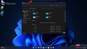
Microsoft has made some changes to Snap Layouts in Windows 11. Essentially, you can now take advantage of this feature in different ways. Instead of relying on a maximize button, you can simply drag the window to the top of your display and you'll see a pane, marked with a red arrow in the screenshot above.

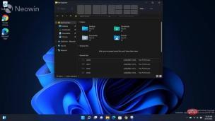
When you drag a window to the top of the pane, you'll see a preview of some of the layouts you can use. This arrangement may vary depending on the size and resolution of your monitor. An example can be seen in the screenshot above.

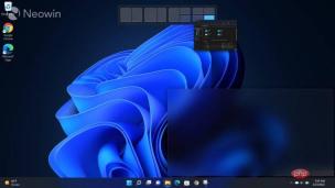
However, Dev Channel build 22557 goes a step further and shows you a preview of where the window will be. This happens when you start dragging a window through the different slots of the Align Layout pane and you get a minimized version of the window in the pane instead of a blurry area showing the space it will take up once that slot is selected situation.
Personally, I like this change. This is a small improvement, but can improve the user experience in many multitasking use cases, especially those that are touch-based. You can still use the Maximize button, but I think the new implementation is more intuitive. I think it makes more sense to view Snap Layouts when you're dragging around the window rather than minimizing or maximizing it.
One thing I would like to see improved further in this implementation is that instead of showing blurry areas, maybe there is more utility in showing an actual preview of the desired window? I think this will allow me to make a better decision as to whether snapping the window in the slot can still make it work for me without having to squint too much. But then again, this is a work-in-progress version, so hopefully Microsoft expands on this idea further in future iterations.
Of course, if you're used to it, you can still use the "old school" method of Win's arrow keys, but I personally prefer this implementation. At the end of the day, it’s all about giving customers more choices, right? The new implementation coupled with the ability to see a preview of the footprint is a nice improvement and I'd love to see it eventually make its way into the GA version of Windows 11.
The above is the detailed content of Learn about the aligned layout features in Windows 11 Dev Channel Build 22557. For more information, please follow other related articles on the PHP Chinese website!

Hot AI Tools

Undresser.AI Undress
AI-powered app for creating realistic nude photos

AI Clothes Remover
Online AI tool for removing clothes from photos.

Undress AI Tool
Undress images for free

Clothoff.io
AI clothes remover

Video Face Swap
Swap faces in any video effortlessly with our completely free AI face swap tool!

Hot Article

Hot Tools

Safe Exam Browser
Safe Exam Browser is a secure browser environment for taking online exams securely. This software turns any computer into a secure workstation. It controls access to any utility and prevents students from using unauthorized resources.

SublimeText3 Linux new version
SublimeText3 Linux latest version

DVWA
Damn Vulnerable Web App (DVWA) is a PHP/MySQL web application that is very vulnerable. Its main goals are to be an aid for security professionals to test their skills and tools in a legal environment, to help web developers better understand the process of securing web applications, and to help teachers/students teach/learn in a classroom environment Web application security. The goal of DVWA is to practice some of the most common web vulnerabilities through a simple and straightforward interface, with varying degrees of difficulty. Please note that this software

SublimeText3 English version
Recommended: Win version, supports code prompts!

Dreamweaver Mac version
Visual web development tools


