

 Backend DevelopmentPython TutorialPython implements eight probability distribution formulas and data visualization tutorials

Knowledge of probability and statistics is at the core of data science and machine learning; we need knowledge of statistics and probability to effectively collect, review, and analyze data.
There are several real-world instances of phenomena that are considered statistical in nature (i.e. weather data, sales data, financial data, etc.). This means that in some cases we have been able to develop methods that help us simulate nature through mathematical functions that can describe the characteristics of the data. “A probability distribution is a mathematical function that gives the probability of occurrence of different possible outcomes in an experiment.” Understanding the distribution of data helps to better model the world around us. It can help us determine the likelihood of various outcomes, or estimate the variability of events. All of this makes understanding different probability distributions very valuable in data science and machine learning. Uniform distributionThe most direct distribution is uniform distribution. A uniform distribution is a probability distribution in which all outcomes are equally likely. For example, if we roll a fair die, the probability of landing on any number is 1/6. This is a discrete uniform distribution. But not all uniform distributions are discrete - they can also be continuous. They can take any real value within the specified range. The probability density function (PDF) of a continuous uniform distribution between a and b is as follows: Let's see how to encode them in Python:
import numpy as np
import matplotlib.pyplot as plt
from scipy import stats

# for continuous
a = 0
b = 50
size = 5000

X_continuous = np.linspace(a, b, size)
continuous_uniform = stats.uniform(loc=a, scale=b)
continuous_uniform_pdf = continuous_uniform.pdf(X_continuous)

# for discrete
X_discrete = np.arange(1, 7)
discrete_uniform = stats.randint(1, 7)
discrete_uniform_pmf = discrete_uniform.pmf(X_discrete)

# plot both tables
fig, ax = plt.subplots(nrows=1, ncols=2, figsize=(15,5))
# discrete plot
ax[0].bar(X_discrete, discrete_uniform_pmf)
ax[0].set_xlabel("X")
ax[0].set_ylabel("Probability")
ax[0].set_title("Discrete Uniform Distribution")
# continuous plot
ax[1].plot(X_continuous, continuous_uniform_pdf)
ax[1].set_xlabel("X")
ax[1].set_ylabel("Probability")
ax[1].set_title("Continuous Uniform Distribution")
plt.show()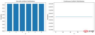
Gaussian distribution
The Gaussian distribution is probably the most commonly heard and familiar distribution. It has several names: some call it the bell curve because its probability plot looks like a bell, some call it the Gaussian distribution because the German mathematician Karl Gauss who first described it named it, and still others It's normally distributed because early statisticians noticed it happening over and over again. The probability density function of a normal distribution is as follows: σ is the standard deviation and μ is the mean of the distribution. Note that in a normal distribution, the mean, mode, and median are all equal. When we plot a normally distributed random variable, the curve is symmetrical about the mean—half the values are to the left of the center and half to the right of the center. And, the total area under the curve is 1.
mu = 0
variance = 1
sigma = np.sqrt(variance)
x = np.linspace(mu - 3*sigma, mu + 3*sigma, 100)

plt.subplots(figsize=(8, 5))
plt.plot(x, stats.norm.pdf(x, mu, sigma))
plt.title("Normal Distribution")
plt.show()
For normal distribution. The rule of thumb tells us what percentage of the data falls within a certain number of standard deviations from the mean. These percentages are:
- 68% of the data fall within one standard deviation of the mean.
- 95% of the data falls within two standard deviations of the mean.
- 99.7% of the data falls within three standard deviations of the mean.
Lognormal distribution
The lognormal distribution is a continuous random variable with a lognormal distribution Probability distributions. Therefore, if the random variable X is lognormally distributed, then Y = ln(X) has a normal distribution. Here is the PDF of the lognormal distribution: A lognormally distributed random variable only takes on positive real values. Therefore, the lognormal distribution creates a right-skewed curve. Let’s plot it in Python:
X = np.linspace(0, 6, 500)

std = 1
mean = 0
lognorm_distribution = stats.lognorm([std], loc=mean)
lognorm_distribution_pdf = lognorm_distribution.pdf(X)

fig, ax = plt.subplots(figsize=(8, 5))
plt.plot(X, lognorm_distribution_pdf, label="μ=0, σ=1")
ax.set_xticks(np.arange(min(X), max(X)))

std = 0.5
mean = 0
lognorm_distribution = stats.lognorm([std], loc=mean)
lognorm_distribution_pdf = lognorm_distribution.pdf(X)
plt.plot(X, lognorm_distribution_pdf, label="μ=0, σ=0.5")

std = 1.5
mean = 1
lognorm_distribution = stats.lognorm([std], loc=mean)
lognorm_distribution_pdf = lognorm_distribution.pdf(X)
plt.plot(X, lognorm_distribution_pdf, label="μ=1, σ=1.5")

plt.title("Lognormal Distribution")
plt.legend()
plt.show()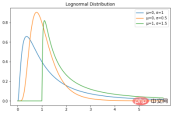
Poisson Distribution
The Poisson distribution is named after the French mathematician Simon Denis Poisson. This is a discrete probability distribution, which means that it counts events with finite outcomes - in other words, it is a counting distribution. Therefore, the Poisson distribution is used to show the number of times an event may occur within a specified period. If an event occurs at a fixed rate in time, then the probability of observing the number (n) of events in time can be described by a Poisson distribution. For example, customers may arrive at a coffee shop at an average rate of 3 times per minute. We can use the Poisson distribution to calculate the probability that 9 customers will arrive within 2 minutes. Here is the probability mass function formula: λ is the event rate in one unit of time – in our case, it is 3. k is the number of occurrences - in our case, it's 9. Scipy can be used here to complete the probability calculation.
from scipy import stats

print(stats.poisson.pmf(k=9, mu=3))
0.002700503931560479
The curve of the Poisson distribution is similar to the normal distribution, and λ represents the peak value.
X = stats.poisson.rvs(mu=3, size=500)

plt.subplots(figsize=(8, 5))
plt.hist(X, density=True, edgecolor="black")
plt.title("Poisson Distribution")
plt.show()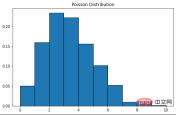
Exponential distribution
指数分布是泊松点过程中事件之间时间的概率分布。指数分布的概率密度函数如下:λ 是速率参数,x 是随机变量。
X = np.linspace(0, 5, 5000)

exponetial_distribtuion = stats.expon.pdf(X, loc=0, scale=1)

plt.subplots(figsize=(8,5))
plt.plot(X, exponetial_distribtuion)
plt.title("Exponential Distribution")
plt.show()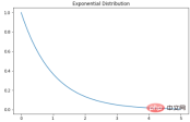
二项分布
可以将二项分布视为实验中成功或失败的概率。有些人也可能将其描述为抛硬币概率。参数为 n 和 p 的二项式分布是在 n 个独立实验序列中成功次数的离散概率分布,每个实验都问一个是 - 否问题,每个实验都有自己的布尔值结果:成功或失败。本质上,二项分布测量两个事件的概率。一个事件发生的概率为 p,另一事件发生的概率为 1-p。这是二项分布的公式:
- P = 二项分布概率
- = 组合数
- x = n次试验中特定结果的次数
- p = 单次实验中,成功的概率
- q = 单次实验中,失败的概率
- n = 实验的次数
可视化代码如下:
X = np.random.binomial(n=1, p=0.5, size=1000)

plt.subplots(figsize=(8, 5))
plt.hist(X)
plt.title("Binomial Distribution")
plt.show()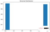
学生 t 分布
学生 t 分布(或简称 t 分布)是在样本量较小且总体标准差未知的情况下估计正态分布总体的均值时出现的连续概率分布族的任何成员。它是由英国统计学家威廉·西利·戈塞特(William Sealy Gosset)以笔名“student”开发的。PDF如下:n 是称为“自由度”的参数,有时可以看到它被称为“d.o.f.” 对于较高的 n 值,t 分布更接近正态分布。
import seaborn as sns
from scipy import stats

X1 = stats.t.rvs(df=1, size=4)
X2 = stats.t.rvs(df=3, size=4)
X3 = stats.t.rvs(df=9, size=4)

plt.subplots(figsize=(8,5))
sns.kdeplot(X1, label = "1 d.o.f")
sns.kdeplot(X2, label = "3 d.o.f")
sns.kdeplot(X3, label = "6 d.o.f")
plt.title("Student's t distribution")
plt.legend()
plt.show()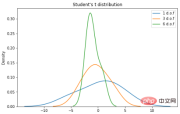
卡方分布
卡方分布是伽马分布的一个特例;对于 k 个自由度,卡方分布是一些独立的标准正态随机变量的 k 的平方和。PDF如下:这是一种流行的概率分布,常用于假设检验和置信区间的构建。在 Python 中绘制一些示例图:
X = np.arange(0, 6, 0.25)

plt.subplots(figsize=(8, 5))
plt.plot(X, stats.chi2.pdf(X, df=1), label="1 d.o.f")
plt.plot(X, stats.chi2.pdf(X, df=2), label="2 d.o.f")
plt.plot(X, stats.chi2.pdf(X, df=3), label="3 d.o.f")
plt.title("Chi-squared Distribution")
plt.legend()
plt.show()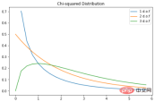
掌握统计学和概率对于数据科学至关重要。在本文展示了一些常见且常用的分布,希望对你有所帮助。
The above is the detailed content of Python implements eight probability distribution formulas and data visualization tutorials. For more information, please follow other related articles on the PHP Chinese website!

 如何使用Python代码创建复杂的财务图表?Apr 24, 2023 pm 06:28 PM
介绍编程和技术应用于金融领域的激增是不可避免的,增长似乎从未下降。应用编程的最有趣的部分之一是历史或实时股票数据的解释和可视化。现在,为了在python中可视化一般数据,matplotlib、seaborn等模块开始发挥作用,但是,当谈到可视化财务数据时,Plotly将成为首选,因为它提供了具有交互式视觉效果的内置函数。在这里我想介绍一个无名英雄,它只不过是mplfinance库matplotlib的兄弟库。我们都知道matplotlib包的多功能性,并且可以方便地绘制任何类型的数据。
 Python可视化 | Python可视化进阶必备 - plotlyMay 03, 2023 pm 02:07 PM
一、简介Plotly是一个非常著名且强大的开源数据可视化框架,它通过构建基于浏览器显示的web形式的可交互图表来展示信息,可创建多达数十种精美的图表和地图。二、绘图语法规则2.1离线绘图方式Plotly中绘制图像有在线和离线两种方式,因为在线绘图需要注册账号获取APIkey,较为麻烦,所以本文仅介绍离线绘图的方式。离线绘图又有plotly.offline.plot()和plotly.offline.iplot()两种方法,前者是以离线的方式在当前工作目录下生成html格式的图像文件,并自动打开;
 使用PHP和ECharts创建可视化图表和报表May 10, 2023 pm 10:21 PM
随着大数据时代的来临,数据可视化成为企业决策的重要工具。千奇百怪的数据可视化工具层出不穷,其中ECharts以其强大的功能和良好的用户体验受到了广泛的关注和应用。而PHP作为一种主流的服务器端语言,也提供了丰富的数据处理和图表展示功能。本文将介绍如何使用PHP和ECharts创建可视化图表和报表。ECharts简介ECharts是一个开源的可视化图表库,它由
 如何利用Vue和Excel快速生成可视化的数据报告Jul 21, 2023 pm 04:51 PM
如何利用Vue和Excel快速生成可视化的数据报告随着大数据时代的到来,数据报告成为了企业决策中不可或缺的一部分。然而,传统的数据报告制作方式繁琐而低效,因此,我们需要一种更加便捷的方法来生成可视化的数据报告。本文将介绍如何利用Vue框架和Excel表格来快速生成可视化的数据报告,并附上相应的代码示例。首先,我们需要创建一个基于Vue的项目。可以使用Vue
 使用PHP和SQLite实现数据图表和可视化Jul 28, 2023 pm 01:01 PM
使用PHP和SQLite实现数据图表和可视化概述:随着大数据时代的到来,数据图表和可视化成为了展示和分析数据的重要方式。在本文中,将介绍如何使用PHP和SQLite实现数据图表和可视化的功能。以一个实例为例,展示如何从SQLite数据库中读取数据,并使用常见的数据图表库来展示数据。准备工作:首先,需要确保已经安装了PHP和SQLite数据库。如果没有安装,可
 可视化 | 再分享一套Flask+Pyecharts可视化模板二Aug 09, 2023 pm 04:05 PM
本期再给大家分享一套适合初学者的<Flask+Pyecharts可视化模板二>,希望对你有所帮助
 使用Flask和D3.js构建交互式数据可视化Web应用程序Jun 17, 2023 pm 09:00 PM
近年来,数据分析和数据可视化已经成为了许多行业和领域中不可或缺的技能。对于数据分析师和研究人员来说,将大量的数据呈现在用户面前并且让用户能够通过可视化手段来了解数据的含义和特征,是非常重要的。为了满足这种需求,在Web应用程序中使用D3.js来构建交互式数据可视化已经成为了一种趋势。在本文中,我们将介绍如何使用Flask和D3.js构建交互式数据可视化Web
 用 Python 制作可视化 GUI 界面,一键实现证件照背景颜色的替换May 19, 2023 pm 04:19 PM
关于界面的大致模样其实和先前的相差不大,大家应该都看过上一篇的内容。界面大体的样子整体GUI的界面如下图所示:用户在使用的时候可以选择将证件照片替换成是“白底背景”或者是“红底背景”,那么在前端的界面上传完成照片之后,后端的程序便会开始执行该有的操作。去除掉背景颜色首先我们需要将照片的背景颜色给去除掉,这里用到的是第三方的接口removebg,官方链接是:我们在完成账号的注册之后,访问下面的链接获取api_key:https://www.remove.bg/api#remove-backgrou


Hot AI Tools

Undresser.AI Undress
AI-powered app for creating realistic nude photos

AI Clothes Remover
Online AI tool for removing clothes from photos.

Undress AI Tool
Undress images for free

Clothoff.io
AI clothes remover

AI Hentai Generator
Generate AI Hentai for free.

Hot Article
Hot Tools

Safe Exam Browser
Safe Exam Browser is a secure browser environment for taking online exams securely. This software turns any computer into a secure workstation. It controls access to any utility and prevents students from using unauthorized resources.

SublimeText3 Linux new version
SublimeText3 Linux latest version

SublimeText3 Chinese version
Chinese version, very easy to use

Notepad++7.3.1
Easy-to-use and free code editor

SublimeText3 Mac version
God-level code editing software (SublimeText3)

