Home >Common Problem >Concept: How Apple turned the HomePod mini into a delightful and adorable smart display
Concept: How Apple turned the HomePod mini into a delightful and adorable smart display
- 王林forward
- 2023-04-13 16:25:031181browse
Apple’s home strategy has been all over the place, but they finally seem to be making an impact with the HomePod mini. Rumors are swirling about Apple making a HomePod with a display, but word on the street is that the product being tested looks a lot like an iPad mounted on a speaker. Instead of making a Frankenstein product that closely resembles Google and Amazon products, they should take the blueprint they laid out for the HomePod mini and use it as the basis for a unique ambient smart display.
Angled circular display
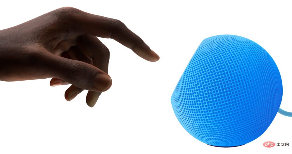
The HomePod mini's top surface lights up with colorful Siri animations, but it can't actually display any kind of content or controls. The fact that the HomePod mini has volume controls printed on its face hinders any kind of visual impact. However, HomePod mini is designed to complement almost any space. The bright colors introduced last year help add a touch of fun to otherwise drab rooms.
The HomePod mini’s illuminated surface is on top of the device, but I recommend Apple adjust the angle of the surface and add a proper touchscreen. The new angle will allow users to use controls and view content more easily. It will be better and add more utility to the product.

HomePod mini is already powered by the Apple Watch's S5 chip and runs a variant of iOS called audioOS. The technology is already in place to power small smart displays. The smart display's software could be based on watchOS or even use an Apple Watch face.
Apple Watch Faces
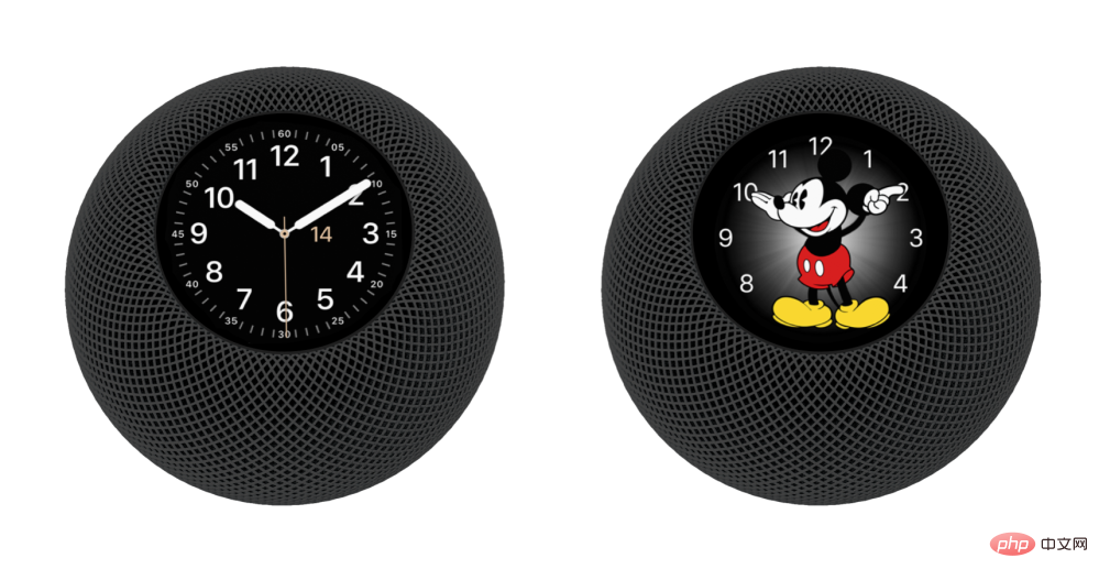
What I like to call the "HomePod touch" starts with a customizable clock and lets you choose from several round Apple Watch faces . You can see below how the utility and Mickey Mouse's face look on HomePod. This new feature will turn HomePod mini into an especially good bedside alarm clock.

App Controls
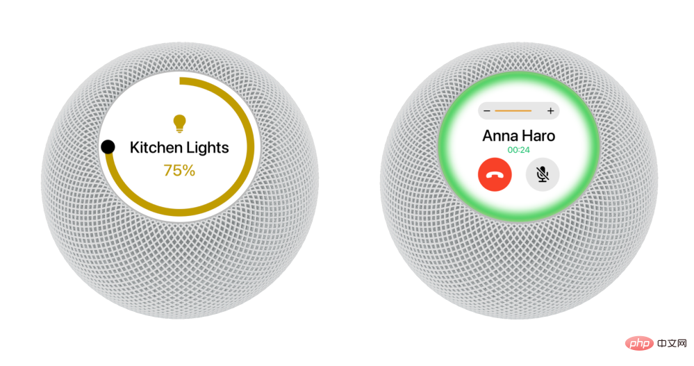
But the clock isn’t the main reason HomePod mini gets a display. It should get the utility shown. You can ask Siri to reveal tactile home controls for lights and other accessories. HomePod mini is great for calls because it offers vastly improved audio. The display can show the name of the person you're talking to, mute button, end button, call duration, and more.
The space gray HomePod touch will have a consistent black background that perfectly matches the watchOS user interface. White HomePod Touch enables the use of a durable white background that complements the product's physical design. I imagine the HomePod uses an LCD rather than an OLED touch to allow for a long-lasting bright colorful background, especially since the display will always be on, eliminating any fear of burnout and keeping the price low.

Media Controls
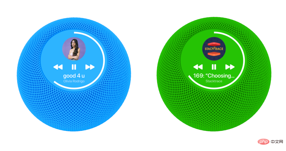
The HomePod mini’s primary function is as a speaker. It's perfect for Apple Music, Apple Podcasts, and Apple TV speakers. Currently, you can use double- and triple-tap to move between content, but the display will showcase album artwork and more controls. Circular displays can even be used for smooth ring-shaped progress indicators.
Click the album cover to fill the entire circular display. A simple flick on the album cover moves you forward and backward.

Fun, Fresh Colors
New colors Apple launched for HomePod mini in November Brought fresh air. Yellows and oranges in particular really brighten up a space. These colors are hard to come by and have helped the HomePod mini grow in popularity.
For the HomePod touch, Apple is offering green, blue, and pink options as well as white and space gray. They both have matching braided cables like the standard HomePod mini and rubber bottoms to secure them to a table.

Pricing Strategy
HomePod touch will effectively Become the current HomePod mini with its great speakers and small Retina display. The current HomePod mini sells for $99, and the HomePod touch will effectively add an Apple Watch built-in. You could look at the $199 Apple Watch Series 3, minus all the health sensors, water resistance, and more expensive materials. The ideal price for the HomePod touch is $199, making it a clear step up from the HomePod mini.
The display and additional features will make a great case for any consumer shopping for a simple home smart speaker. Customers who already own a HomePod mini can seamlessly add HomePod touch to their current setup. You can even create a stereo pair using HomePod touch and HomePod mini.
The above is the detailed content of Concept: How Apple turned the HomePod mini into a delightful and adorable smart display. For more information, please follow other related articles on the PHP Chinese website!

