
 TopicsexcelPractical Excel skills sharing: 5 small steps to help you create a high-quality line chart
Practical Excel skills sharing: 5 small steps to help you create a high-quality line chart

Line charts are a very common way of displaying data in our daily data visualization, and I think everyone is already familiar with it. Line charts are very simple and everyone can make them, but the line charts produced by different people vary widely. Most people's line charts are generated by directly inserting the default line chart style. Regardless of whether they have made such a line chart carefully, the boss is tired of looking at it just because of this style. Today, this article will teach you how to make a high-quality line chart. Let’s take a look!

Everyone who knows a little bit about statistics knows that when conducting descriptive statistical analysis of data, it is usually necessary to highlight the highest value, lowest value and mean value of a certain set of data. . Such as the highest, lowest and average income in different cities, or the highest, lowest and average scores in different subjects.

Usually, the effect of graphing may look like the picture above, but such graphs cannot express the data very intuitively, so today Xiaobai will explain to you a different one. The idea of making a chart, the effect is as shown in the picture below. Friends who want to learn can follow Xiaobai to draw pictures together.

The ideas for making charts are as follows:
Prepare the drawing data, insert the "line chart with data markers", set the lines to None, and set the markers , then add high and low point connecting lines in the "Design" tab, and finally beautify the chart to complete the entire chart.

Step 01 Enter relevant data. Enter the plotting data we need in Excel, as shown in the figure below.

Step 02 Frame select the data, in the "Insert" tab - Insert chart - select "Line chart with data markers", and then click "OK" "Generate a chart, the operation is as shown in the figure below.


Step 03 Adjust the line chart
① Set the position of each element in the chart and delete unnecessary elements in the chart. Click the legend in the chart, set the legend format to display at the top, and delete the grid lines. The operation is as shown in the figure below.


② Click on the vertical coordinate axis and set the maximum value of the vertical coordinate axis to 100 and the unit size to 20. Click on the horizontal axis, set the line to black, solid line, and set the font to Microsoft Yahei and the color to black. The operation is as shown in the figure below.


Step 04 Set up the line chart
① Click the chart, click the "Design" tab in the chart tool - "Add Chart Elements", drop down and select "Line" - add "High and Low Point Connecting Line", the operation is as shown in the figure below.
② Insert a text box at the bottom of the chart to indicate the data source to illustrate the reliability and accuracy of the data source. The operation is shown in the figure below.

③ Insert a square-shaped red color block to attract readers’ attention. Then adjust the chart width. The specific effect is as shown in the figure below.


Step 05 Beautify the chart. At work, you can beautify charts according to the tones that you or your boss like. In this way, you can unknowingly cultivate your own aesthetic tones in the process of making charts.

Okay, that’s it for today’s explanation. The best way to learn something is to try to do it again, so practice and consolidation after class is very important. . If you still have questions during the practice, you can watch the video below, so you don’t have to worry about not learning!
Related learning recommendations: excel tutorial
The above is the detailed content of Practical Excel skills sharing: 5 small steps to help you create a high-quality line chart. For more information, please follow other related articles on the PHP Chinese website!

 MEDIAN formula in Excel - practical examplesApr 11, 2025 pm 12:08 PM
This tutorial explains how to calculate the median of numerical data in Excel using the MEDIAN function. The median, a key measure of central tendency, identifies the middle value in a dataset, offering a more robust representation of central tenden
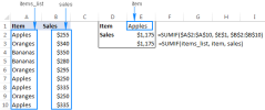
 Google Spreadsheet COUNTIF function with formula examplesApr 11, 2025 pm 12:03 PM
Master Google Sheets COUNTIF: A Comprehensive Guide This guide explores the versatile COUNTIF function in Google Sheets, demonstrating its applications beyond simple cell counting. We'll cover various scenarios, from exact and partial matches to han
 Excel shared workbook: How to share Excel file for multiple usersApr 11, 2025 am 11:58 AM
This tutorial provides a comprehensive guide to sharing Excel workbooks, covering various methods, access control, and conflict resolution. Modern Excel versions (2010, 2013, 2016, and later) simplify collaborative editing, eliminating the need to m
 How to convert Excel to JPG - save .xls or .xlsx as image fileApr 11, 2025 am 11:31 AM
This tutorial explores various methods for converting .xls files to .jpg images, encompassing both built-in Windows tools and free online converters. Need to create a presentation, share spreadsheet data securely, or design a document? Converting yo
 Excel names and named ranges: how to define and use in formulasApr 11, 2025 am 11:13 AM
This tutorial clarifies the function of Excel names and demonstrates how to define names for cells, ranges, constants, or formulas. It also covers editing, filtering, and deleting defined names. Excel names, while incredibly useful, are often overlo
 Standard deviation Excel: functions and formula examplesApr 11, 2025 am 11:01 AM
This tutorial clarifies the distinction between standard deviation and standard error of the mean, guiding you on the optimal Excel functions for standard deviation calculations. In descriptive statistics, the mean and standard deviation are intrinsi
 Square root in Excel: SQRT function and other waysApr 11, 2025 am 10:34 AM
This Excel tutorial demonstrates how to calculate square roots and nth roots. Finding the square root is a common mathematical operation, and Excel offers several methods. Methods for Calculating Square Roots in Excel: Using the SQRT Function: The
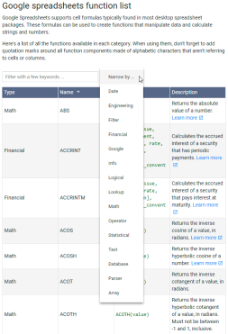 Google Sheets basics: Learn how to work with Google SpreadsheetsApr 11, 2025 am 10:23 AM
Unlock the Power of Google Sheets: A Beginner's Guide This tutorial introduces the fundamentals of Google Sheets, a powerful and versatile alternative to MS Excel. Learn how to effortlessly manage spreadsheets, leverage key features, and collaborate


Hot AI Tools

Undresser.AI Undress
AI-powered app for creating realistic nude photos

AI Clothes Remover
Online AI tool for removing clothes from photos.

Undress AI Tool
Undress images for free

Clothoff.io
AI clothes remover

Video Face Swap
Swap faces in any video effortlessly with our completely free AI face swap tool!

Hot Article
Hot Tools

SublimeText3 Mac version
God-level code editing software (SublimeText3)

SublimeText3 Chinese version
Chinese version, very easy to use

Dreamweaver CS6
Visual web development tools

Notepad++7.3.1
Easy-to-use and free code editor

WebStorm Mac version
Useful JavaScript development tools

