Home >Backend Development >Python Tutorial >Eight popular Python visualization toolkits, which one do you like?
Eight popular Python visualization toolkits, which one do you like?
- WBOYWBOYWBOYWBOYWBOYWBOYWBOYWBOYWBOYWBOYWBOYWBOYWBforward
- 2023-04-11 23:43:212228browse

Hello everyone, I am Python Artificial Intelligence Technology
Friends who like to use Python to do projects will inevitably encounter this situation: when making charts, Which good-looking and practical visualization toolkit should you use? When beautiful charts appear in previous articles, readers always leave messages in the background asking what tool was used to make the chart. Below, the author introduces eight visualization tool packages implemented in Python, some of which can also be used in other languages. Come and try which one do you like?
There are many ways to create graphics in Python, but which method is best? Before we do visualization, we must first clarify some questions about the image target: Do you want to have a preliminary understanding of the distribution of the data? Want to impress people when you present? Maybe you want to show someone an inner image, a middle-of-the-road image?
This article will introduce some commonly used Python visualization packages, including the advantages and disadvantages of these packages and what scenarios they are suitable for. This article only extends to 2D charts, leaving some space for the next talk about 3D charts and business reports (dashboard). However, many of the packages I will talk about this time can support 3D charts and business reports well.
Matplotlib, Seaborn and Pandas
There are several reasons to put these three packages together: First, Seaborn and Pandas are built on Matplotlib. When you When using df.plot() in Seaborn or Pandas, you are actually using code written by others using Matplotlib. Therefore, the graphics are similar in terms of beautification, and the syntax used when customizing the graphics is also very similar.
When it comes to these visualization tools, three words come to mind: Exploratory, Data, and Analysis. These packages are great for exploring data for the first time, but they are not enough for presentations.
Matplotlib is a lower-level library, but the level of customization it supports is incredible (so don’t simply exclude it from the demo packages!), but there are others A tool more suitable for presentation.
Matplotlib also has style selection, which emulates popular beautification tools like ggplot2 and xkcd. Here is an example plot I made using Matplotlib and related tools:
When processing basketball team salary data, I wanted to find the team with the highest median salary. To show the results, I color-coded the salaries of each team into a bar chart to illustrate which team a player would be better off joining.
import seaborn as sns
import matplotlib.pyplot as plt
color_order = ['xkcd:cerulean', 'xkcd:ocean',
 'xkcd:black','xkcd:royal purple',
 'xkcd:royal purple', 'xkcd:navy blue',
'xkcd:powder blue', 'xkcd:light maroon',
 'xkcd:lightish blue','xkcd:navy']
sns.barplot(x=top10.Team,
 y=top10.Salary,
 palette=color_order).set_title('Teams with Highest Median Salary')
plt.ticklabel_format(style='sci', axis='y', scilimits=(0,0))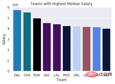
The second graph is the Q-Q plot of the residuals from the regression experiment. The main purpose of this diagram is to show how to create a useful diagram with as few lines as possible, although it may not be as beautiful.
import matplotlib.pyplot as plt
import scipy.stats as stats
#model2 is a regression model
log_resid = model2.predict(X_test)-y_test
stats.probplot(log_resid, dist="norm", plot=plt)
plt.title("Normal Q-Q plot")
plt.show()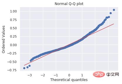
Ultimately, Matplotlib and its related tools have proven to be very efficient, but they are not the best tools when it comes to presentation.
ggplot(2)
You may ask, "Aaron, ggplot is the most commonly used visualization package in R, but don't you want to write a Python package? ”. People have implemented ggplot2 in Python, replicating everything about this package from beautification to syntax.
In all the materials I've looked at, everything about it looks a lot like ggplot2, but the nice thing about this package is that it relies on the Pandas Python package. However, the Pandas Python package has recently deprecated some methods, resulting in incompatible Python versions.
If you want to use real ggplot in R (the look, feel, and syntax are the same except for dependencies), I discussed this in another article .
In other words, if you must use ggplot in Python, then you must install version 0.19.2 of Pandas, but I suggest you not to use lower-level plotting package while downgrading the Pandas version.
The reason why ggplot2 (I think also includes Python's ggplot) is important is that they use "graphic grammar" to construct pictures. The basic premise is that you can instantiate a graph and then add different features separately; that is, you can beautify the title, axes, data points, trend lines, etc. separately.
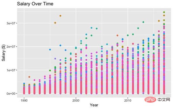
The following is a simple example of ggplot code. We first instantiate the plot with ggplot, set the beautification properties and data, and then add points, themes, and axis and title labels. In addition, search the public account Linux to learn how to reply "git books" in the background and get a surprise gift package.
#All Salaries
ggplot(data=df, aes(x=season_start, y=salary, colour=team)) +
 geom_point() +
 theme(legend.position="none") +
 labs(title = 'Salary Over Time', x='Year', y='Salary ($)')
Bokeh
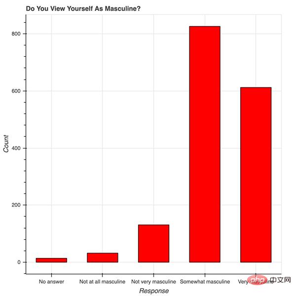
Bokeh 很美。从概念上讲,Bokeh 类似于 ggplot,它们都是用图形语法来构建图片,但 Bokeh 具备可以做出专业图形和商业报表且便于使用的界面。为了说明这一点,我根据 538 Masculinity Survey 数据集写了制作直方图的代码:
import pandas as pd
from bokeh.plotting import figure
from bokeh.io import show
# is_masc is a one-hot encoded dataframe of responses to the question:
# "Do you identify as masculine?"
#Dataframe Prep
counts = is_masc.sum()
resps = is_masc.columns
#Bokeh
p2 = figure(title='Do You View Yourself As Masculine?',
 x_axis_label='Response',
 y_axis_label='Count',
 x_range=list(resps))
p2.vbar(x=resps, top=counts, width=0.6, fill_color='red', line_color='black')
show(p2)
#Pandas
counts.plot(kind='bar')
用 Bokeh 表示调查结果
红色的条形图表示 538 个人关于「你认为自己有男子汉气概吗?」这一问题的答案。9~14 行的 Bokeh 代码构建了优雅且专业的响应计数直方图——字体大小、y 轴刻度和格式等都很合理。
我写的代码大部分都用于标记坐标轴和标题,以及为条形图添加颜色和边框。在制作美观且表现力强的图片时,我更倾向于使用 Bokeh——它已经帮我们完成了大量美化工作。
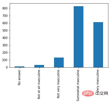
用 Pandas 表示相同的数据
蓝色的图是上面的第 17 行代码。这两个直方图的值是一样的,但目的不同。在探索性设置中,用 Pandas 写一行代码查看数据很方便,但 Bokeh 的美化功能非常强大。
Bokeh 提供的所有便利都要在 matplotlib 中自定义,包括 x 轴标签的角度、背景线、y 轴刻度以及字体(大小、斜体、粗体)等。下图展示了一些随机趋势,其自定义程度更高:使用了图例和不同的颜色和线条。
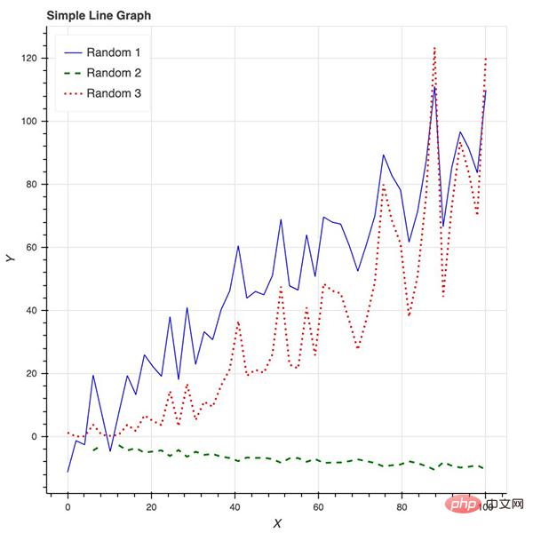
Bokeh 还是制作交互式商业报表的绝佳工具。
Plotly
Plotly 非常强大,但用它设置和创建图形都要花费大量时间,而且都不直观。在用 Plotly 忙活了大半个上午后,我几乎什么都没做出来,干脆直接去吃饭了。我只创建了不带坐标标签的条形图,以及无法删掉线条的「散点图」。Ploty 入门时有一些要注意的点:
- 安装时要有 API 秘钥,还要注册,不是只用 pip 安装就可以;
- Plotly 所绘制的数据和布局对象是独一无二的,但并不直观;
- 图片布局对我来说没有用(40 行代码毫无意义!)
但它也有优点,而且设置中的所有缺点都有相应的解决方法:
- 你可以在 Plotly 网站和 Python 环境中编辑图片;
- 支持交互式图片和商业报表;
- Plotly 与 Mapbox 合作,可以自定义地图;
- 很有潜力绘制优秀图形。
以下是我针对这个包编写的代码:
#plot 1 - barplot
# **note** - the layout lines do nothing and trip no errors
data = [go.Bar(x=team_ave_df.team,
 y=team_ave_df.turnovers_per_mp)]
layout = go.Layout(
 title=go.layout.Title(
 text='Turnovers per Minute by Team',
 xref='paper',
 x=0
 ),
 xaxis=go.layout.XAxis(
 title = go.layout.xaxis.Title(
 text='Team',
 font=dict(
 family='Courier New, monospace',
 size=18,
 color='#7f7f7f'
 )
 )
 ),
 yaxis=go.layout.YAxis(
 title = go.layout.yaxis.Title(
 text='Average Turnovers/Minute',
 font=dict(
 family='Courier New, monospace',
 size=18,
 color='#7f7f7f'
 )
 )
 ),
 autosize=True,
 hovermode='closest')
py.iplot(figure_or_data=data, layout=layout, filename='jupyter-plot', sharing='public', fileopt='overwrite')
#plot 2 - attempt at a scatterplot
data = [go.Scatter(x=player_year.minutes_played,
 y=player_year.salary,
 marker=go.scatter.Marker(color='red',
 size=3))]
layout = go.Layout(title="test",
 xaxis=dict(title='why'),
 yaxis=dict(title='plotly'))
py.iplot(figure_or_data=data, layout=layout, filename='jupyter-plot2', sharing='public')
[Image: image.png]
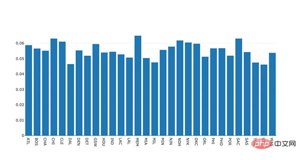
表示不同 NBA 球队每分钟平均失误数的条形图。
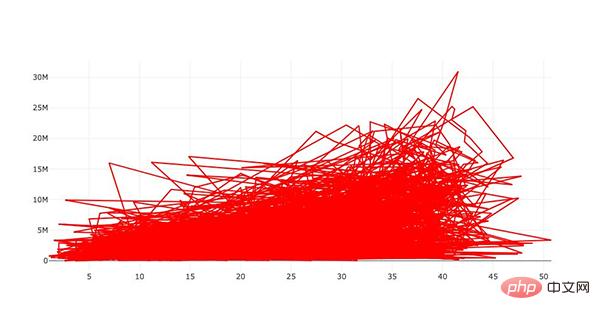
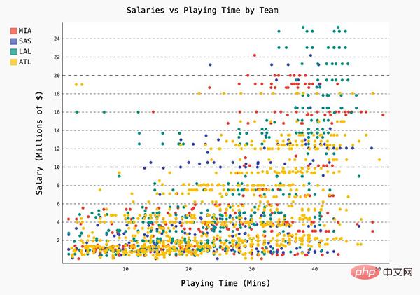
表示薪水和在 NBA 的打球时间之间关系的散点图
总体来说,开箱即用的美化工具看起来很好,但我多次尝试逐字复制文档和修改坐标轴标签时却失败了。但下面的图展示了 Plotly 的潜力,以及我为什么要在它身上花好几个小时:
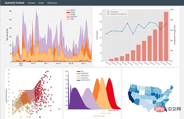
Plotly 页面上的一些示例图
Pygal
Pygal 的名气就不那么大了,和其它常用的绘图包一样,它也是用图形框架语法来构建图像的。由于绘图目标比较简单,因此这是一个相对简单的绘图包。使用 Pygal 非常简单:
- 实例化图片;
- 用图片目标属性格式化;
- 用 figure.add() 将数据添加到图片中。
我在使用 Pygal 的过程中遇到的主要问题在于图片渲染。必须要用 render_to_file 选项,然后在 web 浏览器中打开文件,才能看见我刚刚构建的东西。
最终看来这是值得的,因为图片是交互式的,有令人满意而且便于自定义的美化功能。总而言之,这个包看起来不错,但在文件的创建和渲染部分比较麻烦。
Networkx
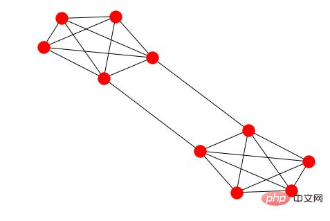
虽然 Networkx 是基于 matplotlib 的,但它仍是图形分析和可视化的绝佳解决方案。图形和网络不是我的专业领域,但 Networkx 可以快速简便地用图形表示网络之间的连接。以下是我针对一个简单图形构建的不同的表示,以及一些从斯坦福 SNAP 下载的代码(关于绘制小型 Facebook 网络)。
我按编号(1~10)用颜色编码了每个节点,代码如下:
options = {
 'node_color' : range(len(G)),
 'node_size' : 300,
 'width' : 1,
 'with_labels' : False,
 'cmap' : plt.cm.coolwarm
}
nx.draw(G, **options)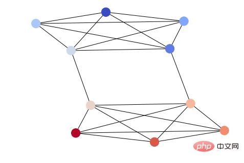
用于可视化上面提到的稀疏 Facebook 图形的代码如下:
import itertools
import networkx as nx
import matplotlib.pyplot as plt
f = open('data/facebook/1684.circles', 'r')
circles = [line.split() for line in f]
f.close()
network = []
for circ in circles:
 cleaned = [int(val) for val in circ[1:]]
 network.append(cleaned)
G = nx.Graph()
for v in network:
 G.add_nodes_from(v)
edges = [itertools.combinations(net,2) for net in network]
for edge_group in edges:
 G.add_edges_from(edge_group)
options = {
 'node_color' : 'lime',
 'node_size' : 3,
 'width' : 1,
 'with_labels' : False,
}
nx.draw(G, **options)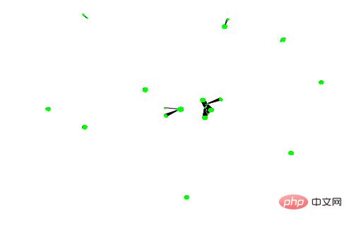
这个图形非常稀疏,Networkx 通过最大化每个集群的间隔展现了这种稀疏化。
有很多数据可视化的包,但没法说哪个是最好的。希望阅读本文后,你可以了解到在不同的情境下,该如何使用不同的美化工具和代码。
The above is the detailed content of Eight popular Python visualization toolkits, which one do you like?. For more information, please follow other related articles on the PHP Chinese website!

