


You have to throw away when comparing goods, and you have to die when comparing people to others - you can see the power of comparison! Therefore, who doesn’t want to make the data more intuitive and convincing through comparison. Then don’t miss this whirlwind chart tutorial that specializes in data comparison, otherwise you will be despised by your boss and colleagues for not being able to express data comparison.

#The cyclone chart is the most commonly used data comparison chart in our work. In the cyclone chart, the two charts are back to back, with the vertical coordinates in the same direction and the horizontal coordinates in opposite directions.


Today we will share with you two ways to make a whirlwind image.
As shown in the table below, we take the data of male and female fans in major cities of a certain platform as an example and create a whirlwind chart to compare the situation of male and female users.

1. Use bar chart to make
We can complete the whirlwind chart through bar chart It is made, but the process will be a bit complicated. Below we will share with you the production steps.
(1) After selecting the data, click [Insert] and select [Clustered Bar Chart] in [Bar Chart].


(2) Pay attention to the ordinate of the chart. The order is opposite to the order of the data. We need to adjust it. Select the vertical axis title, right-click [Format Axis], and check [Reverse Category].

Now male and female fans share the abscissa - the main coordinate. According to the needs of the cyclone chart, we need to use an abscissa for men and women, so that different scales can be set. The method is to set the abscissa coordinate of male or female fans as the secondary coordinate.
(3) Click the yellow female fan bar chart, right-click and select [Format Data Series] to set this series as secondary coordinates.

Now men and women use an abscissa, but the origin of the coordinates is on the left and the coordinate directions are the same, so the bars overlap. We need the coordinate origin to be in the middle of the chart, with the two coordinate directions opposite to each other.
(4) Set the scale value range of the primary and secondary coordinate axes to between -1500 and 1200 respectively, and then set the secondary coordinate to [reverse scale value].

Key points:
Why aren’t the minimum and maximum coordinate values here set to symmetrical -1500, 1500? That's because the abscissa scale area (not the scale value) of Excel is fixed. When the positive and negative scales of the left and right abscissas of the two sets of coordinates are the same, the coordinate origins of the male and female bar charts coincide, and there is no blank space to place the ordinate label. , as follows:

If you want to retain the ordinate label and prevent it from overlapping with the bar chart, you must move the secondary ordinate to the left and the primary ordinate to the right. shift. Therefore, we can only move the secondary (primary) vertical coordinate to the left (right) without changing the scale area by reducing the positive value of the coordinate. As follows:

(5) Select two bar charts respectively, then right-click and select [Add Data Label], the effect is as follows.

(6) Adjust the color of the male and female series bar chart.

(7) Delete redundant elements such as grid lines, chart titles, axis titles, etc., and set the legend to the top.

(8) Modify the text font and color.

(9) Adjust the bar chart gap width to 60% to make the overall chart more beautiful and harmonious.

In this way, we have completed the production of a whirlwind chart comparing male and female users. As shown in the figure below:

2. Use conditional formatting to do
In addition to the regular insertion of bar charts In addition, we can also create such a comparison chart through conditional formatting.
Steps :
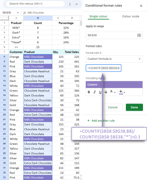
(1) First we need to reorganize the data and place the cities among male and female users. Set the column width of the left and right groups of data cells to 30, and set the data in the cells to be left-aligned and right-aligned respectively.

(2) Select the data in column E, click [Conditional Formatting] in the [Home] tab, and select [Light Blue Data Bar] in [Data Bar] 】Solid filling.

# (3) After adding the data bar, we see that the data bar is aligned to the left. Now we need to adjust it to the right. Click any blue cell, then click the [Home] tab [Conditional Formatting], select [Manage Rules], and open the [Conditional Formatting Rule Manager].

(4) Click [Edit Rules] and set the bar chart direction to right to left in the [Bar Chart Appearance] setting area.

# (5) Repeat step 2 to set column G to purple bar fill.

The colored bars now overlap the numbers. We need to increase the maximum value of the bar in the cell, shorten the current bar, and separate the two.
(6) Select the blue and purple cells respectively, click [Conditional Formatting] and select [Manage Rules], click [Edit Rules] in the pop-up dialog box, and select the data bar [Type] as numbers and set the minimum value to 0 and the maximum value to 1200. This separates the bars from the numbers.

# (7) Finally modify the text size, color, and background fill color to beautify the table.

This method of making a whirlwind image is simple and crude! I believe that only very few friends would think of such a method. It saves so much time compared to the chart method!
Summary:
We completed the production of the cyclone diagram in two ways. Not all charts must be completed through the chart function. Sometimes it may be better to do it from another angle. So which way do you prefer? Welcome to leave a message for discussion.
Related learning recommendations: excel tutorial
The above is the detailed content of Excel chart learning: using whirlwind charts for data comparison. For more information, please follow other related articles on the PHP Chinese website!

 MEDIAN formula in Excel - practical examplesApr 11, 2025 pm 12:08 PM
This tutorial explains how to calculate the median of numerical data in Excel using the MEDIAN function. The median, a key measure of central tendency, identifies the middle value in a dataset, offering a more robust representation of central tenden
 Google Spreadsheet COUNTIF function with formula examplesApr 11, 2025 pm 12:03 PM
Master Google Sheets COUNTIF: A Comprehensive Guide This guide explores the versatile COUNTIF function in Google Sheets, demonstrating its applications beyond simple cell counting. We'll cover various scenarios, from exact and partial matches to han
 Excel shared workbook: How to share Excel file for multiple usersApr 11, 2025 am 11:58 AM
This tutorial provides a comprehensive guide to sharing Excel workbooks, covering various methods, access control, and conflict resolution. Modern Excel versions (2010, 2013, 2016, and later) simplify collaborative editing, eliminating the need to m
 How to convert Excel to JPG - save .xls or .xlsx as image fileApr 11, 2025 am 11:31 AM
This tutorial explores various methods for converting .xls files to .jpg images, encompassing both built-in Windows tools and free online converters. Need to create a presentation, share spreadsheet data securely, or design a document? Converting yo
 Excel names and named ranges: how to define and use in formulasApr 11, 2025 am 11:13 AM
This tutorial clarifies the function of Excel names and demonstrates how to define names for cells, ranges, constants, or formulas. It also covers editing, filtering, and deleting defined names. Excel names, while incredibly useful, are often overlo
 Standard deviation Excel: functions and formula examplesApr 11, 2025 am 11:01 AM
This tutorial clarifies the distinction between standard deviation and standard error of the mean, guiding you on the optimal Excel functions for standard deviation calculations. In descriptive statistics, the mean and standard deviation are intrinsi
 Square root in Excel: SQRT function and other waysApr 11, 2025 am 10:34 AM
This Excel tutorial demonstrates how to calculate square roots and nth roots. Finding the square root is a common mathematical operation, and Excel offers several methods. Methods for Calculating Square Roots in Excel: Using the SQRT Function: The
 Google Sheets basics: Learn how to work with Google SpreadsheetsApr 11, 2025 am 10:23 AM
Unlock the Power of Google Sheets: A Beginner's Guide This tutorial introduces the fundamentals of Google Sheets, a powerful and versatile alternative to MS Excel. Learn how to effortlessly manage spreadsheets, leverage key features, and collaborate


Hot AI Tools

Undresser.AI Undress
AI-powered app for creating realistic nude photos

AI Clothes Remover
Online AI tool for removing clothes from photos.

Undress AI Tool
Undress images for free

Clothoff.io
AI clothes remover

AI Hentai Generator
Generate AI Hentai for free.

Hot Article
Hot Tools

SublimeText3 English version
Recommended: Win version, supports code prompts!

SecLists
SecLists is the ultimate security tester's companion. It is a collection of various types of lists that are frequently used during security assessments, all in one place. SecLists helps make security testing more efficient and productive by conveniently providing all the lists a security tester might need. List types include usernames, passwords, URLs, fuzzing payloads, sensitive data patterns, web shells, and more. The tester can simply pull this repository onto a new test machine and he will have access to every type of list he needs.

SAP NetWeaver Server Adapter for Eclipse
Integrate Eclipse with SAP NetWeaver application server.

VSCode Windows 64-bit Download
A free and powerful IDE editor launched by Microsoft

EditPlus Chinese cracked version
Small size, syntax highlighting, does not support code prompt function

