

 TopicsexcelExcel chart learning stacked column chart comparison (actual and target comparison case)
Excel chart learning stacked column chart comparison (actual and target comparison case)


Everyone knows that EXCEL charts have many types, such as column charts, bar charts, line charts, pie charts, etc. Everyone makes the same charts at work, so how do you use the simplest data to make a high-end chart? Today I will share with you an Excel stacked column chart comparison case.
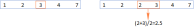
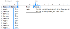
As shown below, this is a sales data of the company's salesmen, listing the sales volume of each salesperson and the indicators that need to be completed.

The picture below is the final effect of the chart we are going to learn to make today. The chart is equipped with arrows that clearly list whether each salesperson has completed the target and the gap between the target and the target. The downward arrow indicates that the indicator is below the indicator, and the upward arrow indicates that the indicator is above the indicator. How to make this comparison histogram? Hurry up and learn!

1. Add auxiliary column
How to use Excel to make a histogram? First we need to make several auxiliary columns based on the source data. Here we will explain to you how to make the auxiliary columns of each series based on the color of the chart series.

means if the sales is less than the target, return the difference otherwise return empty.
means if the sales is less than the target, return the sales minus 10 otherwise return empty.
2. Insert chart
Then you can insert the chart based on the auxiliary column. Hold down the Ctrl key, select cells A3:A9 and D3:H9 respectively, click under the Insert tab, insert column chart - stacked column chart.

3. Modify the chart type
Now you need to modify the chart type of the red arrow and cyan arrow series to "with Line chart with data markers." When you click on the chart, the chart tool will appear on the upper tab. Click "Change Chart Type" in the design tab below the chart tool.

4. Format setting
4.1 Modify the line chart without lines
The line chart in the chart with connecting lines is modified to have no lines.

4.2 Data series fill color
Now modify this data series to the color you want. Double-click the data series, select Fill-Solid Color Fill under the series options in the "Format Data Series" window on the right, and select the corresponding color.

to connect The next step is to change the data markers into arrows. Click on the Insert tab, then Shape - Arrow:.

Double-click the arrow, in the "Format Shape" window on the right, modify the arrow color to be the same as the red series color, and the line to "no line".

Click the arrow to copy, and then click the red series data label to paste. In the same way, you can click the red arrow to copy the cyan arrow, rotate it 180 degrees, modify the color without lines, and then copy and paste it on the cyan series data label. Complete as follows:

4.4 Add data label
Then click on the red series and cyan series, and click the plus sign on the upper right side of the chart respectively , add data label—centered.

4.5 Other modifications
Finally make other modifications, click on the legend below and press Delete to delete.

#Double-click the chart area, set the color in "Format Chart Area" on the right, and fill it with a solid color.

Modify the chart title. The final result is as follows.

How about it, have you learned it?
Related learning recommendations: excel tutorial
The above is the detailed content of Excel chart learning stacked column chart comparison (actual and target comparison case). For more information, please follow other related articles on the PHP Chinese website!

 MEDIAN formula in Excel - practical examplesApr 11, 2025 pm 12:08 PM
This tutorial explains how to calculate the median of numerical data in Excel using the MEDIAN function. The median, a key measure of central tendency, identifies the middle value in a dataset, offering a more robust representation of central tenden
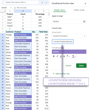 Google Spreadsheet COUNTIF function with formula examplesApr 11, 2025 pm 12:03 PM
Master Google Sheets COUNTIF: A Comprehensive Guide This guide explores the versatile COUNTIF function in Google Sheets, demonstrating its applications beyond simple cell counting. We'll cover various scenarios, from exact and partial matches to han
 Excel shared workbook: How to share Excel file for multiple usersApr 11, 2025 am 11:58 AM
This tutorial provides a comprehensive guide to sharing Excel workbooks, covering various methods, access control, and conflict resolution. Modern Excel versions (2010, 2013, 2016, and later) simplify collaborative editing, eliminating the need to m
 How to convert Excel to JPG - save .xls or .xlsx as image fileApr 11, 2025 am 11:31 AM
This tutorial explores various methods for converting .xls files to .jpg images, encompassing both built-in Windows tools and free online converters. Need to create a presentation, share spreadsheet data securely, or design a document? Converting yo
 Excel names and named ranges: how to define and use in formulasApr 11, 2025 am 11:13 AM
This tutorial clarifies the function of Excel names and demonstrates how to define names for cells, ranges, constants, or formulas. It also covers editing, filtering, and deleting defined names. Excel names, while incredibly useful, are often overlo
 Standard deviation Excel: functions and formula examplesApr 11, 2025 am 11:01 AM
This tutorial clarifies the distinction between standard deviation and standard error of the mean, guiding you on the optimal Excel functions for standard deviation calculations. In descriptive statistics, the mean and standard deviation are intrinsi
 Square root in Excel: SQRT function and other waysApr 11, 2025 am 10:34 AM
This Excel tutorial demonstrates how to calculate square roots and nth roots. Finding the square root is a common mathematical operation, and Excel offers several methods. Methods for Calculating Square Roots in Excel: Using the SQRT Function: The
 Google Sheets basics: Learn how to work with Google SpreadsheetsApr 11, 2025 am 10:23 AM
Unlock the Power of Google Sheets: A Beginner's Guide This tutorial introduces the fundamentals of Google Sheets, a powerful and versatile alternative to MS Excel. Learn how to effortlessly manage spreadsheets, leverage key features, and collaborate


Hot AI Tools

Undresser.AI Undress
AI-powered app for creating realistic nude photos

AI Clothes Remover
Online AI tool for removing clothes from photos.

Undress AI Tool
Undress images for free

Clothoff.io
AI clothes remover

AI Hentai Generator
Generate AI Hentai for free.

Hot Article
Hot Tools

ZendStudio 13.5.1 Mac
Powerful PHP integrated development environment

SublimeText3 Mac version
God-level code editing software (SublimeText3)

Notepad++7.3.1
Easy-to-use and free code editor

SublimeText3 Linux new version
SublimeText3 Linux latest version

MantisBT
Mantis is an easy-to-deploy web-based defect tracking tool designed to aid in product defect tracking. It requires PHP, MySQL and a web server. Check out our demo and hosting services.

