


This article will take you through the Flex layout in CSS3, I hope it will be helpful to you!

Introduction
What is Flex layout
Flex is the abbreviation of Flexible Box , also known as flexbox layout.
Flex layout composition:
- flex container (
flex container) - flex items (
flex items) - main axis
main axis - cross axis
cross axis

The role of Flex layout
Before flex layout appeared, the web page layout methods were standard flow, floating, positioning, etc. It is relatively troublesome to solve more complex problems. [Learning video sharing: css video tutorial, web front-end]
And flex layout can be:
- Automatic elastic scaling
- Easily design a flexible responsive layout structure
- Precisely and flexibly control the layout of block-level boxes
- Applicable to both PC and mobile terminals
Flex container (parent element) property
First define the Flex container before using flex layout.
display:flex;
After defining the Flex container, you can use the corresponding attributes to change the layout of the sub-elements so that the sub-elements can be automatically squeezed or stretched.
Corresponding attributes:
1. justify-content  主轴元素对齐方式
2. align-items      交叉轴元素对齐方式
3. flex-direction   设置主轴方向
4. flex-wrap        主轴一行满了换行
5. align-content    交叉轴行对齐方式
6. flex-flow        同时设置 flex-direction和 flex-wrap属性
1. justify-content
The justify-content attribute of the container can set the child element in Alignment of main axis direction. (Remember to display:flex;define the container first)
justify-content: center;//居中对齐

justify-content: space-between;//间距在子元素之间

justify-content: space-evenly;//主轴方向所有地方的间距都相等
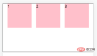
justify-content: space-around;//间距加在子元素的两侧(中间大的是两个子元素的加在一起)

Code:
<!DOCTYPE html>
<html>


  <head>
    <meta charset="UTF-8">
    <meta http-equiv="X-UA-Compatible" content="IE=edge">
    <meta name="viewport" content="width=device-width, initial-scale=1.0">
    <title>主轴对齐方式</title>
    <style>
      * {
        margin: 0;
        padding: 0;
      }


      .box {
        display: flex;


        /* justify-content: center; */
        /* justify-content: space-between; */
        /* justify-content: space-evenly; */
        justify-content: space-around;

        height: 200px;
        margin: auto;
        border: 1px solid #000;
      }

      .box div {
        width: 100px;
        height: 100px;
        background-color: pink;
      }
    </style>
  </head>


  <body>
    <div>
      <div>1</div>
      <div>2</div>
      <div>3</div>
    </div>
  </body>


</html>
2. align-items
The align-items attribute of the container can be set to The alignment of the element in the cross-axis direction .
From this we can set the container attributes justify-content and align-items to be centered so that the element can be perfectly centered.
align-items: center;//居中
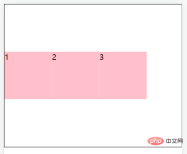
align-items: stretch;//拉伸,默认值(现有状态,这里测试去掉子级的高度)
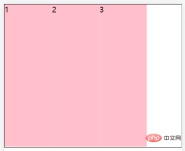
align-items: flex-start;//将子元素在容器顶部对齐
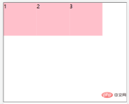
align-items: flex-end;//将子元素在容器底部对齐

Code:
<!DOCTYPE html>
<html>
  <head>
    <meta charset="UTF-8">
    <meta http-equiv="X-UA-Compatible" content="IE=edge">
    <meta name="viewport" content="width=device-width, initial-scale=1.0">
    <title>交叉轴对齐方式</title>
    <style>
      * {
        margin: 0;
        padding: 0;
      }


      .father {
        display: flex;
        /* 居中 */
        /* align-items: center; */


        /* 拉伸,默认值(现有状态,测试的时候去掉子级的高度) */
        /* align-items: stretch; */


        /* align-items: flex-start; */
        align-items: flex-end;
        height: 300px;
        margin: auto;
        border: 1px solid #000;
      }

      .father div {
        /* 如果不设置宽,由内容撑开 */
        width: 100px;
        height: 100px;
        background-color: pink;
      }
    </style>
  </head>


  <body>
    <div>
      <div>1</div>
      <div>2</div>
      <div>3</div>
    </div>
  </body>


</html>
3. flex-direction
The flex-direction property of the container can change the main axis direction of the flex layout. The default flex spindle direction is horizontal to the right. If you change the main axis direction, the cross axis direction will also change.
flex-direction: column;//主轴方向为垂直方向(从上到下)

flex-direction: column-reverse;//主轴方向为垂直方向(从下到上)

flex-direction: row;//主轴方向为水平方向(从左到右)

flex-direction: row-reverse;//主轴方向为水平方向(从右到左)

Achieve vertical centering after modifying the main axis direction :
display:flex;
flex-direction: column;
justify-content: center;

4. flex-wrap
After defining the flex container, if the child element passes If the width exceeds the main axis direction, the child elements in the container will automatically expand and contract.
Such as:
nbsp;html>


    <meta>
    <meta>
    <meta>
    <title>弹性盒子换行</title>
    <style>
      * {
        margin: 0;
        padding: 0;
      }


      .box {
        display: flex;
        height: 500px;
        border: 1px solid #000;
      }

      .box div {
        width: 100px;
        height: 100px;
        background-color: pink;
      }
    </style>


    <div>
      <div>1</div>
      <div>2</div>
      <div>3</div>
      <div>4</div>
      <div>5</div>
      <div>6</div>
      <div>7</div>
      <div>8</div>
      <div>9</div>
    </div>

Solution: The flex-wrap property of the container can make sub-elements beyond the main axis of the container display in new lines.
flex-wrap: nowrap;//默认值,不换行
flex-wrap: wrap;//换行,从上到下

flex-wrap: wrap-reverse;//换行,从下到上

5. align-content
##align- of the container The content attribute can adjust the alignment of sub-element rows ( needs to be set first and then ).
align-content: center;//居中对齐
align-content: space-around;//间距加在子元素的两侧(中间大的是两个子元素的加在一起)
align-content: space-between;//间距在子元素之间
前三者的属性跟主轴对齐方式一样就不再赘述。
align-content: stretch;拉伸,默认值(现有状态,这里测试去掉子级的高度)

6.flex-flow
flex-flow属性是用于同时设置 flex-direction 和 flex-wrap 属性的简写属性。
flex-flow: row wrap;
Flex项(子元素)属性
我们可以设置相应属性让flex 容器的直接子元素成为弹性(flex)项目。(在使用flex布局之前首先定义 Flex 容器。)
相应属性:
1. flex-grow
2. flex-shrink
3. flex-basis
4. flex
5. align-self
6. order
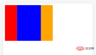
1. flex-grow
使用flex-grow属性来定义弹性盒子内部子元素的放大比例(当所有子元素宽度之和小于父元素的宽度时子元素如何分配父元素的剩余空间)。
nbsp;html>


    <meta>
    <meta>
    <meta>
    <title>Document</title>
    <style>
      .father{
        display:flex;
        width:200px;
        height:150px;
      }


      .box1{
        /* 没有设置宽度 */
        background:red;
        flex-grow: 1;
      }


      .box2{
        background:blue;
        flex-grow: 2;
      }


      .box3{
        background:orange;
        flex-grow: 1;
      }
    </style>


    <div>
      <div></div>
      <div></div>
      <div></div>
    </div>
2. flex-shrink
使用flex-shrink属性来定义弹性盒子内部子元素的缩小比例(当所有子元素宽度之和大于父元素的宽度时子元素如何缩小自己的宽度)。
nbsp;html>


    <meta>
    <meta>
    <meta>
    <title>Document</title>
    <style>
      .father{
        display:flex;
        width:200px;
        height:150px;
      }


      .box1{
        width: 100px;
        background:red;
        flex-shrink: 1;
      }


      .box2{
        width: 100px;
        background:blue;
        flex-shrink: 2;
      }


      .box3{
        width: 100px;
        background:orange;
        flex-shrink: 1;
      }
    </style>


    <div>
      <div></div>
      <div></div>
      <div></div>
    </div>

3. flex-basis
使用flex-basis属性来设置子元素的宽度,默认值为auto(作用跟width一样,优先级比width高,就算width在后面也会显示flex-basis)。
4. flex
使用flex属性来同时设置flex-grow、flex-shrink、flex-basis这3个属性,flex属性就是一个复合属性。
实际应用一般用复合属性。
语法:
flex: grow shrink basis;//顺序不能改变,默认值为0 1 auto;
5. align-self
使用align-self属性设置子元素项目的对齐方式。
注意:align-self属性会覆盖容器的 align-items 属性所设置的对齐方式。
nbsp;html>


    <meta>
    <meta>
    <meta>
    <title>Document</title>
    <style>
      .father{
        display:flex;
        width:200px;
        height:150px;
        align-items: center;
        border: 1px solid #000;
      }


      .box1{
        width: 100px;
        height: 50px;
        background:red;
        align-self: flex-start;
      }


      .box2{
        width: 100px;
        height: 50px;
        background:blue;
      }


      .box3{
        width: 100px;
        height: 50px;
        background:orange;
      }
    </style>


    <div>
      <div>1</div>
      <div>2</div>
      <div>3</div>
    </div>

6. order
使用order属性来定义子元素的排列顺序。
nbsp;html>


    <meta>
    <meta>
    <meta>
    <title>Document</title>
    <style>
      .father{
        display:flex;
        width:200px;
        height:150px;
      }


      .box1{
        width: 100px;
        background:red;
        order: 2;
      }


      .box2{
        width: 100px;
        background:blue;
        order: 1;
      }


      .box3{
        width: 100px;
        background:orange;
        order: 3;
      }
    </style>


    <div>
      <div>1</div>
      <div>2</div>
      <div>3</div>
    </div>

更多编程相关知识,请访问:编程视频!!
The above is the detailed content of A detailed explanation of Flex layout in CSS3. For more information, please follow other related articles on the PHP Chinese website!

 @keyframes vs CSS Transitions: What is the difference?May 14, 2025 am 12:01 AM
@keyframesandCSSTransitionsdifferincomplexity:@keyframesallowsfordetailedanimationsequences,whileCSSTransitionshandlesimplestatechanges.UseCSSTransitionsforhovereffectslikebuttoncolorchanges,and@keyframesforintricateanimationslikerotatingspinners.
 Using Pages CMS for Static Site Content ManagementMay 13, 2025 am 09:24 AM
I know, I know: there are a ton of content management system options available, and while I've tested several, none have really been the one, y'know? Weird pricing models, difficult customization, some even end up becoming a whole &
 The Ultimate Guide to Linking CSS Files in HTMLMay 13, 2025 am 12:02 AM
Linking CSS files to HTML can be achieved by using elements in part of HTML. 1) Use tags to link local CSS files. 2) Multiple CSS files can be implemented by adding multiple tags. 3) External CSS files use absolute URL links, such as. 4) Ensure the correct use of file paths and CSS file loading order, and optimize performance can use CSS preprocessor to merge files.
 CSS Flexbox vs Grid: a comprehensive reviewMay 12, 2025 am 12:01 AM
Choosing Flexbox or Grid depends on the layout requirements: 1) Flexbox is suitable for one-dimensional layouts, such as navigation bar; 2) Grid is suitable for two-dimensional layouts, such as magazine layouts. The two can be used in the project to improve the layout effect.
 How to Include CSS Files: Methods and Best PracticesMay 11, 2025 am 12:02 AM
The best way to include CSS files is to use tags to introduce external CSS files in the HTML part. 1. Use tags to introduce external CSS files, such as. 2. For small adjustments, inline CSS can be used, but should be used with caution. 3. Large projects can use CSS preprocessors such as Sass or Less to import other CSS files through @import. 4. For performance, CSS files should be merged and CDN should be used, and compressed using tools such as CSSNano.
 Flexbox vs Grid: should I learn them both?May 10, 2025 am 12:01 AM
Yes,youshouldlearnbothFlexboxandGrid.1)Flexboxisidealforone-dimensional,flexiblelayoutslikenavigationmenus.2)Gridexcelsintwo-dimensional,complexdesignssuchasmagazinelayouts.3)Combiningbothenhanceslayoutflexibilityandresponsiveness,allowingforstructur
 Orbital Mechanics (or How I Optimized a CSS Keyframes Animation)May 09, 2025 am 09:57 AM
What does it look like to refactor your own code? John Rhea picks apart an old CSS animation he wrote and walks through the thought process of optimizing it.
 CSS Animations: Is it hard to create them?May 09, 2025 am 12:03 AM
CSSanimationsarenotinherentlyhardbutrequirepracticeandunderstandingofCSSpropertiesandtimingfunctions.1)Startwithsimpleanimationslikescalingabuttononhoverusingkeyframes.2)Useeasingfunctionslikecubic-bezierfornaturaleffects,suchasabounceanimation.3)For


Hot AI Tools

Undresser.AI Undress
AI-powered app for creating realistic nude photos

AI Clothes Remover
Online AI tool for removing clothes from photos.

Undress AI Tool
Undress images for free

Clothoff.io
AI clothes remover

Video Face Swap
Swap faces in any video effortlessly with our completely free AI face swap tool!

Hot Article
Hot Tools

WebStorm Mac version
Useful JavaScript development tools

mPDF
mPDF is a PHP library that can generate PDF files from UTF-8 encoded HTML. The original author, Ian Back, wrote mPDF to output PDF files "on the fly" from his website and handle different languages. It is slower than original scripts like HTML2FPDF and produces larger files when using Unicode fonts, but supports CSS styles etc. and has a lot of enhancements. Supports almost all languages, including RTL (Arabic and Hebrew) and CJK (Chinese, Japanese and Korean). Supports nested block-level elements (such as P, DIV),

MantisBT
Mantis is an easy-to-deploy web-based defect tracking tool designed to aid in product defect tracking. It requires PHP, MySQL and a web server. Check out our demo and hosting services.

SublimeText3 Chinese version
Chinese version, very easy to use

ZendStudio 13.5.1 Mac
Powerful PHP integrated development environment

