

 Web Front-endCSS TutorialDetailed explanation of how to use pure CSS to realize the fade animation of multi-line text
Detailed explanation of how to use pure CSS to realize the fade animation of multi-line text

This article will explore some interesting text animations in multi-line text situations. Compared with single-line text, the scene of multi-line text is more complicated. However, in actual business, there are also a lot of multi-line text, but its effect processing will be more difficult than single-line text.

【Learning video sharing: css video tutorial, web front-end】
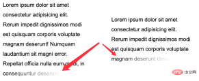
Single line and Fade out multi-line text
First, let’s look at an example where we want to implement such a single line text fade out:

Using mask, you can easily achieve this effect, just:
<p>Lorem ipsum dolor sit amet consectetur.</p>
p {
    mask: linear-gradient(90deg, #fff, transparent);
}
But what if the scene becomes multiple lines? We need to fade out the last line of multi-line text and adapt it to different multi-line scenarios:
This is a little more complicated, but there are many This can be achieved in several ways.
First let’s look at how to use background.
Use <span style="font-size: 18px;">background</span> Implementation
Here will use a The trick is that the background display form of display: inline inline elements is the same as display: block block-level elements (or inline-block, flex, grid) are inconsistent.
A simple example:
<p>Lorem .....</p>
<a>Lorem .....</a>
It should be noted here that the <p></p> element is a block-level element, and is an inline element.
We add a gradient background color from green to blue to them:
p, a {
  background: linear-gradient(90deg, blue, green);
}
Look at the effect:

What? What does it mean? The difference is obvious. The background of block-level elements is a gradient as a whole, while each row of inline elements has a different effect, and the whole is connected in series to form a whole.
Based on this feature, we can construct such a layout:
<p><a>Mollitia nostrum placeat consequatur deserunt velit ducimus possimus commodi temporibus debitis quam</a></p>
p {
    position: relative;
    width: 400px;
}

a {
    background: linear-gradient(90deg, transparent, transparent 70%, #fff);
    background-repeat: no-repeat;
    cursor: pointer;
    color: transparent;

    &::before {
        content: "Mollitia nostrum placeat consequatur deserunt velit ducimus possimus commodi temporibus debitis quam";
        position: absolute;
        top: 0;
        left: 0;
        color: #000;
        z-index: -1;
    }
}
An explanation is needed here:
In order to take advantage of the actual inline elements The
backgroundfeature, we need to wrap the actual text inside the inline element<a></a>The actual text, using
opacity: 0is hidden. The actual displayed text uses the pseudo-element of the<a></a>element, and sets its level to-1. The purpose is to allow the background of the parent element to cover it

element is from transparent to white, using the white behind to gradually cover the text.
a {
    background: linear-gradient(90deg, rgba(0,0,0, .8), rgba(0,0,0, .9) 70%, rgba(255, 255, 255, .9));
} 
CodePen Demo -- Text fades away
Of course, this solution has many problems, such as usingz-index: -1, if the parent container sets a background color, it will be invalid, and it will not be easy to accurately locate the last row. Therefore, a better way is to use mask to solve it.
Use mask<span style="font-size: 18px;"></span> to achieve
Then, if you use mask, the problem will become simpler. We only need to implement two mask areas in one mask, one for accurately controlling the last line , a piece used to control the transparency of the remaining parts.
<p>Lorem ipsum dolor sit amet ....</p>
p {
    width: 300px;
    padding: 10px;
    line-height: 36px;
    mask:
        linear-gradient(270deg, transparent, transparent 30%, #000),
        linear-gradient(270deg, #000, #000);
    mask-size: 100% 46px, 100% calc(100% - 46px);
    mask-position: bottom, top;
    mask-repeat: no-repeat;
}
The effect is as follows: <p></p>

核心在于整个 mask 相关的代码,正如上面而言的,mask 将整个区域分成了两块进行控制:

在下部分这块,我们利用 mask 做了从右向左的渐隐效果。并且利用了 mask-position 定位,以及 calc 的计算,无论文本都多少行,都是适用的!需要说明的是,这里的 46px 的意思是单行文本的行高加上 padding-bottom 的距离。可以适配任意行数的文本:

完整的代码,你可以戳这里:CodePen Demo -- Text fades away 2
添加动画效果
好,看完静态的,我们再来实现一种**动态的文字渐隐消失。
整体的效果是当鼠标 Hover 到文字的时候,整个文本逐行逐渐消失。像是这样:

这里的核心在于,需要去适配不同的行数,不同的宽度,而且文字是一行一行的进行消失。
这里核心还是会运用上内联元素 background 的特性。在 妙用 background 实现花式文字效果 这篇文章中,我们介绍了这样一种技巧。
实现整段文字的渐现,从一种颜色到另外一种颜色:
<div>Button</div>
<p><a>Lorem ipsum dolor sit amet consectetur adipisicing elit. Mollitia nostrum placeat consequatur deserunt velit ducimus possimus commodi temporibus debitis quam, molestiae laboriosam sit repellendus sed sapiente quidem quod accusantium vero.</a></p>
a {
    background:
        linear-gradient(90deg, #999, #999),
        linear-gradient(90deg, #fc0, #fc0);
    background-size: 100% 100%, 0 100px;
    background-repeat: no-repeat;
    background-position: 100% 100%, 0 100%;
    color: transparent;
    background-clip: text;
}
.button:hover ~ p a {
    transition: .8s all linear;
    background-size: 0 100px, 100% 100%;
}
这里需要解释一下,虽然设置了 color: transparent,但是文字默认还是有颜色的,默认的文字颜色,是由第一层渐变赋予的 background: linear-gradient(90deg, #999, #999), linear-gradient(90deg, #fc0, #fc0),也就是这一层:linear-gradient(90deg, #999, #999)。

当 hover 触发时,linear-gradient(90deg, #999, #999) 这一层渐变逐渐消失,而另外一层 linear-gradient(90deg, #fc0, #fc0)` 逐渐出现,借此实现上述效果。
CodePen -- background-clip 文字渐现效果
好,我们可以借鉴这个技巧,去实现文字的渐隐消失。一层为实际的文本,而另外一层是进行动画的遮罩,进行动画的这一层,本身的文字设置为 color: transparent,这样,我们就只能看到背景颜色的变化。
大致的代码如下:
<p>
    <a>Mollitia nostrum placeat consequatur deserunt.</a>
    <a>Mollitia nostrum placeat consequatur deserunt.</a>
</p>
p {
    width: 500px;
}
.word {
    position: absolute;
    top: 0;
    left: 0;
    color: transparent;
    color: #000;
}
.pesudo {
    position: relative;
    background: linear-gradient(90deg, transparent, #fff 20%, #fff);
    background-size: 0 100%;
    background-repeat: no-repeat;
    background-position: 100% 100%;
    transition: all 3s linear;
    color: transparent;
}
p:hover .pesudo,
p:active .pesudo{
    background-size: 500% 100%;
}
其中,.word 为实际在底部,展示的文字层,而 pesudo 为叠在上方的背景层,hover 的时候,触发上方元素的背景变化,逐渐遮挡住下方的文字,并且,能适用于不同长度的文本。

当然,上述方案会有一点瑕疵,我们无法让不同长度的文本整体的动画时间一致。当文案数量相差不大时,整体可以接受,文案相差数量较大时,需要分别设定下 transition-duration 的时长。
完整的 DEMO,你可以戳:CodePen -- Text fades away Animation
原文地址:https://www.cnblogs.com/coco1s/p/16590809.html
作者:ChokCoco
更多编程相关知识,请访问:编程视频!!
The above is the detailed content of Detailed explanation of how to use pure CSS to realize the fade animation of multi-line text. For more information, please follow other related articles on the PHP Chinese website!

 Weekly Platform News: Web Apps in Galaxy Store, Tappable Stories, CSS SubgridApr 14, 2025 am 11:20 AM
In this week's roundup: Firefox gains locksmith-like powers, Samsung's Galaxy Store starts supporting Progressive Web Apps, CSS Subgrid is shipping in Firefox
 Weekly Platform News: Internet Explorer Mode, Speed Report in Search Console, Restricting Notification PromptsApr 14, 2025 am 11:15 AM
In this week's roundup: Internet Explorer finds its way into Edge, Google Search Console touts a new speed report, and Firefox gives Facebook's notification
 The Power (and Fun) of Scope with CSS Custom PropertiesApr 14, 2025 am 11:11 AM
You’re probably already at least a little familiar with CSS variables. If not, here’s a two-second overview: they are really called custom properties, you set
 We Are ProgrammersApr 14, 2025 am 11:04 AM
Building websites is programming. Writing HTML and CSS is programming. I am a programmer, and if you're here, reading CSS-Tricks, chances are you're a
 How Do You Remove Unused CSS From a Site?Apr 14, 2025 am 10:59 AM
Here's what I'd like you to know upfront: this is a hard problem. If you've landed here because you're hoping to be pointed at a tool you can run that tells
 An Introduction to the Picture-in-Picture Web APIApr 14, 2025 am 10:57 AM
Picture-in-Picture made its first appearance on the web in the Safari browser with the release of macOS Sierra in 2016. It made it possible for a user to pop
 Ways to Organize and Prepare Images for a Blur-Up Effect Using GatsbyApr 14, 2025 am 10:56 AM
Gatsby does a great job processing and handling images. For example, it helps you save time with image optimization because you don’t have to manually
 Oh Hey, Padding Percentage is Based on the Parent Element's WidthApr 14, 2025 am 10:55 AM
I learned something about percentage-based (%) padding today that I had totally wrong in my head! I always thought that percentage padding was based on the


Hot AI Tools

Undresser.AI Undress
AI-powered app for creating realistic nude photos

AI Clothes Remover
Online AI tool for removing clothes from photos.

Undress AI Tool
Undress images for free

Clothoff.io
AI clothes remover

AI Hentai Generator
Generate AI Hentai for free.

Hot Article
Hot Tools

SublimeText3 Mac version
God-level code editing software (SublimeText3)

Safe Exam Browser
Safe Exam Browser is a secure browser environment for taking online exams securely. This software turns any computer into a secure workstation. It controls access to any utility and prevents students from using unauthorized resources.

MantisBT
Mantis is an easy-to-deploy web-based defect tracking tool designed to aid in product defect tracking. It requires PHP, MySQL and a web server. Check out our demo and hosting services.

SecLists
SecLists is the ultimate security tester's companion. It is a collection of various types of lists that are frequently used during security assessments, all in one place. SecLists helps make security testing more efficient and productive by conveniently providing all the lists a security tester might need. List types include usernames, passwords, URLs, fuzzing payloads, sensitive data patterns, web shells, and more. The tester can simply pull this repository onto a new test machine and he will have access to every type of list he needs.

ZendStudio 13.5.1 Mac
Powerful PHP integrated development environment

