Home >Web Front-end >Vue.js >How to adapt the Vite project to the screen? Two options to share
How to adapt the Vite project to the screen? Two options to share
- 青灯夜游forward
- 2022-09-30 18:09:242963browse
How to adapt the Vite project to the screen? The following article will share with you two solutions for screen adaptation of the Vite project. It is very detailed. Come and collect it to learn!

Recently, Xiaomei, a student in the project team, seems to have encountered a difficult problem, and she always looks depressed.
With the intention that we are all a project team and should help each other and solve problems together, I sent a message to Xiaomei.
Me: "I see that you haven't been very happy recently. Have you encountered any problems?"
Xiaomei: "I have been checking the information on screen adaptation of the vue3 project recently and found online information. It’s all related to vue2 webpack. I don’t know how to adapt to the vite project? o(╥﹏╥)o”. [Related recommendations: vuejs video tutorial]
Me: "OK, leave it to brother, I'll help you settle it!"
Xiaomei: "❤( ´ ・ᴗ・` )❤”
If you think the article is good or helpful to your own development, please like and collect it! ❤❤❤
rem-based adaptation scheme
What is rem?
rem refers to the unit of font size relative to the root element. In the daily development process, we usually set the font of the root element (html/body) to 10px, which is convenient for us to calculate (at this time 1rem of a child element is equivalent to 10px).
Applicable scenarios
Web applications with no fixed aspect ratio, suitable for most business scenarios
Project actual combat
1. Installation dependencies
npm i postcss-pxtorem autoprefixer amfe-flexible --save-dev
## that is compatible with many current browsers. #2. Create the project root directorypostcss-pxtorem is a plug-in for PostCSS, used to generate rem units from pixel units
autoprefixer Browse The browser prefix processing plug-in
amfe-flexible scalable layout solution replaces the originallib-flexibleand uses theviewport
postcss.config.js file
 ##
##
module.exports = {
	plugins: {
		autoprefixer: {
			overrideBrowserslist: [
				"Android 4.1",
				"iOS 7.1",
				"Chrome > 31",
				"ff > 31",
				"ie >= 8",
				"last 10 versions", // 所有主流浏览器最近10版本用
			],
			grid: true,
		},
		"postcss-pxtorem": {
			rootValue: 192, // 设计稿宽度的1/ 10 例如设计稿按照 1920设计 此处就为192
			propList: ["*", "!border"], // 除 border 外所有px 转 rem
			selectorBlackList: [".el-"], // 过滤掉.el-开头的class,不进行rem转换
		},
	},
};
3, main.ts/js
Import dependencies in the file<pre class="brush:php;toolbar:false">import "amfe-flexible/index.js";</pre>4. Restart the project
In CSS3, we can use the transform attribute scale() method to achieve the scaling effect of elements. Zoom refers to the meaning of "zooming out" and "zooming in".
transform: scaleX(x); / Scale along the x-axis direction/- transform: scaleY(y); / Scale along the y-axis direction/
- transform : scale(); / Scale along the x-axis and y-axis simultaneously/
Web applications with fixed aspect ratio, such as large screens or Fixed window business application

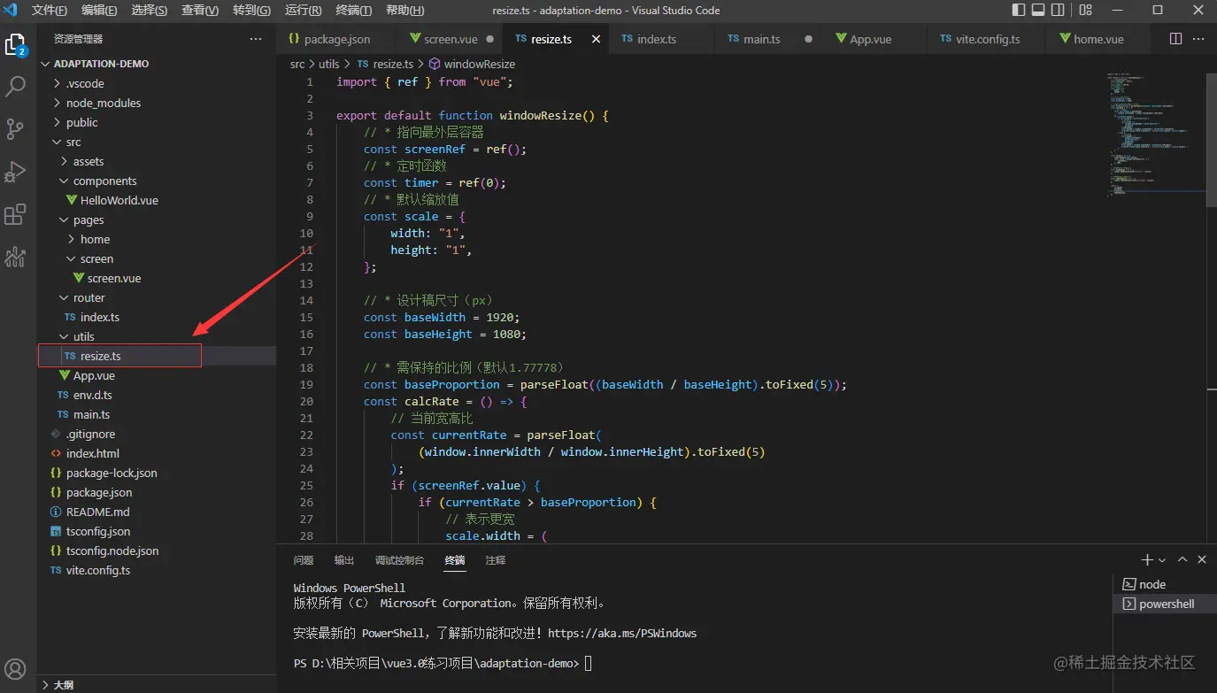
1. Create a new
resize.ts/js file
import { ref } from "vue";

export default function windowResize() {
	// * 指向最外层容器
	const screenRef = ref();
	// * 定时函数
	const timer = ref(0);
	// * 默认缩放值
	const scale = {
		width: "1",
		height: "1",
	};

	// * 设计稿尺寸(px)
	const baseWidth = 1920;
	const baseHeight = 1080;

	// * 需保持的比例(默认1.77778)
	const baseProportion = parseFloat((baseWidth / baseHeight).toFixed(5));
	const calcRate = () => {
		// 当前宽高比
		const currentRate = parseFloat(
			(window.innerWidth / window.innerHeight).toFixed(5)
		);
		if (screenRef.value) {
			if (currentRate > baseProportion) {
				// 表示更宽
				scale.width = (
					(window.innerHeight * baseProportion) /
					baseWidth
				).toFixed(5);
				scale.height = (window.innerHeight / baseHeight).toFixed(5);
				screenRef.value.style.transform = `scale(${scale.width}, ${scale.height})`;
			} else {
				// 表示更高
				scale.height = (
					window.innerWidth /
					baseProportion /
					baseHeight
				).toFixed(5);
				scale.width = (window.innerWidth / baseWidth).toFixed(5);
				screenRef.value.style.transform = `scale(${scale.width}, ${scale.height})`;
			}
		}
	};

	const resize = () => {
		clearTimeout(timer.value);
		timer.value = window.setTimeout(() => {
			calcRate();
		}, 200);
	};

	// 改变窗口大小重新绘制
	const windowDraw = () => {
		window.addEventListener("resize", resize);
	};

	// 改变窗口大小重新绘制
	const unWindowDraw = () => {
		window.removeEventListener("resize", resize);
	};

	return {
		screenRef,
		calcRate,
		windowDraw,
		unWindowDraw,
	};
}
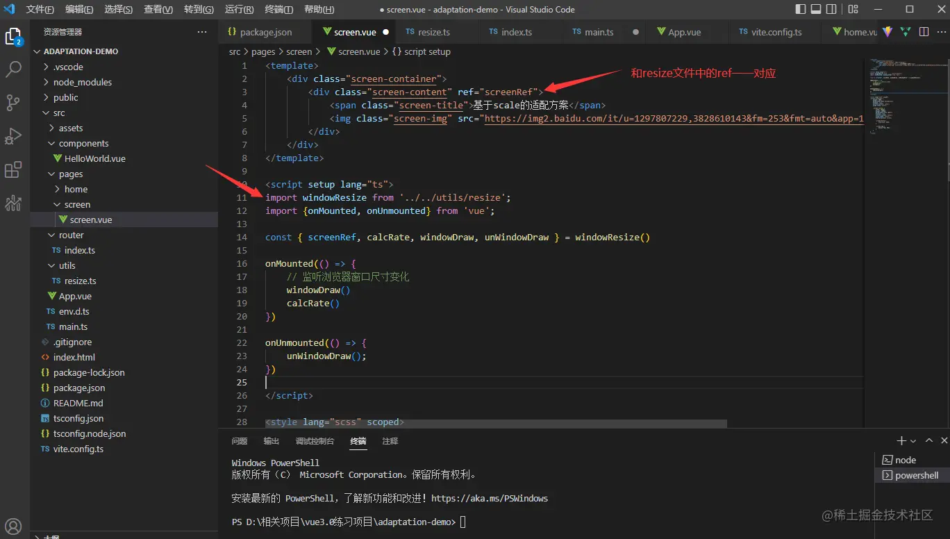
 2. Relevant interface introductionresize.ts/js
<template>
<div>
<div>
<span>基于scale的适配方案</span>
<img src="/static/imghwm/default1.png" data-src="https://img2.baidu.com/it/u=1297807229,3828610143&fm=253&fmt=auto&app=138&f=JPEG?w=500&h=281" class="lazy" alt="How to adapt the Vite project to the screen? Two options to share" >
</div>
</div>
</template>
<script>
import windowResize from '../../utils/resize';
import {onMounted, onUnmounted} from 'vue';
const { screenRef, calcRate, windowDraw, unWindowDraw } = windowResize()
onMounted(() => {
// 监听浏览器窗口尺寸变化
windowDraw()
calcRate()
})
onUnmounted(() => {
unWindowDraw();
})
</script>
<style>
.screen-container {
height: 100%;
background-color: lightcyan;
display: flex;
justify-content: center;
align-items: center;
.screen-content {
width: 1920px;
height: 1080px;
background-color: #fff;
display: flex;
justify-content: center;
align-items: center;
flex-direction: column;
.screen-title {
font-size: 32px;
}
.screen-img {
margin-top: 20px;
}
}
}
</style>
 Write at the end
Recommend open source projects participated by two authors. If the project is helpful to you, please star it!
A simple
backend management project based on Vue3, TS, Vite, qiankun technology stack: www.xkxk.techA simple one based on Vue3 , Vite’s
: screen.xkxk.tech (Learning video sharing:
The above is the detailed content of How to adapt the Vite project to the screen? Two options to share. For more information, please follow other related articles on the PHP Chinese website!
Related articles
See more- Vite3.0 is released, take a look at the new features of Vite3.0
- Understand Vue3+Vite3 source code in seconds, as long as you know these 20 libraries!
- Let's talk about how to encapsulate axios in vite+vue3.0+ts?
- An article provides an in-depth analysis of the responsive mechanism in Vue3
- Let's talk about how to avoid empty classes when dynamically binding classes in Vue!
- Take you step by step to customize an image lazy loading instruction in Vue2

