Home >Web Front-end >Front-end Q&A >css % is relative to what
css % is relative to what
- 青灯夜游Original
- 2022-09-06 16:45:251951browse
css % is a value relative to the height, width or font size of the containing block. If it is static positioning or relative positioning, the containing block is generally its parent element, and % is relative to the parent element; if it is an absolutely positioned element, and the containing block is the nearest ancestor element with a non-static position, then % is relative to The ancestor element takes the value; if it is a fixed-positioned element and the containing block is the viewport, then % takes the value relative to the viewport.

The operating environment of this tutorial: Windows 7 system, CSS3&&HTML5 version, Dell G3 computer.
CSS %--Percentage
Percentage is a relative length unit, relative to the height, width or font size of the containing block (containing block) to get the value.
The concept of containing block cannot simply be understood as the parent element.
If it is static positioning and relative positioning, the containing block is generally its parent element.
If it is an absolutely positioned element, the containing block should be the nearest ancestor element whose position is a non-static attribute.
If it is a fixed-positioned element, its containing block is the viewport.
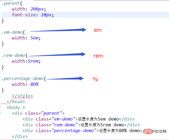
Implementation code:

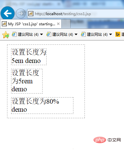
Result picture:

From the picture From the above, we can see that the first row of characters of the 5em div is set to exactly 5 characters in size, because as mentioned above, it is relative to the size of the current element font, and the width occupies 90px, 5 X 18 = 90px. Set the first line of characters of the 5rem div to be smaller, because as mentioned above, it is relative to the font size of the root element (the default browser size is 16px), which is smaller than 18px, and the width occupies 80px, 5 X 16 = 80px. Set the first row of the percentage display to be the largest, because as mentioned above, it is relative to the size ratio of the parent element. The width occupies 160px, 200 X 80% = 160px.
Use of percentage units in common scenarios
(1) Percentage in the box model
The box model in CSS contains the following attributes: : width, max-width, min-width, height, max-height, min-height, padding, margin, etc. These properties have different references when using percentages:
width, max-width, min-width: When the value is a percentage, it is calculated relative to the width of the containing block;
height, max-height, min-height: When the value is a percentage, it is calculated relative to the height of the containing block;
padding , margin: When the value is a percentage, if it is a horizontal value, it is calculated relative to the width of the containing block; if it is a vertical value, it is calculated relative to the height of the containing block.
(2) Percentage in text
The properties of text control in CSS include font-size, line-height, vertical-align, text-indent, etc. These attributes have different references when using percentages:
font-size: calculated based on the font-size of the parent element;
line-height: Calculated based on font-size;
vertical-align: Calculated based on line-height;
text-indent : If it is horizontal, it is calculated based on width, if it is vertical, it is calculated based on height.
(3) Percentage in positioning
In CSS, the top, right, bottom, and left that control the position position can all use percentage as the unit. The reference object is the width and height of the containing block in the same direction. Containing blocks with different positions are different:
If the element is static (static) or relatively positioned (relative), the containing block is generally its parent container;
If the element is absolutely positioned (absolute), the containing block should be the nearest ancestor element whose position is absolute, relative or fixed;
If the element is fixedly positioned ( fixed ), the containing block is the viewport ( viewport ).
(4) Percentage in transformation
The translate and transform-origin values in the transform attribute in CSS can also set the percentage.
translateX() is calculated based on the width of the container
translateY() is calculated based on the height of the container
Transform-origin The abscissa (x) is calculated relative to the width of the container; the ordinate (y) is calculated relative to the height of the container
Note that there is also a z-axis in translate The function translateZ(). It does not accept values in percentages.
Inheritance of percentage
If an element sets the percentage attribute, the descendant elements inherit the calculated value. For example:
p { font-size: 10px;line-height: 120%; }Then the value inherited by the child element of p is line-height: 12px, not line-height: 120%.
(Learning video sharing: web front-end development)
The above is the detailed content of css % is relative to what. For more information, please follow other related articles on the PHP Chinese website!

