In the previous article "Excel chart learning: How to make the chart move like a web page", we learned how to make the Excel chart move like a web page. Today we continue to share the tutorial on how to make Excel dynamic charts. There are even check boxes to select the data that need to be displayed! If anyone uses this chart to give a work report, I guarantee that the boss will look at you twice. Are you sure you don’t want to learn such a high-level and easy-to-learn dynamic chart?

1. Tutorial on making dynamic charts with Excel control
As shown below, the picture shows the company Expenditure status of various expenses from 2015 to 2017. When 2015 is checked, the data for 2015 will be displayed; when 2017 is checked, the data for 2017 will be displayed. This kind of dynamic chart will be very intuitive when displayed. Today we will learn to make an Excel dynamic chart with check boxes.

The original data is as follows:

Need to create a dynamic chart with the effect of the beginning of the article. By observing the renderings, we can see that the main ones are:
1. There are three check boxes on the left side of the top of the chart that can be selected or deselected;
2. When a year is selected, the chart will display the data of that year in real time; if it is deselected, it will be hidden;
3. The chart can display the data of three years at the same time, also You can not display the data of a year;
2. Steps to create Excel dynamic charts
( 1) Excel chart control production: Insert check box
Excel itself has check boxes in "Development Tools". But many people haven't found it because that feature is turned off by default and needs to be turned on manually.
Click the "File" button in the menu bar, find the "Options" button in the pop-up window, and click to open the excel file options window


In the excel options window, select "Customize Ribbon".

In the custom ribbon (B) on the right, select "Main Tab", we select the box in front of "Development Tools" and click OK. You can see the development tools option in the main menu bar


Select "Development Tools" in the menu bar and select Insert "Check Box", and then drag a check box directly in excel. Repeat the steps to drag a total of 3 checkboxes.

Select the check box, right-click, select "Edit Text" in the pop-up window, and change the text of the three check boxes to "2015", "2016" and "2017".

The effect is as follows:

(2) Construct cartographic data
Our main production idea is to construct an area containing all data for three years as the mapping data area. When a certain year is selected, the data for that year in the cartographic data area is real data; if it is not selected, the data area for that year in the cartographic data area is empty.
1. Set the cell that binds the check box value
When the check box is selected, the value of the linked cell is TRUE; when the check box When not selected, the value of the linked cell is FALSE.
Select the check box of "2015", right-click, select "Format Control" in the pop-up window, select the "Control" option in the pop-up window, and set the cell link to "$A $17”


At this time, if "2015" is selected, the value of cell A17 is TRUE; if it is not selected, the value of cell A17 is FALSE. The same setting is used for "2016", the cell link is "$A$18"; the cell link for "2017" is "$A$19".
2. Create dynamic chart data
As shown in the figure below, area 1 is the charting data we need.
A17, A18, and A19 are the link cells of the check box.
When "2015" is selected, the value of A17 is TRUE, and we copy the data of A3:I3 to B17:J17;
When "2015" is not selected When, the value of A17 is FALSE, we set the data of B17:J17 to empty.
To complete this setting, enter the formula in cell B17:
= IF($A17=TRUE,A3,""), pull down to the right and fill in 2015 year's data.

Formula analysis:
If the value of cell A17 is TRUE, the content of cell B17 is the content of cell A3, otherwise it is empty.
After this step, you can test it by unselecting 2015, the value of cell A17 becomes FALSE, and the data in area B17:J17 is cleared;

(3) Make a bar chart
Select the area B16:J19 as the drawing data, click "Insert"-"Bar Chart"-"Clustered Bar Chart" .

Drag the obtained bar chart position below the check box, double-click the icon title, and set the chart title to "Company Expenses from 2015 to 2017" , get the following effect.
(4) Excel chart beautification
Click to select the abscissa axis, right-click and select "Format Axis" , in the pop-up window, set the maximum value of the coordinate axis option to "100";
Click to select the grid line and press delete key to delete, the final effect is as follows.
3. Learning and Reflection
Dynamic graphics can switch to display different content on one picture , is a commonly used Excel advanced chart.
The main difficulty lies in the construction of mapping data. Because we need to add or delete data based on whether the check box is selected. So we need to first know whether the check box is selected, and use its cell link to directly reflect whether the check box is selected or not by whether the value of the linked cell is TRUE.
Use the IF function to determine the value of the corresponding link cell. If it is TRUE, the data of this year is copied to the cartographic data area; if it is FALSE, the data of this year is empty. The graph made using empty data is invisible, so the final result is that the selected years are displayed on the graph, and the unselected years are hidden on the graph.
I hope that through this tutorial on Excel dynamic charts, you can learn from one example and apply dynamic charts in your daily work!
Related learning recommendations: excel tutorial
The above is the detailed content of Excel chart learning: how to use controls to create bar charts. For more information, please follow other related articles on the PHP Chinese website!
 MEDIAN formula in Excel - practical examplesApr 11, 2025 pm 12:08 PM
This tutorial explains how to calculate the median of numerical data in Excel using the MEDIAN function. The median, a key measure of central tendency, identifies the middle value in a dataset, offering a more robust representation of central tenden
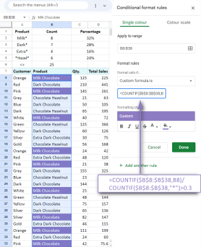 Google Spreadsheet COUNTIF function with formula examplesApr 11, 2025 pm 12:03 PM
Master Google Sheets COUNTIF: A Comprehensive Guide This guide explores the versatile COUNTIF function in Google Sheets, demonstrating its applications beyond simple cell counting. We'll cover various scenarios, from exact and partial matches to han
 Excel shared workbook: How to share Excel file for multiple usersApr 11, 2025 am 11:58 AM
This tutorial provides a comprehensive guide to sharing Excel workbooks, covering various methods, access control, and conflict resolution. Modern Excel versions (2010, 2013, 2016, and later) simplify collaborative editing, eliminating the need to m
 How to convert Excel to JPG - save .xls or .xlsx as image fileApr 11, 2025 am 11:31 AM
This tutorial explores various methods for converting .xls files to .jpg images, encompassing both built-in Windows tools and free online converters. Need to create a presentation, share spreadsheet data securely, or design a document? Converting yo
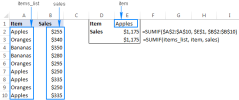 Excel names and named ranges: how to define and use in formulasApr 11, 2025 am 11:13 AM
This tutorial clarifies the function of Excel names and demonstrates how to define names for cells, ranges, constants, or formulas. It also covers editing, filtering, and deleting defined names. Excel names, while incredibly useful, are often overlo
 Standard deviation Excel: functions and formula examplesApr 11, 2025 am 11:01 AM
This tutorial clarifies the distinction between standard deviation and standard error of the mean, guiding you on the optimal Excel functions for standard deviation calculations. In descriptive statistics, the mean and standard deviation are intrinsi
 Square root in Excel: SQRT function and other waysApr 11, 2025 am 10:34 AM
This Excel tutorial demonstrates how to calculate square roots and nth roots. Finding the square root is a common mathematical operation, and Excel offers several methods. Methods for Calculating Square Roots in Excel: Using the SQRT Function: The
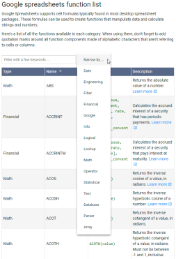 Google Sheets basics: Learn how to work with Google SpreadsheetsApr 11, 2025 am 10:23 AM
Unlock the Power of Google Sheets: A Beginner's Guide This tutorial introduces the fundamentals of Google Sheets, a powerful and versatile alternative to MS Excel. Learn how to effortlessly manage spreadsheets, leverage key features, and collaborate


Hot AI Tools

Undresser.AI Undress
AI-powered app for creating realistic nude photos

AI Clothes Remover
Online AI tool for removing clothes from photos.

Undress AI Tool
Undress images for free

Clothoff.io
AI clothes remover

Video Face Swap
Swap faces in any video effortlessly with our completely free AI face swap tool!

Hot Article

Hot Tools

SublimeText3 Linux new version
SublimeText3 Linux latest version

SublimeText3 Mac version
God-level code editing software (SublimeText3)

MantisBT
Mantis is an easy-to-deploy web-based defect tracking tool designed to aid in product defect tracking. It requires PHP, MySQL and a web server. Check out our demo and hosting services.

VSCode Windows 64-bit Download
A free and powerful IDE editor launched by Microsoft

EditPlus Chinese cracked version
Small size, syntax highlighting, does not support code prompt function


