

 Backend DevelopmentPython TutorialDetailed tutorial on drawing three-dimensional graphs in python

[Related recommendations: Python3 video tutorial]
This article only summarizes the most basic drawing methods.
1. Initialization
Assume that the matplotlib tool package has been installed.
Use matplotlib.figure.Figure to create a plot frame:
import matplotlib.pyplot as plt
from mpl_toolkits.mplot3d import Axes3D
fig = plt.figure()
ax = fig.add_subplot(111, projection='3d')
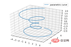
2. Line plots
Basic usage:
ax.plot(x,y,z,label=' ')
code:
import matplotlib as mpl
from mpl_toolkits.mplot3d import Axes3D
import numpy as np
import matplotlib.pyplot as plt

mpl.rcParams['legend.fontsize'] = 10

fig = plt.figure()
ax = fig.gca(projection='3d')
theta = np.linspace(-4 * np.pi, 4 * np.pi, 100)
z = np.linspace(-2, 2, 100)
r = z**2 + 1
x = r * np.sin(theta)
y = r * np.cos(theta)
ax.plot(x, y, z, label='parametric curve')
ax.legend()

plt.show()
3. Scatter plots
Basic usage:
ax.scatter(xs, ys, zs, s=20, c=None, depthshade=True, *args, *kwargs)
- xs,ys,zs: input data;
- s: size of scatter point
- c: color, such as c = 'r' is red;
- depthshase : Transparent, True is transparent, the default is True, False is opaque
- *args, etc. are expansion variables, such as maker = 'o', then the scatter result is the shape of 'o'
code:
from mpl_toolkits.mplot3d import Axes3D
import matplotlib.pyplot as plt
import numpy as np


def randrange(n, vmin, vmax):
    '''
    Helper function to make an array of random numbers having shape (n, )
    with each number distributed Uniform(vmin, vmax).
    '''
    return (vmax - vmin)*np.random.rand(n) + vmin

fig = plt.figure()
ax = fig.add_subplot(111, projection='3d')

n = 100

# For each set of style and range settings, plot n random points in the box
# defined by x in [23, 32], y in [0, 100], z in [zlow, zhigh].
for c, m, zlow, zhigh in [('r', 'o', -50, -25), ('b', '^', -30, -5)]:
    xs = randrange(n, 23, 32)
    ys = randrange(n, 0, 100)
    zs = randrange(n, zlow, zhigh)
    ax.scatter(xs, ys, zs, c=c, marker=m)

ax.set_xlabel('X Label')
ax.set_ylabel('Y Label')
ax.set_zlabel('Z Label')

plt.show()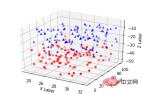
4. Wireframe plots
Basic usage:
ax.plot_wireframe(X, Y, Z, *args, **kwargs)
- X, Y, Z: Input data
- rstride: row step length
- cstride: column step length
- rcount: upper limit of row number
- ccount: upper limit of column number
code:
from mpl_toolkits.mplot3d import axes3d
import matplotlib.pyplot as plt


fig = plt.figure()
ax = fig.add_subplot(111, projection='3d')

# Grab some test data.
X, Y, Z = axes3d.get_test_data(0.05)

# Plot a basic wireframe.
ax.plot_wireframe(X, Y, Z, rstride=10, cstride=10)

plt.show()
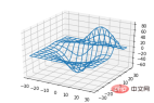
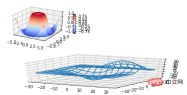
5. Surface plots
Basic usage:
ax.plot_surface(X, Y, Z, *args, **kwargs)
- X,Y,Z: data
- rstride, cstride, rcount, ccount: same as Wireframe plots definition
- color: surface color
- cmap: layer
code:
from mpl_toolkits.mplot3d import Axes3D
import matplotlib.pyplot as plt
from matplotlib import cm
from matplotlib.ticker import LinearLocator, FormatStrFormatter
import numpy as np


fig = plt.figure()
ax = fig.gca(projection='3d')

# Make data.
X = np.arange(-5, 5, 0.25)
Y = np.arange(-5, 5, 0.25)
X, Y = np.meshgrid(X, Y)
R = np.sqrt(X**2 + Y**2)
Z = np.sin(R)

# Plot the surface.
surf = ax.plot_surface(X, Y, Z, cmap=cm.coolwarm,
                       linewidth=0, antialiased=False)

# Customize the z axis.
ax.set_zlim(-1.01, 1.01)
ax.zaxis.set_major_locator(LinearLocator(10))
ax.zaxis.set_major_formatter(FormatStrFormatter('%.02f'))

# Add a color bar which maps values to colors.
fig.colorbar(surf, shrink=0.5, aspect=5)

plt.show()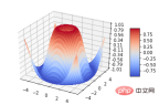
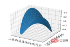
6. Tri-Surface plots
Basic usage:
ax.plot_trisurf(*args, **kwargs)
- X,Y,Z: data
- Other parameters are similar to surface-plot
code:
from mpl_toolkits.mplot3d import Axes3D
import matplotlib.pyplot as plt
import numpy as np


n_radii = 8
n_angles = 36

# Make radii and angles spaces (radius r=0 omitted to eliminate duplication).
radii = np.linspace(0.125, 1.0, n_radii)
angles = np.linspace(0, 2*np.pi, n_angles, endpoint=False)

# Repeat all angles for each radius.
angles = np.repeat(angles[..., np.newaxis], n_radii, axis=1)

# Convert polar (radii, angles) coords to cartesian (x, y) coords.
# (0, 0) is manually added at this stage,  so there will be no duplicate
# points in the (x, y) plane.
x = np.append(0, (radii*np.cos(angles)).flatten())
y = np.append(0, (radii*np.sin(angles)).flatten())

# Compute z to make the pringle surface.
z = np.sin(-x*y)

fig = plt.figure()
ax = fig.gca(projection='3d')

ax.plot_trisurf(x, y, z, linewidth=0.2, antialiased=True)

plt.show()
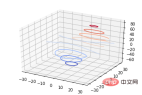
7. Contour plots
Basic usage:
ax.contour(X, Y, Z, *args, **kwargs)
code:
from mpl_toolkits.mplot3d import axes3d
import matplotlib.pyplot as plt
from matplotlib import cm

fig = plt.figure()
ax = fig.add_subplot(111, projection='3d')
X, Y, Z = axes3d.get_test_data(0.05)
cset = ax.contour(X, Y, Z, cmap=cm.coolwarm)
ax.clabel(cset, fontsize=9, inline=1)

plt.show()
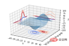
from mpl_toolkits.mplot3d import axes3d
from mpl_toolkits.mplot3d import axes3d
import matplotlib.pyplot as plt
from matplotlib import cm

fig = plt.figure()
ax = fig.gca(projection='3d')
X, Y, Z = axes3d.get_test_data(0.05)
ax.plot_surface(X, Y, Z, rstride=8, cstride=8, alpha=0.3)
cset = ax.contour(X, Y, Z, zdir='z', offset=-100, cmap=cm.coolwarm)
cset = ax.contour(X, Y, Z, zdir='x', offset=-40, cmap=cm.coolwarm)
cset = ax.contour(X, Y, Z, zdir='y', offset=40, cmap=cm.coolwarm)

ax.set_xlabel('X')
ax.set_xlim(-40, 40)
ax.set_ylabel('Y')
ax.set_ylim(-40, 40)
ax.set_zlabel('Z')
ax.set_zlim(-100, 100)

plt.show()
from mpl_toolkits.mplot3d import axes3d
import matplotlib.pyplot as plt
from matplotlib import cm

fig = plt.figure()
ax = fig.gca(projection='3d')
X, Y, Z = axes3d.get_test_data(0.05)
ax.plot_surface(X, Y, Z, rstride=8, cstride=8, alpha=0.3)
cset = ax.contourf(X, Y, Z, zdir='z', offset=-100, cmap=cm.coolwarm)
cset = ax.contourf(X, Y, Z, zdir='x', offset=-40, cmap=cm.coolwarm)
cset = ax.contourf(X, Y, Z, zdir='y', offset=40, cmap=cm.coolwarm)

ax.set_xlabel('X')
ax.set_xlim(-40, 40)
ax.set_ylabel('Y')
ax.set_ylim(-40, 40)
ax.set_zlabel('Z')
ax.set_zlim(-100, 100)

plt.show()
ax.bar(left, height, zs=0, zdir='z', *args, **kwargs
- x, y, zs = z, data
- zdir: The direction of the bar chart planarization, the specific code can be understood accordingly.
from mpl_toolkits.mplot3d import Axes3D
import matplotlib.pyplot as plt
import numpy as np

fig = plt.figure()
ax = fig.add_subplot(111, projection='3d')
for c, z in zip(['r', 'g', 'b', 'y'], [30, 20, 10, 0]):
    xs = np.arange(20)
    ys = np.random.rand(20)

    # You can provide either a single color or an array. To demonstrate this,
    # the first bar of each set will be colored cyan.
    cs = [c] * len(xs)
    cs[0] = 'c'
    ax.bar(xs, ys, zs=z, zdir='y', color=cs, alpha=0.8)

ax.set_xlabel('X')
ax.set_ylabel('Y')
ax.set_zlabel('Z')

plt.show()
from mpl_toolkits.mplot3d import Axes3D
import numpy as np
import matplotlib.pyplot as plt

fig = plt.figure()
ax = fig.gca(projection='3d')

# Plot a sin curve using the x and y axes.
x = np.linspace(0, 1, 100)
y = np.sin(x * 2 * np.pi) / 2 + 0.5
ax.plot(x, y, zs=0, zdir='z', label='curve in (x,y)')

# Plot scatterplot data (20 2D points per colour) on the x and z axes.
colors = ('r', 'g', 'b', 'k')
x = np.random.sample(20*len(colors))
y = np.random.sample(20*len(colors))
c_list = []
for c in colors:
    c_list.append([c]*20)
# By using zdir='y', the y value of these points is fixed to the zs value 0
# and the (x,y) points are plotted on the x and z axes.
ax.scatter(x, y, zs=0, zdir='y', c=c_list, label='points in (x,z)')

# Make legend, set axes limits and labels
ax.legend()
ax.set_xlim(0, 1)
ax.set_ylim(0, 1)
ax.set_zlim(0, 1)
ax.set_xlabel('X')
ax.set_ylabel('Y')
ax.set_zlabel('Z')
 ##MATLAB:
subplot(2,2,1)
subplot(2,2,2)
subplot(2,2,[3,4])
Python:
subplot(2,2,1)
subplot(2,2,2)
subplot(2,1,2)
code:
import matplotlib.pyplot as plt
from mpl_toolkits.mplot3d.axes3d import Axes3D, get_test_data
from matplotlib import cm
import numpy as np


# set up a figure twice as wide as it is tall
fig = plt.figure(figsize=plt.figaspect(0.5))

#===============
#  First subplot
#===============
# set up the axes for the first plot
ax = fig.add_subplot(2, 2, 1, projection='3d')

# plot a 3D surface like in the example mplot3d/surface3d_demo
X = np.arange(-5, 5, 0.25)
Y = np.arange(-5, 5, 0.25)
X, Y = np.meshgrid(X, Y)
R = np.sqrt(X**2 + Y**2)
Z = np.sin(R)
surf = ax.plot_surface(X, Y, Z, rstride=1, cstride=1, cmap=cm.coolwarm,
                       linewidth=0, antialiased=False)
ax.set_zlim(-1.01, 1.01)
fig.colorbar(surf, shrink=0.5, aspect=10)

#===============
# Second subplot
#===============
# set up the axes for the second plot
ax = fig.add_subplot(2,1,2, projection='3d')

# plot a 3D wireframe like in the example mplot3d/wire3d_demo
X, Y, Z = get_test_data(0.05)
ax.plot_wireframe(X, Y, Z, rstride=10, cstride=10)

plt.show()
 Supplement:
Basic usage of text comments:
code:
from mpl_toolkits.mplot3d import Axes3D
import matplotlib.pyplot as plt


fig = plt.figure()
ax = fig.gca(projection='3d')

# Demo 1: zdir
zdirs = (None, 'x', 'y', 'z', (1, 1, 0), (1, 1, 1))
xs = (1, 4, 4, 9, 4, 1)
ys = (2, 5, 8, 10, 1, 2)
zs = (10, 3, 8, 9, 1, 8)

for zdir, x, y, z in zip(zdirs, xs, ys, zs):
    label = '(%d, %d, %d), dir=%s' % (x, y, z, zdir)
    ax.text(x, y, z, label, zdir)

# Demo 2: color
ax.text(9, 0, 0, "red", color='red')

# Demo 3: text2D
# Placement 0, 0 would be the bottom left, 1, 1 would be the top right.
ax.text2D(0.05, 0.95, "2D Text", transform=ax.transAxes)

# Tweaking display region and labels
ax.set_xlim(0, 10)
ax.set_ylim(0, 10)
ax.set_zlim(0, 10)
ax.set_xlabel('X axis')
ax.set_ylabel('Y axis')
ax.set_zlabel('Z axis')

plt.show()
##【 Related recommendations: 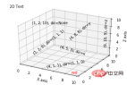 Python3 video tutorial
The above is the detailed content of Detailed tutorial on drawing three-dimensional graphs in python. For more information, please follow other related articles on the PHP Chinese website!

 How to implement factory model in Python?May 16, 2025 pm 12:39 PM
Implementing factory pattern in Python can create different types of objects by creating a unified interface. The specific steps are as follows: 1. Define a basic class and multiple inheritance classes, such as Vehicle, Car, Plane and Train. 2. Create a factory class VehicleFactory and use the create_vehicle method to return the corresponding object instance according to the type parameter. 3. Instantiate the object through the factory class, such as my_car=factory.create_vehicle("car","Tesla"). This pattern improves the scalability and maintainability of the code, but it needs to be paid attention to its complexity
 What does r mean in python original string prefixMay 16, 2025 pm 12:36 PM
In Python, the r or R prefix is used to define the original string, ignoring all escaped characters, and letting the string be interpreted literally. 1) Applicable to deal with regular expressions and file paths to avoid misunderstandings of escape characters. 2) Not applicable to cases where escaped characters need to be preserved, such as line breaks. Careful checking is required when using it to prevent unexpected output.
 How to clean up resources using the __del__ method in Python?May 16, 2025 pm 12:33 PM
In Python, the __del__ method is an object's destructor, used to clean up resources. 1) Uncertain execution time: Relying on the garbage collection mechanism. 2) Circular reference: It may cause the call to be unable to be promptly and handled using the weakref module. 3) Exception handling: Exception thrown in __del__ may be ignored and captured using the try-except block. 4) Best practices for resource management: It is recommended to use with statements and context managers to manage resources.
 Usage of pop() function in python list pop element removal method detailed explanation of theMay 16, 2025 pm 12:30 PM
The pop() function is used in Python to remove elements from a list and return a specified position. 1) When the index is not specified, pop() removes and returns the last element of the list by default. 2) When specifying an index, pop() removes and returns the element at the index position. 3) Pay attention to index errors, performance issues, alternative methods and list variability when using it.
 How to use Python for image processing?May 16, 2025 pm 12:27 PM
Python mainly uses two major libraries Pillow and OpenCV for image processing. Pillow is suitable for simple image processing, such as adding watermarks, and the code is simple and easy to use; OpenCV is suitable for complex image processing and computer vision, such as edge detection, with superior performance but attention to memory management is required.
 How to implement principal component analysis in Python?May 16, 2025 pm 12:24 PM
Implementing PCA in Python can be done by writing code manually or using the scikit-learn library. Manually implementing PCA includes the following steps: 1) centralize the data, 2) calculate the covariance matrix, 3) calculate the eigenvalues and eigenvectors, 4) sort and select principal components, and 5) project the data to the new space. Manual implementation helps to understand the algorithm in depth, but scikit-learn provides more convenient features.
 How to calculate logarithm in Python?May 16, 2025 pm 12:21 PM
Calculating logarithms in Python is a very simple but interesting thing. Let's start with the most basic question: How to calculate logarithm in Python? Basic method of calculating logarithm in Python The math module of Python provides functions for calculating logarithm. Let's take a simple example: importmath# calculates the natural logarithm (base is e) x=10natural_log=math.log(x)print(f"natural log({x})={natural_log}")# calculates the logarithm with base 10 log_base_10=math.log10(x)pri
 How to implement linear regression in Python?May 16, 2025 pm 12:18 PM
To implement linear regression in Python, we can start from multiple perspectives. This is not just a simple function call, but involves a comprehensive application of statistics, mathematical optimization and machine learning. Let's dive into this process in depth. The most common way to implement linear regression in Python is to use the scikit-learn library, which provides easy and efficient tools. However, if we want to have a deeper understanding of the principles and implementation details of linear regression, we can also write our own linear regression algorithm from scratch. The linear regression implementation of scikit-learn uses scikit-learn to encapsulate the implementation of linear regression, allowing us to easily model and predict. Here is a use sc


Hot AI Tools

Undresser.AI Undress
AI-powered app for creating realistic nude photos

AI Clothes Remover
Online AI tool for removing clothes from photos.

Undress AI Tool
Undress images for free

Clothoff.io
AI clothes remover

Video Face Swap
Swap faces in any video effortlessly with our completely free AI face swap tool!

Hot Article
Hot Tools

SublimeText3 Linux new version
SublimeText3 Linux latest version

SublimeText3 English version
Recommended: Win version, supports code prompts!

Notepad++7.3.1
Easy-to-use and free code editor

PhpStorm Mac version
The latest (2018.2.1) professional PHP integrated development tool

Safe Exam Browser
Safe Exam Browser is a secure browser environment for taking online exams securely. This software turns any computer into a secure workstation. It controls access to any utility and prevents students from using unauthorized resources.

