In the previous article "Practical Excel Skills Sharing: Two Quick Ways to Make Pay Slips", we learned the two fastest ways to make pay stubs. Today I will share how to create a dynamic Gantt chart in Excel, come and take a look!

The Gantt chart is mainly used to display the status of work progress. Visually displays a list of phases, their order in time, and their duration. In this way, you can intuitively see when a certain stage will be carried out and compare the progress with expectations, making it easier for project managers to grasp the progress of the project in real time. Gantt charts are widely used and are used in construction, automobiles, IT, chemical industry, machinery and other fields.
There are many software for making Gantt charts, such as Visio, Project and other professional software. In fact, you can also use Excel to create a dynamic Gantt chart with a strong business style. Let’s take a look at the final effect first:

The following uses the 2010 version to explain the main steps.
1. Preparation of data sources

Before making a Gantt chart, you need to determine some basics Information: Phase tasks, start date, number of days required for each phase, as shown in the picture above, other blank spaces are calculated by formulas.
1. Start date
The formula is very simple. Enter =B3 C3 in cell B4 and pull down:

2. Cumulative number of days
Here is a classic usage of the SUM function. To use the cumulative summation formula, enter the formula in cell D3
=SUM($C$3:C3), drop down.
Note that the starting point of the summing range (the first C3) uses an absolute reference, and the end point does not use an absolute reference, so that when the formula is pulled down, the summing range will increase sequentially.

3. Completion time
This formula is also very simple. Just enter =B3 C3 in cell E3 and pull down.

The above is the basic data method. To make a dynamic Gantt chart, you also need some auxiliary data, as shown in the following figure:

Cell A12 is a manually entered number. Based on this number, use the formula to calculate the "number of completed days" and "number of uncompleted days". Let's take a look at the formulas in these two places:
4. Number of days completed in each stage
Enter the formula in cell H2:

and then fill it down.
Briefly explain the function of this formula.
First of all, calculates the number of days completed in each stage, which is fixed and compared with the number of days in progress A12, so A12 in the formula uses an absolute reference of $A$12.
Secondly, the formula mainly uses the IF function to determine the number of days to complete the stage by comparing the cumulative number of days in a certain stage (such as the cumulative number of days in the market research stage D5) and the size of cell A12. . If D5A12, continue to determine whether the difference between D5 and A12 is less than the required number of days C5. If it is less, return the second parameter A12-N(D4) , if greater than 0, return 0. As you can see in the table, if the number of days to complete is 10, D5>10, and D5-10=1, which is less than C5, so the number of days to complete is equal to A12-N(D4)=10-D4=10-8=2, that is The market research project only lasted 2 days.

This formula is a very important part of the entire chart data. If you don’t understand it yet, just apply it.
5. Number of unfinished days
This formula is very simple. Enter =C3-H3 in cell I3 and pull down. That is, the number of unfinished days = the number of days needed - the number of completed days.

At this point, the data source of the dynamic Gantt chart has been constructed. Now enter the drawing process. The interface of each version may be different. We will use the Excel 2010 version for screenshot demonstration.
2. Production of basic charts
Select the A2:B9 area, hold down the Ctrl key and select the H2:I9 area, and then insert the stacked bar chart under the bar chart:

After completion For:

Click Design under Chart Tools-Select Data (if you don’t see the Chart Tool, click on the chart you just inserted):

Click the "Add" button in the pop-up "Select Data Source" dialog box:

In the pop-up "Edit Data Series" In the dialog box, select cell B2 for the series name, delete the original content for the series value, select the cell range B3:B9, and click "OK":

Select "Start Date" in the "Select Data Source" dialog box and click the "Move Up" button to move the start date to the top:

Next click "Horizontal ( Category) "Edit" button in the Axis Label" option area:

Select the A3:A9 cell range in the axis label area, and then click "OK":

Click "OK" to close the "Select Data Source" dialog box:

The result after completion is like this:

Choose a favorite chart style:

For example, I chose this:

Some friends may find a problem. The order of this picture is exactly opposite to what we want. Determining the project is the first step and should be at the top. The final plan is the last step and should be at the bottom. Therefore, you need to continue to adjust, right-click the vertical coordinate, and select "Format Axis" from the pop-up shortcut menu:

Check the "Reverse Category" checkbox, and then Click "Close":

Right-click on the series "Start Date" and select "Format Data Series" from the pop-up menu:

Select "No Fill" for fill type:

Select "No Line" for border color:

Do not close this window, directly select the next series (number of completed days), you can also see from the data that the selected content has changed:


Set the fill type of this series to "Solid Color Fill" and set a favorite color:

After selecting the appropriate color, you can see two colors in the picture. The same method is used if you need to set the color for the third series.
Next, you need to set the time axis. Right-click the date above the chart and select "Format Axis":

In the axis options , set the minimum and maximum values as fixed methods, enter the start date of the project for the minimum value, and enter the end date of the project for the maximum value:

Stretch the chart to a suitable size , delete the legend on the right:

We manually enter this number of days, and you can see that the chart will change accordingly.

At this point, a static Gantt chart is completed. Next, learn how to turn this static diagram into a dynamic chart.
3. Completion of dynamic charts
So-called dynamic charts generally use control buttons to adjust data changes, so we first need to add Developer tab. (If there is already a "Development Tools" tab in the interface, ignore this step.) Taking the 2010 version as an example, select the "File" → "Options" command, customize the ribbon in "Excel Options", and check the "Development Tools" and then click "OK":

You will see the contents of the "Development Tools" tab in our Excel toolbar.

After the addition is completed, select the "Scroll Bar (Form Control)" button in "Insert":

Drag an area of suitable size anywhere in the table to complete the addition of the button.

Right-click and select "Format Control":

In the "Control" tab, set respectively The following content: minimum value 1, maximum value 41, cell link selection A12, click "OK".

Move this button to the chart and click the button to see the effect.

In practical applications, it does not make much sense to use controls to control the Gantt chart. A more reasonable usage is to use the formula =TODAY()-B3 to calculate. Number of days (A12). The advantage of this is that when you open the form every day, you will see the progress as of that day.
Summary, through today’s study, we learned the following key points:
In the production process of many charts, only Basic data is far from enough. Formulas are also needed to improve the auxiliary data, so that the chart can be more in line with actual needs;
The Gantt chart is made using a stacked bar chart Yes, the whole process seems cumbersome, and it only takes a few minutes if you are skilled, especially some of the common techniques, such as hiding a certain series and leaving a blank space, which are often used in some advanced charts;
The method of adding dynamic buttons is the least technical in the entire production process. As long as the data source is properly constructed, each static chart can be turned into a high-end dynamic chart. ;
Regarding the beautification of charts, this is the simplest and most difficult problem, because everyone's aesthetics are different. The author suggests that beautification should follow a basic principle: it can effectively express the core information of the data, and it should not be too fancy or complicated. After all, charts are meant to reflect data more intuitively and help business decisions, not computer drawing competitions.
Related learning recommendations: excel tutorial
The above is the detailed content of Practical Excel skills sharing: making dynamic Gantt charts. For more information, please follow other related articles on the PHP Chinese website!
 MEDIAN formula in Excel - practical examplesApr 11, 2025 pm 12:08 PM
This tutorial explains how to calculate the median of numerical data in Excel using the MEDIAN function. The median, a key measure of central tendency, identifies the middle value in a dataset, offering a more robust representation of central tenden
 Google Spreadsheet COUNTIF function with formula examplesApr 11, 2025 pm 12:03 PM
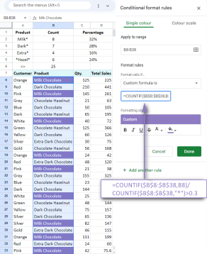
Master Google Sheets COUNTIF: A Comprehensive Guide This guide explores the versatile COUNTIF function in Google Sheets, demonstrating its applications beyond simple cell counting. We'll cover various scenarios, from exact and partial matches to han
 Excel shared workbook: How to share Excel file for multiple usersApr 11, 2025 am 11:58 AM
This tutorial provides a comprehensive guide to sharing Excel workbooks, covering various methods, access control, and conflict resolution. Modern Excel versions (2010, 2013, 2016, and later) simplify collaborative editing, eliminating the need to m
 How to convert Excel to JPG - save .xls or .xlsx as image fileApr 11, 2025 am 11:31 AM
This tutorial explores various methods for converting .xls files to .jpg images, encompassing both built-in Windows tools and free online converters. Need to create a presentation, share spreadsheet data securely, or design a document? Converting yo
 Excel names and named ranges: how to define and use in formulasApr 11, 2025 am 11:13 AM
This tutorial clarifies the function of Excel names and demonstrates how to define names for cells, ranges, constants, or formulas. It also covers editing, filtering, and deleting defined names. Excel names, while incredibly useful, are often overlo
 Standard deviation Excel: functions and formula examplesApr 11, 2025 am 11:01 AM
This tutorial clarifies the distinction between standard deviation and standard error of the mean, guiding you on the optimal Excel functions for standard deviation calculations. In descriptive statistics, the mean and standard deviation are intrinsi
 Square root in Excel: SQRT function and other waysApr 11, 2025 am 10:34 AM
This Excel tutorial demonstrates how to calculate square roots and nth roots. Finding the square root is a common mathematical operation, and Excel offers several methods. Methods for Calculating Square Roots in Excel: Using the SQRT Function: The
 Google Sheets basics: Learn how to work with Google SpreadsheetsApr 11, 2025 am 10:23 AM
Unlock the Power of Google Sheets: A Beginner's Guide This tutorial introduces the fundamentals of Google Sheets, a powerful and versatile alternative to MS Excel. Learn how to effortlessly manage spreadsheets, leverage key features, and collaborate


Hot AI Tools

Undresser.AI Undress
AI-powered app for creating realistic nude photos

AI Clothes Remover
Online AI tool for removing clothes from photos.

Undress AI Tool
Undress images for free

Clothoff.io
AI clothes remover

AI Hentai Generator
Generate AI Hentai for free.

Hot Article

Hot Tools

SublimeText3 Chinese version
Chinese version, very easy to use

mPDF
mPDF is a PHP library that can generate PDF files from UTF-8 encoded HTML. The original author, Ian Back, wrote mPDF to output PDF files "on the fly" from his website and handle different languages. It is slower than original scripts like HTML2FPDF and produces larger files when using Unicode fonts, but supports CSS styles etc. and has a lot of enhancements. Supports almost all languages, including RTL (Arabic and Hebrew) and CJK (Chinese, Japanese and Korean). Supports nested block-level elements (such as P, DIV),

DVWA
Damn Vulnerable Web App (DVWA) is a PHP/MySQL web application that is very vulnerable. Its main goals are to be an aid for security professionals to test their skills and tools in a legal environment, to help web developers better understand the process of securing web applications, and to help teachers/students teach/learn in a classroom environment Web application security. The goal of DVWA is to practice some of the most common web vulnerabilities through a simple and straightforward interface, with varying degrees of difficulty. Please note that this software

Dreamweaver Mac version
Visual web development tools

SecLists
SecLists is the ultimate security tester's companion. It is a collection of various types of lists that are frequently used during security assessments, all in one place. SecLists helps make security testing more efficient and productive by conveniently providing all the lists a security tester might need. List types include usernames, passwords, URLs, fuzzing payloads, sensitive data patterns, web shells, and more. The tester can simply pull this repository onto a new test machine and he will have access to every type of list he needs.


