

 Backend DevelopmentPython TutorialDetailed graphic explanation of how to use Python to draw dynamic visualization charts
Detailed graphic explanation of how to use Python to draw dynamic visualization charts

This article brings you relevant knowledge about python, which mainly introduces related issues about drawing dynamic visualization icons. Using Python’s Plotly graphics library, you can effortlessly Generate animated charts and interactive charts. Let’s take a look at it. I hope it will be helpful to everyone.

Recommended learning: python video tutorial
Storytelling is a crucial skill for data scientists. In order to express our ideas and persuade others, we need to communicate effectively. And beautiful visualizations are a great tool for this task.
This article will introduce 5 non-traditional visualization techniques that can make your data stories more beautiful and effective. Python's Plotly graphics library will be used here, allowing you to effortlessly generate animated charts and interactive charts.
Install the module
If you haven’t installed Plotly yet, just run the following command in your terminal to complete the installation:
pip install plotly
Visualized dynamic graph
When studying the evolution of this or that indicator, we often involve time data. The Plotly animation tool only requires one line of code to allow people to watch the changes in data over time, as shown in the figure below:
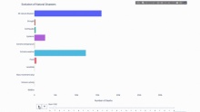
The code is as follows:
import plotly.express as px
from vega_datasets import data
df = data.disasters()
df = df[df.Year > 1990]
fig = px.bar(df,
             y="Entity",
             x="Deaths",
             animation_frame="Year",
             orientation='h',
             range_x=[0, df.Deaths.max()],
             color="Entity")
# improve aesthetics (size, grids etc.)
fig.update_layout(width=1000,
                  height=800,
                  xaxis_showgrid=False,
                  yaxis_showgrid=False,
                  paper_bgcolor='rgba(0,0,0,0)',
                  plot_bgcolor='rgba(0,0,0,0)',
                  title_text='Evolution of Natural Disasters',
                  showlegend=False)
fig.update_xaxes(title_text='Number of Deaths')
fig.update_yaxes(title_text='')
fig.show()
As long as You have a time variable to filter on, then almost any chart can be animated. The following is an example of making a scatter chart animation:
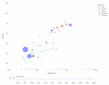
import plotly.express as px
df = px.data.gapminder()
fig = px.scatter(
    df,
    x="gdpPercap",
    y="lifeExp",
    animation_frame="year",
    size="pop",
    color="continent",
    hover_name="country",
    log_x=True,
    size_max=55,
    range_x=[100, 100000],
    range_y=[25, 90],
    #   color_continuous_scale=px.colors.sequential.Emrld
)
fig.update_layout(width=1000,
                  height=800,
                  xaxis_showgrid=False,
                  yaxis_showgrid=False,
                  paper_bgcolor='rgba(0,0,0,0)',
                  plot_bgcolor='rgba(0,0,0,0)')
Sun chart
The sunburst chart is a Great way to visualize group by statements. If you want to break down a given quantity by one or more categorical variables, use a sun chart.
Suppose we want to break down the average tip data according to gender and time of day. This double group by statement can be displayed more effectively through visualization compared to a table.
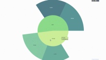
This chart is interactive, allowing you to click and explore the categories on your own. You just need to define all your categories, declare the hierarchy between them (see the parents parameter in the code below) and assign the corresponding values, which in our case is the output of the group by statement.
import plotly.graph_objects as go
import plotly.express as px
import numpy as np
import pandas as pd
df = px.data.tips()
fig = go.Figure(go.Sunburst(
    labels=["Female", "Male", "Dinner", "Lunch", 'Dinner ', 'Lunch '],
    parents=["", "", "Female", "Female", 'Male', 'Male'],
    values=np.append(
        df.groupby('sex').tip.mean().values,
        df.groupby(['sex', 'time']).tip.mean().values),
    marker=dict(colors=px.colors.sequential.Emrld)),
                layout=go.Layout(paper_bgcolor='rgba(0,0,0,0)',
                                 plot_bgcolor='rgba(0,0,0,0)'))
fig.update_layout(margin=dict(t=0, l=0, r=0, b=0),
                  title_text='Tipping Habbits Per Gender, Time and Day')
fig.show()
Now we add one more layer to this hierarchy:
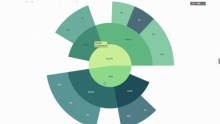
To do this, we add another group by statement involving three categorical variables value.
import plotly.graph_objects as go
import plotly.express as px
import pandas as pd
import numpy as np
df = px.data.tips()
fig = go.Figure(go.Sunburst(labels=[
    "Female", "Male", "Dinner", "Lunch", 'Dinner ', 'Lunch ', 'Fri', 'Sat',
    'Sun', 'Thu', 'Fri ', 'Thu ', 'Fri  ', 'Sat  ', 'Sun  ', 'Fri   ', 'Thu   '
],
                            parents=[
                                "", "", "Female", "Female", 'Male', 'Male',
                                'Dinner', 'Dinner', 'Dinner', 'Dinner',
                                'Lunch', 'Lunch', 'Dinner ', 'Dinner ',
                                'Dinner ', 'Lunch ', 'Lunch '
                            ],
                            values=np.append(
                                np.append(
                                    df.groupby('sex').tip.mean().values,
                                    df.groupby(['sex',
                                                'time']).tip.mean().values,
                                ),
                                df.groupby(['sex', 'time',
                                            'day']).tip.mean().values),
                            marker=dict(colors=px.colors.sequential.Emrld)),
                layout=go.Layout(paper_bgcolor='rgba(0,0,0,0)',
                                 plot_bgcolor='rgba(0,0,0,0)'))
fig.update_layout(margin=dict(t=0, l=0, r=0, b=0),
                  title_text='Tipping Habbits Per Gender, Time and Day')

fig.show()
Pointer diagram
Pointer diagram is just for looks. Use this type of chart when reporting on success metrics like KPIs and showing how close they are to your goals.

import plotly.graph_objects as go
fig = go.Figure(go.Indicator(
    domain = {'x': [0, 1], 'y': [0, 1]},
    value = 4.3,
    mode = "gauge+number+delta",
    title = {'text': "Success Metric"},
    delta = {'reference': 3.9},
    gauge = {'bar': {'color': "lightgreen"},
        'axis': {'range': [None, 5]},
             'steps' : [
                 {'range': [0, 2.5], 'color': "lightgray"},
                 {'range': [2.5, 4], 'color': "gray"}],
          }))
fig.show()
Sankey Plot
Another way to explore the relationship between categorical variables is a parallel coordinate plot like the following. You can drag, drop, highlight and browse values at any time, perfect for presentations.
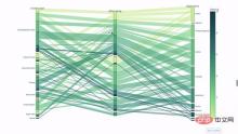
The code is as follows:
import plotly.express as px
from vega_datasets import data
import pandas as pd
df = data.movies()
df = df.dropna()
df['Genre_id'] = df.Major_Genre.factorize()[0]
fig = px.parallel_categories(
    df,
    dimensions=['MPAA_Rating', 'Creative_Type', 'Major_Genre'],
    color="Genre_id",
    color_continuous_scale=px.colors.sequential.Emrld,
)
fig.show()
Parallel coordinate chart
The parallel coordinate chart is a derivative of the above chart . Here, each string represents a single observation. This is a method that can be used to identify outliers (single lines that are far away from the rest of the data), clusters, trends, and redundant variables (for example, if two variables have similar values at every observation, they will lie on the same horizontal line , a useful tool to indicate the presence of redundancy).
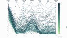
The code is as follows:
import plotly.express as px
from vega_datasets import data
import pandas as pd
df = data.movies()
df = df.dropna()
df['Genre_id'] = df.Major_Genre.factorize()[0]
fig = px.parallel_coordinates(
    df,
    dimensions=[
        'IMDB_Rating', 'IMDB_Votes', 'Production_Budget', 'Running_Time_min',
        'US_Gross', 'Worldwide_Gross', 'US_DVD_Sales'
    ],
    color='IMDB_Rating',
    color_continuous_scale=px.colors.sequential.Emrld)
fig.show()
Recommended learning: python video tutorial
The above is the detailed content of Detailed graphic explanation of how to use Python to draw dynamic visualization charts. For more information, please follow other related articles on the PHP Chinese website!

 Python and Time: Making the Most of Your Study TimeApr 14, 2025 am 12:02 AM
To maximize the efficiency of learning Python in a limited time, you can use Python's datetime, time, and schedule modules. 1. The datetime module is used to record and plan learning time. 2. The time module helps to set study and rest time. 3. The schedule module automatically arranges weekly learning tasks.
 Python: Games, GUIs, and MoreApr 13, 2025 am 12:14 AM
Python excels in gaming and GUI development. 1) Game development uses Pygame, providing drawing, audio and other functions, which are suitable for creating 2D games. 2) GUI development can choose Tkinter or PyQt. Tkinter is simple and easy to use, PyQt has rich functions and is suitable for professional development.
 Python vs. C : Applications and Use Cases ComparedApr 12, 2025 am 12:01 AM
Python is suitable for data science, web development and automation tasks, while C is suitable for system programming, game development and embedded systems. Python is known for its simplicity and powerful ecosystem, while C is known for its high performance and underlying control capabilities.
 The 2-Hour Python Plan: A Realistic ApproachApr 11, 2025 am 12:04 AM
You can learn basic programming concepts and skills of Python within 2 hours. 1. Learn variables and data types, 2. Master control flow (conditional statements and loops), 3. Understand the definition and use of functions, 4. Quickly get started with Python programming through simple examples and code snippets.
 Python: Exploring Its Primary ApplicationsApr 10, 2025 am 09:41 AM
Python is widely used in the fields of web development, data science, machine learning, automation and scripting. 1) In web development, Django and Flask frameworks simplify the development process. 2) In the fields of data science and machine learning, NumPy, Pandas, Scikit-learn and TensorFlow libraries provide strong support. 3) In terms of automation and scripting, Python is suitable for tasks such as automated testing and system management.
 How Much Python Can You Learn in 2 Hours?Apr 09, 2025 pm 04:33 PM
You can learn the basics of Python within two hours. 1. Learn variables and data types, 2. Master control structures such as if statements and loops, 3. Understand the definition and use of functions. These will help you start writing simple Python programs.
 How to teach computer novice programming basics in project and problem-driven methods within 10 hours?Apr 02, 2025 am 07:18 AM
How to teach computer novice programming basics within 10 hours? If you only have 10 hours to teach computer novice some programming knowledge, what would you choose to teach...
 How to avoid being detected by the browser when using Fiddler Everywhere for man-in-the-middle reading?Apr 02, 2025 am 07:15 AM
How to avoid being detected when using FiddlerEverywhere for man-in-the-middle readings When you use FiddlerEverywhere...


Hot AI Tools

Undresser.AI Undress
AI-powered app for creating realistic nude photos

AI Clothes Remover
Online AI tool for removing clothes from photos.

Undress AI Tool
Undress images for free

Clothoff.io
AI clothes remover

AI Hentai Generator
Generate AI Hentai for free.

Hot Article
Hot Tools

SublimeText3 Mac version
God-level code editing software (SublimeText3)

Safe Exam Browser
Safe Exam Browser is a secure browser environment for taking online exams securely. This software turns any computer into a secure workstation. It controls access to any utility and prevents students from using unauthorized resources.

MantisBT
Mantis is an easy-to-deploy web-based defect tracking tool designed to aid in product defect tracking. It requires PHP, MySQL and a web server. Check out our demo and hosting services.

SecLists
SecLists is the ultimate security tester's companion. It is a collection of various types of lists that are frequently used during security assessments, all in one place. SecLists helps make security testing more efficient and productive by conveniently providing all the lists a security tester might need. List types include usernames, passwords, URLs, fuzzing payloads, sensitive data patterns, web shells, and more. The tester can simply pull this repository onto a new test machine and he will have access to every type of list he needs.

ZendStudio 13.5.1 Mac
Powerful PHP integrated development environment

