


In the previous article "Excel Function Learning: Talking about the SUMPRODUCT Function", we learned how to use the SUMPRODUCT function. The following article introduces practical Excel skills and talks about advanced chart production. I hope it will be helpful to everyone!

After reading this tutorial for the first time, I don’t understand what it is. Read this tutorial for the second time, huh? Even after turning off the tutorial, I still can’t do it. After reading this tutorial for the third time, forget it, I'll turn on the computer and follow along. Not many people can make this interesting high-level chart, so hurry up and learn it. After you learn it, you will be the brightest star in your circle of friends. Haha, help me up, I want to continue learning.
Speaking of graphics, everyone doesn’t know what comes to mind. Hehe, the tutorials written by Fenzi are usually charts, so the graphics here are inseparable from the charts (of course I still hope to write something else, haha !). So how exactly does it change the horizon? Well, there may be a few tutorials next, all of which will tell you what kind of sparks graphics and charts can create.
It seems that I have said a lot of nonsense again, let’s take a look at the chart effect!

When you see such a circular percentage, do you think about what it is made of?
Pie chart? NO, radar chart? NO.
That is?
Don’t think that a circle is a pie chart. If you want to know how to make it, look down.
The data here is very simple, it is a completion rate and a target value:

Select the data and insert it into a column chart. You heard it right, it is a column chart. Shape chart, as shown in the figure:
The effect after insertion is not what we want. We need to select the chart and then "switch rows and columns" to make the two data form two series, such as Figure:

Delete the unnecessary elements of the chart "Chart Title", "Chart Legend", "Grid Lines", "Abscissa Axis", select and press the DELETE key can delete.
Select the vertical axis of the chart, right-click "Format Axis" and set the maximum and minimum values of the axis.
#After setting the maximum and minimum values, you can press the DELETE key to delete.
Select the data series and set the data series format, as shown in the figure:

Let’s see the effect at this time:
The protagonist is here, insert a circle (remember, do not select the chart when inserting graphics), hold down the SHIFT key to draw a perfect circle. Then set the graphic format, as shown in the figure:
Select the drawn circle, hold down the CTRL key and drag to copy another one Graphics, and then set the size and outline lines.
Align and combine the two charts (remember, both circles are selected), as shown in the picture:
Copy the combined graphics, Click the chart target series and paste, the effect is:

Select the small circle in the middle of the combined graphics again to set the fill color (for the combined graphics, click twice to select it individually and set it), the effect is:
method, paste the graph into the completion rate series, the effect is:
Um, what is this? It’s all deformed, what should I do?
Select the data series and set the fill format, as shown in the figure:
Why use cascading and scale to 1?
Because our target is 1, then we want this shape to be scaled to 1.
The effect after setting:
If we adjust the size of the chart at this time, the circle will be deformed, what should we do?
Teach you how to add a series to the chart, change the new series to "pie chart", and then set the pie chart to have no fill and no lines.
The pie chart will force the graph to be displayed as a square, so no matter how you zoom it in or out, it will always be a perfect circle!
Okay, let’s send Buddha to the West, let’s talk about how to add it.
Right-click on the chart and "Select Data", click the Add button, and after adding, change the chart type to pie chart, as shown in the figure:

After adding the pie chart, try pulling it out again to see if the graphics are all perfectly round. hey-hey.
Related learning recommendations: excel tutorial
The above is the detailed content of Practical Excel skills sharing: Advanced chart production-column chart. For more information, please follow other related articles on the PHP Chinese website!

 MEDIAN formula in Excel - practical examplesApr 11, 2025 pm 12:08 PM
This tutorial explains how to calculate the median of numerical data in Excel using the MEDIAN function. The median, a key measure of central tendency, identifies the middle value in a dataset, offering a more robust representation of central tenden
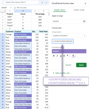 Google Spreadsheet COUNTIF function with formula examplesApr 11, 2025 pm 12:03 PM
Master Google Sheets COUNTIF: A Comprehensive Guide This guide explores the versatile COUNTIF function in Google Sheets, demonstrating its applications beyond simple cell counting. We'll cover various scenarios, from exact and partial matches to han
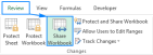 Excel shared workbook: How to share Excel file for multiple usersApr 11, 2025 am 11:58 AM
This tutorial provides a comprehensive guide to sharing Excel workbooks, covering various methods, access control, and conflict resolution. Modern Excel versions (2010, 2013, 2016, and later) simplify collaborative editing, eliminating the need to m
 How to convert Excel to JPG - save .xls or .xlsx as image fileApr 11, 2025 am 11:31 AM
This tutorial explores various methods for converting .xls files to .jpg images, encompassing both built-in Windows tools and free online converters. Need to create a presentation, share spreadsheet data securely, or design a document? Converting yo
 Excel names and named ranges: how to define and use in formulasApr 11, 2025 am 11:13 AM
This tutorial clarifies the function of Excel names and demonstrates how to define names for cells, ranges, constants, or formulas. It also covers editing, filtering, and deleting defined names. Excel names, while incredibly useful, are often overlo
 Standard deviation Excel: functions and formula examplesApr 11, 2025 am 11:01 AM
This tutorial clarifies the distinction between standard deviation and standard error of the mean, guiding you on the optimal Excel functions for standard deviation calculations. In descriptive statistics, the mean and standard deviation are intrinsi
 Square root in Excel: SQRT function and other waysApr 11, 2025 am 10:34 AM
This Excel tutorial demonstrates how to calculate square roots and nth roots. Finding the square root is a common mathematical operation, and Excel offers several methods. Methods for Calculating Square Roots in Excel: Using the SQRT Function: The
 Google Sheets basics: Learn how to work with Google SpreadsheetsApr 11, 2025 am 10:23 AM
Unlock the Power of Google Sheets: A Beginner's Guide This tutorial introduces the fundamentals of Google Sheets, a powerful and versatile alternative to MS Excel. Learn how to effortlessly manage spreadsheets, leverage key features, and collaborate


Hot AI Tools

Undresser.AI Undress
AI-powered app for creating realistic nude photos

AI Clothes Remover
Online AI tool for removing clothes from photos.

Undress AI Tool
Undress images for free

Clothoff.io
AI clothes remover

Video Face Swap
Swap faces in any video effortlessly with our completely free AI face swap tool!

Hot Article
Hot Tools

Zend Studio 13.0.1
Powerful PHP integrated development environment

WebStorm Mac version
Useful JavaScript development tools

SAP NetWeaver Server Adapter for Eclipse
Integrate Eclipse with SAP NetWeaver application server.

Safe Exam Browser
Safe Exam Browser is a secure browser environment for taking online exams securely. This software turns any computer into a secure workstation. It controls access to any utility and prevents students from using unauthorized resources.

mPDF
mPDF is a PHP library that can generate PDF files from UTF-8 encoded HTML. The original author, Ian Back, wrote mPDF to output PDF files "on the fly" from his website and handle different languages. It is slower than original scripts like HTML2FPDF and produces larger files when using Unicode fonts, but supports CSS styles etc. and has a lot of enhancements. Supports almost all languages, including RTL (Arabic and Hebrew) and CJK (Chinese, Japanese and Korean). Supports nested block-level elements (such as P, DIV),

