This article brings you relevant knowledge about excel, which mainly introduces some pie chart making techniques. Let’s take a look at how to use excel to make pie charts. I hope it will be useful to everyone. help.

Related learning recommendations: excel tutorial
How to use a pie chart to show the percentage of task completion.
Let’s look at the effect first:

To achieve such an effect, it is actually very simple. Next, let’s take a look at the specific operation process:
Step 1 Prepare the data source

Enter the completion rate in cell B1, and enter the formula in cell B2 to calculate the remaining amount:
=1-B1
Step 2 Insert pie chart

Step 3 Settings Chart data source
Right-click the pie chart → select data, add a series "Two Pies" in the pop-up dialog box, and adjust the two-pie series to the top.

Step 4 Set the series format
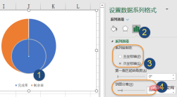
Right-click the pie chart, set the data series format, set it to the secondary axis, pie Figure separation is 60%.

Step 5 Set the pie chart outline and adjust the position
Click the two series of the pie chart in sequence and set the shape outline to "No outline"
The next step is to adjust the position of the two cakes in the middle. Be careful not to drag directly to the middle in this step. First click on the two cakes in the middle, hold down the left mouse button and drag it slightly towards the middle position, then release the mouse.
Then drag the two cakes in the middle to the middle.

Step 6 Set the fill color
Click the two cake series in the middle and set the shape fill to egg yellow.
Click the outer pie chart, then click one of the data points, and set the shape fill to dark cyan. Set the fill color of the other data point to light gray.

Step 7 Add a text box to simulate the data label
Click the chart, click the [Insert] tab → [Text Frame] → [Draw horizontal text box], drag the mouse to draw a text box.
Keep the text box selected, enter the equal sign in the edit bar, then click the completion rate in cell B1 and press Enter.
For friends who use WPS tables, this step can be changed to right-clicking on the two cakes, then adding data labels, and then adjusting the position of the data labels.

Finally set the color of the text box, set the font to Agency FB, and adjust the font size appropriately.
Click the legend, press Delete to delete, OK.
Related learning recommendations: excel tutorial
The above is the detailed content of Understand how to make pie charts in excel in one article. For more information, please follow other related articles on the PHP Chinese website!

Hot AI Tools

Undresser.AI Undress
AI-powered app for creating realistic nude photos

AI Clothes Remover
Online AI tool for removing clothes from photos.

Undress AI Tool
Undress images for free

Clothoff.io
AI clothes remover

Video Face Swap
Swap faces in any video effortlessly with our completely free AI face swap tool!

Hot Article

Hot Tools

SublimeText3 Chinese version
Chinese version, very easy to use

Notepad++7.3.1
Easy-to-use and free code editor

SublimeText3 Linux new version
SublimeText3 Linux latest version

MantisBT
Mantis is an easy-to-deploy web-based defect tracking tool designed to aid in product defect tracking. It requires PHP, MySQL and a web server. Check out our demo and hosting services.

SAP NetWeaver Server Adapter for Eclipse
Integrate Eclipse with SAP NetWeaver application server.


