Home >Web Front-end >Front-end Q&A >What are the categories of gradients in CSS3?
What are the categories of gradients in CSS3?
- WBOYWBOYWBOYWBOYWBOYWBOYWBOYWBOYWBOYWBOYWBOYWBOYWBOriginal
- 2022-03-29 17:23:123334browse
Gradient in css3 can be divided into: 1. Linear gradient, the syntax is "linear-gradient(gradient direction, color 1, color 2, ...);"; 2. Radial gradient, the syntax is "radial-gradient(circle type gradient size gradient position, color 1, color 2);".

The operating environment of this tutorial: Windows 10 system, CSS3&&HTML5 version, Dell G3 computer.
What are the categories of gradients in CSS3?
CSS3 Gradient is divided into linear-gradient (linear gradient) and radial-gradient (radial gradient).
Linear Gradients - Down/Up/Left/Right/Diagonally
Radial Gradient Gradients) - defined by their centers
linear gradient
linear-gradient() function Used to create an image that represents a linear gradient of two or more colors.
To create a linear gradient, you need to specify two colors. You can also achieve gradient effects in different directions (specified as an angle). If the direction is not specified, the gradient will default from top to bottom.
CSS Syntax
background-image: linear-gradient(direction, color-stop1, color-stop2, ...);
direction Specifies the direction (or angle) of the gradient using an angle value.
color-stop1, color-stop2,... are used to specify the starting and ending colors of the gradient.
The example is as follows:
<html>
<head>
<meta charset="utf-8">
<title>123</title>
<style>
#grad1 {
    height: 200px;
    background-color: red; /* 不支持线性的时候显示 */
    background-image: linear-gradient(to bottom right, red , yellow);
}
</style>
</head>
<body>
<h3>线性渐变 - 对角</h3>
<p>从左上角开始(到右下角)的线性渐变。起点是红色,慢慢过渡到黄色:</p>
<div id="grad1"></div>
<p><strong>注意:</strong> Internet Explorer 8 及之前的版本不支持渐变。</p>
</body>
</html>
Output result:

Radial gradient
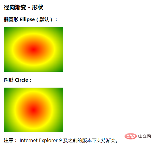
The radial-gradient() function creates an "image" with a radial gradient.
The radial gradient is defined by the center point.
In order to create a radial gradient you must set two stop colors.
CSS Syntax
background-image: radial-gradient(shape size at position, start-color, ..., last-color);
shape Determines the type of circle:
ellipse (default): Specifies the radial gradient of the ellipse.
circle: Specify the radial gradient of the circle.
size defines the size of the gradient. Possible values:
- ##farthest-corner (default): Specify The radius length of the radial gradient is from the center of the circle to the farthest corner from the center ##closest-side: Specifies the radius length of the radial gradient from the center of the circle to the side closest to the center
- closest-corner: Specify the radius length of the radial gradient from the center of the circle to the corner closest to the center of the circle
- farthest-side: Specify the radial gradient The length of the radius is from the center of the circle to the side furthest from the center.
- position defines the position of the gradient. Possible values:
- center (default): Set the ordinate value in the center of the radial gradient circle.
- top: Set the top to be the ordinate value of the center of the radial gradient circle.
- bottom: Set the bottom to the ordinate value of the center of the radial gradient circle.
- start-color, ..., last-color are used to specify the starting and ending colors of the gradient.
<!DOCTYPE html>
<html>
<head>
<meta charset="utf-8">
<title>123</title>
<style>
#grad1 {
    height: 150px;
    width: 200px;
    background-color: red; /* 浏览器不支持的时候显示 */
    background-image: radial-gradient(red, yellow, green); /* 标准的语法(必须放在最后) */
}
#grad2 {
    height: 150px;
    width: 200px;
    background-color: red; /* 浏览器不支持的时候显示 */
    background-image: radial-gradient(circle, red, yellow, green); /* 标准的语法(必须放在最后) */
}
</style>
</head>
<body>
<h3>径向渐变 - 形状</h3>
<p><strong>椭圆形 Ellipse(默认):</strong></p>
<div id="grad1"></div>
<p><strong>圆形 Circle:</strong></p>
<div id="grad2"></div>
<p><strong>注意:</strong> Internet Explorer 9 及之前的版本不支持渐变。</p>
</body>
</html>
Output result:
 (Learning video sharing:
The above is the detailed content of What are the categories of gradients in CSS3?. For more information, please follow other related articles on the PHP Chinese website!

