


Flexbox means "flexible box". It is a new layout mode introduced by CSS3. It is a scalable and flexible web page layout method; the Flexbox layout mode can expand and contract the elements in the flex container. to fill the available space to the maximum extent possible.

The operating environment of this tutorial: Windows 7 system, CSS3&&HTML5 version, Dell G3 computer.
Flexbox is the abbreviation of Flexible box (flexible box container). It is a new layout mode introduced by CSS3, a scalable and flexible web page layout method. It determines how elements are arranged on the page so that they appear predictably across different screen sizes and devices.
Flexbox has very powerful functions and can easily implement many complex layouts. Before it appeared, the layout methods we often used were floating or fixed-width percentages for layout, which required a large amount of code and was difficult to understand.
The flex layout is called Flexbox because of its ability to expand and contract elements within a flex container to maximize the available space. Compared with previous layout methods (such as table layout and floating elements within block elements), Flexbox is a more powerful way:
- Arrange elements in different directions
- Rearrange elements Display order
- Change the alignment of elements
- Dynamicly load elements into a container
Create a flex container:
In the parent element Add this attribute:
display: flex;
nbsp;html>


    <meta>
    <meta>
    <meta>
    <title>Document</title>

<style>
    *{
        margin: 0;
        padding: 0;
    }
    .flex-container{
        background-color: #131111;
        display: flex; /*让这个div变成弹性盒子*/
    }
    .flex-container .flex-item{
        padding: 20px;
        background-color: #b1ff84;
    }
    .flex-container .flex-item:first-child{
        background-color: #f5e25f;
    }
    .flex-container .flex-item:last-child{
        background-color: #0B5A79;
    }
</style>

    <div>
        <div>1</div>
        <div>2</div>
    </div>
Running effect:
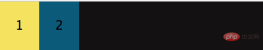
is equivalent to two divs automatically floating to the left , By default, all direct child elements are considered flex items and are arranged in a row from left to right. If the total width of the flex items is greater than the container, then the flex items will be scaled down until they fit within the flex container width.
You can also arrange the two sub-divs in a row and add: flex-direction: column;
## in .flex-container. #running result:

<!DOCTYPE html>
<html>
<head>
    <meta charset="UTF-8">
    <meta name="viewport" content="width=device-width, initial-scale=1.0">
    <meta http-equiv="X-UA-Compatible" content="ie=edge">
    <title>Document</title>
</head>
<style>
    *{
        margin: 0;
        padding: 0;
    }
    .flex-container{
        background-color: #131111;
        display: flex;  /*让这个div变成弹性盒子*/
        justify-content: flex-end;
    }
    .flex-container .flex-item{
        padding: 20px;
        background-color: #b1ff84;
    }
    .flex-container .flex-item:first-child{
        background-color: #f5e25f;
    }
    .flex-container .flex-item:last-child{
        background-color: #0B5A79;
    }
</style>
<body>
    <div>
        <div>1</div>
        <div>2</div>
    </div>
</body>
</html>
Operating effect:
 ##When the justify-content value is: center, the flex item is centered and aligned, and its operating effect is:
 justify-content has a total of six values, the first three are easier to understand: justify-start (default, aligned to the left), center, justify-end,
- space-evenly
- : The spacing between the starting edge of the flex container and the first flex item is equal to the spacing between each adjacent flex item. (Note from Fool's Wharf: This attribute was rarely seen before because browsers did not support it before, and chrome only supported it after version 60. By extension,
align-content: space-evenlyalso has this logic)
- space-between
- : The spacing between any two adjacent flex items is the same, but not necessarily equal to the first/last flex item and flex The spacing between container edges; the spacing between the starting edge and the first item and the spacing between the end edge and the last item are equal.
- : Each flex item in the flex container has equal spacing on each side. Note that this means that the space between two adjacent flex items will be twice the space between the first/last flex item and its nearest edge
 You can also align the specified div upward or downward:
<!DOCTYPE html>
<html>
<head>
    <meta charset="UTF-8">
    <meta name="viewport" content="width=device-width, initial-scale=1.0">
    <meta http-equiv="X-UA-Compatible" content="ie=edge">
    <title>Document</title>
</head>
<style>
    *{
        margin: 0;
        padding: 0;
    }
    .flex-container{
        background-color: #131111;
        display: flex;  /*让这个div变成弹性盒子*/
        justify-content: center;
        align-items: center;
    }
    .flex-container .flex-item{
        padding: 20px;
        background-color: #b1ff84;
    }
    .flex-container .flex-item:first-child{
        background-color: #f5e25f;
    }
    .flex-container .flex-item:last-child{
        background-color: #0B5A79;
    }
    .flex-bottom{
        /* 让这个div向上 */
        align-self: flex-start;
    }
</style>
<body>
    <div>
        <!-- 多加个class属性,方便指定 -->
        <div class="flex-item flex-bottom">1</div>
        <div>2 <br />2 <br/></div>
        <div>3 <br />3<br />3</div>
    </div>
</body>
</html>
Running effect:
 Similarly, algin-item also has five attribute values:
flex-start | flex-end | center | baseline | stretch;
Next The picture is the corresponding effect:
 Allow flex items to be arranged in multiple rows/columns
    .flex-container{
        background-color: #131111;
        display: flex;
        flex-wrap: wrap;
    }
默认情况下, flex 项不允许多行/列排列(nowrap),如果 flex 容器尺寸对于所有 flex 项来说不够大,那么flex 项将被调整大小以适应单行或列排列。
通过添加 flex-wrap: wrap ,可以将溢出容器的 flex 项将被排列到另一行/列中,它也有三个取值:
nowrap(默认):不换行.

wrap:换行,第一行在上方

wrap-reverse:换行,第一行在下方

插入一段代码,看下效果:
nbsp;html>


    <meta>
    <meta>
    <meta>
    <title>Document</title>

<style>
    *{
        margin: 0;
        padding: 0;
    }
    .flex-container{
        background-color: #131111;
        display: flex;
        flex-wrap: wrap;
        justify-content: space-evenly;/**/
        align-content: space-evenly;
    }
    .flex-container .flex-item{
        padding: 20px;
        background-color: #b1ff84;
    }
    .flex-container .flex-item:first-child{
        background-color: #f5e25f;
    }
    .flex-container .flex-item:last-child{
        background-color: #0B5A79;
    }
    .flex-bottom{
        /* 让这个div向下 */
        align-self: stretch;
    }
</style>

    <div>
        <!-- 多加个class属性,方便指定 -->
        <div>1</div>
        <div>2</div>
        <div>3</div>
        <div>4</div>
        <div>5</div>
        <div>6</div>
        <div>7</div>
        <div>8</div>
        <div>9</div>
        <div>10</div>
    </div>
运行效果:
当长度不够长时,自动换行:


当长度再短时:

拉伸 flex 项
flex-grow 只有在 flex 容器中有剩余空间时才会生效。flex 项的 flex-grow 属性指定该 flex 项相对于其他 flex 项将拉伸多少,以填充 flex 容器。默认值为1。当设置为 0 时,该 flex 项将不会被拉伸去填补剩余空间。在这个例子中,两个项的比例是 1:2,意思是在被拉伸时,第一个 flex 项将占用 1/3,而第二个 flex 项将占据余下的空间,flex-grow控制的是flex项的拉伸比例,而不是占据 flex 容器的空间比例。
<!DOCTYPE html>
<html>
<head>
    <meta charset="UTF-8">
    <meta name="viewport" content="width=device-width, initial-scale=1.0">
    <meta http-equiv="X-UA-Compatible" content="ie=edge">
    <title>Document</title>
</head>
<style>
    *{
        margin: 0;
        padding: 0;
    }
    .flex-container{
        background-color: #131111;
        display: flex;
    }
    .flex-item1{flex-grow: 0;}
    .flex-item2{flex-grow: 1;}
    .flex-item3{flex-grow: 2;}
    .flex-container{
        width:400px;
        padding:10px;
        background-color: #F0f0f0;
      }
      .flex-container .flex-item{
        padding:20px 0;
        text-align: center;
        width:90px;
        background-color: #B1FF84;
      }
      .flex-container .flex-item:first-child{
        background-color: #F5DE25;
      }
      .flex-container .flex-item:last-child{
        background-color: #90D9F7;
      }

</style>
<body>
        <div>
                <div class="flex-item flex-item1">1</div>
                <div class="flex-item flex-item2">2</div>
                <div class="flex-item flex-item3">3</div>
              </div>
</body>
</html>
我将三个div全部设为width:90px;
运行效果:

将flex-container的width变为600时:

可以看出2 3 以不同的比例在填充剩余的空间,grow-shrink则是相反的,默认为1,即如果空间不足,该项目将缩小。
The above is the detailed content of What is css3 flexbox. For more information, please follow other related articles on the PHP Chinese website!

 Keys in React: A Deep Dive into Performance Optimization TechniquesMay 01, 2025 am 12:25 AM
KeysinReactarecrucialforoptimizingperformancebyaidinginefficientlistupdates.1)Usekeystoidentifyandtracklistelements.2)Avoidusingarrayindicesaskeystopreventperformanceissues.3)Choosestableidentifierslikeitem.idtomaintaincomponentstateandimproveperform
 What are keys in React?May 01, 2025 am 12:25 AM
Reactkeysareuniqueidentifiersusedwhenrenderingliststoimprovereconciliationefficiency.1)TheyhelpReacttrackchangesinlistitems,2)usingstableanduniqueidentifierslikeitemIDsisrecommended,3)avoidusingarrayindicesaskeystopreventissueswithreordering,and4)ens
 The Importance of Unique Keys in React: Avoiding Common PitfallsMay 01, 2025 am 12:19 AM
UniquekeysarecrucialinReactforoptimizingrenderingandmaintainingcomponentstateintegrity.1)Useanaturaluniqueidentifierfromyourdataifavailable.2)Ifnonaturalidentifierexists,generateauniquekeyusingalibrarylikeuuid.3)Avoidusingarrayindicesaskeys,especiall
 Using Indexes as Keys in React: When It's Acceptable and When It's NotMay 01, 2025 am 12:17 AM
Using indexes as keys is acceptable in React, but only if the order of list items is unchanged and not dynamically added or deleted; otherwise, a stable and unique identifier should be used as the keys. 1) It is OK to use index as key in a static list (download menu option). 2) If list items can be reordered, added or deleted, using indexes will lead to state loss and unexpected behavior. 3) Always use the unique ID of the data or the generated identifier (such as UUID) as the key to ensure that React correctly updates the DOM and maintains component status.
 React's JSX Syntax: A Developer-Friendly Approach to UI DesignMay 01, 2025 am 12:13 AM
JSXisspecialbecauseitblendsHTMLwithJavaScript,enablingcomponent-basedUIdesign.1)ItallowsembeddingJavaScriptinHTML-likesyntax,enhancingUIdesignandlogicintegration.2)JSXpromotesamodularapproachwithreusablecomponents,improvingcodemaintainabilityandflexi
 What type of audio files can be played using HTML5?Apr 30, 2025 pm 02:59 PM
The article discusses HTML5 audio formats and cross-browser compatibility. It covers MP3, WAV, OGG, AAC, and WebM, and suggests using multiple sources and fallbacks for broader accessibility.
 Difference between SVG and Canvas HTML5 element?Apr 30, 2025 pm 02:58 PM
SVG and Canvas are HTML5 elements for web graphics. SVG, being vector-based, excels in scalability and interactivity, while Canvas, pixel-based, is better for performance-intensive applications like games.
 Is drag and drop possible using HTML5 and how?Apr 30, 2025 pm 02:57 PM
HTML5 enables drag and drop with specific events and attributes, allowing customization but facing browser compatibility issues on older versions and mobile devices.


Hot AI Tools

Undresser.AI Undress
AI-powered app for creating realistic nude photos

AI Clothes Remover
Online AI tool for removing clothes from photos.

Undress AI Tool
Undress images for free

Clothoff.io
AI clothes remover

Video Face Swap
Swap faces in any video effortlessly with our completely free AI face swap tool!

Hot Article
Hot Tools

ZendStudio 13.5.1 Mac
Powerful PHP integrated development environment

DVWA
Damn Vulnerable Web App (DVWA) is a PHP/MySQL web application that is very vulnerable. Its main goals are to be an aid for security professionals to test their skills and tools in a legal environment, to help web developers better understand the process of securing web applications, and to help teachers/students teach/learn in a classroom environment Web application security. The goal of DVWA is to practice some of the most common web vulnerabilities through a simple and straightforward interface, with varying degrees of difficulty. Please note that this software

mPDF
mPDF is a PHP library that can generate PDF files from UTF-8 encoded HTML. The original author, Ian Back, wrote mPDF to output PDF files "on the fly" from his website and handle different languages. It is slower than original scripts like HTML2FPDF and produces larger files when using Unicode fonts, but supports CSS styles etc. and has a lot of enhancements. Supports almost all languages, including RTL (Arabic and Hebrew) and CJK (Chinese, Japanese and Korean). Supports nested block-level elements (such as P, DIV),

SublimeText3 English version
Recommended: Win version, supports code prompts!

MantisBT
Mantis is an easy-to-deploy web-based defect tracking tool designed to aid in product defect tracking. It requires PHP, MySQL and a web server. Check out our demo and hosting services.

