Home >Web Front-end >CSS Tutorial >An article explaining in detail how to implement loading animation of dynamic arc line length changes with css
An article explaining in detail how to implement loading animation of dynamic arc line length changes with css
- 青灯夜游forward
- 2022-01-22 09:57:174114browse
How to use CSS to implement dynamic line loading animation? The following article introduces three methods of using CSS to implement loading animations that change the length of dynamic arc lines. I hope it will be helpful to everyone!

A group of friends asked me how to use CSS to achieve the following Loading effect:
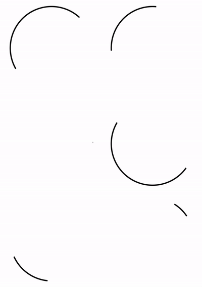
This is a very interesting one question.
We know that using CSS, we can easily achieve such an animation effect:
<div></div>
div {
    width: 100px;
    height: 100px;
    border-radius: 50%;
    border: 2px solid transparent;
    border-top: 2px solid #000;
    border-left: 2px solid #000;
    animation: rotate 3s infinite linear;
}
@keyframes rotate {
    100% {
        transform: rotate(360deg);
    }
}
The animation is as follows:

with requirements Compared with the line loading animation, the above animation lacks a core point:
- The length of the line will change during the rotation movement
So, the difficulty here becomes, how to dynamically realize the length change of the arc segment? Solving this problem basically solves the above-mentioned line transformation Loading animation.
This article will introduce several interesting ways in CSS that may dynamically change the length of arc lines:
Method 1: Use masks to achieve
The first method The method, which is also easier to think of, is to use masking.
We implement two semicircle lines, one is the actual color that can be seen, the other is the same as the background color, a relatively thicker semicircle line, when two When the speed of line movement is inconsistent, we can visually see dynamically changing arc lines.
Look at the schematic diagram and you will understand at a glance:
<div></div>
div {
    width: 200px;
    height: 200px;
}
div::before {
    position: absolute;
    content: "";
    top: 0px; left: 0px; right: 0px; bottom: 0px;
    border-radius: 50%;
    border: 3px solid transparent;
    border-top: 3px solid #000;
    border-left: 3px solid #000;
    animation: rotate 3s infinite ease-out;
}
div::after {
    position: absolute;
    content: "";
    top: -2px; left: -2px; right: -2px; bottom: -2px;
    border-radius: 50%;
    border: 7px solid transparent;
    border-bottom: 7px solid #fff;
    border-right: 7px solid #fff;
    animation: rotate 4s infinite ease-in-out;
}
@keyframes rotate {
    100% {
        transform: rotate(0deg);
    }
}
The core is to realize two semicircular lines, one black and one background color. The two lines move at different rates (controlled by animation time and easing). The effect is as follows:

For the complete code you can hit-- CodePen Demo - Linear Loadinghttps://codepen.io/Chokcoco/pen/PvqYNJThe two biggest problems with the above solution are:
- If the background color is not a solid color, the secret will be exposed
- If It is required that the length of the line segment that can be displayed is greater than half a circle, which cannot be completed


[Web Animation] Introduction to SVG Line Animation
at Here, we only need a simple SVG tag, combined with its CSS styles stroke-dasharray and stroke-dashoffset to easily achieve the above effect : <svg class="circular" viewbox="25 25 50 50">
<circle class="path" cx="50" cy="50" r="20" fill="none" />
</svg>
.circular {
  width: 100px;
  height: 100px;
  animation: rotate 2s linear infinite;
}
.path {
  stroke-dasharray: 1, 200;
  stroke-dashoffset: 0;
  stroke: #000;
  animation: dash 1.5s ease-in-out infinite
}
@keyframes rotate {
  100% {
    transform: rotate(360deg);
  }
}
@keyframes dash {
  0% {
    stroke-dasharray: 1, 200;
    stroke-dashoffset: 0;
  }
  50% {
    stroke-dasharray: 89, 200;
    stroke-dashoffset: -35px;
  }
  100% {
    stroke-dasharray: 89, 200;
    stroke-dashoffset: -124px;
  }
}
- stroke
: Analogous to border-color in CSS, set the border color for svg graphics; - stroke-dasharray
: The value is an array, with no upper limit. Each number alternately represents the width of the stroke and space; - stroke-dashoffset
: dash The distance from the pattern to the start of the path.
stroke-dasharray to cut the original complete line into multiple segments. Suppose stroke-dasharray: 10, 10 represents such a graphic:

stroke-dasharray: 1, 200 in the actual code means that it is in the middle of two 1px line segments, with an interval of 200px, due to The circumference of a circle with a diameter of 40px is 40 * π ≈ 125.6px, which is less than 200, so the actual figure is as follows, there is only one point:

同理,stroke-dasharray: 89, 200 表示:

通过 animation,让线段在这两种状态之间补间变换。而 stroke-dashoffset 的作用则是将线段向前推移,配合父容器的 transform: rotate() 旋转动画,使得视觉效果,线段是在一直在向一个方向旋转。结果如下:
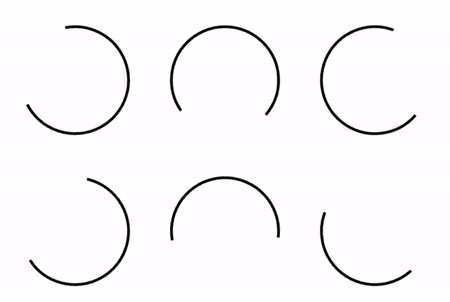
完整的代码你可以戳这里:CodePen Demo -- Linear loading
https://codepen.io/Chokcoco/pen/jOGQGJP?editors=1100
OK,还会有同学说了,我不想引入 SVG 标签,我只想使用纯 CSS 方案。这里,还有一种利用 CSS @property 的纯 CSS 方案。
方法三:使用 CSS @property 让 conic-gradient 动起来
这里我们需要借助 CSS @property 的能力,使得本来无法实现动画效果的角向渐变,动起来。
正常来说,渐变是无法进行动画效果的,如下所示:
<div></div>
.normal {
    width: 200px;
    height: 200px;
    border-radius: 50%;
    background: conic-gradient(yellowgreen, yellowgreen 25%, transparent 25%, transparent 100%);
    transition: background 300ms;

    &:hover {
        background: conic-gradient(yellowgreen, yellowgreen 60%, transparent 60.1%, transparent 100%);
    }
}
将会得到这样一种效果,由于 conic-gradient 是不支持过渡动画的,得到的是一帧向另外一帧的直接变化:

好,使用 CSS @property 自定义变量改造一下:
@property --per {
syntax: '<percentage>';
inherits: false;
initial-value: 25%;
}
div {
background: conic-gradient(yellowgreen, yellowgreen var(--per), transparent var(--per), transparent 100%);
transition: --per 300ms linear;
&:hover {
--per: 60%;
}
}看看改造后的效果:

在这里,我们可以让渐变动态的动起来,赋予了动画的能力。
我们只需要再引入 mask,将中间部分裁切掉,即可实现上述线条 Loading 动画,伪代码如下:
<div></div>
@property --per {
    syntax: "<percentage>";
    inherits: false;
    initial-value: 10%;
}

div {
    position: relative;
    width: 100px;
    height: 100px;
    border-radius: 50%;
    animation: rotate 11s infinite ease-in-out;

    &::before {
        content: "";
        position: absolute;
        top: 0;
        left: 0;
        right: 0;
        bottom: 0;
        border-radius: 50%;
        background: conic-gradient(transparent, transparent var(--per), #fa7 var(--per), #fa7);
        mask: radial-gradient(transparent, transparent 47.5px, #000 48px, #000);
        animation: change 3s infinite cubic-bezier(0.57, 0.29, 0.49, 0.76);
    }
}

@keyframes change {
    50% {
        transform: rotate(270deg);
        --per: 98%;
    }
    100% {
        transform: rotate(720deg);
    }
}

@keyframes rotate {
    100% {
        transform: rotate(360deg);
        filter: hue-rotate(360deg);
    }
}
这里,我顺便加上了 filter: hue-rotate(),让线条在旋转的同时,颜色也跟着变化,最终效果如下,这是一个纯 CSS 解决方案:

完整的代码你可以猛击这里:Linear Loading Animation
https://codepen.io/Chokcoco/pen/ZEXmJxP?editors=1100
本方案的唯一问题在于,当前 CSS @property 的兼容性稍微不是那么乐观。当然,未来可期。
最后
简单总结一下,本文介绍了 3 种实现动态弧形线条长短变化的 Loading 动画,当然,它们各有优劣,实际使用的时候根据实际情况具体取舍。有的时候,切图也许也是更省时间的一种方式:)
好了,本文到此结束,希望本文对你有所帮助 :)
(学习视频分享:css视频教程)
The above is the detailed content of An article explaining in detail how to implement loading animation of dynamic arc line length changes with css. For more information, please follow other related articles on the PHP Chinese website!

