Home >Web Front-end >Front-end Q&A >Organize and share 5 pure CSS to achieve cool text effects
Organize and share 5 pure CSS to achieve cool text effects
- WBOYWBOYWBOYWBOYWBOYWBOYWBOYWBOYWBOYWBOYWBOYWBOYWBforward
- 2022-01-13 18:19:524544browse
This article brings you 5 very cool text effects. These effects are all implemented using CSS. I hope it will be helpful to everyone.

CSS is a very special language. You think CSS can only be used to control the structure and style of web pages, but as long as you have rich imagination, you can create Endless possibilities.
1. Gradient text effect
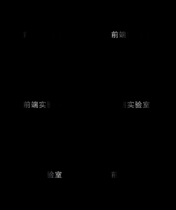
background: linear-gradient(90deg, black 0%, white 50%, black 100%);Set the webkit-background-clip property and use the text as the cropping area to crop outwards
-webkit-background-clip: text;
        background-clip: text;
Set animation through the -webkit-animation property , you can achieve the above effect-webkit-animation: shining 3s linear infinite;
animation: shining 3s linear infinite;@-webkit-keyframes shining {
from {
background-position: -500%;
}
to {
background-position: 500%;
}
}
@keyframes shining {
from {
background-position: -500%;
}
to {
background-position: 500%;
}
}Style reference<html>
<link rel="stylesheet" href="./css/neno-text-style.css">
<body>
<p class="neon">前端实验室</p>
</body>
</html>
2. Rainbow text effect (marquee)
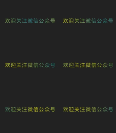
.text {
    letter-spacing: 0.2rem;
    font-size: 1.5rem;
    background-image: -webkit-linear-gradient(left, #147B96, #E6D205 25%, #147B96 50%, #E6D205 75%, #147B96);
    -webkit-text-fill-color: transparent;
    -webkit-background-clip: text;
    -webkit-background-size: 200% 100%;
}
This effect is also achieved using background-clip:text and the linear gradient attribute linear-gradient. The rainbow text effect is achieved by setting the regional color value. Dynamic rainbow text needs to set the -webkit-animation attribute-webkit-animation: maskedAnimation 4s infinite linear;
@keyframes maskedAnimation {
0% {
background-position: 0 0;
}
100% {
background-position: -100% 0;
}
}CSS style.rainbow {
letter-spacing: 0.2rem;
font-size: 1.2rem;
text-transform: uppercase;
}
.rainbow span {
animation: rainbow 50s alternate infinite forwards;
}
@keyframes rainbow {
0% {
color: #efc68f;
}
...
100% {
color: #8fefed;
}
}<html>
<head>
<link rel="stylesheet" href="./css/rainbow-color-text-style.css">
</head>
<body>
<div class="text">【前端实验室】分享前端最新、最实用前端技术</div>
</body>
</html>
3. Glowing text effect
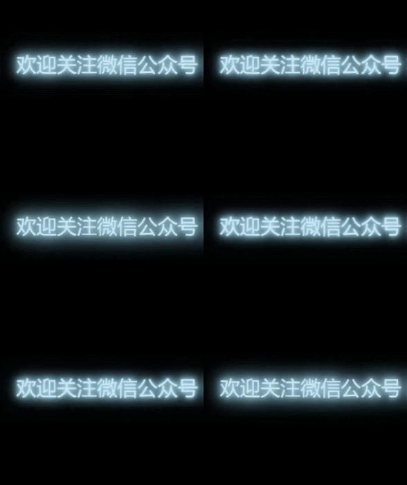
.neon {
    color: #cce7f8;
    font-size: 2.5rem;
    -webkit-animation: shining 0.5s alternate infinite;
    animation: shining 0.5s alternate infinite;
}
@-webkit-keyframes shining {
from {
text-shadow: 0 0 10px lightblue, 0 0 20px lightblue, 0 0 30px lightblue, 0 0 40px skyblue, 0 0 50px skyblue, 0 0 60px skyblue;
}
to {
text-shadow: 0 0 5px lightblue, 0 0 10px lightblue, 0 0 15px lightblue, 0 0 20px skyblue, 0 0 25px skyblue, 0 0 30px skyblue;
}
}<html>
<head>
<link rel="stylesheet" href="./css/neno-text-style.css">
</head>
<body>
<p class="neon">【前端实验室】分享前端最新、最实用前端技术</p>
</body>
</html>
4. Typewriter effect
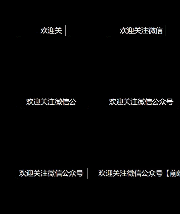
.typing {
    color: white;
    font-size: 2em;
    width: 21em;
    height: 1.5em;
    border-right: 1px solid transparent;
    animation: typing 2s steps(42, end), blink-caret .75s step-end infinite;
    font-family: Consolas, Monaco;
    word-break: break-all;
    overflow: hidden;
}
/* 打印效果 */
@keyframes typing {
from {
width: 0;
}
to {
width: 21em;
}
}
/* 光标 */
@keyframes blink-caret {
from,
to {
border-color: transparent;
}
50% {
border-color: currentColor;
}
}<html> <head> <link rel="stylesheet" href="./css/typing-style.css"> </head> <body> <div class="typing">【前端实验室】分享前端最新、最实用前端技术</div> </html>The white-space:nowrap attribute is mainly to ensure that one line is displayed. Considering the display of English letters, this attribute is removed to ensure that there will be no character discontinuity. word-break:break-all enables English characters to be presented one by one. The steps function in the animation attribute allows the animation to be executed intermittently rather than continuously. The syntax of steps() is: steps(number, position), where the number keyword indicates how many segments the animation is divided into; the position keyword indicates whether the animation is continuous from the beginning or end of the time period, and supports start and The two keywords end have the following meanings:
- start: means starting directly
- end: means stopping abruptly, which is the default value
5. Fault style text effect
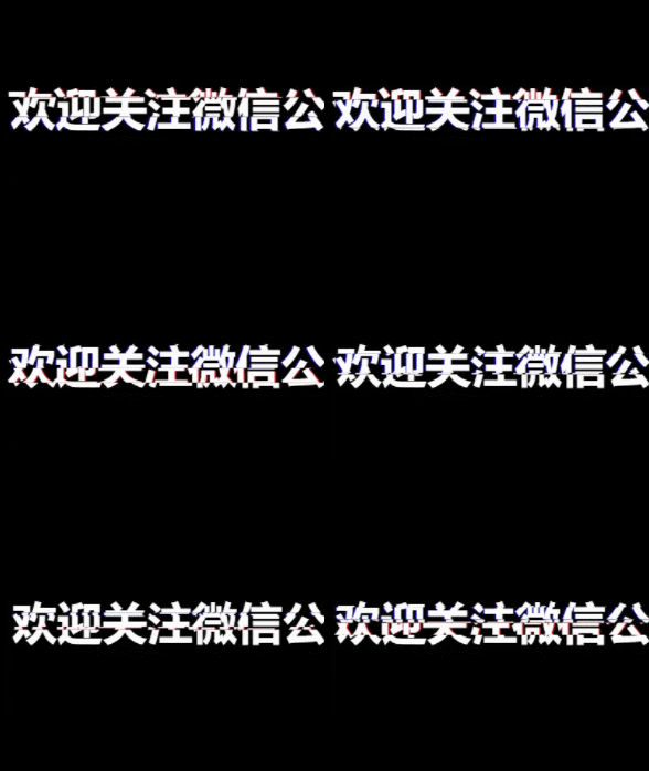
<div class="text" data-text="欢迎关注微信公众号【前端实验室】">
  欢迎关注微信公众号【前端实验室】
</div>
Custom attributes are mainly used here, data- plus the custom attribute name, and the text to be displayed is assigned for the pseudo element to obtain the corresponding text.
@keyframes animation-before{
    0% {
        clip-path: inset(0 0 0 0);
    }
    ...
    100% {
        clip-path: inset(.62em 0 .29em 0);
    }
}
@keyframes animation-after{
      0% {
        clip-path: inset(0 0 0 0);
    }
    ...
    100% {
        clip-path: inset(.29em 0 .62em 0);
    }
}
Two keyframes are set up here, namely animation-before and animation-after. The former is for pseudo-element before, and the latter is for pseudo-element after. The clip-path attribute is a new property mask of CSS3. The inset() value indicates that the shape of the mask is a rectangle. After defining the mask's effect area, set the frame-by-frame animation through @keyframes. Make the mask's area of effect change in the vertical direction to achieve the effect of up and down jittering. .text{
display: inline-block;
font-size: 3.5em;
font-weight: 600;
padding: 0 4px;
color: white;
position: relative;
}.text::before{
content: attr(data-text);
position: absolute;
left: -2px;
width: 100%;
background: black;
text-shadow:2px 0 red;
animation: animation-before 3s infinite linear alternate-reverse;
}.text::after{
content: attr(data-text);
position: absolute;
left: 2px;
width: 100%;
background: black;
text-shadow: -2px 0 blue;
animation: animation-after 3s infinite linear alternate-reverse;
}Finally, we set two pseudo elements before and after, position them at the same position as the parent element, and then move them a little distance to the left and right respectively to create a misaligned effect, and then move them both The background color is set to the same color as the background color of the parent element, which is used to block the parent elementThis way, a perfect glitch-style text display animation can be achieved~Cool special effects It can add a different style to our web pages. The source code of the effect achieved in this article has been uploaded to Github. You can get it by replying to the aaa text effect in the background of the public account. Come and learn with us! (Learning video sharing: css video tutorial)
The above is the detailed content of Organize and share 5 pure CSS to achieve cool text effects. For more information, please follow other related articles on the PHP Chinese website!

