Home >Web Front-end >CSS Tutorial >How to achieve the effect of panning to the left and disappearing in css3
How to achieve the effect of panning to the left and disappearing in css3
- WBOYWBOYWBOYWBOYWBOYWBOYWBOYWBOYWBOYWBOYWBOYWBOYWBOriginal
- 2021-12-15 18:24:143818browse
Method: 1. Use the "animation: name time" statement to bind the left translation disappearing animation to the element; 2. Use "@keyframes name {100%{transform: translateX (- translation distance); opacity: 0;}}" statement achieves the effect of the element moving to the left and disappearing.

The operating environment of this tutorial: Windows 10 system, CSS3&&HTML5 version, Dell G3 computer.
How to achieve the effect of panning to the left and disappearing in css3
In css, if you want to achieve the effect of elements panning to the left and disappearing, you can use animation Properties and @keyframes rules.
The principle of creating animation is to gradually change one set of CSS styles into another set of styles. You can change this set of CSS styles multiple times during the animation.
Specify the time when the change occurs as a percentage, or through the keywords "from" and "to", which are equivalent to 0% and 100%. 0% is the start time of the animation, 100% is the end time of the animation. For best browser support, you should always define 0% and 100% selectors.
There is also a transform attribute used to set the image sliding action. The transform property applies a 2D or 3D transformation to an element. This property allows us to rotate, scale, move or tilt the element.
There is also the opacity attribute used to set the transparent style of the element.
The example is as follows:
<!DOCTYPE html>
<html lang="en">
<head>
    <meta charset="UTF-8">
    <meta name="viewport" content="width=device-width, initial-scale=1.0">
    <meta http-equiv="X-UA-Compatible" content="ie=edge">
    <title>Document</title>
    <style>
.div1{
  width:100px;
  height:100px;
  background:pink;
  margin:0 auto;
animation:fadenum 5s;
}
@keyframes fadenum{
  100%{transform:translateX(-200px);opacity:0;}
}
</style>
</head>
<body>
<div class="div1">这是一个向左平移消失的div</div>
</body>
</html>
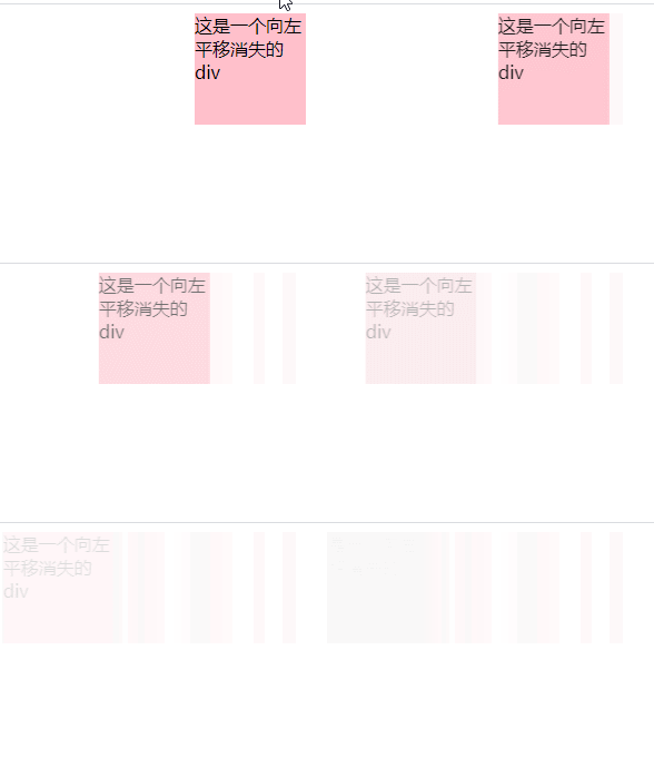
Output result:

(Learning video sharing: css video tutorial)
The above is the detailed content of How to achieve the effect of panning to the left and disappearing in css3. For more information, please follow other related articles on the PHP Chinese website!

