
Home >Web Front-end >CSS Tutorial >How to achieve rounded corners and shadows of borders in css3
How to achieve rounded corners and shadows of borders in css3

- 青灯夜游Original
- 2021-12-15 12:02:392970browse
In css3, you can use the border-radius attribute to achieve rounded corners, the syntax "border-radius: fillet radius value;"; you can use the box-shadow attribute to achieve shadow, the syntax "box-shadow: X-axis offset Shift Y-axis offset blur radius expansion radius color projection mode;".

The operating environment of this tutorial: Windows 7 system, CSS3&&HTML5 version, Dell G3 computer.
Rounded corners of the border--border-radius
Rounded squares:
border-radius:10px; /* 所有角都使用半径为10px的圆角 */
Effect:

Solid upper semicircle:
Method: Set the height (height) to half the width (width), and only set the radius of the upper left corner and upper right corner to be consistent with the height of the element (or can be greater than the height).
#box{
    width:80px;
    height:40px;/*宽度的一半*/
    background:skyblue;
    border-radius:40px 40px 0 0;/*4个值分别代表上、右、下、左*/
}
Effect:

Solid circle:
Method: Set the width (width) and height (height) values to be consistent ( that is, a square), and the four rounded corner values are set to half of their values.
#box{
    width:80px;
    height:80px;
    background:skyblue;
    border-radius:40px;
}
Effect:

Solid left semicircle:
Method: The width of the element is half of the height, and the upper left corner and the lower left corner are The angle is set to half the height.
#box{
    width:40px;
    height:80px;
    background:skyblue;
    border-radius:40px 0 0 40px;
}
Effect:

Border shadow ---box-shadow
box-shadow can add a shadow to the element and supports adding one Or more than one.
box-shadow: X轴偏移量 Y轴偏移量 阴影模糊半径 阴影扩展半径 阴影颜色 投影方式;
Parameters:
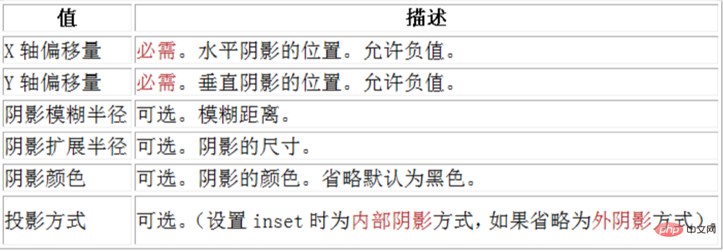
Note: inset can be written in the first or last parameter, other positions are invalid.
Shadow blur radius:
This parameter is optional. The value can only be positive. If the value is 0, it means that the shadow has no blur effect. The larger the value, the smaller the edge of the shadow. Vague.
css code:
#box{
     width:50px;
     height:50px;
     background:#fff;
     box-shadow:4px 4px 15px #666;
 }
Effect:

Shadow expansion radius:
This parameter is optional, the value can be It is a positive or negative value. If the value is positive, the entire shadow will be extended and expanded. Otherwise, if the value is negative, it will be reduced.
css code:
#box{
     width:50px;
     height:50px;
     background:#fff;
     box-shadow:4px 4px 15px -3px #666;
}
Effect:

#box{
    width:50px;
    height:50px;
    background:#fff;
    box-shadow:-5px 5px 5px #666;
}
Effect:
 ##The Y-axis offset is a negative number:
#box{
    width:50px;
    height:50px;
    background:#fff;
    box-shadow:5px -5px 5px #666;
}
Effect:
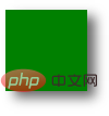
 Outer shadow:
#box{
     width:50px;
     height:50px;
     background:green;
     box-shadow:5px 4px 10px #666;
}
Effect:
 Inner shadow:
#box{
     width:50px;
     height:50px;
     background:#fff;
     box-shadow:5px 4px 10px #666 inset;
}
Effect:
## Add multiple shadows: 
#box{
     width:50px;
     height:50px;
     background:#fff;
     box-shadow:5px 4px 10px #666 inset,
                3px 3px 5px pink,
                6px 4px 2px green;
}
Effect:
(Learning video sharing:  css video tutorial
The above is the detailed content of How to achieve rounded corners and shadows of borders in css3. For more information, please follow other related articles on the PHP Chinese website!
Related articles
See more- What is the code for css3 attribute to control rotation?
- What are the properties that implement animation effects in css3
- What are the triggering methods for css3 transition?
- What is the difference between css3 animation and js animation
- What are the syntaxes for defining gradients in css3
- How to remove input cursor in css3