


align-content
作用:
会设置自由盒内部各个项目在垂直方向排列方式。
条件:
必须对父元素设置自由盒属性display:flex;,并且设置排列方式为横向排列flex-direction:row;并且设置换行,flex-wrap:wrap;这样这个属性的设置才会起作用。
设置对象:
这个属性是对她容器内部的项目起作用,对父元素进行设置。
取值:
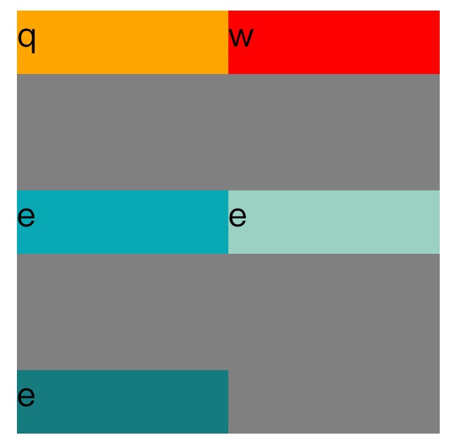
stretch:默认设置,会拉伸容器内每个项目占用的空间,填充方式为给每个项目下方增加空白。第一个项目默认从容器顶端开始排列。
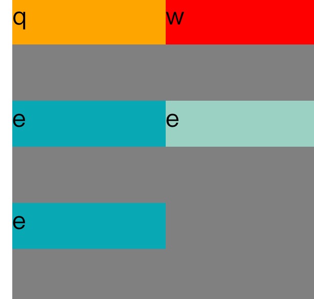
<span style="color: #800000;">html>


<meta charset="UTF-8">
<title>
Align-content
</title>
<style>

#father</style></span>{<span style="color: #ff0000;">

    width</span>:<span style="color: #0000ff;">200px</span>;<span style="color: #ff0000;">
    display</span>:<span style="color: #0000ff;">flex</span>;<span style="color: #ff0000;">
    flex-direction</span>:<span style="color: #0000ff;">row</span>;<span style="color: #ff0000;">
    flex-wrap</span>:<span style="color: #0000ff;">wrap</span>;<span style="color: #ff0000;">
    align-content</span>:<span style="color: #0000ff;">strech</span>;<span style="color: #ff0000;">
    height</span>:<span style="color: #0000ff;">200px</span>;<span style="color: #ff0000;">
    background-color</span>:<span style="color: #0000ff;">grey</span>;
}<span style="color: #800000;">
.son1</span>{<span style="color: #ff0000;">

      height</span>:<span style="color: #0000ff;">30px</span>;<span style="color: #ff0000;">
    width</span>:<span style="color: #0000ff;">100px</span>;<span style="color: #ff0000;">
    background-color</span>:<span style="color: #0000ff;">orange</span>;
}<span style="color: #800000;">

.son2</span>{<span style="color: #ff0000;">

    height</span>:<span style="color: #0000ff;">30px</span>;<span style="color: #ff0000;">
    width</span>:<span style="color: #0000ff;">100px</span>;<span style="color: #ff0000;">
    background-color</span>:<span style="color: #0000ff;">red</span>;
}<span style="color: #800000;">

.son3</span>{<span style="color: #ff0000;">

      height</span>:<span style="color: #0000ff;">30px</span>;<span style="color: #ff0000;">
    width</span>:<span style="color: #0000ff;">100px</span>;<span style="color: #ff0000;">
    background-color</span>:<span style="color: #0000ff;">#08a9b5</span>;
}<span style="color: #800000;">


<div id="father">

<div class="son1">
q
</div>

<div class="son2">
w
</div>

<div class="son3">
e
</div>
<div class="son3">
e
</div>
<div class="son3">
e
</div>


</div>


</span>
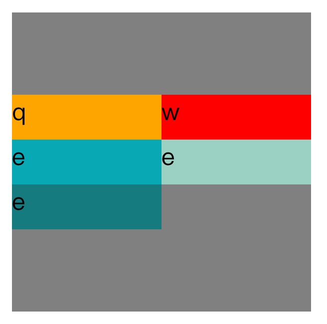
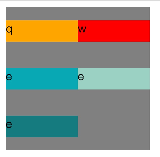
Center:这个会取消项目之间的空白并把所有项目垂直居中。
<span style="color: #800000;">html>


<meta charset="UTF-8">
<title>
关于文档元素测试
</title>
<style>

#father</style></span>{<span style="color: #ff0000;">

    width</span>:<span style="color: #0000ff;">200px</span>;<span style="color: #ff0000;">
    display</span>:<span style="color: #0000ff;">flex</span>;<span style="color: #ff0000;">
    flex-direction</span>:<span style="color: #0000ff;">row</span>;<span style="color: #ff0000;">
    flex-wrap</span>:<span style="color: #0000ff;">wrap</span>;<span style="color: #ff0000;">
    align-content</span>:<span style="color: #0000ff;">center</span>;<span style="color: #ff0000;">
    height</span>:<span style="color: #0000ff;">200px</span>;<span style="color: #ff0000;">
    background-color</span>:<span style="color: #0000ff;">grey</span>;
}<span style="color: #800000;">
.son1</span>{<span style="color: #ff0000;">

      height</span>:<span style="color: #0000ff;">30px</span>;<span style="color: #ff0000;">
    width</span>:<span style="color: #0000ff;">100px</span>;<span style="color: #ff0000;">
    background-color</span>:<span style="color: #0000ff;">orange</span>;
}<span style="color: #800000;">

.son2</span>{<span style="color: #ff0000;">

    height</span>:<span style="color: #0000ff;">30px</span>;<span style="color: #ff0000;">
    width</span>:<span style="color: #0000ff;">100px</span>;<span style="color: #ff0000;">
    background-color</span>:<span style="color: #0000ff;">red</span>;
}<span style="color: #800000;">

.son3</span>{<span style="color: #ff0000;">

      height</span>:<span style="color: #0000ff;">30px</span>;<span style="color: #ff0000;">
    width</span>:<span style="color: #0000ff;">100px</span>;<span style="color: #ff0000;">
    background-color</span>:<span style="color: #0000ff;">#08a9b5</span>;
}<span style="color: #800000;">


.son4</span>{<span style="color: #ff0000;">

      height</span>:<span style="color: #0000ff;">30px</span>;<span style="color: #ff0000;">
    width</span>:<span style="color: #0000ff;">100px</span>;<span style="color: #ff0000;">
    background-color</span>:<span style="color: #0000ff;">#9ad1c3</span>;
}<span style="color: #800000;">

.son5</span>{<span style="color: #ff0000;">

      height</span>:<span style="color: #0000ff;">30px</span>;<span style="color: #ff0000;">
    width</span>:<span style="color: #0000ff;">100px</span>;<span style="color: #ff0000;">
    background-color</span>:<span style="color: #0000ff;">rgb(21,123,126)</span>;
}<span style="color: #800000;">


<div id="father">

<div class="son1">
q
</div>

<div class="son2">
w
</div>

<div class="son3">
e
</div>
<div class="son4">
e
</div>
<div class="son5">
e
</div>


</div>


</span>
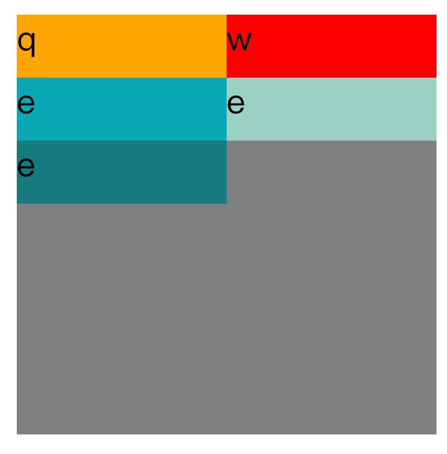
Flex-start:这个会取消项目之间的空白,并把项目放在容器顶部。
<span style="color: #800000;">html>


<meta charset="UTF-8">
<title>
关于文档元素测试
</title>
<style>

#father</style></span>{<span style="color: #ff0000;">

    width</span>:<span style="color: #0000ff;">200px</span>;<span style="color: #ff0000;">
    display</span>:<span style="color: #0000ff;">flex</span>;<span style="color: #ff0000;">
    flex-direction</span>:<span style="color: #0000ff;">row</span>;<span style="color: #ff0000;">
    flex-wrap</span>:<span style="color: #0000ff;">wrap</span>;<span style="color: #ff0000;">
    align-content</span>:<span style="color: #0000ff;">flex-start</span>;<span style="color: #ff0000;">
    height</span>:<span style="color: #0000ff;">200px</span>;<span style="color: #ff0000;">
    background-color</span>:<span style="color: #0000ff;">grey</span>;
}<span style="color: #800000;">
.son1</span>{<span style="color: #ff0000;">

      height</span>:<span style="color: #0000ff;">30px</span>;<span style="color: #ff0000;">
    width</span>:<span style="color: #0000ff;">100px</span>;<span style="color: #ff0000;">
    background-color</span>:<span style="color: #0000ff;">orange</span>;
}<span style="color: #800000;">

.son2</span>{<span style="color: #ff0000;">

    height</span>:<span style="color: #0000ff;">30px</span>;<span style="color: #ff0000;">
    width</span>:<span style="color: #0000ff;">100px</span>;<span style="color: #ff0000;">
    background-color</span>:<span style="color: #0000ff;">red</span>;
}<span style="color: #800000;">

.son3</span>{<span style="color: #ff0000;">

      height</span>:<span style="color: #0000ff;">30px</span>;<span style="color: #ff0000;">
    width</span>:<span style="color: #0000ff;">100px</span>;<span style="color: #ff0000;">
    background-color</span>:<span style="color: #0000ff;">#08a9b5</span>;
}<span style="color: #800000;">


.son4</span>{<span style="color: #ff0000;">

      height</span>:<span style="color: #0000ff;">30px</span>;<span style="color: #ff0000;">
    width</span>:<span style="color: #0000ff;">100px</span>;<span style="color: #ff0000;">
    background-color</span>:<span style="color: #0000ff;">#9ad1c3</span>;
}<span style="color: #800000;">

.son5</span>{<span style="color: #ff0000;">

      height</span>:<span style="color: #0000ff;">30px</span>;<span style="color: #ff0000;">
    width</span>:<span style="color: #0000ff;">100px</span>;<span style="color: #ff0000;">
    background-color</span>:<span style="color: #0000ff;">rgb(21,123,126)</span>;
}<span style="color: #800000;">


<div id="father">

<div class="son1">
q
</div>

<div class="son2">
w
</div>

<div class="son3">
e
</div>
<div class="son4">
e
</div>
<div class="son5">
e
</div>


</div>


</span>
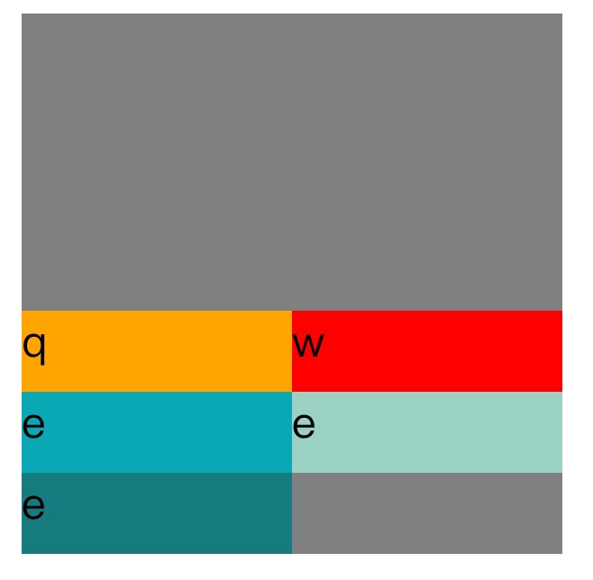
flex-end:这个会取消项目之间的空白并把项目放在容器底部。
align-content:flex-end;
space-between这个会使项目在垂直方向两端对齐。即上面的项目对齐容器顶部,最下面一个项目对齐容器底部。留相同间隔在每个项目之间。
align-content:space-between;
Space-around:这个会使每个项目上下位置保留相同长度空白,使得项目之间的空白为两倍的单个项目空白。
align-content:space-around;
Inherit:使得元素的这个属性继承自它的父元素。
innitial:使元素这个属性为默认初始值。

 HTML, CSS, and JavaScript: Examples and Practical ApplicationsMay 09, 2025 am 12:01 AM
The roles of HTML, CSS and JavaScript in web development are: 1. HTML is used to build web page structure; 2. CSS is used to beautify the appearance of web pages; 3. JavaScript is used to achieve dynamic interaction. Through tags, styles and scripts, these three together build the core functions of modern web pages.
 How do you set the lang attribute on the tag? Why is this important?May 08, 2025 am 12:03 AM
Setting the lang attributes of a tag is a key step in optimizing web accessibility and SEO. 1) Set the lang attribute in the tag, such as. 2) In multilingual content, set lang attributes for different language parts, such as. 3) Use language codes that comply with ISO639-1 standards, such as "en", "fr", "zh", etc. Correctly setting the lang attribute can improve the accessibility of web pages and search engine rankings.
 What is the purpose of HTML attributes?May 07, 2025 am 12:01 AM
HTMLattributesareessentialforenhancingwebelements'functionalityandappearance.Theyaddinformationtodefinebehavior,appearance,andinteraction,makingwebsitesinteractive,responsive,andvisuallyappealing.Attributeslikesrc,href,class,type,anddisabledtransform
 How do you create a list in HTML?May 06, 2025 am 12:01 AM
TocreatealistinHTML,useforunorderedlistsandfororderedlists:1)Forunorderedlists,wrapitemsinanduseforeachitem,renderingasabulletedlist.2)Fororderedlists,useandfornumberedlists,customizablewiththetypeattributefordifferentnumberingstyles.
 HTML in Action: Examples of Website StructureMay 05, 2025 am 12:03 AM
HTML is used to build websites with clear structure. 1) Use tags such as, and define the website structure. 2) Examples show the structure of blogs and e-commerce websites. 3) Avoid common mistakes such as incorrect label nesting. 4) Optimize performance by reducing HTTP requests and using semantic tags.
 How do you insert an image into an HTML page?May 04, 2025 am 12:02 AM
ToinsertanimageintoanHTMLpage,usethetagwithsrcandaltattributes.1)UsealttextforaccessibilityandSEO.2)Implementsrcsetforresponsiveimages.3)Applylazyloadingwithloading="lazy"tooptimizeperformance.4)OptimizeimagesusingtoolslikeImageOptimtoreduc
 HTML's Purpose: Enabling Web Browsers to Display ContentMay 03, 2025 am 12:03 AM
The core purpose of HTML is to enable the browser to understand and display web content. 1. HTML defines the web page structure and content through tags, such as, to, etc. 2. HTML5 enhances multimedia support and introduces and tags. 3.HTML provides form elements to support user interaction. 4. Optimizing HTML code can improve web page performance, such as reducing HTTP requests and compressing HTML.
 Why are HTML tags important for web development?May 02, 2025 am 12:03 AM
HTMLtagsareessentialforwebdevelopmentastheystructureandenhancewebpages.1)Theydefinelayout,semantics,andinteractivity.2)SemantictagsimproveaccessibilityandSEO.3)Properuseoftagscanoptimizeperformanceandensurecross-browsercompatibility.


Hot AI Tools

Undresser.AI Undress
AI-powered app for creating realistic nude photos

AI Clothes Remover
Online AI tool for removing clothes from photos.

Undress AI Tool
Undress images for free

Clothoff.io
AI clothes remover

Video Face Swap
Swap faces in any video effortlessly with our completely free AI face swap tool!

Hot Article
Hot Tools

DVWA
Damn Vulnerable Web App (DVWA) is a PHP/MySQL web application that is very vulnerable. Its main goals are to be an aid for security professionals to test their skills and tools in a legal environment, to help web developers better understand the process of securing web applications, and to help teachers/students teach/learn in a classroom environment Web application security. The goal of DVWA is to practice some of the most common web vulnerabilities through a simple and straightforward interface, with varying degrees of difficulty. Please note that this software

SublimeText3 English version
Recommended: Win version, supports code prompts!

Atom editor mac version download
The most popular open source editor

Notepad++7.3.1
Easy-to-use and free code editor

Safe Exam Browser
Safe Exam Browser is a secure browser environment for taking online exams securely. This software turns any computer into a secure workstation. It controls access to any utility and prevents students from using unauthorized resources.

