Home >Web Front-end >Bootstrap Tutorial >Let's talk about the picture component and outline component in Bootstrap
Let's talk about the picture component and outline component in Bootstrap
- 青灯夜游forward
- 2021-11-19 19:32:332432browse
This article will take you to learn about the picture components and outline components in Bootstrap, and introduce responsive pictures, picture thumbnails, picture tags and outlines (Figures). I hope it will be helpful to everyone. !

1 Images
This section will learn how to make images support responsive behavior (so that they do not exceed the scope of the parent element) and how to use classes (class) Add some styles.
1.1 Responsive images
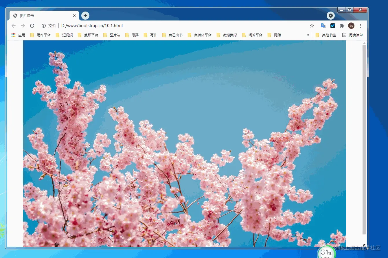
Make images support responsive layout through the .img-fluid class provided by Bootstrap. The principle is to give max-width: 100%; and height: auto; to the image so that it scales with the parent element. [Related recommendations: "bootstrap tutorial"]
nbsp;html>


    <meta>
    <meta>
    <meta>
    <meta>
    <link>
    <title>图片演示</title>


        <div>

            <img  src="/static/imghwm/default1.png" data-src="pic/taohua.jpg" class="lazy" alt="Let's talk about the picture component and outline component in Bootstrap" >

        </div>

     <script></script>
The above container is to center the image and cut it with margins on all sides. It is not part of the image component. The following is a demonstration video.

10.1.2 Image thumbnail
In addition to the border-radius provided by the general class, you can also use .img-thumbnail to make the image thumbnail The appearance has a circular border of 1px width.
<!doctype html>
<html lang="zh-CN">
  <head>
    <meta charset="utf-8">
    <meta name="viewport" content="width=device-width, initial-scale=1">
    <meta name="keywords" content="">
    <meta name="description" content="">
    <link href="bootstrap5/bootstrap.min.css" rel="stylesheet">
    <style>
      .div1{width: 300;  height: 300px;text-align: center;padding-top: 50px;}
    </style>
    <title>图片演示</title>
  </head>
  <body>
            <div class="div1">
                 <img class="img-thumbnail lazy"  src="/static/imghwm/default1.png"  data-src="pic/taohua.jpg"       style="max-width:90%"  alt="点击查看大图">
            </div>

     <script src="bootstrap5/bootstrap.bundle.min.js" ></script>
  </body>
</html>
This component is also responsive, but I only gave a screenshot. The CSS style above is to keep the image from being close to the edge, so that the border is not visible. In fact, it is the same if you use the container directly. This is just to not use the container so that everyone will not think that the container is also part of it.

1.3 picture tag
The picture element is used by including one or more source elements and an img element combined with media (media query). Different pictures are displayed according to the different sizes matched by the screen. If there is no match or the browser does not support the picture attribute, the img element will be used. No matter how many sources are specified for a picture element, only one of them or img will be displayed.
If you use the element to specify multiple <source></source> elements for a <img class="img-thumbnail lazy" src="/static/imghwm/default1.png" data-src="pic/taohua.jpg" alt="Let's talk about the picture component and outline component in Bootstrap" > be sure to add the .img-* classes to <img class="img-thumbnail lazy" src="/static/imghwm/default1.png" data-src="pic/taohua.jpg" alt="Let's talk about the picture component and outline component in Bootstrap" > element instead of <picture></picture> element or source element.
The source elements are arranged in order. The media query value, if it is max-width, is sorted from small to large; if it is min-width, it is sorted from large to small. The following is the source code. The js code in the source code is to obtain the screen width as a comparison.
nbsp;html>


    <meta>
    <meta>
    <meta>
    <meta>
    <link>
    <title>图片演示</title>


        <div>
            <p>
                <span></span>
                <script>
                getwidth();
                window.onresize = function(){
                    getwidth();
                }
                function getwidth(){
                document.getElementById("info").innerHTML="宽度:"+document.documentElement.clientWidth+",高度:"+document.documentElement.clientHeight;
                }
                </script>
                    </p>
            <picture>
                <source>
                <source>
                <img  class="img-thumbnail lazy" src="/static/imghwm/default1.png" data-src="pic/taohua.jpg" alt="Let's talk about the picture component and outline component in Bootstrap" >
            </source></source></picture>

            <picture>
                <source>
                <source>
                <img  class="img-thumbnail lazy" src="/static/imghwm/default1.png" data-src="pic/taohua.jpg" alt="Let's talk about the picture component and outline component in Bootstrap" >
            </source></source></picture>
        </div>

     <script></script>
The following is a demonstration

2 Figures
Display related images through Bootstrap’s figure component and text. Any time you need to display a piece of content (such as an image with an optional caption), use the <figure></figure> tag.
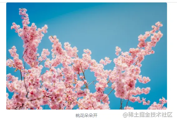
Use the built-in .figure, .figure-img and .figure-caption categories to provide some basic HTML5 <figure></figure> and <figcaption></figcaption> tags Style settings. The image does not have a clear size. Please be sure to add the .img-fluid category to the <img class="figure-img img-fluid rounded lazy" src="/static/imghwm/default1.png" data-src="pic/taohua.jpg" alt="Let's talk about the picture component and outline component in Bootstrap" > tag to set it as a responsive image.
In fact, the outline component is not only used for pictures. In the text layout part and the source citation part of the previous section, the outline component has been used.
nbsp;html>


    <meta>
    <meta>
    <meta>
    <meta>
    <link>
    <title>figure演示</title>


        <div>

            <figure>
                <img  class="figure-img img-fluid rounded lazy" src="/static/imghwm/default1.png" data-src="pic/taohua.jpg" alt="Let's talk about the picture component and outline component in Bootstrap" >
                <figcaption>桃花朵朵开</figcaption>
                </figure>
        </div>

     <script></script>

A brief explanation of the rounded class in the img tag means that the corners of the image are rounded. You don’t need to write it if you don’t need it. The class text-center in the figcaption tag is used to align the image in the center. Text-end can also be used to align the image to the right. The default does not need to be left aligned.
That’s it for today’s lesson. Please follow me, and learn the tables in Bootstrap in Section 11 of my original "Bootstrap5 from Zero Basics to Mastery" originally written by Liu Liu. Tables have a wide range of uses and are quite troublesome to design. Fortunately, with the help of bootstrap we It's easy to make beautiful tables.
If this article is helpful to you, please remember to like it!
For more knowledge about bootstrap, please visit: bootstrap basic tutorial! !
The above is the detailed content of Let's talk about the picture component and outline component in Bootstrap. For more information, please follow other related articles on the PHP Chinese website!

