


This article will take you through the breakpoints and containers in Bootstrap5. I hope it will be helpful to you!

1. Bootstrap5 breakpoints
1.1 Mobile first
Speaking of mobile first, we must first mention responsive design. Responsive interface is to design a page that can adapt to different devices. Responsive design uses media query and other technologies to achieve style adaptation under different devices/windows. It also That is to say, it will display different page layouts to users according to the different devices you use. [Related recommendation: "bootstrap tutorial"]
This is implemented by having a media query technology based on HTML5, which can obtain the screen width, and then use css to use different values under different widths Just css effect.
Mobile first is to first develop an interface suitable for mobile clients, and then adapt the corresponding style according to the situation of the PC. On the contrary, the design idea is to give priority to PC. Which one to choose? The method should be considered based on your habits and which users account for a large proportion. Mobile first is now generally advocated.
1.2 Bootstrap breakpoints
The so-called breakpoint refers to the critical point. This table and its content must be remembered. In addition, especially the class infix, it is often used. This will be demonstrated in detail in the layout of the next section. You only need to read it a few times. It doesn't matter if you can't remember it. You can check it out when the time comes.
| Breakpoint type | Class infix | Resolution | ||||
|---|---|---|---|---|---|---|
| Small, tablet or old laptop) | sm | ≥576px | ||||
| Medium (medium, narrow screen computer) | md |
≥768px | ||||
lg | ≥992px||||||
| xl |
|
|||||
| xxl |
|
|
≥576px | Medium
≥768px | Large
≥992px | X- Large
≥1200px | XX-Large
≥1400px |
||
|---|---|---|---|---|---|---|
.container | 100%540px | 720px | 960px | 1140px | 1320px | |
.container-sm | 100%540px | 720px | 960px | 1140px | 1320px | |
.container-md | 100%100% | 720px | 960px | 1140px | 1320px | |
.container- lg | 100%100% | 100% | 960px | 1140px | 1320px | |
.container-xl | 100%100% | 100% | 100% | 1140px | 1320px | |
.container-xxl | 100%100% | 100% | 100% | 100% | 1320px | |
.container-fluid | 100%100% | 100% | 100% | 100% | 100% |
2.3 Container parsing changes with browser width
2.3.1 Simple examples
Some friends may not understand the table in 2.2. I will give you a few examples:Take container-md as an example. When the screen When the width is less than 768px, the container width accounts for 100% of the screen width. When the screen width is greater than 768px and less than 992px, the container width is always 720px; and when the screen width is greater than 992px and less than 1200px, the container width is always 960px, and so on, the same is true for other breakpoint containers and the default container.2.3.2 Several characteristics of Bootstrap containers (excluding flow containers)
- The width of the container jumps and is not smooth. The width of the interval between each two breakpoints is the same
- The container is borderless before the breakpoint and has margins after the breakpoint. For a 768px screen, the container width is 720px.
- The default container (container) and the small container (container-sm) are currently equivalent, but it is not ruled out that there will be changes in the next step.
2.4 Demo code for container changes with browser width
The following is the demo code under different browser widths, as well as GIF If you don’t understand the rendering, you can download the code and study it yourself. The style part is written by me to set the background color of the container and the interval of each container to facilitate distinction and viewing. It has nothing to do with the container itself.2.4.1 Demonstration animation

<!doctype html>
<html>
  <head>
    <meta charset="utf-8">
    <meta name="viewport" content="width=device-width, initial-scale=1">
    <meta name="keywords" content="">
    <meta name="description" content="">
    <link href="bootstrap5/bootstrap.min.css" rel="stylesheet">

    <title>不同宽度下容器宽度演示</title>
    <style>
      div{background-color: rgba(0, 0, 255, 0.178);padding: 10px;margin: 10px;}
    </style>
  </head>
  <body>
    <div>    默认容器  </div>
    <div>container-sm 100% wide until small breakpoint</div>
    <div>container-md 100% wide until medium breakpoint</div>
    <div>container-lg 100% wide until large breakpoint</div>
    <div>container-xl 100% wide until extra large breakpoint</div>
    <div>container-xxl 100% wide until extra extra large breakpoint</div>
    <div> 流式容器 </div>

     <script src="bootstrap5/bootstrap.bundle.min.js" ></script>
  </body>
</html>
For more programming-related knowledge, please visit:
The above is the detailed content of Let's talk about breakpoints and containers in Bootstrap5. For more information, please follow other related articles on the PHP Chinese website!

 如何使用Docker进行容器的故障恢复和自动重启Nov 07, 2023 pm 04:28 PM
Docker作为一种基于容器技术的轻量级虚拟化平台,已经被广泛应用于各种场景中。在生产环境中,容器的高可用性和故障自动恢复是至关重要的。本文将介绍如何使用Docker进行容器的故障恢复和自动重启,包括具体的代码示例。一、容器自动重启的配置在Docker中,通过在运行容器时使用--restart选项可以启用容器的自动重启功能。常见的选项有:no:不自动重启。默
 修复Windows 11上的断点错误:10种有效方法Apr 24, 2023 am 10:19 AM
由于Windows11仍然相对较新,并且仍有望进行大量改进,因此用户必然会处理一两个错误。一个这样的错误是Windows11上的突破点到达错误消息。此错误可能是由于许多因素造成的,其中一些是已知的,而另一些则很难确定。值得庆幸的是,这些解决方案通常并不牵强,在某些情况下只需要系统更新。无论原因和复杂性如何,我们都收集了解决本完整指南中的错误的方法。你只需要按照说明操作,你就会没事的。错误消息“已到达断点”是什么意思?已到达的断点是Windows11用户可能遇到的常见错误消息。此错误消息通常在
 华为、浪潮等单位合作创建的开源容器镜像中心,AtomHub,宣布正式开放公测,可稳定下载国内服务Jan 02, 2024 pm 03:54 PM
华为官方消息显示,开放原子开发者大会以“一切为了开发者”为主题,在无锡举办了两天,时间为12月16日至17日会上,由开放原子开源基金会主导,华为、浪潮、DaoCloud、谐云、青云、飓风引擎以及OpenSDV开源联盟、openEuler社区、OpenCloudOS社区等成员单位共同发起建设的AtomHub可信镜像中心正式开放公测。AtomHub秉承共建、共治、共享的理念,旨在为开源组织和开发者提供中立、开放共建的可信开源容器镜像中心。鉴于DockerHub等镜像仓库的不稳定性和不可控性,以及一些
 如何通过CMD在Windows 10或11上安装Redhat PodmanOct 02, 2023 pm 09:33 PM
在Windows11或10上安装RedHatPodman请按照以下步骤使用命令提示符或Powershell在Windows机器上安装RedHatPodman:步骤1:检查系统要求首先,您必须确保您的Windows系统使用最新更新运行,以便它能够满足运行Podman的要求。您应该使用的是Windows11或Windows10版本1709(内部版本16299)或更高版本,并且必须启用适用于Linux2(WSL2)的Windows子系统和VM功能,好吧,如果它们尚未激活,那么您可以使用第二步命令执行此
 前端开发中的JavaScript调试技巧与方法经验分享Nov 02, 2023 pm 05:54 PM
前端开发中的JavaScript调试技巧与方法经验分享引言:在前端开发中,JavaScript是最常见和重要的编程语言之一,它被广泛用于开发网页、应用程序和移动端等。然而,由于JavaScript的动态和松散的特性,开发人员经常会遇到各种各样的bug和问题。在这篇文章中,我将分享一些我在前端开发中所学到的JavaScript调试技巧和方法,
 Python 作为小程序后端的三种方法Apr 12, 2023 pm 09:10 PM
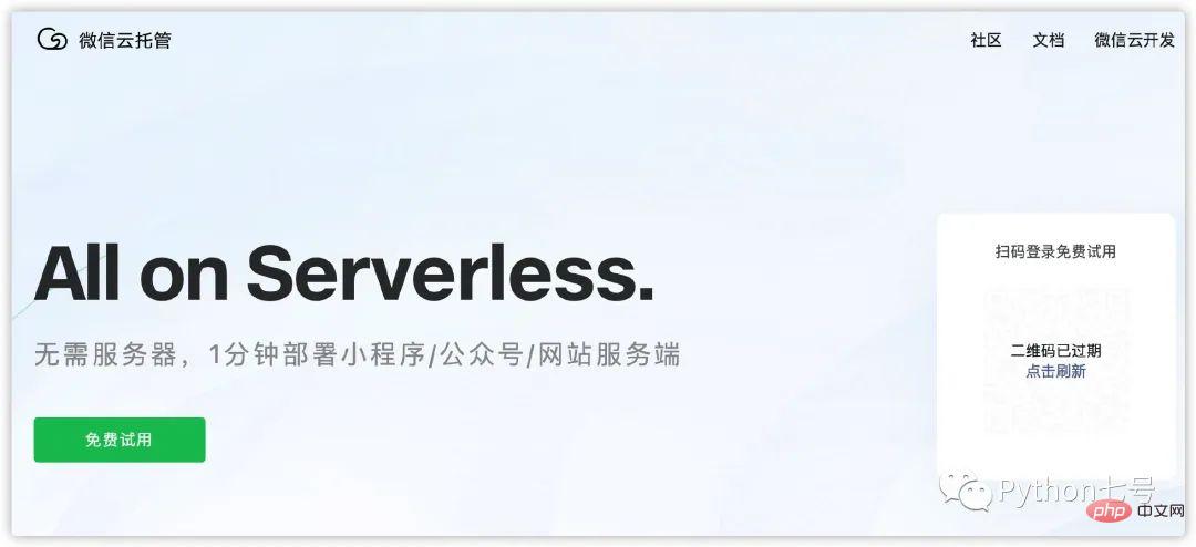
你好,我是征哥。微信的小程序是一个很不错的体验,简单,上手快,这几天也在学习使用小程序,自己总结了三种用 Python 作为小程序后端的方式,供你参考。方法一、微信的云托管[1]。优点:不需要购买服务器,不需要域名备案,按使用量计费,DevOps 自动化,安全鉴权,适合没有运维经验的人。缺点:费用这块,肯定是比自建服务器费用略高的。就像同一车型,自动挡的车比手动挡的车更贵一样。所谓云托管,就是一个 Docker 容器,你只需要弄一个仓库,可以 github, gitlab, gitee 中的任意
 如何解决找不到程序的输入点Feb 18, 2024 pm 08:45 PM
无法定位程序输入点怎么解决在使用电脑时,我们有时会遇到一些问题,其中之一就是“无法定位程序输入点”。这个问题的出现会导致我们无法打开或运行某个程序,给我们的工作和生活造成一定的困扰。那么,当我们遇到无法定位程序输入点的问题时,应该如何解决呢?首先,我们需要了解“无法定位程序输入点”的原因。这个问题通常是由于程序在运行过程中出现错误导致的。可能是由于程序文件损
 学习Go语言的微服务架构和容器技术Nov 30, 2023 am 11:14 AM
学习Go语言的微服务架构和容器技术随着云计算和大数据的快速发展,微服务架构和容器技术在软件开发领域变得越来越流行。而Go语言作为一种开源的、高效的编程语言,正因其强大的并发性和简洁的语法而受到广泛关注。本文将介绍学习Go语言微服务架构和容器技术的相关知识和方法。首先,我们来了解一下微服务架构。微服务架构是一种通过将应用程序拆分为一系列较小的、独立的服务来构建


Hot AI Tools

Undresser.AI Undress
AI-powered app for creating realistic nude photos

AI Clothes Remover
Online AI tool for removing clothes from photos.

Undress AI Tool
Undress images for free

Clothoff.io
AI clothes remover

AI Hentai Generator
Generate AI Hentai for free.

Hot Article
Hot Tools

Dreamweaver Mac version
Visual web development tools

MantisBT
Mantis is an easy-to-deploy web-based defect tracking tool designed to aid in product defect tracking. It requires PHP, MySQL and a web server. Check out our demo and hosting services.

PhpStorm Mac version
The latest (2018.2.1) professional PHP integrated development tool

SublimeText3 Chinese version
Chinese version, very easy to use

mPDF
mPDF is a PHP library that can generate PDF files from UTF-8 encoded HTML. The original author, Ian Back, wrote mPDF to output PDF files "on the fly" from his website and handle different languages. It is slower than original scripts like HTML2FPDF and produces larger files when using Unicode fonts, but supports CSS styles etc. and has a lot of enhancements. Supports almost all languages, including RTL (Arabic and Hebrew) and CJK (Chinese, Japanese and Korean). Supports nested block-level elements (such as P, DIV),

