Home >Web Front-end >CSS Tutorial >3 ways to implement rounded triangles with pure CSS (skill sharing)
3 ways to implement rounded triangles with pure CSS (skill sharing)
- 青灯夜游forward
- 2021-07-15 19:15:565134browse
This article will introduce you to 3 methods of drawing rounded triangles using CSS. It has certain reference value. Friends in need can refer to it. I hope it will be helpful to everyone.

Previously in this article - "6 Techniques for Drawing Triangles with CSS (Sharing)", introduced 6 ways to use CSS to achieve Triangular way.
But a very important scene is missed. How to use pure CSS to implement a triangle with rounded corners? , like this:

This article will introduce several ways to implement triangles with rounded corners.
Method 1. Fully Compatible SVG Method
If you want to generate a triangle with rounded corners, the least amount of code, the best way Generated using SVG.
Use SVG's polygon tag <polygon></polygon> to generate a trigonal shape, and use SVG's stroke-linejoin="round" to generate rounded corners at the connection.
The amount of code is very small, the core code is as follows:
<svg>
  <polygon></polygon>
</svg>
.triangle {
    fill: #0f0;
    stroke: #0f0;
    stroke-width: 10;
}
The actual graphics are as follows:
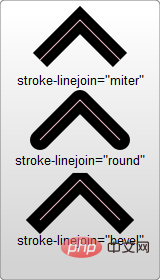
Here, we actually use SVG polygons stroke-linejoin: round The rounded corners generated by the round attribute, what is stroke-linejoin
-
miter is the default value, which means using a square brush to form sharp corners at the connection -
round means connecting with rounded corners to achieve a smooth effect -
bevel The connection will form a miter

We actually generate a rounded triangle through a polygon with a border and the border connection type is stroke-linejoin: round
.triangle {
    fill: #0f0;
    stroke: #000;
    stroke-width: 10;
}

Control the fillet size through stroke-width
So how to control the size of the fillet? It is also very simple. By controlling the size of stroke-width
Of course, to keep the size of the triangle consistent, while increasing/reducing the stroke-width, you need to reduce/increase the width/height of the graphic.

For the complete DEMO, you can click here: CodePen Demo -- Using SVG to implement a triangle with rounded cornershttps: //codepen.io/Chokcoco/pen/eYWZvKo
Method 2. Graphic splicing
However, as mentioned above,use pure CSS Implement a triangle with rounded corners
, but the first method above actually uses SVG. So is there a way to just use CSS? Of course, divergent thinking, the interesting part of CSS is here, using a graphic, there can be many ingenious solutions! Let’s take a look, a rounded triangle can actually be split into several parts:

Drawing a rhombus with rounded corners
Then, our next goal becomes to draw a rhombus with rounded corners. There are many methods. This article gives one of the methods:1. First, transform a square into Form a rhombus, use transform
<div></div>
div {
    width:  10em;
    height: 10em;
    transform: rotate(-60deg) skewX(-30deg) scale(1, 0.866);
}
 2. Transform one of the angles Rounded corners:
 div {
width: 10em;
height: 10em;
transform: rotate(-60deg) skewX(-30deg) scale(1, 0.866);
+ border-top-right-radius: 30%;
} At this point, we have successfully obtained a rhombus with rounded corners!
 Splicing 3 rhombuses with rounded corners
The next step is very simple. We only need to use the other two pseudo-elements of the element to generate 2 more rhombuses with rounded corners. A rounded rhombus can be spliced together with a total of 3 graphics rotation and displacement! The complete code is as follows:###<div></div>
div{
    position: relative;
    background-color: orange;
}
div:before,
div:after {
    content: '';
    position: absolute;
    background-color: inherit;
}
div,
div:before,
div:after {
    width:  10em;
    height: 10em;
    border-top-right-radius: 30%;
}
div {
    transform: rotate(-60deg) skewX(-30deg) scale(1,.866);
}
div:before {
    transform: rotate(-135deg) skewX(-45deg) scale(1.414, .707) translate(0,-50%);
}
div:after {
    transform: rotate(135deg) skewY(-45deg) scale(.707, 1.414) translate(50%);
}
就可以得到一个圆角三角形了!效果如下:

完整的代码你可以戳这里:CodePen Demo -- A triangle with rounded
https://codepen.io/Chokcoco/pen/vYmLVZr
法三. 图形拼接实现渐变色圆角三角形
完了吗?没有!
上述方案,虽然不算太复杂,但是有一点还不算太完美的。就是无法支持渐变色的圆角三角形。像是这样:
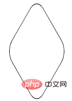
如果需要实现渐变色圆角三角形,还是有点复杂的。但真就还有人鼓捣出来了,下述方法参考至 -- How to make 3-corner-rounded triangle in CSS。
同样也是利用了多块进行拼接,但是这次我们的基础图形,会非常的复杂。
首先,我们需要实现这样一个容器外框,和上述的方法比较类似,可以理解为是一个圆角菱形(画出 border 方便理解):

<div></div>
div {
    width: 200px;
    height: 200px;
    transform: rotate(30deg) skewY(30deg) scaleX(0.866);
    border: 1px solid #000;
    border-radius: 20%;
}
接着,我们同样使用两个伪元素,实现两个稍显怪异的图形进行拼接,算是对 transform 的各种用法的合集:
div::before,
div::after {
    content: "";
    position: absolute;
    width: 200px;
    height: 200px;
}
div::before {
    border-radius: 20% 20% 20% 55%;
    transform: scaleX(1.155) skewY(-30deg) rotate(-30deg) translateY(-42.3%) skewX(30deg) scaleY(0.866) translateX(-24%);
    background: red;
}
div::after {
    border-radius: 20% 20% 55% 20%;
    background: blue;
    transform: scaleX(1.155) skewY(-30deg) rotate(-30deg) translateY(-42.3%) skewX(-30deg) scaleY(0.866) translateX(24%);
}
为了方便理解,制作了一个简单的变换动画:
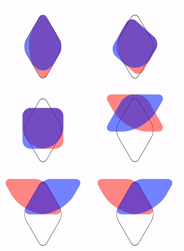
本质就是实现了这样一个图形:

最后,给父元素添加一个 overflow: hidden 并且去掉父元素的 border 即可得到一个圆角三角形:

由于这两个元素重叠空间的特殊结构,此时,给两个伪元素添加同一个渐变色,会完美的叠加在一起:
div::before,
div::after, {
    background: linear-gradient(#0f0, #03a9f4);
}
最终得到一个渐变圆角三角形:

上述各个图形的完整代码,你可以戳这里:CodePen Demo -- A triangle with rounded and gradient background
https://codepen.io/Chokcoco/pen/LYyGRpV
最后
本文介绍了几种在 CSS 中实现带圆角三角形的方式,虽然部分有些繁琐,但是也体现了 CSS ”有趣且折磨人“ 的一面,具体应用的时候,还是要思考一下,对是否使用上述方式进行取舍,有的时候,切图也许是更好的方案。
好了,本文到此结束,希望对你有帮助 :)
原文地址:https://segmentfault.com/a/1190000040344317
作者:chokcoco
更多编程相关知识,请访问:编程视频!!
The above is the detailed content of 3 ways to implement rounded triangles with pure CSS (skill sharing). For more information, please follow other related articles on the PHP Chinese website!
Related articles
See more- Ten cool Christmas code effects for programmers [Free download]
- Five beautiful 2021 countdown dynamic special effects source codes (free download)
- 6 Tips for Drawing Triangles with CSS (Share)
- 5 practical CSS 3D effects to make your pages more stunning!
- PS skill sharing: Use polar coordinates to create cool special effects (detailed explanations with pictures and texts)
- How to implement blood wheel eye + reincarnation eye special effects with pure CSS (detailed code explanation)

