Home >Web Front-end >HTML Tutorial >How to achieve html flip effect
How to achieve html flip effect
- 藏色散人Original
- 2021-06-03 11:11:285870browse
How to implement the flip effect: First, overlay the two images to be displayed using positioning; then use the CSS3 perspective combined with the "transform:rateY()" attribute to achieve the flip effect.

The operating environment of this article: Windows7 system, HTML5&&CSS3 version, Dell G3 computer.
CSS3 achieves beautiful card flip effect
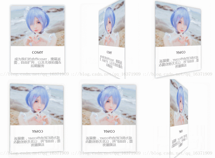
##Post the rendering first (The actual effect is 1000 times smoother than the gif image, feel free to use it): Mainly uses the
perspective of CSS3 combined with the transform:ratateY() attribute to complete. When you define the perspective attribute for an element, its child elements get the perspective effect, not the element itself. It should be noted that is: the perspective attribute only affects 3D conversion elements. This attribute is now well supported in Firefox and Google Safari. The description of this attribute on W3C.cn has not been updated in time.
backface-visibility:hidden (This property defines whether the element is visible when it is not facing the screen). If you do not add this attribute, you will always be able to see only one card. The effect of failure is as follows:  The complete code is posted below:
<!DOCTYPE html>
<html>

    <head>
        <meta charset="utf-8">
        <meta http-equiv="Content-Type" content="text/html">
        <meta name="viewport" content="width=device-width, initial-scale=1,user-scalable=no">
        <meta http-equiv="X-UA-Compatible" content="IE=Edge,chrome=1">
        <title>CSS3实现卡片翻转效果</title>
        <style>
            .re-item {
                width: 220px;
                margin: 50px auto;
                height: 276px;
                cursor: pointer;
                position: relative;
                perspective: 500;
                -webkit-perspective: 500;
            }

            .re-item img {
                max-width: 220px;
            }

            .re-item-front,
            .re-item-back {
                position: absolute;
                top: 0;
                left: 0;
                width: 100%;
                height: 100%;
                background-color: #fff;
                -webkit-perspective: 1000;
                /*backface-visibility: hidden;*/
                -webkit-transition: all 1.5s;
                -moz-transition: all 1.5s;
                -ms-transition: all 1.5s;
                -o-transition: all 1.5s;
                box-shadow: rgba(50, 50, 50, 0.2) 0 0 15px;
                overflow: hidden;
            }

            .re-item-back {
                position: relative;
                transform: rotateY(-180deg);
                -webkit-transform: rotateY(-180deg);
            }

            .re-item:hover .re-item-front {
                transform: rotateY(-180deg);
                -webkit-transform: rotateY(-180deg);
            }

            .re-item:hover .re-item-back {
                transform: rotateY(-360deg);
                -webkit-transform: rotateY(-360deg);
            }

            .re-box .re-item dd {
                text-align: center;
                font-family: "微软雅黑";
            }

            .re-item .re-item-job {
                margin: 2px 0;
                font-size: 18px;
                color: #303030;
                line-height: 40px;
            }

            .re-item .re-item-des {
                padding: 0 12px;
                font-size: 14px;
                color: #939393;
            }
        </style>
    </head>

    <body>
        <div class="re-box">
            <div class="re-item">
                <dl class="re-item-front">
                    <dt><img src="/static/imghwm/default1.png"  data-src="img/c2.jpg"  class="lazy"   / alt="coser"></dt>
                    <dd class="re-item-job">coser</dd>
                    <dd class="re-item-des">成为我们的合作coser,漫展返图,自由扩列,以及无偿拍摄&后期服务</dd>
                </dl>

                <div class="re-item-back">
                    <img src="/static/imghwm/default1.png"  data-src="img/c2_1.jpg"  class="lazy"   alt="苏苏" />
                    <button type="button" class="join_btn open_modal" data-id="2">立即加入</button>
                </div>
            </div>
        </div>
    </body>

</html>
Okay Take a look at the html structure. Many of them are unnecessary. The most critical structure is as follows. You can also delete the css. <p class="re-item">
<p class="re-item-front"></p>
<p class="re-item-back"></p>
</p>My implementation code is like this, I posted it directly because I am too lazy to delete it. html video tutorial】
The above is the detailed content of How to achieve html flip effect. For more information, please follow other related articles on the PHP Chinese website!

