

 Web Front-endCSS TutorialDetailed explanation of how to achieve colorful and intelligent shadows using pure CSS
This article will give you a detailed introduction to the method of realizing colorful and intelligent shadows using pure CSS. It has certain reference value. Friends in need can refer to it. I hope it will be helpful to everyone.

#Ever wondered how to create a drop shadow effect that inherits certain colors from a foreground element? Read this article and find out how!
I passed by Home Depot (Home Depot, American Home Depot Company, the world's leading retailer of home building materials and supplies) a few days ago. They were displaying and selling smart lights on a large scale, one of which is a series of light bulbs located behind the television that cast a light similar to the color displayed on the foreground screen of the television, similar to the one pictured below.

Pay attention to what's going on behind the TV. The colors displayed in the foreground of the television screen are projected by the lamp into a colored shadow background. As the colors on the screen change, the background projection color also changes. Really cool, right?
After seeing this, my first natural thought was, could I use web development techniques to create a colorful shadow that was smart enough to simulate the foreground color? Facts have proved that this effect can be achieved using only CSS. In this article, we'll look at how. [Learning video sharing: css video tutorial]
Let’s get started!
Make it happen
As you will discover in the following paragraphs, creating smart colored shadows using only CSS may seem at first glance It is a difficult task, but when we take it step by step and break the difficult parts into smaller parts, you will find that everything becomes easier to understand and digest. In the following chapters, we will create an example that looks like this:
#What you see is a picture of sushi with a background color corresponding to the foreground color shadow. To emphasize that what we're doing is dynamic, add a pulsating animation effect to the shadow. With this working example, let’s dive into how to make everything come alive using only HTML and CSS.
Display image
The HTML used to display sushi looks like this and there is nothing special:
<div class="parent">
  <div class="colorfulShadow sushi"></div>
</div>
We have a parent div Element .parent, which contains a child element .suchi for display. We instantiate it by using a background image. The specific style rules of the .sushi element are as follows:
.sushi {
  margin: 100px;
  width: 150px;
  height: 150px;
  background-image: url("https://www.kirupa.com/icon/1f363.svg");
  background-repeat: no-repeat;
  background-size: contain;
}
In the above style rules, we will div Set to 150 * 150 width and height pixels, and set background-image and related attributes. If we show the results we have achieved now, you can see the content as shown below .
Creating the Shadow
Now that we have our sushi image displayed, the more interesting part is defining the shadow. We will define the shadow by specifying a child pseudo-element ::after, which will do 3 things:
- locate directly where the image is
Behind the div; - Inherits the same background image as the parent element;
- Produces colorful
drop-shadowshadow effects through filters.
The above 3 functions are implemented by the following 2 style rules:
.colorfulShadow {
  position: relative;
}
.colorfulShadow::after {
  content: "";
  width: 100%;
  height: 100%;
  position: absolute;
  background: inherit;
  background-position: center center;
  filter: drop-shadow(0px 0px 10px rgba(0, 0, 0, 0.50)) blur(20px);
  z-index: -1;
}
Take a moment to browse the implementation here and pay close attention to each attribute and corresponding value. The most notable are the background attribute and the filter attribute. The value of background is inherit, which means it will inherit the background value of the parent element:
background: inherit;
filter The attribute defines two Filter values: drop-shadow and blur
filter: drop-shadow(0px 0px 10px rgba(0, 0, 0, 0.50)) blur(20px);
Our drop-shadow filter is set to a 50% Transparency black shadow. blur The filter sets a blur effect of 20px for the element. The combination of these two filters can ultimately create colorful shadows. When these two style rules are in effect, we can see the colorful shadows appearing behind the sushi image as shown below:

To this point, we have achieved a lot. For the sake of completeness, if you want colorful shadows with a zoom-in and zoom-out animation, the following additional CSS can help you achieve that:
.colorfulShadow {
  position: relative;
}
.colorfulShadow::after {
  content: "";
  width: 100%;
  height: 100%;
  position: absolute;
  background: inherit;
  background-position: center center;
  filter: drop-shadow(0px 0px 10px rgba(0, 0, 0, 0.50)) blur(20px);
  z-index: -1;
  /* animation time! */
  animation: oscillate 1s cubic-bezier(.17, .67, .45, 1.32) infinite alternate;
}

@keyframes oscillate {
  from {
    transform: scale(1, 1);
  }
  to {
    transform: scale(1.3, 1.3);
  }
}
如果你想在不使用循环动画效果的情况下增强交互性,也可以使用 CSS transition 来改变阴影的行为,如在 hover 操作情况下。需要强调的难点是对待伪元素只需要像对待用 HTML 创建的或 JavaScript 动态创建的元素一样,唯一的不同是这个元素完全是仅使用 CSS 创建的!
结论
伪元素允许我们使用 CSS 来创建通常在 HTML 和 JavaScript 领域内完成的元素创建任务。对于我们多彩的智能阴影来说,我们依赖于父元素有一个背景图像集,这使得我们定义一个既可以继承父级背景细节又可以设置模糊效果和投影效果的子元素变得容易。虽然这一切都很好,减少了我们大量的复制粘贴工作,但是这种方法也不是很灵活。
如果我想将这样的阴影应用到一个不只是带有背景图像的空元素上,该怎么办呢?如果我有一个 HTML 元素如一个按钮或组合框,我想应用这种阴影效果呢?一种解决方案是依靠 JavaScript 复制 DOM 中的相应元素,将其放置在前台元素底层,应用过滤器,这样也是一种方法。虽然这可以实现效果,但我想到这个有点重复 DOM 元素的沉重过程就不寒而栗。更糟糕的是,JavaScript 没有将你想提供的任意视觉意向转换为渲染目标位图的能力!
更多编程相关知识,请访问:编程视频!!
The above is the detailed content of Detailed explanation of how to achieve colorful and intelligent shadows using pure CSS. For more information, please follow other related articles on the PHP Chinese website!

 5个常见的JavaScript内存错误Aug 25, 2022 am 10:27 AM
JavaScript 不提供任何内存管理操作。相反,内存由 JavaScript VM 通过内存回收过程管理,该过程称为垃圾收集。
 实战:vscode中开发一个支持vue文件跳转到定义的插件Nov 16, 2022 pm 08:43 PM
vscode自身是支持vue文件组件跳转到定义的,但是支持的力度是非常弱的。我们在vue-cli的配置的下,可以写很多灵活的用法,这样可以提升我们的生产效率。但是正是这些灵活的写法,导致了vscode自身提供的功能无法支持跳转到文件定义。为了兼容这些灵活的写法,提高工作效率,所以写了一个vscode支持vue文件跳转到定义的插件。

 Node.js 19正式发布,聊聊它的 6 大特性!Nov 16, 2022 pm 08:34 PM
Node 19已正式发布,下面本篇文章就来带大家详解了解一下Node.js 19的 6 大特性,希望对大家有所帮助!

 聊聊如何选择一个最好的Node.js Docker镜像?Dec 13, 2022 pm 08:00 PM
选择一个Node的Docker镜像看起来像是一件小事,但是镜像的大小和潜在漏洞可能会对你的CI/CD流程和安全造成重大的影响。那我们如何选择一个最好Node.js Docker镜像呢?

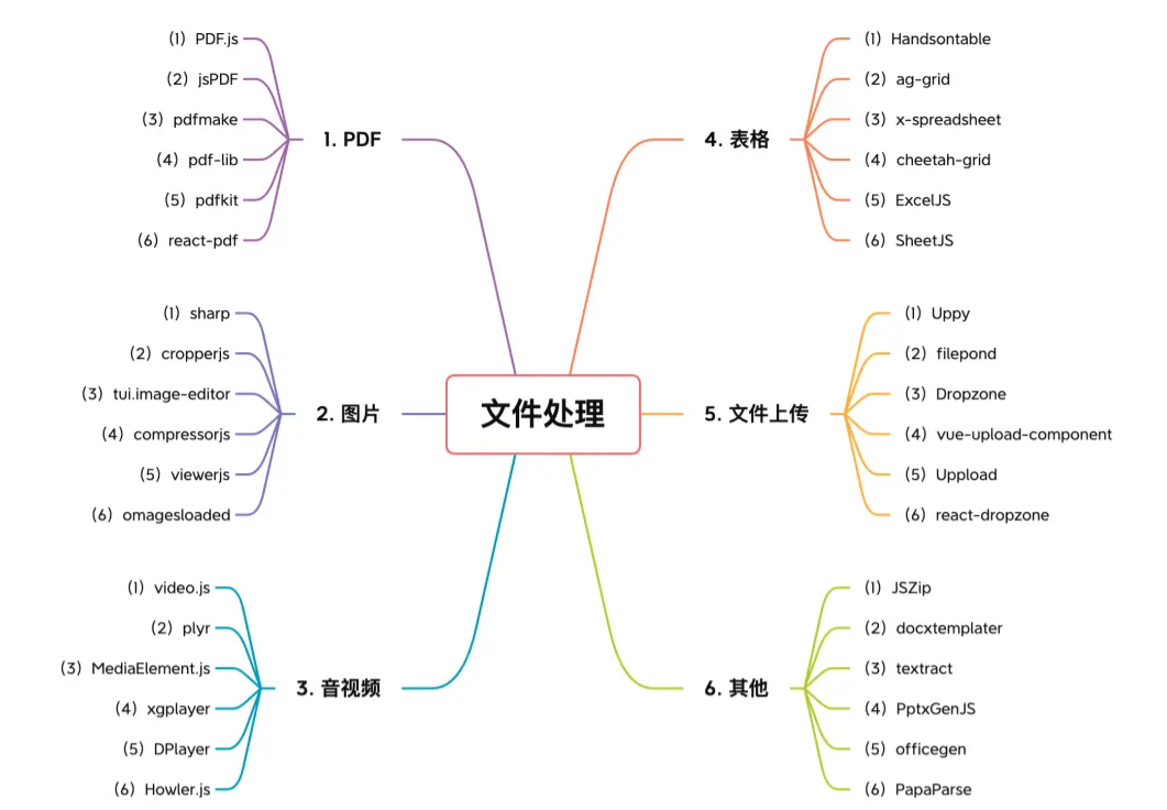 【6大类】实用的前端处理文件的工具库,快来收藏吧!Jul 15, 2022 pm 02:58 PM
本篇文章给大家整理和分享几个前端文件处理相关的实用工具库,共分成6大类一一介绍给大家,希望对大家有所帮助。


Hot AI Tools

Undresser.AI Undress
AI-powered app for creating realistic nude photos

AI Clothes Remover
Online AI tool for removing clothes from photos.

Undress AI Tool
Undress images for free

Clothoff.io
AI clothes remover

AI Hentai Generator
Generate AI Hentai for free.

Hot Article
Hot Tools

SublimeText3 Chinese version
Chinese version, very easy to use

SublimeText3 English version
Recommended: Win version, supports code prompts!

MantisBT
Mantis is an easy-to-deploy web-based defect tracking tool designed to aid in product defect tracking. It requires PHP, MySQL and a web server. Check out our demo and hosting services.

Dreamweaver CS6
Visual web development tools

WebStorm Mac version
Useful JavaScript development tools

