
Home >Web Front-end >CSS Tutorial >Share some tips for processing text on images with CSS
Share some tips for processing text on images with CSS

- 青灯夜游forward
- 2021-04-21 11:02:122356browse
This article will introduce to you how to use CSS to process text on images. It has certain reference value. Friends in need can refer to it. I hope it will be helpful to everyone.
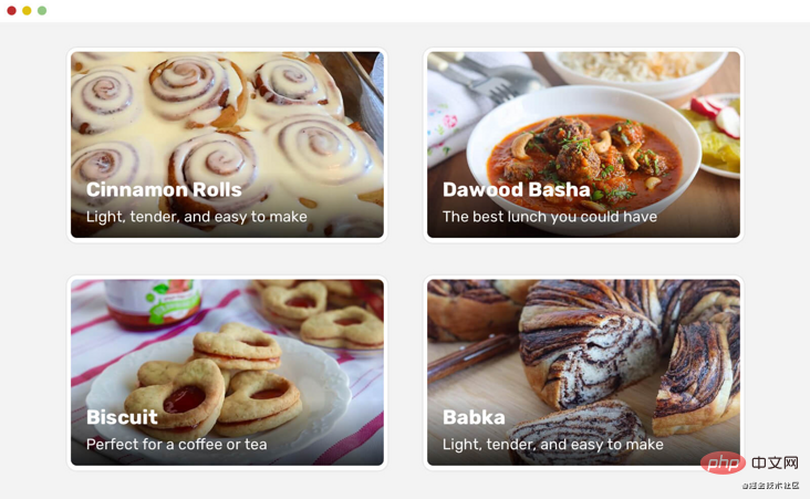
In the process of working on a project, we may encounter a component with text above the image. In some cases, the text is difficult to read depending on the image used, such as the text being white and the background image being light.
There are some different solutions for this situation, such as adding a gradient overlay or a tinted background image, text shadow, etc.
Introduction
Every solution should solve a problem. Let’s explore the issues in this case. When designing a component with text above an image, we need to pay attention so that the text must be easy to read.
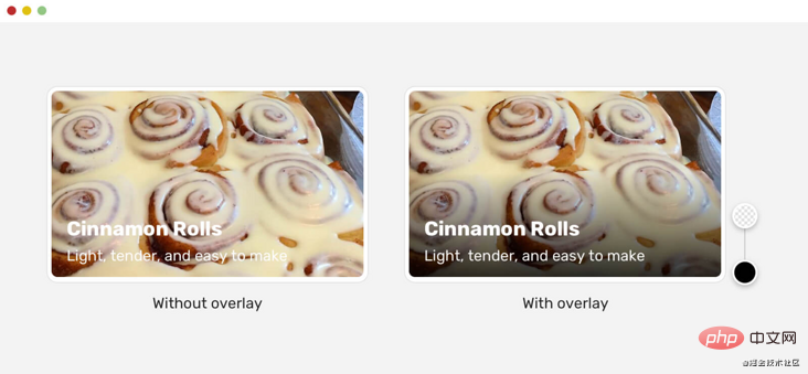
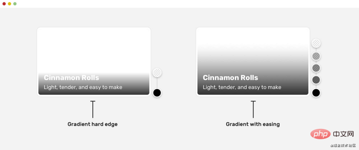
Note in the image above that the version without the gradient overlay is almost unreadable, which is detrimental to the user. To solve this problem, we need to add a layer below the text to make it easier to read. There are also things to pay attention to when adding layers. Because, accessibility is not considered in many solutions.
Multiple Solutions
There are various solutions to making text easier to read. Let’s look at each one.
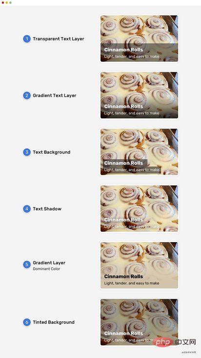
As shown in the picture above, there are different solutions to this problem. What needs to be noted is the gradient solution. Why? Because this solution can easily make the text less accessible.
(Learning video sharing: css video tutorial)
Solution
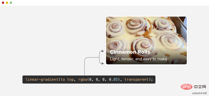
The Gradient Overlay )
Generally speaking, gradient overlay is the most common solution for making text on an image clearer, so let’s focus on that.
When implementing gradient overlay, there are two ways:
Use separate elements for gradients (pseudo elements or empty
<p></p>)Apply gradient as background image.
Each of the above methods has its advantages and disadvantages, let’s take a look.
.card__content {
  position: absolute;
  /* other styles (left, top, right, and padding) */
  background: linear-gradient(to top, rgba(0, 0, 0, 0.85), transparent);
}
At first glance, you may think that the gradient effect is good, but it is not comprehensive enough. If I tested the same gradient effect with a more diverse set of images, here are the results:
The contrast between the white text and the image is not always clear. For some people, it's acceptable, but using this gradient is a huge mistake because the text is inaccessible.
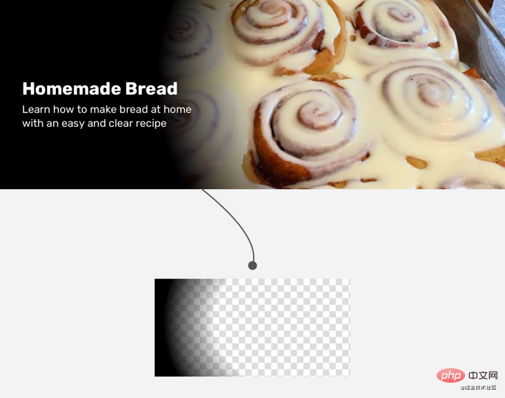
The reason is that the gradient should cover more space vertically, so its height needs to be larger. A gradient equal to the size of the content will not work in all cases. To solve this problem, we can use min-height as follows:
.card__contentmin-height of the element.Flexbox pushes content to the bottom.
.card__content {
  position: absolute;
  /* other styles (left, top, right, and padding) */
  display: flex;
  flex-direction: column;
  justify-content: flex-end;
  background: linear-gradient(to top, rgba(0, 0, 0, 0.85), transparent);
}
Another solution is to just use padding-top instead of min-height and flexbox.
.card__content {
  position: absolute;
  padding-top: 60px;
  background: linear-gradient(to top, rgba(0, 0, 0, 0.85), transparent);
}
Please note the difference between the left card and the right card, the gradient height is larger.
That looks good, can we do better? of course!
Slow Gradient
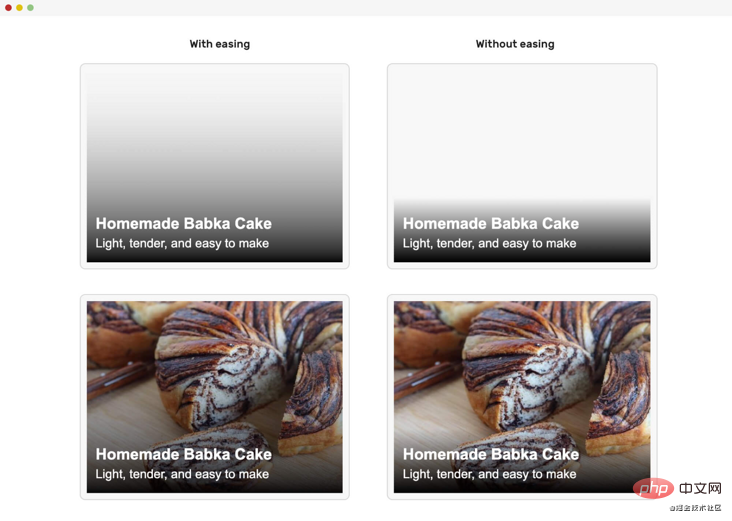
If we observe carefully, we will find that the end of the gradient is very abrupt. This is the so-called hard edge phenomenon.
To make it even better, we can apply the easing concept to the gradient. This way the gradient will appear more natural and no hard edges will be noticeable at the end of the gradient.
In CSS we need to have multiple gradient stops to achieve easing, as at the time of writing there is no native way to do this. The good news is that the CSS Working Group is discussing the possibility of implementing easing in CSS gradients, but it's unclear when this will happen.
Thankfully, Mr. Andreas Larsen has created a handy PostCSS and Sketch plugin that converts normal gradients into simplified gradients.
This is the CSS gradient for the above example:
.card__content {
  background-image: linear-gradient(
    0deg,
    hsla(0, 0%, 35.29%, 0) 0%,
    hsla(0, 0%, 34.53%, 0.034375) 16.36%,
    hsla(0, 0%, 32.42%, 0.125) 33.34%,
    hsla(0, 0%, 29.18%, 0.253125) 50.1%,
    hsla(0, 0%, 24.96%, 0.4) 65.75%,
    hsla(0, 0%, 19.85%, 0.546875) 79.43%,
    hsla(0, 0%, 13.95%, 0.675) 90.28%,
    hsla(0, 0%, 7.32%, 0.765625) 97.43%,
    hsla(0, 0%, 0%, 0.8) 100%
  );
}
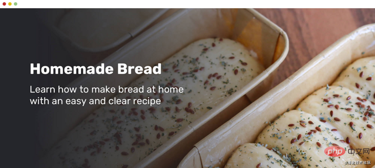
Horizontal gradient
Not only does text on images process Can be vertical, we can also use them as horizontal gradients. In this case, it requires a horizontal gradient.
This is the CSS gradient above, I used the previously mentioned tools to generate the gentle gradient.
background: linear-gradient(
  to right,
  hsl(0, 0%, 0%) 0%,
  hsla(0, 0%, 0%, 0.964) 7.4%,
  hsla(0, 0%, 0%, 0.918) 15.3%,
  hsla(0, 0%, 0%, 0.862) 23.4%,
  hsla(0, 0%, 0%, 0.799) 31.6%,
  hsla(0, 0%, 0%, 0.73) 39.9%,
  hsla(0, 0%, 0%, 0.655) 48.2%,
  hsla(0, 0%, 0%, 0.577) 56.2%,
  hsla(0, 0%, 0%, 0.497) 64%,
  hsla(0, 0%, 0%, 0.417) 71.3%,
  hsla(0, 0%, 0%, 0.337) 78.1%,
  hsla(0, 0%, 0%, 0.259) 84.2%,
  hsla(0, 0%, 0%, 0.186) 89.6%,
  hsla(0, 0%, 0%, 0.117) 94.1%,
  hsla(0, 0%, 0%, 0.054) 97.6%,
  hsla(0, 0%, 0%, 0) 100%
);
混合纯色和渐变
这里从Netflix网站了解了这种模式。 在未登录用户的主页上,有一个带有大背景图像的标题。
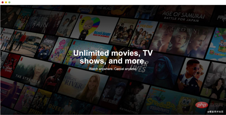
我喜欢它,但是它隐藏了很多图像细节。 确保仅在图像具有装饰性时才使用此功能。
<div class="hero">
<img src="/static/imghwm/default1.png" data-src="cover.jpg" class="lazy" alt="" />
<div class="hero__content">
<h2>Unlimited movies, TV shows, and more.</h2>
<p>Watch anywhere. Cancel anytime.</p>
</div>
</div>```
<div class="hero">
<img src="/static/imghwm/default1.png" data-src="cover.jpg" class="lazy" alt="" />
<div class="hero__content">
<h2>Unlimited movies, TV shows, and more.</h2>
<p>Watch anywhere. Cancel anytime.</p>
</div>
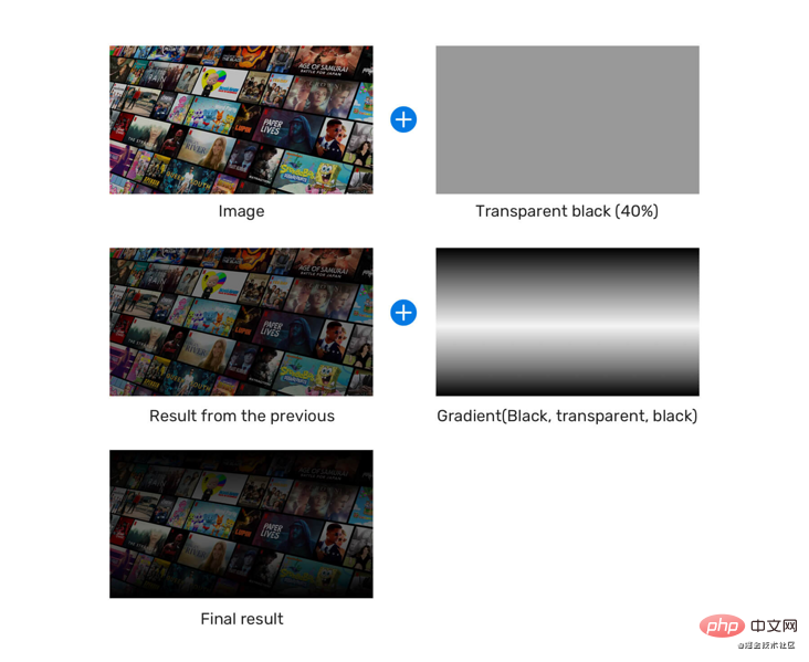
</div>.hero:after {
content: "";
position: absolute;
left: 0;
top: 0;
width: 100%;
height: 100%;
background-color: rgba(0, 0, 0, 0.4);
background-image: linear-gradient(
to top,
rgba(0, 0, 0, 0.8),
rgba(0, 0, 0, 0) 60%,
rgba(0, 0, 0, 0.8) 100%
);
}下面是拆解过程。
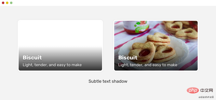
渐变叠加和文本阴影
有一个很有用的小技巧,可以让文字比图像更好。就是使用 text-shadow,这可能不容易注意到,但在图像无法加载的情况下,这是非常有用的。
看下面的例子:
.whatever-text {
  text-shadow: 0 2px 3px rgba(0, 0, 0, 0.3);
}
渐变叠加,文本阴影和不透明度
这是在Facebook的视频播放器上注意到的模式。 他们使用多种技术来使文本(和其他UI元素)清晰可见。 与视频播放器打交道时,确保其上方的元素应引人注目非常重要。
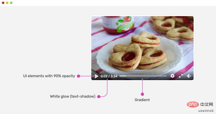
.player__icon {
  opacity: 0.9;
}

.player__time {
  color: #fff;
  text-shadow: 0 0 5px #fff;
}播放图标为opacity: 0.9。 这有助于使它们与下面的背景融为一体。 给人一种感觉:控件是混合在一起的。
此外,在白色文本中使用白色文本阴影是使文本更清晰的有效方法。你是否想要证明,即使背景是完全白色的图像,上面的方法也可以工作?给你。
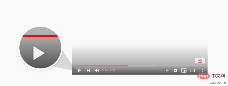
YouTube也对他们的视频做类似的事情。
径向渐变
我从Netflix了解到的一个有趣的解决方案是使用径向渐变。 下面是它的工作原理:
设置底色背景颜色。
将图像以75%的宽度放置到右上角。
覆盖层等于图像的大小和位置。
.hero {
  background-color: #000;
  min-height: 300px;
}

.hero__image {
  position: absolute;
  right: 0;
  top: 0;
  width: 75%;
  height: 100%;
  object-fit: cover;
}

.hero:after {
  content: "";
  position: absolute;
  right: 0;
  top: 0;
  width: 75%;
  height: 100%;
  background: radial-gradient(
    ellipse 100% 100% at right center,
    transparent 80%,
    #000
  );
}
不过,Netflix团队使用了一张图像作为覆盖层。这里不能确定原因,可能是一个跨浏览器的问题或其他东西。
选择可访问的覆盖颜色
这是一个很棒的工具,可以帮助我们根据图像选择正确的叠加不透明度。
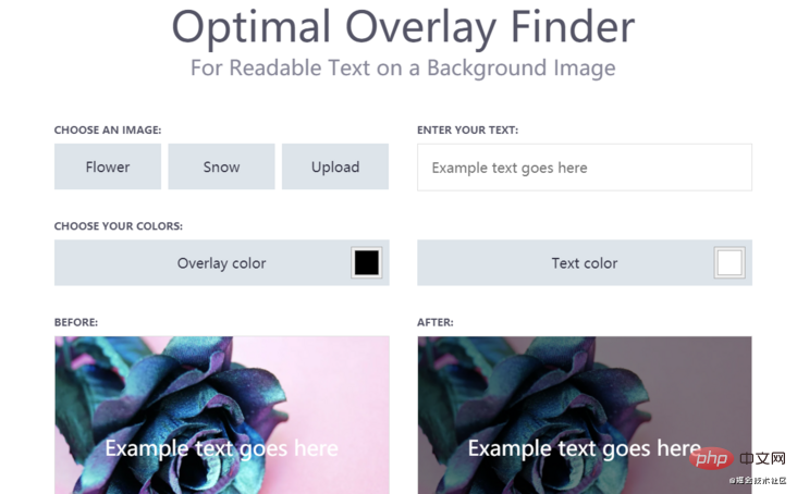
一般而言,如果你确保渐变叠加层可以正确填充文本,并且具有不错的色彩对比,那就可以了。
测试
解决方案要经过测试,才能被认为是好的,对吧? 我用来测试渐变叠加层的一种方法是在其下方添加白色背景。 如果文本可读,则渐变将适用于我们使用的任何图像。 如果没有,则需要进行调整和增强。
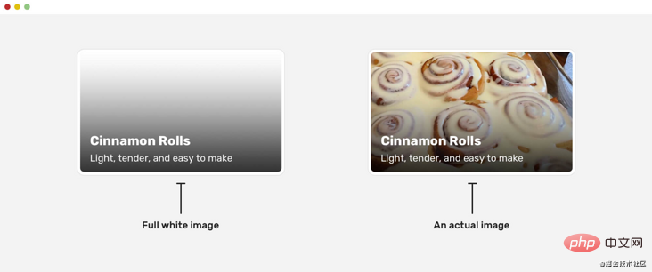
在上面的例子中,我选择了标题下的纯色,对比度是4.74,这样比较好。
原文地址:https://ishadeed.com/article/handling-text-over-image-css/
作者:Ahmad shaded
译文地址:https://segmentfault.com/a/1190000039761418
更多编程相关知识,请访问:编程入门!!
The above is the detailed content of Share some tips for processing text on images with CSS. For more information, please follow other related articles on the PHP Chinese website!
Related articles
See more- Nine retro camera special effects codes drawn with pure CSS3
- 11 practical text input and 6 button operation effects in web development
- 12 exquisite and cool background decoration special effects libraries (share)
- Share tips on using CSS to achieve cool charging animation effects
- Learn more about the @property feature in CSS