
 Web Front-endBootstrap TutorialDetailed explanation of how to customize the side navigation bar in bootstrap
This article will introduce to you how to bootstrap customize the side navigation bar. It has certain reference value. Friends in need can refer to it. I hope it will be helpful to everyone.

The responsive navigation bar that comes with bootstrap slides downwards. Sometimes it cannot meet the personalized needs. You need to make a side-sliding menu similar to android drawerLayout. This This is the bootstrap custom side-sliding menu I want to implement. I refer to the side-sliding of many official websites. The implementation methods are different, and the advantages and disadvantages are also very obvious. In order to only achieve a side-sliding effect on the homepage of some official websites, owl.carousel is used. The sliding screen plug-in personally feels that it is making a mountain out of a molehill. The more professional name of this bootstrap side sliding menu is called mobile navigation bar. I also compare this name, which is more in line with the characteristics of bootstrap. Therefore, this article introduces an easier method that is easier for novices to accept.
Related recommendations: "bootstrap tutorial"
bootstrap side navigation bar implementation principle
The side sliding bar uses positioning fixed
Use bootstrap responsiveness and use the tool class visible-sm visible-xs hidden-xs hidden-sm, etc. to adapt to different screens
The side-sliding effect of the side-sliding bar does not use the jquery method. It uses the css3 transforms attribute to move p. The side-sliding animation effect uses the css attribute transition
-
Disadvantages: Use two sets of menus, one is the menu displayed on the PC screen, and the other is the mobile phone navigation menu displayed on the mobile terminal. This disadvantage is relatively obvious. It generates irrelevant labels. The advantage is that there is less code and is simple and easy to accept.
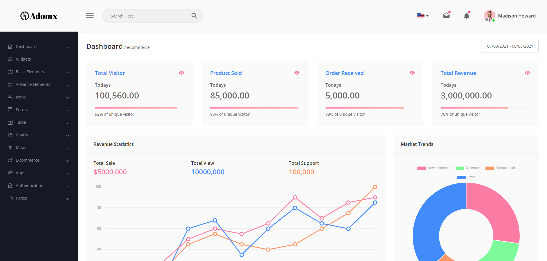
Rendering


##bootstrap navigation Bar layout
    <!--手机导航栏-->
    <div id="mobile-menu" class="mobile-nav visible-xs visible-sm">
        <ul>
            <li><a href="#">首页</a></li>
            <li><a href="#">Java</a></li>
            <li><a href="#">SVN</a></li>
            <li><a href="#">iOS</a></li>
        </ul>
    </div>
    <!--pc导航栏-->
    <nav class="navbar-inverse visible-lg visible-md" role="navigation">
        <div class="container">
            <div class="navbar-header">
                <a class="navbar-brand" href="#">菜鸟教程</a>
            </div>
            <div>
                <ul class="nav navbar-nav">
                    <li class="active"><a href="#">iOS</a></li>
                    <li><a href="#">SVN</a></li>
                    <li><a href="#" class="dropdown-toggle" data-toggle="dropdown">Java</a></li>
                </ul>
            </div>
        </div>
    </nav>
    <!--手机导航栏侧滑-->
    <div class="nav-btn visible-xs visible-sm">
        <a href="#" class="mobile-nav-taggle" id="mobile-nav-taggle">
            <span class="glyphicon glyphicon-align-justify"></span>
        </a>
    </div>
The layout of a navigation bar uses two navigation menus, one for PC and one for mobile phone. It is implemented using bootstrap responsiveness and tool class visible-xs visible-sm. Hide the switch button on the PC side; visible-lg visible-md realizes the display of the navigation bar on the PC side; visible-xs visible-sm realizes the display of the mobile navigation bar on the mobile phone. For details on the bootstrap responsive tool class, please see: https://www.runoob.com/bootstrap/bootstrap-responsive-utilities.html
css to achieve layout and side-sliding effects (side-sliding Key css3 attributes transform, transition)
Not much code, only 10 lines* {margin:0;padding:0;}
#mobile-menu {position:fixed;top:0;left:0;width:220px;height:100%;background-color:#373737;z-index:9999;}
a:hover ,a:focus{text-decoration:none}
.mobile-nav ul li a {color:gray;display:block;padding:1em 5%; border-top:1px solid #4f4f4f;border-bottom:1px solid #292929;transition:all 0.2s ease-out;cursor:pointer;#mobile-menu {position:fixed;top:0;left:0;width:220px;height:100%;background-color:#373737;z-index:9999;transition:all 0.3s ease-in;}}
.mobile-nav ul li a:hover {background-color: #23A1F6;color: #ffffff;}
.show-nav {transform:translateX(0);}
.hide-nav {transform:translateX(-220px);} /*侧滑关键*/
.mobile-nav-taggle {height:35px;line-height:35px;width:35px;background-color:#23A1F6;color:#ffffff;display:inline-block;text-align:center;cursor:pointer}
.nav.avbar-inverse{position:relative;}
.nav-btn {position:absolute;right:20px;top:20px;}It is worth noting that there are two properties of css3: transform: rotation p, supports 2D or 3D rotation of elements. The attribute value translateX (X) is the distance of moving Xpx on the transition: property duration timing-function delay;
Click event switches side sliding
        $("#mobile-nav-taggle").click(function () {
            var mobileMenu = $("#mobile-menu");
            if (mobileMenu.hasClass("show-nav")) {
                setTimeout(function () {
                    mobileMenu.addClass("hide-nav").removeClass("show-nav");
                }, 100)
            }
            else {
                setTimeout(function (){
                    mobileMenu.addClass("show-nav").removeClass("hide-nav");
                }, 100)
            }
        })
Summary
It is not recommended to use two menu navigation bars , the shortcomings are obvious, just to achieve the effect, don't mind, in fact, it can also be achieved with a menu navigation bar, try media and it can be achieved.
This article is reproduced from: http://blog.csdn.net/kebi007/article/details/76038251For more programming-related knowledge, please visit:Programming Video
! !The above is the detailed content of Detailed explanation of how to customize the side navigation bar in bootstrap. For more information, please follow other related articles on the PHP Chinese website!

 10款好看又实用的Bootstrap后台管理系统模板(快来下载)Aug 06, 2021 pm 01:55 PM
一个好的网站,不能只看外表,网站后台同样很重要。本篇文章给大家分享10款好看又实用的Bootstrap后台管理系统模板,可以帮助大家快速建立强大有美观的网站后台,欢迎下载使用!如果想要获取更多后端模板,请关注php中文网后端模板栏目!
 bootstrap与jquery是什么关系Aug 01, 2022 pm 06:02 PM
bootstrap与jquery的关系是:bootstrap是基于jquery结合了其他技术的前端框架。bootstrap用于快速开发Web应用程序和网站,jquery是一个兼容多浏览器的javascript库,bootstrap是基于HTML、CSS、JAVASCRIPT的。
 7款实用响应式Bootstrap电商源码模板(快来下载)Aug 31, 2021 pm 02:13 PM
好看又实用的Bootstrap电商源码模板可以提高建站效率,下面本文给大家分享7款实用响应式Bootstrap电商源码,均可免费下载,欢迎大家使用!更多电商源码模板,请关注php中文网电商源码栏目!
 8款Bootstrap企业公司网站模板(源码免费下载)Aug 24, 2021 pm 04:35 PM
好看又实用的企业公司网站模板可以提高您的建站效率,下面PHP中文网为大家分享8款Bootstrap企业公司网站模板,均可免费下载,欢迎大家使用!更多企业站源码模板,请关注php中文网企业站源码栏目!
 bootstrap中sm是什么意思May 06, 2022 pm 06:35 PM
在bootstrap中,sm是“小”的意思,是small的缩写;sm常用于表示栅格类“.col-sm-*”,是小屏幕设备类的意思,表示显示大小大于等于768px并且小于992px的屏幕设备,类似平板设备。
 bootstrap默认字体大小是多少Aug 22, 2022 pm 04:34 PM
bootstrap默认字体大小是“14px”;Bootstrap是一个基于HTML、CSS、JavaScript的开源框架,用于快速构建基于PC端和移动端设备的响应式web页面,并且默认的行高为“20px”,p元素行高为“10px”。
 bootstrap是免费的吗Jun 21, 2022 pm 05:31 PM
bootstrap是免费的;bootstrap是美国Twitter公司的设计师“Mark Otto”和“Jacob Thornton”合作基于HTML、CSS、JavaScript 开发的简洁、直观、强悍的前端开发框架,开发完成后在2011年8月就在GitHub上发布了,并且开源免费。
 bootstrap modal 如何关闭Dec 07, 2020 am 09:41 AM
bootstrap modal关闭的方法:1、连接好bootstrap的插件;2、给按钮绑定模态框事件;3、通过“ $('#myModal').modal('hide');”方法手动关闭模态框即可。


Hot AI Tools

Undresser.AI Undress
AI-powered app for creating realistic nude photos

AI Clothes Remover
Online AI tool for removing clothes from photos.

Undress AI Tool
Undress images for free

Clothoff.io
AI clothes remover

AI Hentai Generator
Generate AI Hentai for free.

Hot Article
Hot Tools

EditPlus Chinese cracked version
Small size, syntax highlighting, does not support code prompt function

MinGW - Minimalist GNU for Windows
This project is in the process of being migrated to osdn.net/projects/mingw, you can continue to follow us there. MinGW: A native Windows port of the GNU Compiler Collection (GCC), freely distributable import libraries and header files for building native Windows applications; includes extensions to the MSVC runtime to support C99 functionality. All MinGW software can run on 64-bit Windows platforms.

SublimeText3 Chinese version
Chinese version, very easy to use

PhpStorm Mac version
The latest (2018.2.1) professional PHP integrated development tool

SublimeText3 Linux new version
SublimeText3 Linux latest version

