Home >Web Front-end >CSS Tutorial >Draw a circle using pure CSS (code example)
Draw a circle using pure CSS (code example)
- 青灯夜游forward
- 2021-03-25 10:46:224323browse
This article introduces how to draw a circle using pure CSS through code examples. It has certain reference value. Friends in need can refer to it. I hope it will be helpful to everyone.

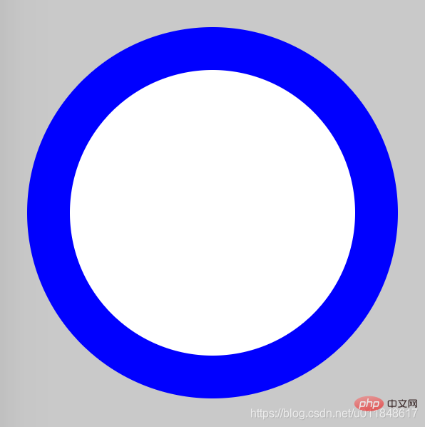
The idea of drawing a circle is very simple: first draw two circles and set different background colors; then make the centers of the two circles coincide.
Difficulty factor
##☆☆HTML
<div class="container">
    <span class="ring-style"></span>
</div>
Analysis: - There is a parent container here
CSS
.container {
    position: relative;
    top: 0;
    left: 0;
    width: 300px;
    height: 300px;
    background-color: lightgrey;
}
.ring-style {
    display: inline-block;
    position: absolute;
    top: 50%;
    left: 50%;
    transform: translate(-50%, -50%);
    background-color: blue;
    width: 260px;
    height: 260px;
    border-radius: 260px;
}
.ring-style::before {
    content: ' ';
    display: inline-block;
    position: absolute;
    top: 50%;
    left: 50%;
    transform: translate(-50%, -50%);
    background-color: white;
    width: 200px;
    height: 200px;
    border-radius: 200px;
}
Analysis:
- Set the width, height and rounded corners of the element The effect is to draw a circle
- Create two circles through the ::before pseudo-element and the body element
- By setting the top, left, and translate attributes based on the absolute positioning of the parent container, Center the element horizontally and vertically based on the parent container, so that the centers of the two circles coincide
CSS video tutorial]
Rendering

border-radius
- :: before && ::after
- Elements are centered horizontally and vertically
- For more programming-related knowledge, please visit:
The above is the detailed content of Draw a circle using pure CSS (code example). For more information, please follow other related articles on the PHP Chinese website!
Statement:
This article is reproduced at:csdn.net. If there is any infringement, please contact admin@php.cn delete

