
Home >Web Front-end >Bootstrap Tutorial >bootstrap implements simple side navigation bar effect
bootstrap implements simple side navigation bar effect

- 青灯夜游forward
- 2021-01-21 17:01:577057browse
This article will introduce to you how to implement the bootstrap side navigation bar. It has certain reference value. Friends in need can refer to it. I hope it will be helpful to everyone.

Related recommendations: "bootstrap tutorial"
bootstrap side navigation bar implementation principle
The side sliding bar uses positioning fixed
Use bootstrap responsively using the tool class visible-sm visible-xs hidden-xs hidden -sm and other adaptations to different screens
The side-sliding effect of the side-sliding bar is not implemented using the jquery method. Instead, the css3 transforms attribute is used to move the div and create the side-sliding animation effect. The css attribute transition
is used. Disadvantages: using two sets of menus, one is the menu displayed on the PC screen, and the other is the mobile navigation menu displayed on the mobile terminal. This disadvantage is relatively obvious. , generate irrelevant tags, the advantage is less code, simple and easy to accept
Rendering
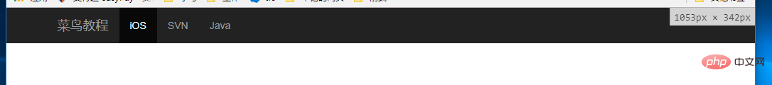
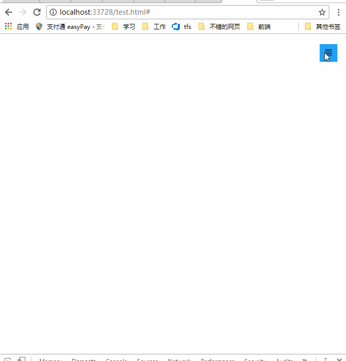
##bootstrap navigation bar layout
    <!--手机导航栏-->
    <div>
        <ul>
            <li><a>首页</a></li>
            <li><a>Java</a></li>
            <li><a>SVN</a></li>
            <li><a>iOS</a></li>
        </ul>
    </div>
    <!--pc导航栏-->
    <nav>
        <div>
            <div>
                <a>菜鸟教程</a>
            </div>
            <div>
                <ul>
                    <li><a>iOS</a></li>
                    <li><a>SVN</a></li>
                    <li><a>Java</a></li>
                </ul>
            </div>
        </div>
    </nav>
    <!--手机导航栏侧滑-->
    <div>
        <a>
            <span></span>
        </a>
    </div>
A navigation bar layout uses two navigation menus, one for PC and one for mobile phone, using bootstrap responsive usage tools The class visible-xs visible-sm implements hiding the toggle button on the PC; visible-lg visible-md implements the display of the navigation bar on the PC; visible-xs visible-sm implements the display of the mobile navigation bar on the mobile phone.
For details on the bootstrap responsive tool class, please see: https://www.runoob.com/bootstrap/bootstrap-responsive-utilities.html
css to achieve layout and side-sliding effects (side-sliding Key css3 attributes transform, transition)
Not much code, only 10 lines * {margin:0;padding:0;}
#mobile-menu {position:fixed;top:0;left:0;width:220px;height:100%;background-color:#373737;z-index:9999;}
a:hover ,a:focus{text-decoration:none}
.mobile-nav ul li a {color:gray;display:block;padding:1em 5%; border-top:1px solid #4f4f4f;border-bottom:1px solid #292929;transition:all 0.2s ease-out;cursor:pointer;#mobile-menu {position:fixed;top:0;left:0;width:220px;height:100%;background-color:#373737;z-index:9999;transition:all 0.3s ease-in;}}
.mobile-nav ul li a:hover {background-color: #23A1F6;color: #ffffff;}
.show-nav {transform:translateX(0);}
.hide-nav {transform:translateX(-220px);} /*侧滑关键*/
.mobile-nav-taggle {height:35px;line-height:35px;width:35px;background-color:#23A1F6;color:#ffffff;display:inline-block;text-align:center;cursor:pointer}
.nav.avbar-inverse{position:relative;}
.nav-btn {position:absolute;right:20px;top:20px;}
It is worth noting that there are two properties of css3:transform: rotation div supports 2D or 3D rotation of elements. The attribute value translateX (X) is the distance moved by Xpx on the X axis
http://www.w3school.com.cn/cssref/pr_transform.asp
And side sliding The animation effect is to use the transition attribute to set the effect of the transition animation of the attribute. Syntax
transition: property duration timing-function delay;
http://www.w3school.com.cn/cssref/pr_transition.asp
Click event switches side sliding
        $("#mobile-nav-taggle").click(function () {
            var mobileMenu = $("#mobile-menu");
            if (mobileMenu.hasClass("show-nav")) {
                setTimeout(function () {
                    mobileMenu.addClass("hide-nav").removeClass("show-nav");
                }, 100)
            }
            else {
                setTimeout(function (){
                    mobileMenu.addClass("show-nav").removeClass("hide-nav");
                }, 100)
            }
        })
Summary
It is not recommended to use two menu navigation bars, disadvantages Obviously, it's just to achieve the effect, don't mind, in fact it can also be achieved with a menu navigation bar, try media and it can be achieved. Code download: http://download.csdn.net/detail/kebi007/9909725Introduction to Programming ! !
The above is the detailed content of bootstrap implements simple side navigation bar effect. For more information, please follow other related articles on the PHP Chinese website!