Home >Web Front-end >CSS Tutorial >How to use css3 skew() attribute
How to use css3 skew() attribute
- 青灯夜游Original
- 2020-12-18 13:51:443124browse
In CSS3, skew() is a skew attribute that needs to be used together with the transform attribute. It can change the shape of the element on the page and allow the element to undergo 2D skew transformation along the X and Y axes; the syntax "transform :skew(x,y)".

The operating environment of this tutorial: Windows 7 system, CSS3 version, this method is suitable for all brands of computers.
Recommended: "css video tutorial"
css3 skew attribute skew()
Just started to contact the 2D transformation of CSS3 Attributes, I am confused by this skew(), I don’t know how it changes!
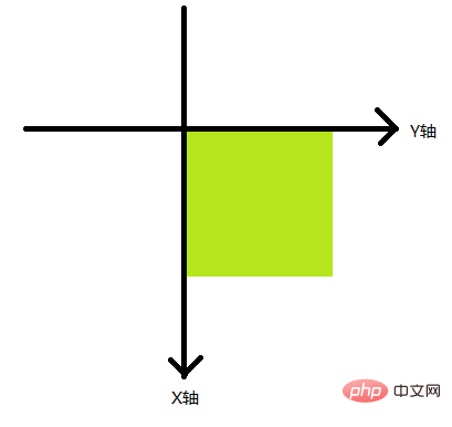
After studying for a while, I discovered that the bevel coordinate system of CSS3 is completely different from the coordinate system in mathematics (set the bevel origin to the upper left corner)

Transform property applies to the 2D or 3D transformation of the element. This property allows you to rotate, scale, move, tilt, etc. the element.
And skew(x-angle,y-angle): Defines the 2D skew transformation along the X and Y axes.
Example:
<style>
div{
            width: 200px;
            height: 200px;
            transition:all 2s;
            margin: 150px auto;
        }
.div1{
        background-color: #f00;
    }
.div2{
        background-color: #0f0;
    }
</style>
<body>
    <div class="div1"></div>
    <div class="div2"></div>
</body>
Below we set the skew (0, 30deg) attribute when the mouse passes by
.div1:hover {
            transform:skew(0,30deg);
            transform-origin: left top;
        }
Before moving in

After moving in

It can be seen from the two pictures that skew (0, 30deg); is based on the horizontal Y-axis, clockwise Rotation
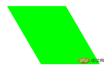
Next we set the skew (30deg, 0) attribute when the mouse passes by
.div2:hover {
            transform:skew(30deg,0);
            transform-origin: left top;

        }
Before moving in

After moving in

It can be seen from the two pictures that skew (30deg, 0); is based on the vertical X-axis and rotates counterclockwise
More For more programming-related knowledge, please visit: Introduction to Programming! !
The above is the detailed content of How to use css3 skew() attribute. For more information, please follow other related articles on the PHP Chinese website!

