
Home >Web Front-end >CSS Tutorial >What is the difference between CSS Holy Grail layout and Double Flying Wing layout?
What is the difference between CSS Holy Grail layout and Double Flying Wing layout?

- 青灯夜游Original
- 2020-12-03 09:43:499388browse
Difference: Holy Grail Layout sets the left and right inner margins for the middle div, then positions the left and right divs and sets the right and left attributes so as not to block the middle div; the double-wing layout is created directly inside the middle div. The sub-div is used to place content. In the sub-div, set the left and right margins respectively to leave space for the left and right column divs.

The operating environment of this article: windows10 system, css 3, thinkpad t480 computer.
(Recommended tutorial: CSS Video Tutorial)
Holy Grail Layout and Double Flying Wing Layout in CSS
Function:
The Holy Grail layout and the double flying wing layout solve the same problem, which is a three-column layout with top width on both sides and adaptive middle. Columns should be placed at the front of the document flow to render first.
Difference:
The solution to the problem of Holy Grail layout and double flying wing layout is the same in the first half, that is, all three columns are float , but add negative margins to the left and right columns to line them up with the middle column div to form a three-column layout.
The difference is that the idea of solving the problem of "the content of the middle column div is not blocked" is different:
Holy Grail layout, in order to prevent the content of the middle div from being blocked, set the left and right padding-left of the middle div After adding padding-right, use relative layout position: relative for the left and right divs and match the right and left attributes respectively, so that the divs in the left and right columns will not block the middle div after they are moved.
Double flying wing layout, in order to prevent the content of the middle div from being blocked, create a sub-div directly inside the middle div to place the content, and use margin-left and margin-right in the sub-div to leave space for the left and right column divs. out of position.
There is one more div, and about 4 less css attributes are used (the two attributes of divpadding-left and padding-right in the middle of the holy grail layout, plus the relative layout of the left and right divs position: relative and the corresponding There are 4 attributes in total right and left, 6 in total; while the double-wing layout sub-div uses margin-left and margin-right in total 2 attributes, 6-2=4), I personally feel that the idea of the Holy Grail layout is more direct and concise. .
To put it simply, "the double flying wing layout creates one more div than the holy grail layout, but does not need a relative layout", rather than what you said in the title "removing relative" is the double flying wing layout.
The final interface is the same:

Comparison picture:

Holy Grail layout :
Advantages: No need to add dom nodes
Disadvantages: Disadvantages of Holy Grail layout: There is no problem under normal circumstances, but this solution will be exposed under special circumstances The disadvantage is that if the browser is enlarged wirelessly, the "holy grail" will be "broken". As shown in the figure: When the width of the middle part is smaller than the left part, layout confusion will occur. (middle 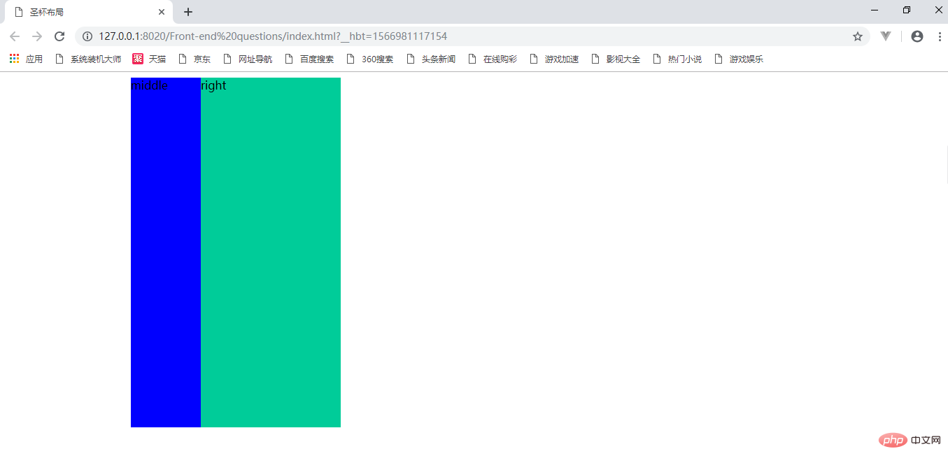
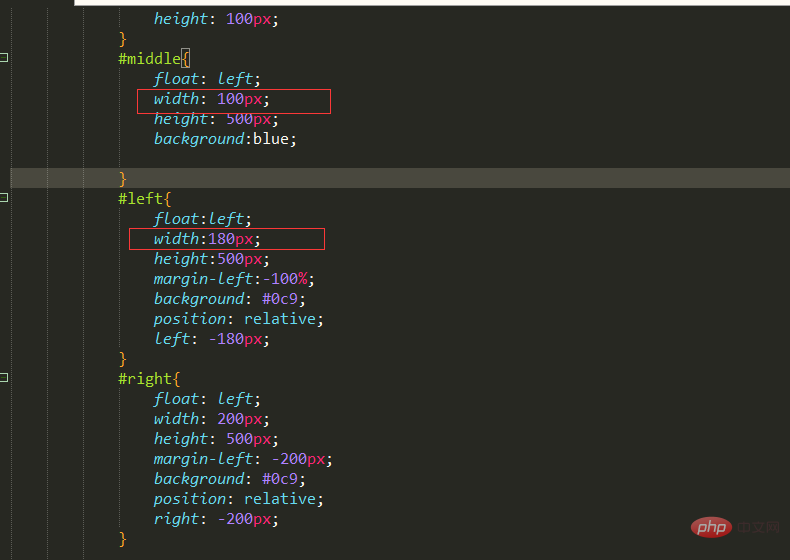
<!DOCTYPE html>
<html>
    <head>
        <meta charset="utf-8" />
        <title>圣杯布局</title>
        <style>

            #bd{
                padding: 0 200px 0 180px;
                height: 100px;
            }
            #middle{
                float: left;
                width: 100%;
                height: 500px;
                background:blue;

            }
            #left{
                float:left;
                width:180px;
                height:500px;
                margin-left:-100%;
                background: #0c9;
                position: relative;
                left: -180px;
            }
            #right{
                float: left;
                width: 200px;
                height: 500px;
                margin-left: -200px;
                background: #0c9;
                position: relative;
                right: -200px;
            }

        </style>
    </head>
    <body>

        <div id="bd">
            <div id="middle">middle</div>
            <div id="left">left</div>
            <div id="right">right</div>


        </div>

    </body>
</html>
#bd{
                padding: 0 200px 0 180px;
                height: 100px;
            }
The middle column After the position of the middle column is adjusted, the position of the left column also moves to the right accordingly, and is restored to the correct position through the relative positioning of left
#left{

                position: relative;
                left: -180px;
            }
After the position of the middle column is adjusted, the position of the right column also moves to the left accordingly, and through the relative positioning of left The positioned right is restored to the correct position
#right{

                position: relative;
                right: -200px;
            }
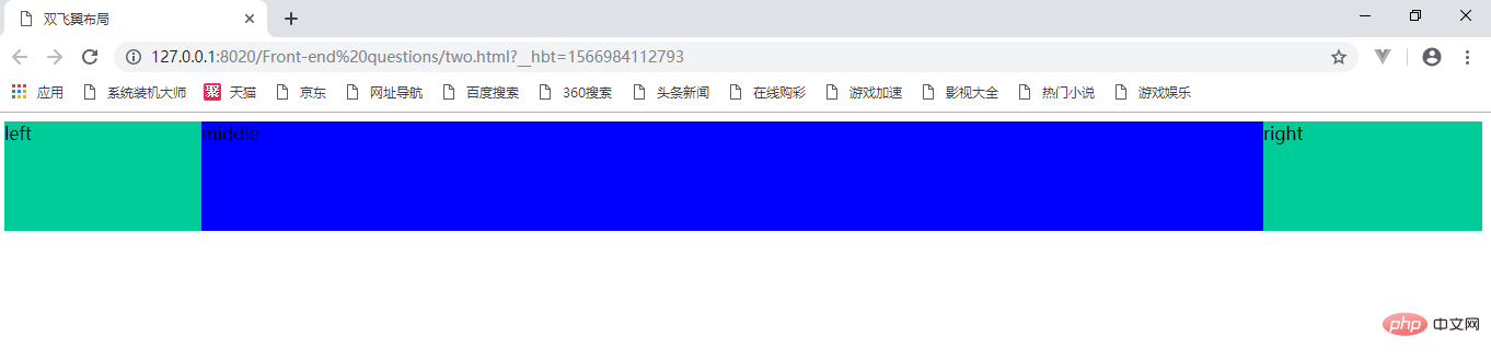
Double flying wing layout:<span style="font-size: 16px;"></span>
<!DOCTYPE html>
<html>
    <head>
        <meta charset="UTF-8">
       <title>双飞翼布局</title>
        <style>

#center{
     float:left;
     width:100%;/*左栏上去到第一行*/
     height:100px;
     background:blue;
 }
 #left{
     float:left;
     width:180px;
     height:100px;
     margin-left:-100%;
     background:#0c9;
}
 #right{
    float:left;
    width:200px;
    height:100px;
    margin-left:-200px;
      background:#0c9;
 }

 /*给内部div添加margin,把内容放到中间栏,其实整个背景还是100%*/
 #inside{
    margin:0 200px 0 180px;
     height:100px;
 }
 </style>
     </head>
     <body>
         <div id="center">
             <div id="inside">middle</div>
         </div>
         <div id="left">left</div>
         <div id="right">right</div>
     </body>
 </html
For more programming-related knowledge, please visit:Introduction to Programming! !
The above is the detailed content of What is the difference between CSS Holy Grail layout and Double Flying Wing layout?. For more information, please follow other related articles on the PHP Chinese website!