Home >Web Front-end >Front-end Q&A >Understand how F-style layout design improves web page readability
Understand how F-style layout design improves web page readability
- coldplay.xixiOriginal
- 2020-08-27 17:20:592594browse

【Related learning recommendations: Website production video tutorial】
Although web page layout methods are ever-changing, layout methods usually follow several common rules. Among many layout methods, the F-style layout is one with strong usability and wide application range. Today’s article will discuss with you the application of F-style layout in web pages.
The design basis of F-style layout is that when the user scans the content, the movement trajectory is similar to the letter F, and the reading method of layout matching can allow users to obtain information faster (Fast), so Named F-style layout.
Where does the F-style layout come from?
The F-style layout originated from an eye tracking study by NNGroup project, they tracked the eye movements of more than 200 users while browsing various web pages, and found that when the user’s eyeballs browse the webpage quickly, especially when browsing text content quickly, the eyeball movement trajectory is similar to the letter F, and the entire movement process Follow the following three parts:
Users will first browse in the horizontal direction, giving priority to the upper part of the content block. At this time, the eye movement forms the top horizontal line of the letter F.
·Next, their eyes will scan vertically along the left side of the screen, looking for content that can arouse points of interest in the paragraph. When they find content that arouses their interest, they will continue to browse carefully horizontally, and usually these The range of sight corresponding to the content will be smaller than the scope of the first horizontal browsing, and this sight track forms a horizontal line in the middle of the letter F.
·Next, the user will move their eyes to the left side of the screen and continue browsing downwards.
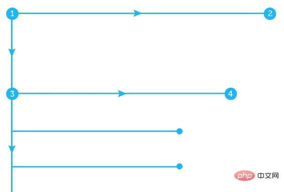
The way we browse content is trained to start browsing horizontally from the upper left corner, return to the left and scan down to find points of interest, and continue browsing horizontally.
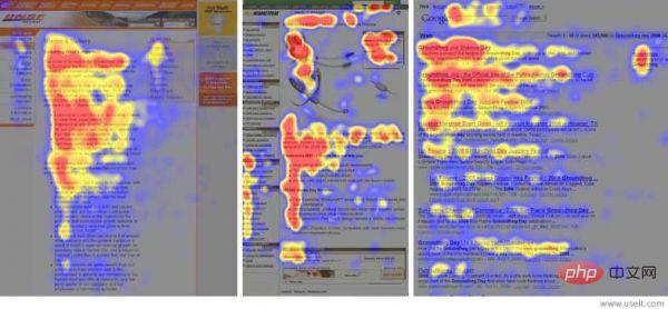
NNGrou’s eye tracking research proves this. The red part is the area that the user is interested in, followed by the yellow area, and the uninterested area is blue. Area, the gray area is the part that the user directly ignores without stopping.
Obviously, the user’s browsing process is not divided into three parts, but its pattern is still used.
Why use F-style layout?
F-style layout allows you to create a more layered design, which is easier for users to browse and obtain. information. For most countries and regions around the world, the F-style layout is very consistent with reading habits. This rule makes it widely used in UI and web design.
When to use F-style layout?
Websites with heavy text content such as news and blogs are suitable for F-style layout. It is mainly suitable for text reading. .
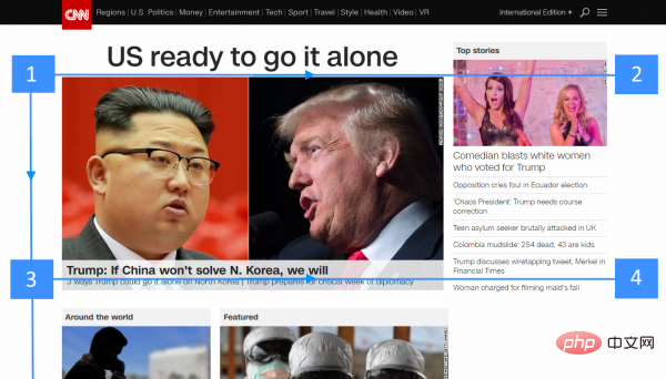
CNN uses F-style layout
How to use F-style layout?
F-style layout allows designers to better control the visibility of content.
1. Determine the priority of content
If you have a sufficient understanding of the priority of the content on the page, then you can combine the user's browsing habits and prioritize the important content. Content is arranged where users’ eyes often stay. Let these "hot spots" where important content is presented carry the core interaction.
2. Set initial expectations
The first few paragraphs of the text are very important. Try to place the most core and focused content at the top of the page, which is why the title, introduction and navigation bar are so important.
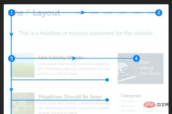
Users can quickly read content within seconds.
3. Designed for speed reading
Users usually do not read articles word by word, but obtain content through meaning groups, so you need Arrange the meaning groups that may contain content that the user is interested in according to the F-style layout, so that the content can be presented as efficiently as possible:
·Paragraphs begin with fresh, interesting, and key words.
·Users will first view the elements with the highest priority (that is, the area with the heaviest visual weight). Therefore, in a text-based website, you should highlight the importance of the text itself (such as keywords), and use elements such as color matching to enhance the presence of elements such as buttons that involve key interactions.
·Each paragraph states one thing, and state it as pointedly as possible.
·Place the most important elements (such as CTA buttons, etc.) on the far left or right, which is the beginning of the user's reading. At this time, users usually pause while reading, and this moment allows them extra time to consider and choose the next step of interaction.
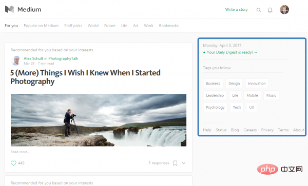
4. Make good use of the sidebar
The sidebar can usually help users go to the next level, and the user interaction will be more in-depth:
·Provide content that users want to see, rather than things like advertisements, related articles, and widgets.
·Design it as a tool for users to find specific content. The most common designs are table of contents lists, tag clouds, and "most clicked" article lists.
5. Avoid boring layouts
The biggest problem with the F-style layout is that it makes the entire page look boring. Similar and repetitive content appears in different places throughout the page, and users are likely to quickly tire of similar layouts. Therefore, you need to create some elements that break the awkward pattern so that users can constantly adjust their attention and continue reading.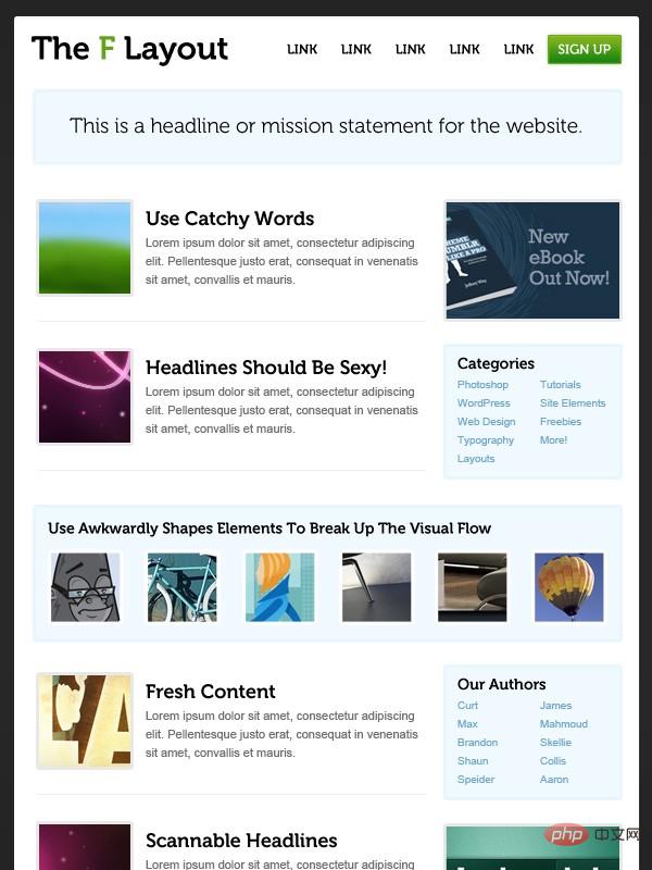
Conclusion
Of course, the F-style layout follows the trends and habits of humans browsing information, and it can help you optimize the layout. With structures, you don't necessarily have to use them this way. Interesting design and good readability are equally important, and sometimes it’s not hard to achieve both.If you want to know more about related learning, please pay attention to thephp training column!
The above is the detailed content of Understand how F-style layout design improves web page readability. For more information, please follow other related articles on the PHP Chinese website!

