
 Daily ProgrammingCSS Knowledgecss sets the background image to be blurry and the content not to be blurry
 Requirement: A p has set the background: url. Now it is necessary to blur the background of the picture and display the text in the p clearly.
Original code:
<!DOCTYPE html><html lang="en"><head>
<meta charset="utf-8">
<style type="text/css">
.content { color: #ffffff; font-size: 40px; }
.bg { background: url('1.jpg'); background-repeat: no-repeat; background-position: center; background-size: cover; height:600px; text-align: center; line-height: 600px; }
</style></head><body><p class="bg">
<p class="content">我是内容</p></p></body></html>Original effect: 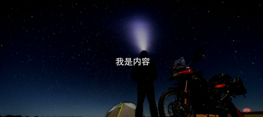
Solution: The content and image are placed in a p respectively, and the background p blur is set through css , set the absolute position of content p.
html code:
<!DOCTYPE html><html lang="en"><head>
<meta charset="utf-8">
<style type="text/css">
.content { color: #ffffff; font-size: 40px; }
.bg { background: url('1.jpg'); height:600px; text-align: center; line-height: 600px; }
.bg-blur { float: left; width: 100%; background-repeat: no-repeat; background-position: center; background-size: cover; -webkit-filter: blur(15px); -moz-filter: blur(15px); -o-filter: blur(15px); -ms-filter: blur(15px); filter: blur(15px); }
.content-front { position:absolute; left: 10px; right: 10px; height:600px; line-height: 600px; text-align: center; }
</style></head><body>
<p>
<p class="bg bg-blur"></p>
<p class="content content-front">我是内容</p>
</p></p></body></html>Effect: 
<!DOCTYPE html><html lang="en"><head>
<meta charset="utf-8">
<style type="text/css">
.content { color: #ffffff; font-size: 40px; }
.bg { background: url('1.jpg'); background-repeat: no-repeat; background-position: center; background-size: cover; height:600px; text-align: center; line-height: 600px; }
</style></head><body><p class="bg">
<p class="content">我是内容</p></p></body></html>Original effect:
<!DOCTYPE html><html lang="en"><head>
<meta charset="utf-8">
<style type="text/css">
.content { color: #ffffff; font-size: 40px; }
.bg { background: url('1.jpg'); height:600px; text-align: center; line-height: 600px; }
.bg-blur { float: left; width: 100%; background-repeat: no-repeat; background-position: center; background-size: cover; -webkit-filter: blur(15px); -moz-filter: blur(15px); -o-filter: blur(15px); -ms-filter: blur(15px); filter: blur(15px); }
.content-front { position:absolute; left: 10px; right: 10px; height:600px; line-height: 600px; text-align: center; }
</style></head><body>
<p>
<p class="bg bg-blur"></p>
<p class="content content-front">我是内容</p>
</p></p></body></html>Effect:
https://blog.csdn.net/oHeHeHou/article/details/51975539
Recommended tutorial:The above is the detailed content of css sets the background image to be blurry and the content not to be blurry. For more information, please follow other related articles on the PHP Chinese website!

Hot AI Tools

Undresser.AI Undress
AI-powered app for creating realistic nude photos

AI Clothes Remover
Online AI tool for removing clothes from photos.

Undress AI Tool
Undress images for free

Clothoff.io
AI clothes remover

Video Face Swap
Swap faces in any video effortlessly with our completely free AI face swap tool!

Hot Article
Hot Tools

Safe Exam Browser
Safe Exam Browser is a secure browser environment for taking online exams securely. This software turns any computer into a secure workstation. It controls access to any utility and prevents students from using unauthorized resources.

SublimeText3 Mac version
God-level code editing software (SublimeText3)

mPDF
mPDF is a PHP library that can generate PDF files from UTF-8 encoded HTML. The original author, Ian Back, wrote mPDF to output PDF files "on the fly" from his website and handle different languages. It is slower than original scripts like HTML2FPDF and produces larger files when using Unicode fonts, but supports CSS styles etc. and has a lot of enhancements. Supports almost all languages, including RTL (Arabic and Hebrew) and CJK (Chinese, Japanese and Korean). Supports nested block-level elements (such as P, DIV),

Notepad++7.3.1
Easy-to-use and free code editor

WebStorm Mac version
Useful JavaScript development tools

