How to make data curve chart
- 藏色散人Original
- 2020-05-15 10:04:3430741browse

How to make a data curve chart?
1. Create a new excel file on the computer desktop (the operation process is to right-click, select the "New" option in the options, and then select "excel file" to successfully create a new excel file. file)
2. Double-click to open the newly created excel file, enter the data you need to statistically create a curve, remember to enter the X-axis data at the top and the Y-axis data at the bottom. .
3. Then select the data with a larger X-axis range required and draw the curve first. Among the editor's data, the data below has a larger range, so select all the data below first.
4. Then switch the upper menu bar to the "Insert" option, click the small triangle below "Scatter Plot", and select the curve type with smooth lines in it.
5. A graph of these data will pop up in the interface. Then select the data, right-click, and select the "Select Data" option.
6. A small window will pop up as shown in the figure below, click the "Add" option, and a selection data box will appear as shown below.
7. Select the data name in "Series Name", this picture is "Absorbance"; select the data to be added in "X-Axis Series Value" and "Y-Axis Series Value" respectively.
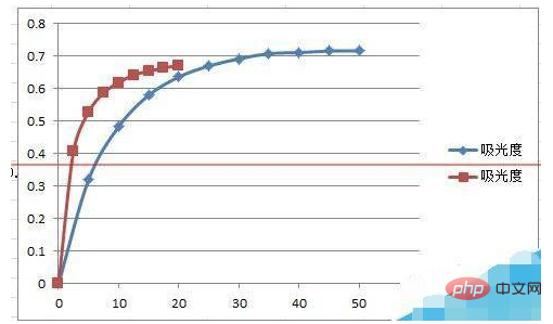
8. After clicking "OK", two curves will be successfully formed on one graph in the interface. The picture below is the rendering after production.

Recommended: "Excel Tutorial"
The above is the detailed content of How to make data curve chart. For more information, please follow other related articles on the PHP Chinese website!

