Home >Web Front-end >CSS Tutorial >Detailed explanation of CSS property box-sizing
Detailed explanation of CSS property box-sizing
- Guanhuiforward
- 2020-05-09 09:43:058527browse
CSS box model
You need to first understand the CSS box model
The calculation rules of width and height in the CSS box model:
In CSS , the width and height you set for an element will only apply to the content area of this element. If this element has any borders or padding, the width and height of the box when drawn to the screen will be added to the set border and padding values.
The following is an example
When padding and border are not added
<body>
  <div class="wrapper"></div>
</body>
*{
      margin:0;
      padding:0;
    }
    body{
      border:1px solid blue;
      margin:10px;
    }
    .wrapper{
      width:100px;
      height:100px;
      background:pink;
    }
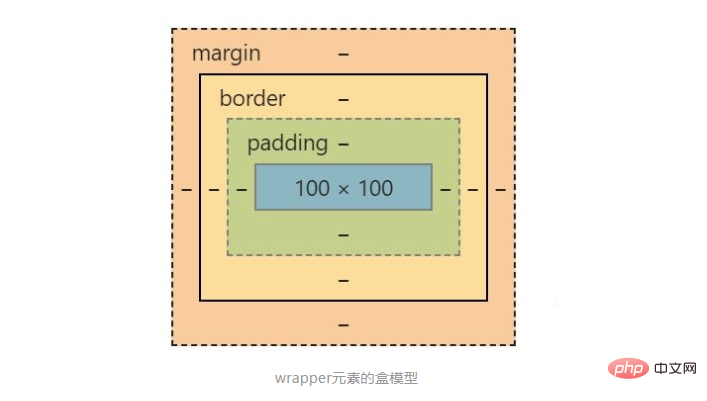
At this time, the width and height of the div.wrapper element is 100* 100

##Box model of the wrapper element
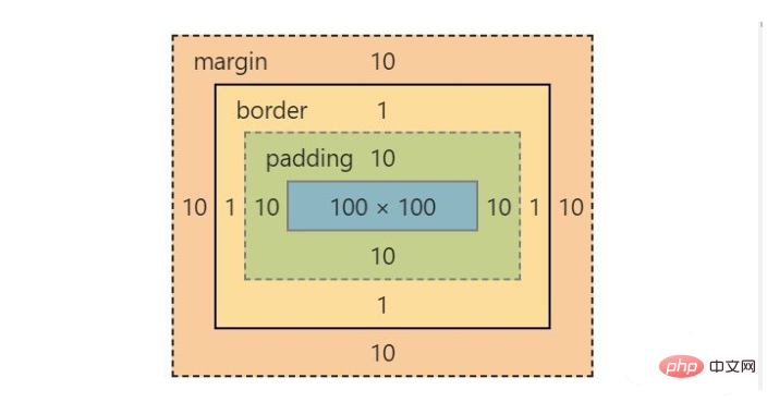
When adding padding and border styles to the div.wrapper element.wrapper{
width:100px;
height:100px;
background:pink;
padding:10px;
border:1px solid black;
margin:10px;
}


Note: margin will not affect the width and height of the element. Although margin is also set here, margin is not added to the width and height of the element. The value of
box-sizing attribute
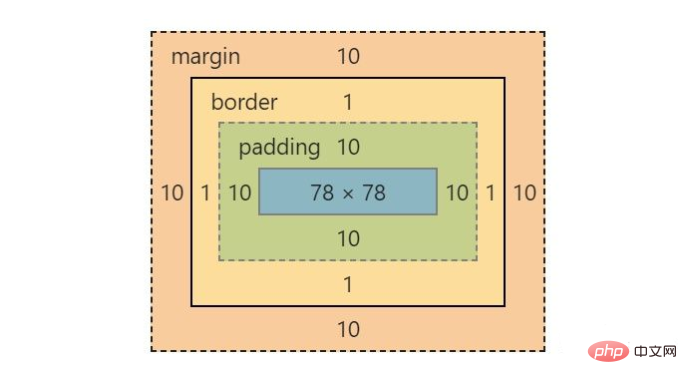
1. What is the box-sizing attribute used for? The box-sizing attribute is a method used to change the width and height of the calculated element in the CSS box model2. The value of box-sizingcontent -box is the default value. If you set the width of an element to 100px, then the element's content area will be 100px wide, and the width of any borders and padding will be added to the last drawn width of the element. border-boxIf you set the width of an element to 100px, then this 100px will include its border and padding, and the actual width of the content area will be width minus border padding. Calculated. 3. Use the box-sizing attributeUse border-box<body> <div class="wrapper"></div> </body>
    *{
      margin:0;
      padding:0;
      box-sizing:border-box;
    }
    body{
      border:1px solid blue;
      margin:10px;
    }
    .wrapper{
      width:100px;
      height:100px;
      background:pink;
      margin:10px;
      padding:10px;
      border:1px solid black;
    }


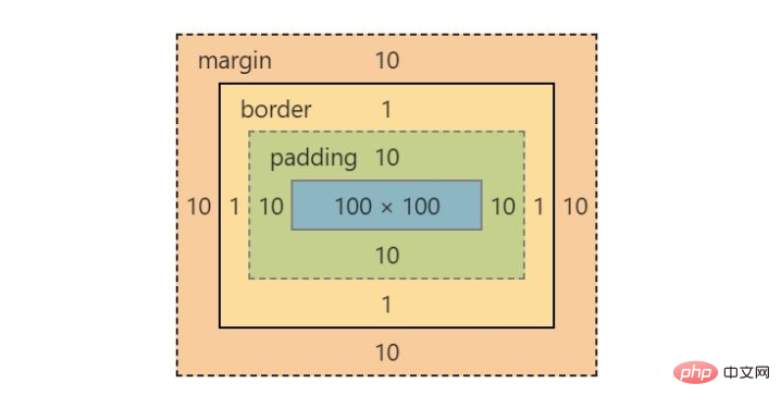
Use content-box
Take the above example as an example, just change the value of box-sizing to content-box*{
margin:0;
padding:0;
box-sizing:content-box;
}


CSSTutorial》
The above is the detailed content of Detailed explanation of CSS property box-sizing. For more information, please follow other related articles on the PHP Chinese website!

