Home >Web Front-end >CSS Tutorial >How to implement an adaptive container in css
How to implement an adaptive container in css
- 王林forward
- 2020-03-20 10:47:482151browse

Goal:
Implement a width-adaptive container whose height is half the width.
1. Think about how to implement
This problem is similar to: We are on the mobile page, there is a picture with a width of 100%, if we do not set the height, the picture will be based on the original size , proportional scaling.
We can use this idea to set a corresponding proportional height for the element according to the height of the element.
(Recommended tutorial: CSS Introduction Tutorial)
2. Implementation method 1 - Implement
so-called viewport unit (viewport) through vw viewport unit units) is relative to the size of the viewport (viewport), 100vw is equal to 100% of the viewport width, that is, 1vw is equal to 1% of the viewport width.
We can use this feature to implement width-to-height adaptive containers on the mobile side.
HTML code:
<div class="box">
    <img  src="/static/imghwm/default1.png"  data-src="http://images.pingan8787.com/2019_07_12guild_page.png"  class="lazy"   / alt="How to implement an adaptive container in css" >
</div>
css code:
*{
    margin:0;
    padding:0
}
.box{
    width:100%;
    height:51.5vw
}
.box img{
    width:100%;
}
Why is the height of .box 51.5vw?
The reason is that the original size of the picture is the aspect ratio of 884 * 455, that is, 455 / 884 = 51.5%.
Compared with the proportional scaling of the original image, this method has an advantage: no matter whether the image is loaded successfully or not, the container height is always calculated, which will not cause page jitter or page redrawing, thereby improving performance.
Let’s take a look at the comparison between successful and failed image loading in this case:

3. Implementation method 2 - Implementation through sub-element padding
It is implemented by setting the padding attribute of the child element, which is more commonly used and has a better effect. What needs to be understood here is: the value of the percentage of the padding attribute of the child element is first relative to the width of the parent container.
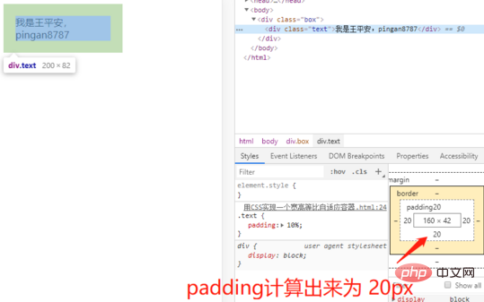
Look at the following code and renderings to understand:
HTML code:
<div class="box">
    <div class="text">我是王平安,pingan8787</div>
</div>
css code:
.box{
    width: 200px;
}
.text{
    padding: 10%;
}
Analysis:
Here we set the width of the parent container .box to 200px and the padding of the child element .text: 10%, so the padding calculation result of .box is 20px;
Next, combined with the theme, we use this principle to achieve the problem of equal proportions:
HTML code:
<div class="box">
    <div class="text">
        <img  src="/static/imghwm/default1.png"  data-src="http://images.pingan8787.com/2019_07_12guild_page.png"  class="lazy"   / alt="How to implement an adaptive container in css" >
    </div>
</div>
css code:
.box{
    width: 100%;
}
.text{
    overflow: hidden;
    height: 0;
    padding-bottom: 51.5%;
}
.box .text img{
    width: 100%;
}
here.text padding-bottom: 51.5%; is also calculated according to the first method, using the aspect ratio of the original size of the image. It should be noted that setting .text here to height: 0; will cause the height to be higher than the actual problem, so in order to avoid In this case, you need to set height: 0;.
Recommended related video tutorials: css video tutorial
The above is the detailed content of How to implement an adaptive container in css. For more information, please follow other related articles on the PHP Chinese website!

